Okay so I’ve been putting together book review journal templates for like three years now and honestly the reader diary format is probably the easiest one to monetize on KDP if you set it up right.
The basic structure you want is super straightforward but here’s where most people mess up – they either make it too complicated or so bare bones that nobody wants to actually use it. I tested like 47 different layouts last month when I was supposed to be watching The Last of Us with my wife and the conversion rate differences were wild.
The Core Pages You Actually Need
Start with a simple title page obviously. Then you need a “how to use this journal” page but keep it to like 5-6 bullet points max. Nobody reads long instructions and you’re just wasting page count that could be actual usable content.
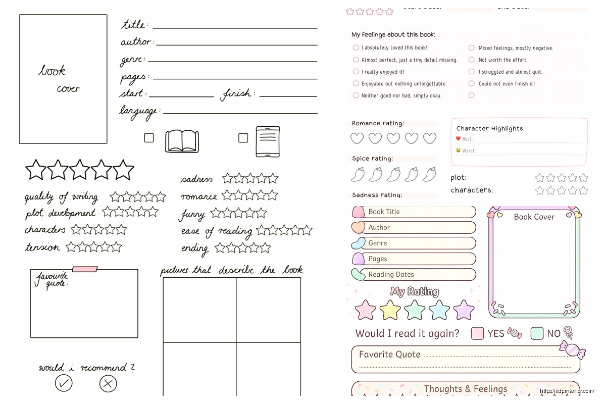
For the main review pages I usually go with one book per 2-page spread. Left page has the basic info fields and right page has the actual review/notes section. This layout tested way better than single-page reviews because people like having space to write without feeling cramped.
Left Page Fields
- Book Title (make this line thicker than you think, people write BIG)
- Author
- Genre/Category
- Date Started / Date Finished
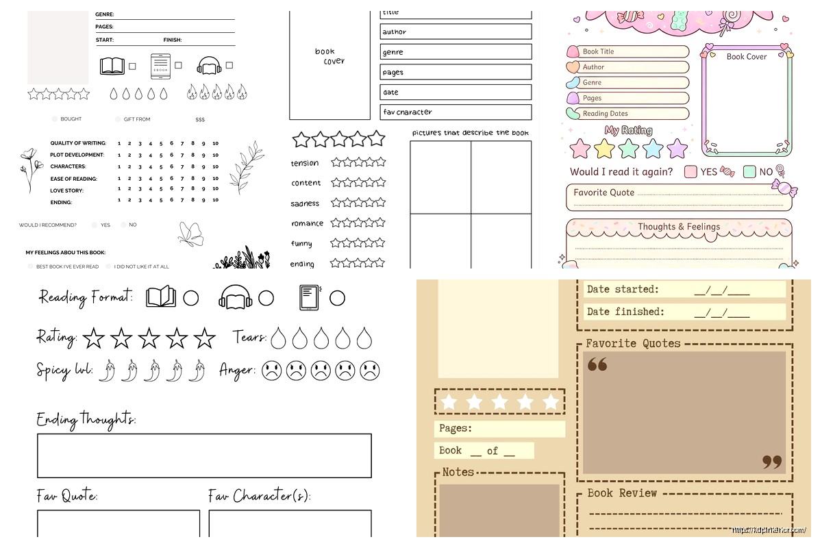
- Star Rating (I do 5 stars as outlines they can fill in)
- Format Read (physical, ebook, audiobook – this one’s important people actually track this now)
- Where I Got It (borrowed, bought, gift, library)
- Would I Recommend? Yes/No checkboxes
Wait I forgot to mention – add a “Pages” field too because book nerds love tracking how many pages they read. Some of my best-selling templates have a yearly page counter in the back.
Right Page Content Areas
This is where you gotta balance structure with freedom. Too many prompts and people feel constrained, too few and they don’t know what to write.
I use these sections with about 8-10 lines each:
Initial Thoughts: Just lined space for whatever they want to say right after finishing
Favorite Quotes: This section always needs more space than you think btw. I learned this the hard way when I got a 2-star review saying “not enough room for quotes” and she was right
Characters I Loved/Hated: Two column format works best here
Plot Summary: Keep this optional-feeling with lighter prompt text
What I Learned/Felt: The reflection section that makes people feel intellectual about their reading lol
The Monthly Reading Log Section
Okay so funny story – I almost didn’t include this in my first template because I thought it was redundant but it ended up being the feature people mentioned most in reviews. Go figure.
At the start of each month put a single-page tracker with like 15-20 lines where they can quick-list books with just title, author, rating, and finish date. It’s for people who read a ton and don’t wanna fill out the full review page for everything. My friend Sarah reads like 30 books a month and she said she uses the full review pages for books she really cares about and the monthly log for the rest.
Reading Goals and Stats Pages
Put these near the front. People need to see them when they open the journal or they forget about tracking goals entirely.
Annual Reading Goal: A big box where they write their target number, then a visual tracker. I use a bookshelf graphic with 52 book spines they can color in if they’re going for one-per-week, but you can do circles, bars, whatever. The visual component is key though – just a number field doesn’t work as well.
Monthly Breakdown: 12 small boxes for tracking monthly totals
Genre Tracker: This one’s gonna sound weird but it performs really well. A pie chart outline or bar graph where they track what genres they’re reading. Book people LOVE analyzing their reading patterns.
Back Matter Sections That Actually Get Used
- Books I Want to Read Next (3-4 pages of lined title/author fields)
- Books I’d Read Again
- Books I Wouldn’t Recommend
- Favorite Authors Discovered This Year
- Reading Statistics Summary (total books, total pages, favorite genre, etc)
The statistics page at the very end needs to be designed so they fill it out on December 31st and feel accomplished. Use prompts like “I read ___ books totaling ___ pages” and “My favorite book was ___” – make it Instagram-ready basically because that’s what people do with these.
Design Stuff That Matters More Than You Think
Line spacing is critical and everyone gets this wrong at first. For handwriting sections use 0.35-0.4 inch spacing between lines. Smaller and people with normal handwriting can’t use it comfortably. I tested this extensively because my first template had lines too close together and got roasted in reviews.
Font choices – use something clean and readable for prompts. I stick with Garamond or Palatino for the prompt text, 10pt usually. For headers go bigger obviously, 14-16pt depending on hierarchy.
Margins need to be at least 0.5 inches on all sides but I go 0.6 on the inner margin for binding. KDP’s gonna eat some of that space and you don’t want text disappearing into the gutter.
The Color Question
Interior color costs way more to print obviously so most reading journals are black and white. But here’s what I found – a LITTLE bit of gray shading for section headers and boxes makes it look way more professional without adding color printing costs. Like 20% gray for background fills on header sections, maybe 10% for subtle lines or boxes.
If you do go full color the production costs are gonna kill your royalty unless you price it at like $15+ and honestly most people won’t pay that for a reading journal when there’s cheaper options.
Page Count Sweet Spot
I’ve tested everything from 100 pages to 300 pages. The best seller for me is 120 pages which gives you room for about 50 full book reviews plus all the extra tracking pages. That prices out reasonably on KDP and doesn’t feel too intimidating.
Some people want year-long journals with space for like 100+ books but those end up being thick expensive books that don’t convert as well. Better to position it as a “50 Book Reading Journal” or whatever and let people buy multiple if they need them.
Interior Layout Flow
This is the order that tested best for me:
- Title page
- This journal belongs to page
- How to use this journal
- Annual reading goal page
- Monthly goals breakdown
- Genre tracker page
- Month 1 reading log
- Book review pages (8-10 books worth)
- Month 2 reading log
- Book review pages (8-10 books worth)
You get the pattern. Alternate monthly logs with review pages throughout. End with all the back matter summary pages I mentioned.
Prompts That Actually Help People Write
Generic prompts like “write your thoughts here” are useless. People stare at them and don’t know what to say. Better prompts:
- “What hooked me in the first chapter…”
- “If I could change one thing about this book…”
- “This reminded me of…” (for connecting books to each other)
- “I’d recommend this to someone who likes…”
- “The ending made me feel…”
But don’t put prompts on EVERY page or it feels like homework. Mix prompted sections with blank lined sections.
Trim Size and Format
6×9 inches is standard and works great for reading journals. It’s portable but big enough to write in comfortably. Some people do 8×10 for more writing space but then it’s less portable and printing costs more.
I tried 5×8 once thinking portable would be good but the pages felt cramped and it didn’t sell well at all.
The Cover Thing
Oh and another thing – your cover needs to clearly communicate “reading journal” or “book review diary” at a glance. I see so many pretty abstract covers that don’t convert because nobody knows what the product is. Put a book icon, reading imagery, or stack of books somewhere on there.
Title-wise “Book Review Journal” performs better in search than like “Reader’s Diary” or creative names. People search for what they know.
Testing What Actually Works
When I launched my first reading journal template I included way too many fancy sections that I thought were cool – like a section for tracking book club meetings and another for lending history. Nobody used them. The reviews said it was cluttered.
Stripped it down to the core stuff I mentioned above and sales went up like 40%. Sometimes less really is more, which is annoying because we wanna add all the features.
My cat just jumped on my keyboard but anyway –
Variations You Can Create
Once you’ve got the basic template down you can spin off variations:
- Genre-specific versions (Romance Reading Journal, Mystery Book Diary, etc)
- Kid’s reading journals with simpler prompts
- Book club edition with space for group discussion notes
- Minimalist version with less prompts for people who don’t like structure
The genre-specific ones can actually outperform generic ones in niche searches but you gotta research if there’s enough search volume first.
Common Mistakes to Avoid
Don’t make every single page identical. Break it up with those monthly tracker pages and different section dividers. Repetitive pages feel boring to flip through even if they’re functional.
Don’t use fancy cursive fonts that are hard to read. I don’t care how pretty they look, readability trumps aesthetics for interiors every time.
Don’t forget page numbers. Seems obvious but I literally forgot them on my first upload and had to redo the whole file.
Don’t make the star rating graphics too small. People will try to color them in with markers and tiny stars just become black blobs.
File Setup Technical Stuff
Export as PDF obviously, make sure you’re using CMYK not RGB if you want colors to print right. Embed all fonts. 300 DPI minimum for any graphics or decorative elements.
The bleed setup on KDP is 0.125 inches so if you have any design elements that go to the page edge extend them into the bleed area or you’ll get white borders where you don’t want them.
I use Adobe InDesign for layout but you can honestly do this in Canva if you’re comfortable with it. Just watch your margins and line spacing carefully.
Actually Affinity Publisher is cheaper than InDesign and works great for this kind of project if you’re looking for software recommendations.
Anyway that’s pretty much the whole structure for a solid book review journal template. Start with this basic framework and then tweak based on your specific niche or audience needs. The key is making it functional enough that people actually use it but not so complicated that it’s overwhelming.
 Editable Canva Lined Journal: Express Your Thoughts - KDP Template
1 × $0.00
Editable Canva Lined Journal: Express Your Thoughts - KDP Template
1 × $0.00 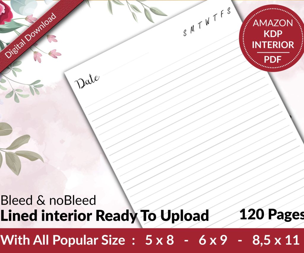 Lined Pages Journal 120 pages Ready to Upload PDF Commercial Use KDP Template 6x9 8.5x11 5x8 for Notebooks, Diaries, Low Content
1 × $0.00
Lined Pages Journal 120 pages Ready to Upload PDF Commercial Use KDP Template 6x9 8.5x11 5x8 for Notebooks, Diaries, Low Content
1 × $0.00 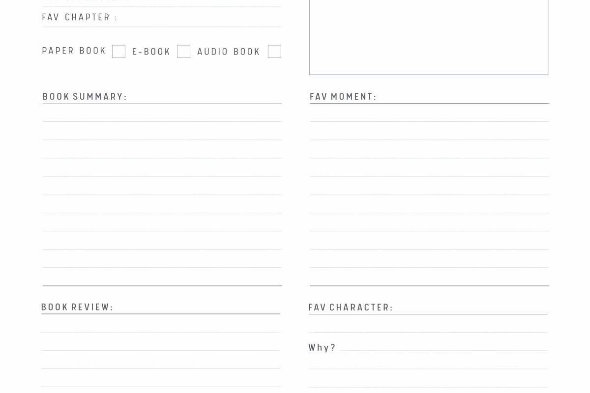
DISCOVER OUR FREE BEST SELLING PRODUCTS
Editable Canva Lined Journal: Express Your Thoughts – KDP Template
Lined Pages Journal 120 pages Ready to Upload PDF Commercial Use KDP Template 6×9 8.5×11 5×8 for Notebooks, Diaries, Low Content
Lined Pages Journal 120 pages Ready to Upload PDF Commercial Use KDP Template 6×9 8.5×11 5×8 for Notebooks, Diaries, Low Content
Cute Dogs Coloring Book for Kids | Activity Book | KDP Ready-To-Upload
Daily Planner Diary : Diary Planners for Everyday Productivity, 120 pages, 6×9 Size | Amazon KDP Interior
Wolf Coloring KDP interior For Adults, Used as Low Content Book, PDF Template Ready To Upload COMMERCIAL Use 8.5×11"
Coloring Animals Head Book for Kids, Perfect for ages 2-4, 4-8 | 8.5×11 PDF
Printable Blank Comic Book Pages PDF : Create Your Own Comics – 3 Available Sizes
Notes KDP interior Ready To Upload, Sizes 8.5×11 6×9 5×8 inch PDF FILE Used as Amazon KDP Paperback Low Content Book, journal, Notebook, Planner, COMMERCIAL Use
Black Lined Journal: 120 Pages of Black Lined Paper Perfect for Journaling, KDP Notebook Template – 6×9
Student Planner Journal 120 pages Ready to Upload PDF Commercial Use KDP Template 6×9" 8.5×11" for Low Content book
Recipe Journal Template – Editable Recipe Book Template, 120 Pages – Amazon KDP Interior