Okay so spine design is one of those things nobody thinks about until they upload their book to KDP and suddenly realize the spine width calculator is giving them weird dimensions and you’re like wait what do I even put here.
First thing – your spine width completely depends on page count and paper type. Amazon has this calculator buried in the help section and honestly I bookmark it because I use it literally every single project. You need your final trim size, your page count (interior pages only, not the cover), and whether you’re using white or cream paper. Cream paper is slightly thicker so your spine ends up a tiny bit wider. For a 6×9 book with 150 pages on white paper you’re looking at around 0.31 inches. That’s not a lot of space.
The template itself needs to account for the front cover, spine, and back cover all in one continuous image. KDP requires specific dimensions and you gotta be exact or it’ll reject your upload. So for that same 6×9 book, your full cover width is: (6 inches x 2) + spine width + 0.25 inches for bleed. Height is your trim size plus 0.125 inches top and bottom for bleed.
I usually work in Photoshop but Canva works too if you set up custom dimensions. Actually last month I was helping my friend Sarah design her cookbook spine and she insisted on using Canva even though I told her the text tools are limited and… anyway we made it work but man it was frustrating.
Setting Up Your Spine Template
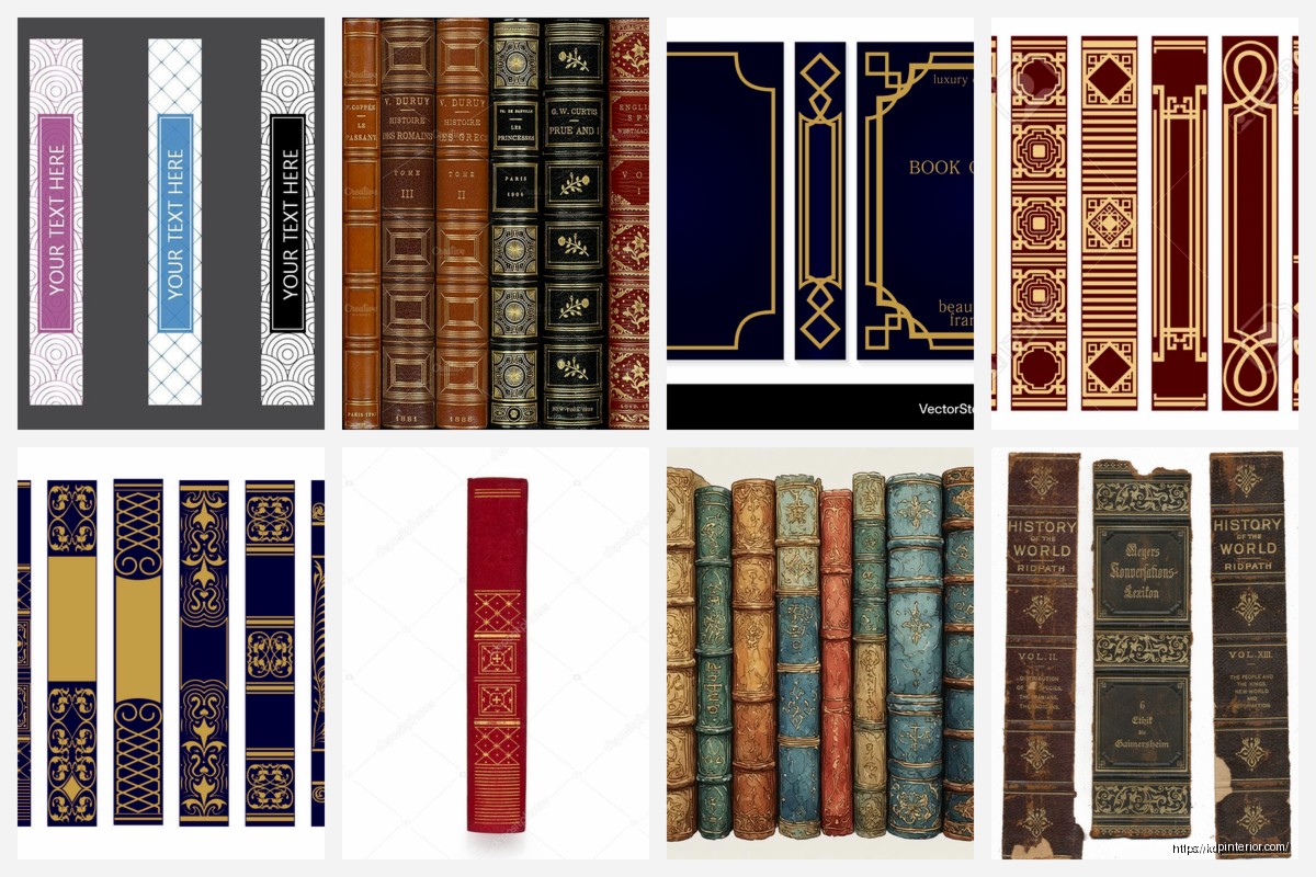
The spine area is this narrow vertical strip in the middle of your cover. You need to mark it clearly in your design file because if your text bleeds over into the front or back cover sections it’s gonna wrap around weird when printed. I use guides in Photoshop – just drag them from the ruler to mark where the spine starts and ends.
Here’s what I do every time: calculate spine width, add guides at those exact measurements from the left edge (accounting for front cover width), then I add two more guides about 0.0625 inches inside those boundaries. That’s your safety zone. Never put critical text right at the edge of the spine area because book binding isn’t perfect and your text might wrap slightly.
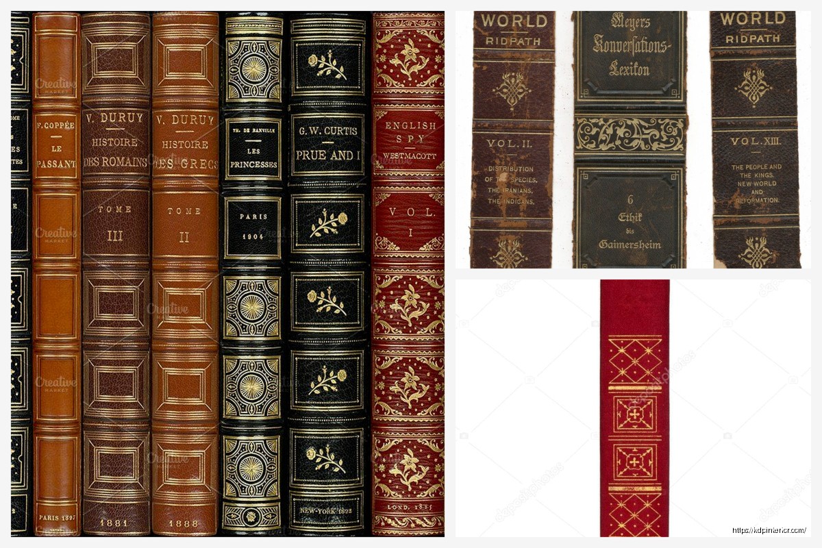
Text on spines needs to run vertically and here’s something that trips people up – in the US market, text reads from top to bottom when the book is standing upright with the front cover facing you. Some European books do it the other way but for Amazon US stick with top to bottom. I learned this the hard way on my third book when I uploaded it backwards and didn’t notice until I got the proof copy and was like why does this look so weird on my shelf.
Font Selection for Narrow Spaces
You’ve got maybe a quarter inch to work with most of the time unless you’re publishing a 400 page monster. That means your font choice actually matters. I typically use sans-serif fonts for spines – they’re cleaner and more readable at small sizes. My go-to fonts are usually Arial, Helvetica, Futura, or Montserrat. Something with good letter spacing and clean lines.
Font size depends on your spine width but generally I start around 16-20pt for a standard spine and adjust from there. If your title is really long you might need to abbreviate or use a smaller size but don’t go below 12pt or it becomes unreadable. Some designers try to cram too much info on the spine and it just looks cluttered.
Oh and another thing – always always always create your text as an editable layer not rasterized. You’re gonna want to adjust the size or spacing at least three times before you’re happy with it. Trust me.
What Actually Goes on the Spine
Standard spine includes: book title, author name, and sometimes publisher logo if you have one. For books under 130 pages or so the spine might be too narrow for KDP to even require spine text. I think their cutoff is around 0.25 inches – below that you can leave it blank.
Title should be most prominent, author name smaller below it. If you’re doing a series I sometimes add the series name too but only if there’s room. My cat just jumped on my keyboard sorry – anyway for nonfiction you might want to include a subtitle if it’s important for discoverability but honestly most people are looking at your book from the front not the side.
Publisher logos usually go at the bottom of the spine, small and unobtrusive. I created a simple logo for my publishing imprint and it’s literally just text but it looks professional enough.
Color and Contrast Considerations
Your spine needs to match your overall cover design obviously but it also needs to stand out on a bookshelf. I was watching this documentary about bookstore displays last week and they showed how books with high contrast spines get noticed more and it totally makes sense.
If your cover is dark, your spine text should be light colored. White or light gray on black looks super clean. If you’ve got a busy cover design, consider making your spine a solid color block – it’ll actually stand out more. I see a lot of indie authors just extend their cover design across the spine and the text gets lost in the background imagery.
Test your contrast by printing it out or at least viewing it at actual size on your screen. Zoom out and squint at it. If you can’t read it easily, nobody else will either.
Design Elements and Graphics
You can add small design elements to your spine but keep it minimal. A thin line above or below the text, small decorative elements that match your cover theme, maybe a subtle gradient. But the spine is not the place for complex graphics.
I sometimes carry a single design element from the front cover onto the spine – like if there’s a border pattern or icon that’s part of the branding. This creates visual continuity. For a series this is actually really important because you want all your books to look cohesive on the shelf.
Wait I forgot to mention – if you’re doing a hardcover the spine is wider and you have more room to work with. Hardcover templates are different and KDP has separate calculators for those. The principles are the same but you can usually fit more text and design elements.
Technical Specs and File Setup
Your cover file needs to be uploaded as a single PDF or TIFF usually I just do PDF because it’s simpler. Resolution needs to be 300 DPI minimum. Color mode should be RGB for KDP even though that seems counterintuitive for print – they convert it on their end.
The template you download from KDP shows exactly where your spine area is. There’s usually a pink or blue guide showing the spine boundaries and they include all the bleed areas marked. Don’t delete those guides, design around them.
One thing that’s gonna sound weird but I always design my covers at 600 DPI then downsample to 300 for upload. It gives me more flexibility if I need to adjust anything and the quality is noticeably better especially for text. Files are bigger but storage is cheap.
Common Mistakes I See All the Time
Text too close to the spine edge – it wraps around or gets cut off during binding. Leave that safety margin I mentioned earlier.
Font too small or too ornate – remember this needs to be readable from across a room basically. Your fancy script font looks great on the front cover but it’s illegible on the spine.
Color bleed issues – if your spine is a different color than your front/back cover make sure the colors meet cleanly at the boundary. I’ve seen books where there’s a weird gap or overlap because the designer didn’t align things properly.
Forgetting about the bleed area – your spine design needs to extend into the bleed zone slightly so there’s no white gaps during printing.
Wrong text orientation – seriously check which way your text reads before uploading.
Proofing Your Spine Design
Always order a physical proof copy before you publish. The spine is one of those things that looks different in person than on screen. I’ve had to adjust spine text size on probably 60% of my books after seeing the first proof.
When you get your proof, look at it on a shelf next to other books. Does it stand out? Is the text readable? Does the spine width match what you expected? Sometimes the actual printed spine is slightly different than the calculator predicted especially if you’re right on the edge of a page count threshold.
Take a photo of your book on a shelf with other books and look at it on your phone. If you can’t read the spine text in the photo, make it bigger.
Tools and Resources
KDP Cover Calculator – bookmark this page you’ll use it constantly
Cover template generator – download a new template for every single book don’t reuse old ones with different dimensions
Photoshop or GIMP for precise control, Canva for simpler designs
Actual ruler or measuring tape to check your printed proof against your digital specs
I keep a folder of all my spine designs so I can reference what worked well for previous books. It’s faster than starting from scratch every time and helps maintain consistency across my catalog.
The spine width calculator sometimes gets updated when Amazon changes paper stock suppliers so if your calculations seem off compared to an older book that might be why. Happened to me last year and I was so confused until I realized they’d changed something on their end.
Series Branding on Spines
If you’re publishing a series, your spines become even more important because that’s how readers identify books in a set. I use consistent fonts, colors, and layout across all series books. Usually I’ll add a small series number or book number on the spine too.
For my productivity planner series I use the same blue color block on every spine with white text – makes them instantly recognizable as part of the set. The front covers vary more but the spines are uniform.
Some authors do color-coded series where each book has a different spine color but the layout stays the same. That works great for visual identification but make sure the colors all look good together if someone owns the whole series.
Anyway that’s basically everything I’ve learned about spine design through way too many iterations and proof copies. The key things are: calculate your width accurately, keep text readable and properly oriented, maintain good contrast, and always proof the physical book before going live because screens lie about how things actually look in print.
 Cute Dogs Coloring Book for Kids | Activity Book | KDP Ready-To-Upload
1 × $0.00
Cute Dogs Coloring Book for Kids | Activity Book | KDP Ready-To-Upload
1 × $0.00  Black Lined Journal: 120 Pages of Black Lined Paper Perfect for Journaling, KDP Notebook Template - 6×9
1 × $0.00
Black Lined Journal: 120 Pages of Black Lined Paper Perfect for Journaling, KDP Notebook Template - 6×9
1 × $0.00 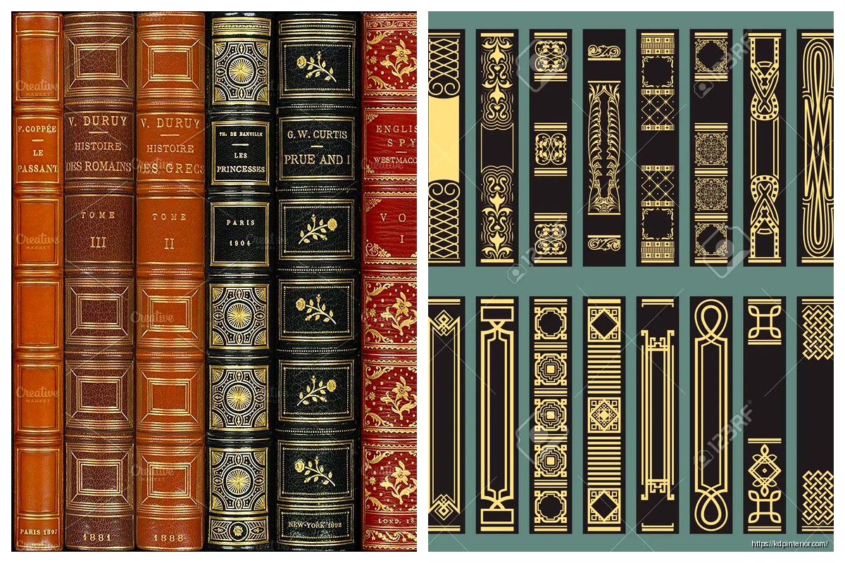
DISCOVER OUR FREE BEST SELLING PRODUCTS
Editable Canva Lined Journal: Express Your Thoughts – KDP Template
Lined Pages Journal 120 pages Ready to Upload PDF Commercial Use KDP Template 6×9 8.5×11 5×8 for Notebooks, Diaries, Low Content
Lined Pages Journal 120 pages Ready to Upload PDF Commercial Use KDP Template 6×9 8.5×11 5×8 for Notebooks, Diaries, Low Content
Cute Dogs Coloring Book for Kids | Activity Book | KDP Ready-To-Upload
Daily Planner Diary : Diary Planners for Everyday Productivity, 120 pages, 6×9 Size | Amazon KDP Interior
Wolf Coloring KDP interior For Adults, Used as Low Content Book, PDF Template Ready To Upload COMMERCIAL Use 8.5×11"
Coloring Animals Head Book for Kids, Perfect for ages 2-4, 4-8 | 8.5×11 PDF
Printable Blank Comic Book Pages PDF : Create Your Own Comics – 3 Available Sizes
Notes KDP interior Ready To Upload, Sizes 8.5×11 6×9 5×8 inch PDF FILE Used as Amazon KDP Paperback Low Content Book, journal, Notebook, Planner, COMMERCIAL Use
Black Lined Journal: 120 Pages of Black Lined Paper Perfect for Journaling, KDP Notebook Template – 6×9
Student Planner Journal 120 pages Ready to Upload PDF Commercial Use KDP Template 6×9" 8.5×11" for Low Content book
Recipe Journal Template – Editable Recipe Book Template, 120 Pages – Amazon KDP Interior