Okay so book wrapper templates are basically the full jacket layout when you’re doing print books, and honestly most people overcomplicate this but I’m gonna break down what actually works after doing like 200+ books.
First thing – wrapper vs cover, they’re different. The wrapper is the entire spread that wraps around your book. You’ve got front cover, spine, back cover, plus the flaps that fold inside if you’re doing hardcover. For paperback it’s simpler, just front-spine-back as one continuous piece.
Getting Your Dimensions Right
This is where everyone screws up initially. You can’t just guess the spine width – it’s calculated based on page count and paper type. KDP has this calculator but lemme save you time. For cream paper (which I use for like 90% of my books), it’s roughly:
Page count × 0.0025 = spine width in inches
So a 200-page book on cream paper is gonna be about 0.5 inches. White paper is thinner, closer to 0.002 per page. I keep a spreadsheet with common page counts already calculated because doing math at 11pm when you’re trying to upload is not fun.
The total wrapper width is: back cover width + spine width + front cover width + bleed on both sides. KDP requires 0.125 inch bleed, so for a 6×9 book with 200 pages you’re looking at roughly 12.5 inches wide by 9.25 inches tall for the whole template.
Template Software Options
I’ve used basically everything at this point. Started with Canva Pro which honestly works fine for simpler designs. They’ve got KDP templates built in now but they’re kinda limited. The spine text placement always feels slightly off to me, dunno why.
Moved to Adobe InDesign after my first year and that’s the professional standard. Steep learning curve though. If you’re doing this seriously and plan to pump out multiple books, worth learning. I watched some random YouTube tutorials while my cat was destroying my office plant and picked up enough to be dangerous.
Affinity Publisher is the middle ground – one-time payment, does 95% of what InDesign does. I actually prefer it now for most projects because it doesn’t have that annoying subscription.
Setting Up Your Template File
Whether you’re in Canva, InDesign, whatever – you need guides. Lots of guides. Here’s my standard setup:
- Trim lines showing where the book actually cuts
- Bleed area extending 0.125″ beyond trim
- Spine center line
- Safety margins 0.125″ inside trim (nothing critical goes outside this)
- Flap fold lines if doing hardcover
Oh and another thing – set your color mode to CMYK from the start if you’re printing. RGB looks great on screen but prints weird. Learned that the hard way on book #3, had to reorder the whole print run because the blues came out purple-ish.
Front Cover Layout Basics
Your front cover is the money maker obviously. Standard elements:
Title needs to be readable at thumbnail size – I test this by shrinking my design to like 150px wide on screen. If I can’t read it, font’s too small or too decorative. Amazon shoppers see thumbnails first.
Subtitle if you have one, author name, main imagery or design elements. Keep everything at least 0.25 inches from the spine and top/bottom edges. Trim drift is real and I’ve had covers where text got chopped because I pushed too close.
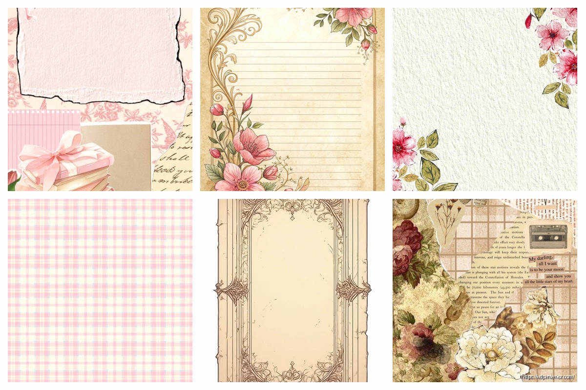
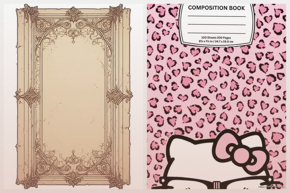
For low-content books (planners, journals, notebooks), the front cover needs to communicate function immediately. Like if it’s a recipe journal, there better be cooking imagery or food graphics. Don’t get artsy if it sacrifices clarity.
Spine Design Reality Check
Here’s the thing about spines – if your book is under 100 pages or so, the spine is gonna be tiny. Like 0.25 inches or less. You physically cannot fit much there. I see people trying to cram full titles and author names and publisher logos on a spine that’s barely visible. Don’t.
For thin spines: just author last name and a shortened title, vertical text. Sometimes just title. Sometimes nothing at all honestly.
For thicker books (200+ pages): you’ve got room to work with. Standard layout is title reading top to bottom, author name also top to bottom, both aligned the same direction. Some publishers go bottom to top but top to bottom is more common in US markets.
Font size on spines – minimum 9pt, preferably 10-12pt. Test print this. What looks fine on screen can be illegible on the actual book. I do test prints through KDP for every new template size I create, costs like $3-4 per proof copy but saves headaches.
Wait I forgot to mention – spine text color needs serious contrast with spine background. Black text on dark backgrounds might look sophisticated on screen but good luck reading it on a bookshelf. White text on dark or black text on light. Period.
Back Cover Components
Back covers for fiction vs nonfiction are totally different animals. Fiction needs:
- Book description/blurb – hook readers in first 2-3 sentences
- Author bio (short, like 3-4 sentences max)
- Author photo optional but helps with credibility
- Barcode space – bottom right corner, needs 2×1.2 inch clear space minimum
- Maybe testimonials if you have them
Nonfiction back covers I treat more like sales pages:
- Bullet points of what readers learn/get
- Author credentials and why they’re qualified
- Maybe a testimonial from someone with credibility
- Clear statement of who this book is for
- Barcode space still bottom right
For low-content books the back cover is honestly less critical since people are buying based on interior mostly, but I still put a quick description and maybe show a sample interior page.
Barcode Placement Rules
KDP automatically generates the barcode, you just leave space for it. Bottom right corner, at least 2 inches wide by 1.2 inches tall. I usually leave 2.5×1.5 to be safe. This area needs to be white or very light colored background – no busy patterns or dark colors or the scanner can’t read it.
Keep this space at least 0.25 inches from all edges. Nothing else goes in barcode space, not even decorative elements.
Hardcover Flaps If You’re Doing Those
Hardcover flaps are usually 3-4 inches wide. Left flap (inside front cover) typically has expanded book description or author bio. Right flap (inside back cover) often has author photo and additional bio info, or info about other books.
Honestly I don’t do many hardcovers through KDP because the margins are tighter and the upfront costs are higher for proof copies. My paperback stuff sells way better. But when I do hardcovers, I keep the flap content minimal – people don’t read flaps as much as you’d think.
Color and Typography Strategy
This is gonna sound weird but I limit myself to 3 colors max per wrapper design. More than that starts looking chaotic unless you really know what you’re doing design-wise. Pick a primary color (usually tied to genre expectations), a secondary color for contrast, and maybe an accent.
Genre color expectations are real:
- Romance: reds, pinks, purples
- Thriller/mystery: blacks, dark blues, reds
- Self-help: blues, greens, orange
- Fantasy: purples, deep blues, metallics
- Business: blues, grays, black with accent colors
You can break these rules but know you’re fighting against reader expectations.
Typography – two fonts maximum. One for title (display font, can be decorative), one for body text (readable sans-serif or serif). Using three or more fonts makes it look amateur. I spent like two months early on using four different fonts per cover because I thought it looked “dynamic” and yeah, those covers didn’t sell.
Image Resolution Requirements
300 DPI minimum for print. This is non-negotiable. 150 DPI might look okay-ish but will print blurry. Your wrapper template at final size should be 300 DPI throughout.
If you’re pulling images from stock sites, download the highest resolution available. I use Creative Fabrica and Elements Envato mostly – unlimited downloads for monthly fee, way better than buying individual images.
Oh and funny story – was watching The Office for the millionth time while designing a wrapper last month and Jim’s talking about DPI in some random episode and I realized I’d set up my file at 72 DPI like a complete idiot. Had to redo the whole thing.
Bleed and Safety Margins Explained Better
Bleed is the extra area beyond your final trim size. When books are cut, there’s slight variation – maybe 1-2mm. Bleed ensures that if the cut is slightly off, you don’t end up with white edges where you didn’t want them.
Extend your background colors and images all the way to the bleed edge. Don’t stop at the trim line or you risk white showing.
Safety margins are the opposite – the area inside the trim where you keep important stuff. Text, logos, anything critical stays inside safety margins (at least 0.125″ from trim, I use 0.25″ to be extra safe).
So you’ve got: bleed edge → trim line → safety margin → content area
Working With KDP Cover Creator vs Custom Templates
KDP has a built-in cover creator tool that’s honestly not terrible for basic stuff. I used it for my first few books. Limitations are obvious though – limited fonts, limited layouts, everyone’s books start looking similar.
Custom templates give you complete control. You download the template dimensions from KDP for your specific trim size and page count, then design in your software of choice, export as PDF, upload.
PDF export settings matter – PDF/X-1a:2001 format, CMYK color, fonts embedded, 300 DPI, no compression or minimal compression. Most design software has preset export options for print that handle this.
Common Mistakes I See Constantly
Text too close to spine – it curves around the spine edge and becomes unreadable. Keep 0.5 inches minimum from spine on front and back covers.
Forgetting about spine direction – if you hold the book with front cover facing you, spine text should read top to bottom so when it’s on a shelf you can read it.
Using low-res images – yeah I already mentioned this but seriously, this is the #1 quality issue. Blurry covers kill sales.
Not checking actual proof copy – what looks perfect on screen can have issues in print. Colors shift, text might be smaller than expected, paper texture affects appearance. Always order a proof.
Overly complex designs – simpler usually sells better. Your cover needs to work at thumbnail size on Amazon, not just as a full-size showcase piece.
Template Organization System
I keep master templates for each trim size I commonly use: 5×8, 6×9, 8.5×11. These have all the guides and measurements set up. When starting a new book, I duplicate the appropriate master and work from there.
Folder structure: Project Name → Design Files → Finals → Print Files. Keep your working files separate from export-ready PDFs. Name files with version numbers. I learned this after losing track of which version was which and accidentally uploading an old proof copy design.
Testing Before Full Upload
Before uploading to KDP for real, I do a preflight check:
- All images 300 DPI
- CMYK color mode
- Fonts embedded or outlined
- Bleed extends properly
- Barcode space clear
- No spelling errors (use spellcheck but also manual review)
- All text inside safety margins
- File size under KDP limits (usually fine unless you have tons of high-res photos)
KDP’s previewer tool is helpful but not perfect. It’ll catch obvious problems like wrong dimensions or missing bleed, but won’t catch things like poor color choices or hard-to-read fonts.
The real test is the physical proof copy. I cannot stress this enough – order the proof, wait the few days, review it in person. I’ve caught issues in proof that never showed on screen – color shifts, text readability problems, spine alignment being slightly off.
Alright that’s basically the full rundown on wrapper templates. Start with simpler designs, test everything in print, and don’t be afraid to iterate based on what actually sells vs what you think looks cool.
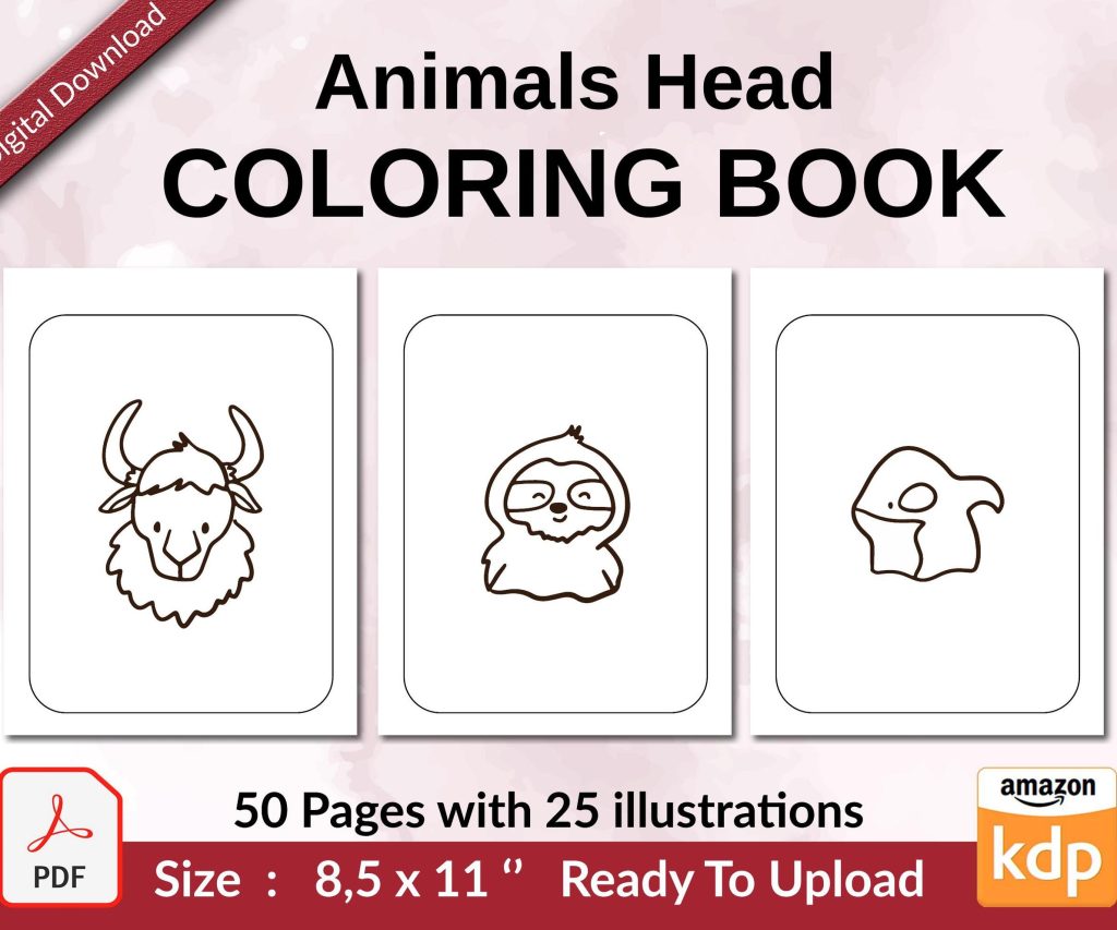 Coloring Animals Head Book for Kids, Perfect for ages 2-4, 4-8 | 8.5x11 PDF
1 × $0.00
Coloring Animals Head Book for Kids, Perfect for ages 2-4, 4-8 | 8.5x11 PDF
1 × $0.00 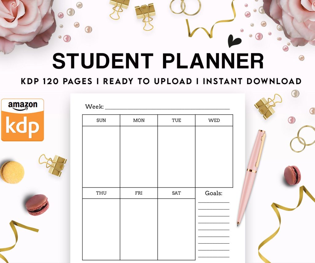 Student Planner Journal 120 pages Ready to Upload PDF Commercial Use KDP Template 6x9" 8.5x11" for Low Content book
1 × $0.00
Student Planner Journal 120 pages Ready to Upload PDF Commercial Use KDP Template 6x9" 8.5x11" for Low Content book
1 × $0.00 
DISCOVER OUR FREE BEST SELLING PRODUCTS
Editable Canva Lined Journal: Express Your Thoughts – KDP Template
Lined Pages Journal 120 pages Ready to Upload PDF Commercial Use KDP Template 6×9 8.5×11 5×8 for Notebooks, Diaries, Low Content
Lined Pages Journal 120 pages Ready to Upload PDF Commercial Use KDP Template 6×9 8.5×11 5×8 for Notebooks, Diaries, Low Content
Cute Dogs Coloring Book for Kids | Activity Book | KDP Ready-To-Upload
Daily Planner Diary : Diary Planners for Everyday Productivity, 120 pages, 6×9 Size | Amazon KDP Interior
Wolf Coloring KDP interior For Adults, Used as Low Content Book, PDF Template Ready To Upload COMMERCIAL Use 8.5×11"
Coloring Animals Head Book for Kids, Perfect for ages 2-4, 4-8 | 8.5×11 PDF
Printable Blank Comic Book Pages PDF : Create Your Own Comics – 3 Available Sizes
Notes KDP interior Ready To Upload, Sizes 8.5×11 6×9 5×8 inch PDF FILE Used as Amazon KDP Paperback Low Content Book, journal, Notebook, Planner, COMMERCIAL Use
Black Lined Journal: 120 Pages of Black Lined Paper Perfect for Journaling, KDP Notebook Template – 6×9
Student Planner Journal 120 pages Ready to Upload PDF Commercial Use KDP Template 6×9" 8.5×11" for Low Content book
Recipe Journal Template – Editable Recipe Book Template, 120 Pages – Amazon KDP Interior