Amazon KDP guide, KDP book publishing
Booklet Design Template: Mini Book Layouts
Apr
Okay so booklet design templates are honestly way simpler than people make them out to be, and I literally just finished setting up three different mini book layouts for a client last week while my cat kept walking across my keyboard, so this is fresh in my mind.
The Basic Setup Nobody Tells You About
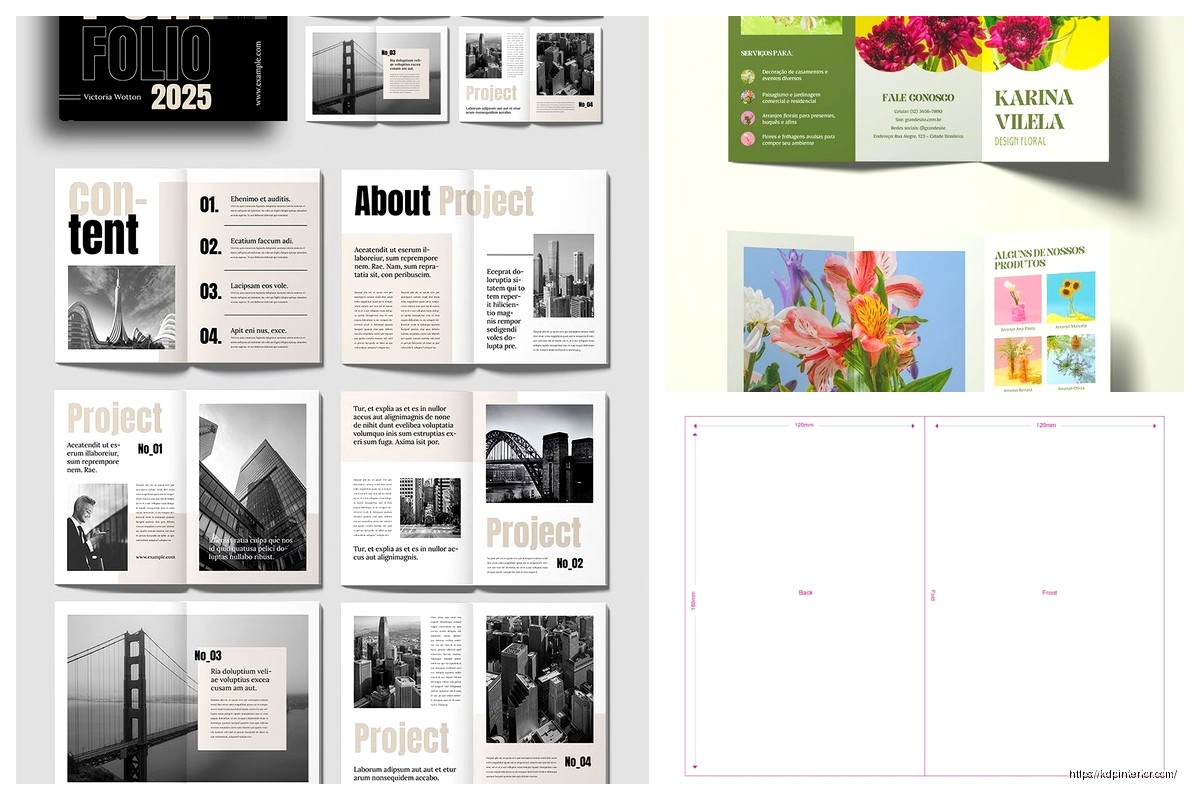
First thing – you gotta understand that booklets aren’t just shrunken regular books. The whole layout changes because you’re usually looking at 5.5×8.5 inches or smaller. I’ve done tons of these for planners, wedding programs, recipe collections, all that stuff. The page count matters way more than with regular books because of how the signatures fold.
Here’s what I mean – if you’re printing these yourself or going through a local printer, they’re gonna fold sheets in half to create the booklet. So your page count needs to be divisible by 4. Always. I learned this the hard way back in 2018 when I had to redo an entire gratitude journal template because I had 22 pages and the printer was like “uh this doesn’t work.”
Most of my successful booklet templates are either 12, 16, 20, or 24 pages. The sweet spot is honestly 16-20 pages for mini books on KDP because it’s thick enough to feel substantial but not so thick that the spine gets wonky.
Margins Are Gonna Drive You Crazy
The margin setup is where everyone screws up initially. With a standard 6×9 book, you can get away with 0.5 inch margins on the outside and maybe 0.75 on the gutter. Booklets? Completely different game.
For a 5.5×8.5 booklet I usually do:
- Inside margin (gutter): 0.75 inches minimum, sometimes 0.875
- Outside margin: 0.5 inches
- Top margin: 0.625 inches
- Bottom margin: 0.75 inches
The gutter needs extra room because these smaller books don’t lay flat like paperbacks. People are literally folding them open, and if your text runs too close to the center, it disappears into the crack. I’ve gotten so many returns on early booklets because of this exact issue.
Oh and another thing – if you’re doing saddle-stitch binding (the stapled kind), you need to account for creep. This is something I didn’t learn until maybe year 3 of doing this, and it changed everything. Inner pages shift slightly when you fold multiple sheets together, so your inside margins need progressive adjustment. Most design software has a creep setting, but honestly for booklets under 24 pages, just adding an extra 0.125 inches to your gutter handles it.
Font Sizing That Actually Works
People always want to shrink fonts down because “it’s a mini book” but that’s backwards thinking. Your reader is holding this thing closer to their face than a regular book, so readability matters even more.
I stick with 10-11pt for body text in booklets. Sometimes 9.5pt if it’s a reference guide where people expect dense information. Anything smaller and you’re gonna get complaints. Headers can be 14-16pt for H2s and 12-13pt for H3s.
The font choice itself matters too – sans serif fonts like Arial or Calibri actually work better in booklets than in full-size books because they stay clear at smaller sizes. I use Garamond or Georgia for serif options when I want something more elegant, but test it first. What looks good on your 27-inch monitor might look cramped in a 5-inch wide text block.
Layout Styles That Sell
Wait I forgot to mention – there are basically three layout approaches I rotate through depending on what the booklet’s for:
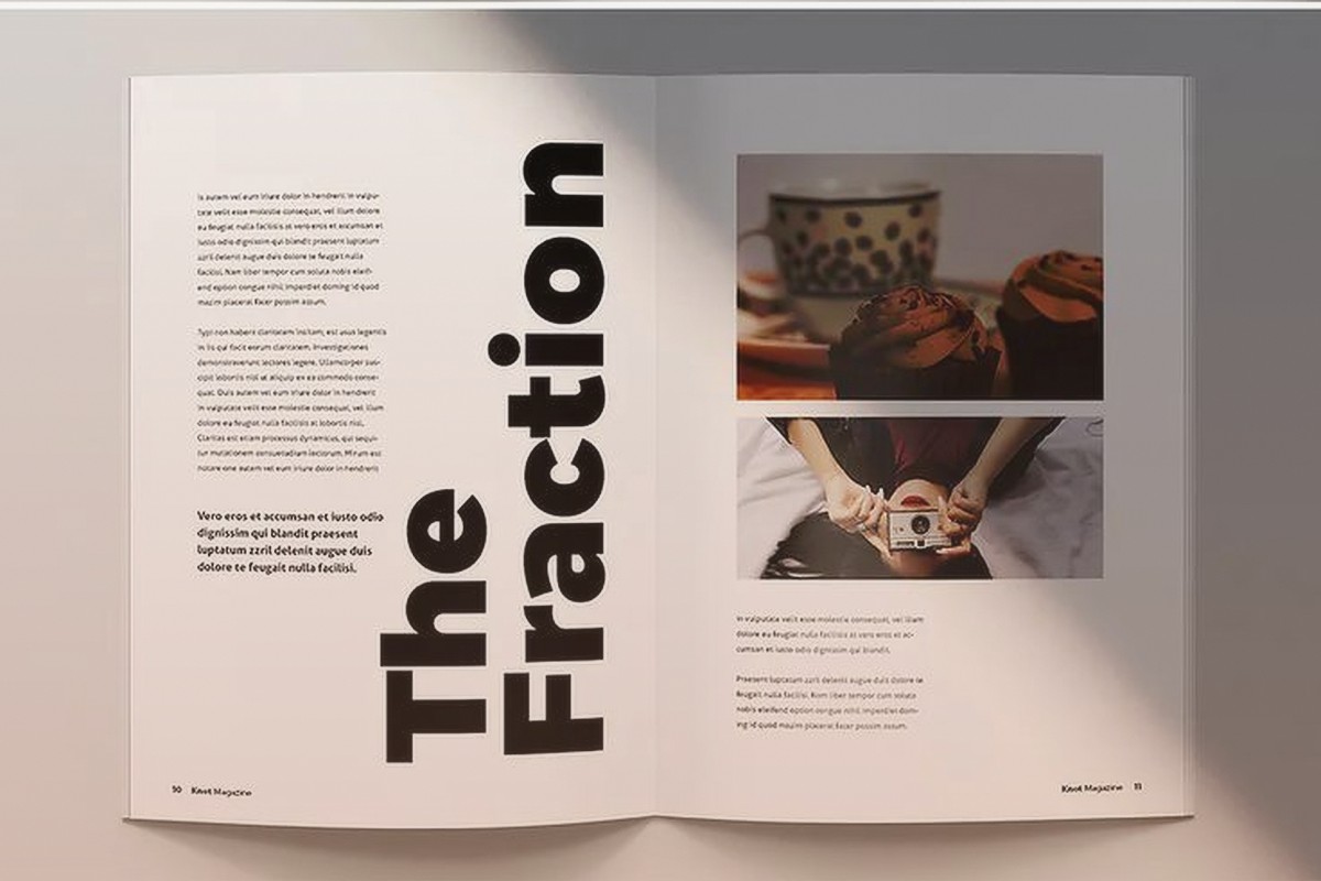
Single Column Clean
This is your standard layout, just one text column down the page. Works great for guided journals, devotionals, poetry collections, anything where you want people to focus on one thing at a time. The key is generous line spacing – I go with 1.3 to 1.5 line height. Feels spacious without wasting pages.
I did a manifestation journal template last month using this style, super minimal, lots of white space, and it’s converting at like 18% which is way above my average. Sometimes simple just wins.
Two Column Micro
This sounds weird but for reference booklets – think phrase books, plant identification guides, quick recipe collections – two narrow columns work amazing. Each column is only about 2 inches wide, but it lets you pack more info without feeling cluttered.
The trick is a decent gap between columns, at least 0.25 inches, and you need to be really careful with hyphenation. Turn it off or set it to manual only, because auto-hyphenation in narrow columns creates these ugly stacked hyphens that look super unprofessional.
Mixed Media Spreads
For activity booklets or anything with visual elements, I design in spreads instead of single pages. You’re looking at pages 2-3 as one unit, 4-5 as another unit, etc. This lets you do cool stuff like have an image bleed across the gutter or create a checklist that spans both pages.
The downside is you gotta be really precise with your page planning because everything’s paired. Can’t just add a random page later without redoing the whole spread structure.
Templates I Keep Coming Back To
Okay so funny story – I have this folder on my computer called “booklet masters” and it’s just like 8 templates I’ve refined over the years. These handle probably 90% of client requests:
The Basic Lined Journal: 5.5×8.5, 20 pages, header space at top, lined writing area, page numbers bottom center. Margins at 0.75/0.5/0.625/0.75. I’ve sold this template structure for gratitude journals, prayer journals, travel journals, you name it. Just swap the cover and maybe add some themed headers.
The Recipe Booklet: 5×8 size, two recipes per page in a card format. Little decorative border, space for ingredients and instructions, maybe a notes section. This one I usually do 16 pages so it’s 32 recipe slots. Converts crazy good during holidays.
The Workbook Style: 6×9 (slightly bigger but still mini compared to standard), mix of text blocks and fillable spaces. Headers in bold sans serif, body in serif, lots of checkboxes and writing lines. Great for self-help content, productivity planners, that whole niche.
I was watching this documentary about fonts the other night and it made me rethink some of my typography choices, but honestly these templates work because they’re tested with actual buyers, not design theory.
Software Setup Real Quick
Most people ask what I use – it’s mostly Adobe InDesign for client work because the master pages feature saves so much time. You set up your margins, headers, footers, page numbers once and it applies to all pages automatically.
But for simpler booklets or if you’re just starting, Canva actually has decent booklet templates now. The pro version lets you set custom dimensions and bleed settings. Not as precise as InDesign but way faster for basic stuff.
Google Docs can work in a pinch if you’re really careful with your margins and you export to PDF properly. I’ve done it for super simple lined journals. Just set your page size custom, set margins, turn off headers/footers unless you want page numbers, and you’re basically good.
Bleed Settings People Forget
If your booklet has any background color or images that go to the edge, you need bleed. For KDP it’s 0.125 inches on all sides. This means your actual design canvas is bigger than your trim size.
So a 5.5×8.5 booklet with bleed is actually 5.75×8.75 in your design file. The extra 0.125 on each edge gets trimmed off, but it prevents white lines if the cut isn’t perfectly aligned.
The thing that trips people up is they add bleed but forget to extend their backgrounds into it. Your background color or pattern needs to go all the way to the edge of the bleed area, not just to the trim line.
Page Elements That Matter
Headers and footers in booklets are kinda optional depending on your style. For journals and workbooks, I usually skip them entirely or just put a small page number. For reference booklets or anything with sections, running headers help people navigate.
Page numbers – bottom center or bottom outside corners. I go outside corners (alternating left/right) for anything over 16 pages, center for shorter booklets. Use a simple font, 8-9pt, maybe 50% opacity so it’s there but not screaming at you.
White space is your friend. Cannot stress this enough. In a mini book format, cramming too much on a page makes it feel overwhelming. I aim for about 60-70% text coverage max. The rest is margins and breathing room.
Testing Before You Publish
This is gonna sound obvious but print a physical proof before you publish anything. Not just a PDF on your screen – an actual printed and folded booklet. I use my home printer for initial tests, print on regular paper, fold it, staple it if it’s that kind of design.
You’ll catch so many issues this way. Text too close to the spine, margins feeling cramped, page numbers in weird spots, all that stuff that looks fine on screen but fails in physical form.
For KDP specifically, order an author proof copy. It’s like three bucks plus shipping. I do this for every new booklet template before making it live. Had one situation where my gray background looked perfect on screen but printed way too dark and muddy. Would’ve gotten destroyed in reviews if I hadn’t caught it.
Quick Fixes for Common Problems
Gutter text disappearing: Increase inside margin to 0.875 or even 1 inch. Yes it feels like a lot but trust me.
Pages feeling cramped: Reduce your font size slightly but increase line height proportionally. 10pt font with 1.4 line height feels more spacious than 11pt with 1.2 line height.
Uneven page count: Add a notes page, resources page, or “about the author” page at the end. Easy filler that adds value.
Images looking blurry: Booklets need 300 DPI minimum just like regular books, but because everything’s smaller, low-res images become super obvious. I use 400 DPI for anything image-heavy.
The reality is booklet templates are mostly about understanding the physical constraints and designing around them. Once you’ve done a few and held them in your hands, you develop this intuition for what works. My first probably 15-20 booklet designs had issues, but now I can set one up in like an hour because the structure’s internalized.
Just start with simple layouts, test physically, adjust based on what feels off when you’re actually using it, and you’ll figure out your own template system pretty quick.
DISCOVER OUR FREE BEST SELLING PRODUCTS
Editable Canva Lined Journal: Express Your Thoughts – KDP Template
Lined Pages Journal 120 pages Ready to Upload PDF Commercial Use KDP Template 6×9 8.5×11 5×8 for Notebooks, Diaries, Low Content
Lined Pages Journal 120 pages Ready to Upload PDF Commercial Use KDP Template 6×9 8.5×11 5×8 for Notebooks, Diaries, Low Content
Cute Dogs Coloring Book for Kids | Activity Book | KDP Ready-To-Upload
Daily Planner Diary : Diary Planners for Everyday Productivity, 120 pages, 6×9 Size | Amazon KDP Interior
Wolf Coloring KDP interior For Adults, Used as Low Content Book, PDF Template Ready To Upload COMMERCIAL Use 8.5×11"
Coloring Animals Head Book for Kids, Perfect for ages 2-4, 4-8 | 8.5×11 PDF
Printable Blank Comic Book Pages PDF : Create Your Own Comics – 3 Available Sizes
Notes KDP interior Ready To Upload, Sizes 8.5×11 6×9 5×8 inch PDF FILE Used as Amazon KDP Paperback Low Content Book, journal, Notebook, Planner, COMMERCIAL Use
Black Lined Journal: 120 Pages of Black Lined Paper Perfect for Journaling, KDP Notebook Template – 6×9
Student Planner Journal 120 pages Ready to Upload PDF Commercial Use KDP Template 6×9" 8.5×11" for Low Content book
Recipe Journal Template – Editable Recipe Book Template, 120 Pages – Amazon KDP Interior