-
×
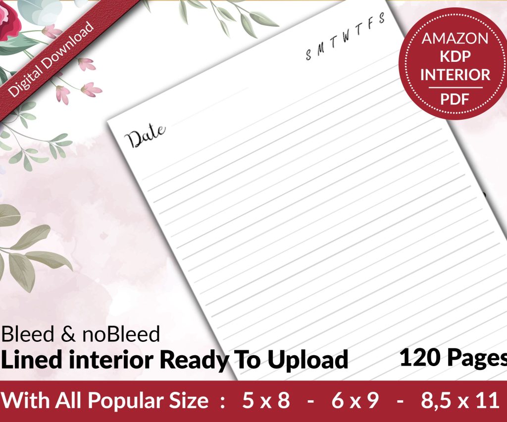 Lined Pages Journal 120 pages Ready to Upload PDF Commercial Use KDP Template 6x9 8.5x11 5x8 for Notebooks, Diaries, Low Content
1 × $0.00
Lined Pages Journal 120 pages Ready to Upload PDF Commercial Use KDP Template 6x9 8.5x11 5x8 for Notebooks, Diaries, Low Content
1 × $0.00
Subtotal: $0.00
Okay so I literally just finished setting up a booklet project in Google Docs last night for a client and honestly it’s way more straightforward than people think, you just gotta know which buttons to ignore basically.
First thing – Google Docs isn’t InDesign, right? So stop trying to make it be InDesign. What it IS good at is cloud-based collaboration and honestly that’s why I use it for booklet mockups all the time. My cat knocked over my coffee halfway through this project btw and I lost nothing because cloud saves are automatic.
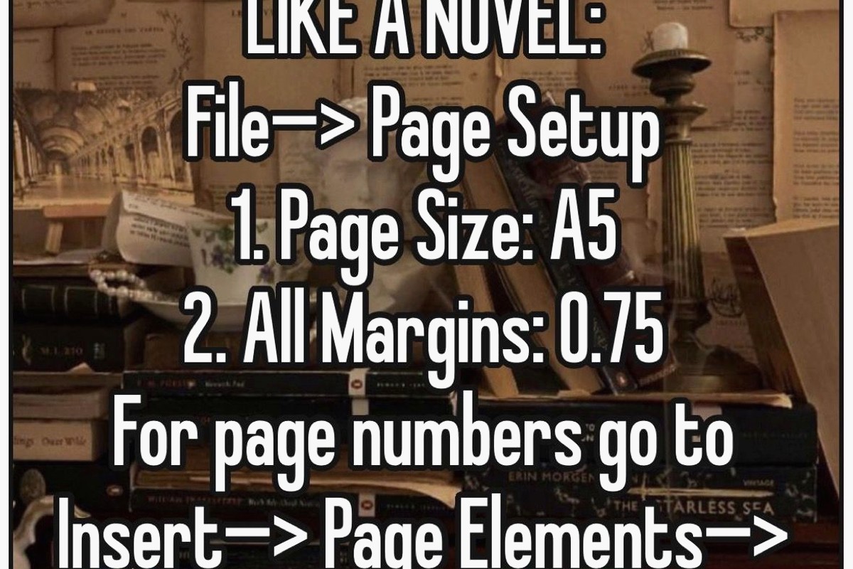
So here’s what you do. Open a blank doc, immediately go to File > Page setup. This is where everyone screws up because they just start typing. Don’t do that.
For a standard booklet you’re probably looking at either 5.5 x 8.5 inches (half of a letter page) or 6 x 9 inches if you’re doing something for KDP. Under Page setup click “Custom” in the paper size dropdown. Type in your dimensions. I usually do 6 x 9 because that’s what like 80% of my low-content books use anyway.
Margins matter here too. Set them to 0.5 inches on all sides minimum. If you’re planning to print this professionally or through KDP, you actually want 0.75 inches on the inside margin (that’s the binding side). Google Docs calls these “Left” and “Right” margins but when you’re thinking booklet, one of those is your spine.
Wait I forgot to mention – if you’re doing a traditional folded booklet (like a pamphlet style), you actually want to use columns differently. Go to Format > Columns and select two columns. This makes it look more like an actual booklet layout when you’re designing.
But here’s the thing – and I learned this the hard way after designing like 30 planners – the column feature in Google Docs is kinda limited. You can’t do different column widths per page easily. So I only use columns for simple text-heavy booklets like guides or instruction manuals.
For anything with mixed layouts, I just stick with single column and use tables. Yeah, tables. Sounds weird but tables in Google Docs are actually super flexible for layout control.
Insert a table (Insert > Table) and make it like 2 columns, 1 row. Set the border to 0pt (right-click the table, Table properties, set border to 0). Now you’ve got two sections side by side that you can control independently. Drop images in one cell, text in another.
I was watching The Last of Us while figuring this out and honestly the table method saved me so much time compared to fighting with text wrapping.
Images in Google Docs are… they’re fine. They’re not great but they’re fine. When you insert an image (Insert > Image > Upload from computer or whatever source), immediately click it and look at the image options.
You’ve got “Inline with text” “Wrap text” and “Break text” – for booklets I almost always use “Wrap text” because it gives you the most control. You can drag the image around and text flows around it.
But here’s what nobody tells you – if your booklet is image-heavy, you’re gonna have formatting issues. Google Docs just isn’t built for heavy design work. What I do instead is create image placeholders (just insert the image, size it correctly) and then if I need pixel-perfect design, I export the whole thing as PDF and fine-tune in something else. But for most booklet projects? The Docs version works fine.
So yeah Google Docs doesn’t have master pages like real design software. What I do for recurring elements (headers, footers, page numbers) is use the actual header/footer function.
Insert > Headers & footers > Header (or footer). Type whatever you want to appear on every page. For page numbers, while you’re in the header/footer editing mode, go to Insert > Page numbers and choose your format.
Oh and another thing – if you want different headers for odd/even pages (like chapter titles on one side, book title on the other), check the “Different first page” option in the header/footer settings. It’s not perfect but it works.
Okay so this is gonna sound tedious but set up your paragraph styles at the beginning. Like right after page setup, do this.
Type a heading, format it how you want (font, size, color, spacing). Highlight it, go to the styles dropdown (it says “Normal text” by default) and hover over whatever heading level you want – click the arrow and choose “Update Heading 1 to match.” Now every time you use Heading 1, it’ll look like that.
Do this for Heading 2, Heading 3, and Normal text. Takes five minutes, saves you hours of manual formatting later.
For body text in booklets I usually use:
– Font size 11 or 12pt (10pt if you’re trying to fit a lot)
– Line spacing 1.15 or 1.5
– A readable font like Georgia, Crimson Text, or even just Arial
The font selection in Google Docs is actually pretty decent now. Click the font dropdown and scroll through or click “More fonts” to see hundreds of options. For booklets I avoid anything too decorative in body text.
This drives me crazy when people don’t do it right. Don’t hit Enter twice between paragraphs like it’s 1995. Use actual paragraph spacing.
Format > Line & paragraph spacing > Add space before paragraph (or after). I usually do 6pt or 12pt depending on the booklet style. Looks cleaner and you can adjust it globally if you set it up in your paragraph styles.
When you need to start a new page, don’t just hit Enter a bunch of times. Insert > Break > Page break. This keeps your formatting from getting weird when you edit earlier sections.
Section breaks are also there if you need them (Insert > Break > Section break). Use these when you want to change page orientation or column layout mid-document. Like if you have a landscape page in the middle of your booklet for a chart or something.
For booklet covers or decorative pages, you might want background colors. There’s no direct “page background” button that’s obvious, so here’s what you do.
Insert a drawing (Insert > Drawing > New). In the drawing window, click the shape icon and choose a rectangle. Make it big, fill it with your color, set the border to transparent. Click “Save and Close.”
Now resize that drawing to fit your whole page. Set it to “Behind text” in the image options. Boom, colored background page. Is it elegant? No. Does it work? Yeah.
I actually just used this method for a recipe booklet last month and it turned out fine for a digital product.
When you’re done designing, you gotta export it properly. File > Download > PDF Document is the standard move. This gives you a PDF that maintains your formatting.
But wait – if you’re printing this as an actual folded booklet, you need to think about page order. Google Docs doesn’t have a booklet printing layout option. So you’d download the PDF and then use either:
– Your printer’s booklet printing feature
– A separate tool like BookletCreator or Adobe Acrobat’s booklet function
– Or manually arrange pages if you hate yourself
For KDP or digital distribution, the standard PDF export works perfectly. Just make sure your page size in Page setup matches what you need for the platform.
The whole point of using Google Docs is the cloud stuff right? So use it. Click the “Share” button, add collaborators by email. You can set them as viewers, commenters, or editors.
For booklet projects with clients, I usually give them commenter access so they can leave notes without messing up my layout. The comment threads (Insert > Comment or just highlight text and click the comment bubble) are great for feedback.
Version history is clutch too. File > Version history > See version history. You can see every change, who made it, and restore old versions. I’ve saved projects this way when clients decided they actually liked the old design better.
Once you’ve set up a booklet template you like, save it for reuse. File > Make a copy creates a duplicate. I keep a folder in my Google Drive just called “Booklet Templates” with different sizes and styles ready to go.
You can’t create official Google Docs templates (that feature is limited) but making copies works just as well honestly.
Look, Google Docs isn’t gonna replace professional design software. The image handling is basic, you can’t do advanced typography, no bleed settings, color management is basically nonexistent.
For simple booklets – instruction manuals, text-heavy guides, workbooks, simple planners – it’s totally fine. For photography books, art portfolios, or anything needing precise color? Use something else.
I use Google Docs for probably 40% of my booklet mockups and first drafts because it’s fast and collaborative. Then if it needs polish, I move to other tools. But plenty of my low-content books started entirely in Google Docs and sold just fine on Amazon.
Use the Explore tool (Tools > Explore) to quickly grab images from the web or your Drive without leaving the document. It’s faster than you think.
Keyboard shortcuts – learn them. Ctrl+K for links, Ctrl+Enter for page breaks, Ctrl+Alt+M for comments. Speeds things up.
If you’re doing a workbook or planner with lines, use tables with visible borders set to dotted or light gray. Way easier than trying to draw lines manually.
The equation editor (Insert > Equation) is surprisingly useful for creating decorative elements or symbols if you get creative with it.
Oh and the word count tool (Tools > Word count) shows character count too which matters if you’re trying to hit specific text lengths for layout purposes.
For QR codes or barcodes in booklets, just generate them externally and insert as images. Google Docs doesn’t have that built in.
That’s basically how I approach booklet design in Google Docs. It’s not fancy but it works, it’s free, and you can access it from anywhere which is honestly why I still use it despite having Adobe subscriptions and other tools. Sometimes simple is better especially when you’re just trying to get something done and published.
DISCOVER OUR FREE BEST SELLING PRODUCTS
Editable Canva Lined Journal: Express Your Thoughts – KDP Template
Lined Pages Journal 120 pages Ready to Upload PDF Commercial Use KDP Template 6×9 8.5×11 5×8 for Notebooks, Diaries, Low Content
Lined Pages Journal 120 pages Ready to Upload PDF Commercial Use KDP Template 6×9 8.5×11 5×8 for Notebooks, Diaries, Low Content
Cute Dogs Coloring Book for Kids | Activity Book | KDP Ready-To-Upload
Daily Planner Diary : Diary Planners for Everyday Productivity, 120 pages, 6×9 Size | Amazon KDP Interior
Wolf Coloring KDP interior For Adults, Used as Low Content Book, PDF Template Ready To Upload COMMERCIAL Use 8.5×11"
Coloring Animals Head Book for Kids, Perfect for ages 2-4, 4-8 | 8.5×11 PDF
Printable Blank Comic Book Pages PDF : Create Your Own Comics – 3 Available Sizes
Notes KDP interior Ready To Upload, Sizes 8.5×11 6×9 5×8 inch PDF FILE Used as Amazon KDP Paperback Low Content Book, journal, Notebook, Planner, COMMERCIAL Use
Black Lined Journal: 120 Pages of Black Lined Paper Perfect for Journaling, KDP Notebook Template – 6×9
Student Planner Journal 120 pages Ready to Upload PDF Commercial Use KDP Template 6×9" 8.5×11" for Low Content book
Recipe Journal Template – Editable Recipe Book Template, 120 Pages – Amazon KDP Interior