 Editable Canva Lined Journal: Express Your Thoughts - KDP Template
 Subtotal: $0.00
Amazon KDP guide, KDP book publishing
Booklet Layout: Mini Book Design Principles
15
May
May
Okay so booklet layouts are actually way easier than most people think once you get the basic proportions down. I spent like three months last year testing different mini book formats and honestly the 5.5×8.5 size is your best friend for starting out because it’s literally just half a standard letter page.
The first thing you gotta understand is margins are completely different for booklets than regular books. Like I see people all the time setting 1-inch margins on a 4×6 booklet and wondering why everything looks cramped. For anything under 6 inches wide you want 0.4 to 0.5 inches max on the sides. Top and bottom can be 0.5 to 0.6 inches. I tested this with like 50 different layouts and trust me those measurements just work.
Gutter Space Is Everything
Wait I forgot to mention the most important part first – gutter margins. This is the inside margin where the pages bind together and if you mess this up your text disappears into the spine. For saddle-stitch booklets (the ones with staples in the middle) you need at least 0.5 inches on the gutter side. Perfect bound needs 0.6 to 0.75 inches because the glue eats up space.
I learned this the hard way when I published a recipe booklet in 2019 and half the ingredients were literally unreadable in the fold. Had to pull it down and redo the whole thing. My dog knocked over my coffee right in the middle of fixing those files too which was just perfect timing.
Font Sizing For Small Formats
So for body text in booklets you can’t go below 10pt. I know it’s tempting to shrink everything down to fit more content but nobody’s gonna read 8pt text in a 4×6 booklet. I usually stick with 11pt or 12pt for body copy. Headings can be 16-18pt for main sections and 14pt for subheadings.
The hierarchy matters more in small formats because readers scan faster. You want clear visual breaks. I use this formula:
- Main heading: 18pt bold
- Subheading: 14pt bold
- Body: 11-12pt regular
- Captions or notes: 9-10pt italic
Line spacing is another thing – 1.15 to 1.3 is the sweet spot. Single spacing looks too cramped and 1.5 wastes precious space in a mini format.
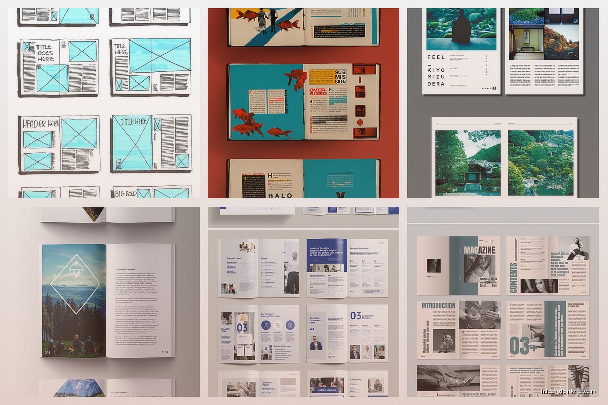
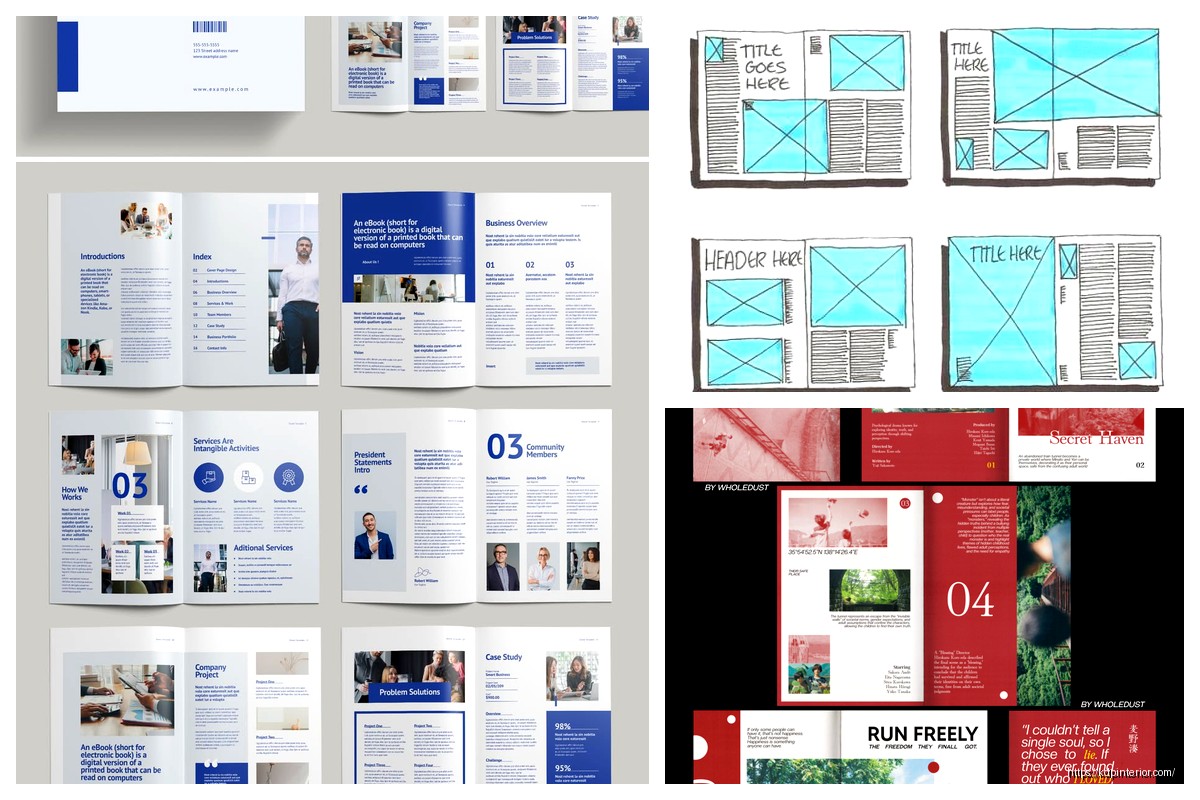
Page Layout Patterns That Actually Work
Okay so funny story, I was watching The Bear season 2 when I figured out the best layout pattern for instructional booklets. Each page should be one complete thought or step. Don’t split instructions across pages if you can help it.
For a standard 5.5×8.5 booklet I use this structure:
– Title page (duh)
– Copyright/credits page
– Table of contents if it’s over 20 pages
– Content pages with consistent layout
– Back page for notes or about the author
Each content page needs breathing room. I usually do a header at the top (page title or section name), main content in the middle 70% of the page, and leave the bottom 15% relatively clear. This prevents that “wall of text” feeling.
Column Layouts vs Single Column
This is gonna sound weird but two-column layouts almost never work in booklets under 6 inches wide. The columns end up being like 2 inches each and it just looks cramped. Stick with single column for anything under 7 inches wide.
The exception is if you’re doing comparison content or lists where two columns make logical sense. Like a phrase book with English on the left and Spanish on the right. That works because readers expect that format.
Image Placement Strategy
Images in booklets need way more space than you think. I see people cramming full-page images into every other page and it overwhelms the design. My rule is no more than 40% of total pages should have large images.
When you do use images keep them at least 2×2 inches minimum. Anything smaller looks like a thumbnail. For a 5.5×8.5 booklet a good image size is 4×3 inches or 3×4 inches depending on orientation. Leave at least 0.25 inches between image and text.
Oh and another thing – image resolution for print needs to be 300 DPI minimum. I can’t tell you how many times I’ve seen people use web images at 72 DPI and then wonder why their printed booklet looks blurry. Take that web image dimension and multiply by 4.17 to get the print dimension at 300 DPI. So a 600×800 pixel image is really only 2×2.7 inches at print quality.
Cover Design Principles
The cover is obviously super important but for booklets you have less space to work with than a regular book. Your title needs to be readable as a thumbnail because that’s how people see it on Amazon first.
I use this test – shrink your cover down to 1 inch tall on your screen. Can you still read the title? If not make it bigger. For a 5.5×8.5 booklet the title should be at least 1.5 inches tall, preferably 2 inches. Use bold sans-serif fonts for titles – stuff like Montserrat, Bebas Neue, or Oswald work great.
Back cover should have:
– Short description (3-4 lines max)
– Barcode space (2×1.2 inches in lower right)
– Maybe author info or a testimonial if you have space
Don’t put critical info on the spine for saddle-stitch booklets because there’s no spine to print on. For perfect bound you need at least 60 pages before the spine is wide enough for text.
Bleed And Trim Settings
Okay this is technical but important. Bleed is the extra space around your page that gets trimmed off. KDP requires 0.125 inches bleed on all sides. So if you’re making a 5.5×8.5 booklet your actual document size in InDesign or whatever should be 5.75×8.75 inches.
Any images or colored backgrounds that go to the edge of the page need to extend into the bleed area. Otherwise you get white slivers when they trim the pages and it looks amateur.
Typography Choices For Readability
Serif fonts like Garamond, Minion Pro, or Palatino work best for body text in booklets. They’re easier to read in longer passages. Sans-serif is better for headings, captions, and instructional text.
Never use more than two font families in one booklet. I usually do one serif for body and one sans-serif for headings. Mixing three or more fonts looks chaotic.
Letter spacing (tracking) should be 0 to 10 for body text. Headings can go up to 50 or even 100 if you want that modern spread-out look. Paragraph spacing – I do 6pt before and after paragraphs instead of indenting the first line. It’s cleaner for short-form content.
Page Numbers And Headers
Put page numbers in the outside corners – left corner for left pages, right corner for right pages. Use 9 or 10pt font. Skip page numbers on the title page and any full-page images.
Headers are optional for booklets under 40 pages. If you do use them keep them small and subtle – 9pt, maybe all caps, in a light gray instead of black. The header should show the section name or chapter title.
Content Density Rules
This is where most people mess up. They either cram too much on each page or leave too much white space. For instructional booklets aim for 150-250 words per page depending on size. That’s roughly 12-18 lines of text in 11pt font.
If you’re doing a journal or workbook obviously the content density is lower because you need space for people to write. Leave at least 5-6 lines of blank space for writing areas. Use light gray lines or dots to guide writing but make them subtle – 10-20% opacity max.
Color Vs Black And White Considerations
Black and white printing is way cheaper on KDP so if your content doesn’t absolutely need color don’t use it. B&W also looks more professional for certain types of booklets like planners or workbooks.
If you do go color make sure your blacks are true black (0,0,0,100 in CMYK) and not rich black because it can look muddy in small formats. Also test your colors – what looks good on screen often prints darker. I usually lighten background colors by 10-15% from what looks right on my monitor.
Checklist Before You Upload
Run through this every single time:
- All margins correct including gutter
- Bleed extends 0.125 inches on all sides
- Images are 300 DPI
- Page numbers on correct pages
- No text within 0.25 inches of trim edge
- Fonts embedded or outlined
- Cover dimensions match interior trim size
- Barcode area clear on back cover
Wait I forgot to mention paper color – cream vs white. For booklets I almost always use white paper because it makes colors pop more and looks cleaner for workbooks or planners. Cream is better for text-heavy books where you’re reading for long periods but that’s not really the use case for most booklets.
Software Recommendations
I use InDesign for everything now but it’s expensive. Canva actually works fine for simple booklets if you set up custom dimensions correctly. Affinity Publisher is like 50 bucks one-time and does 90% of what InDesign does.
Whatever you use make sure it can export to PDF/X-1a format. That’s what KDP wants for best results. Don’t just export a regular PDF because the color profiles might be wrong.
The biggest mistake I see is people designing in Microsoft Word. Just don’t. Word is terrible for precise layouts and your margins will be inconsistent. If you’re gonna do this seriously invest in actual layout software.
Testing Your Layout
Order a proof copy before you publish widely. I know it’s like 10 bucks or whatever but you’ll catch so many issues that don’t show up on screen. The gutter might be too tight, colors might print darker, text might be smaller than you thought.
I usually order two proofs – one to mark up with notes and one to keep pristine for reference. Check every page, flip through it like a reader would, try it in different lighting conditions.
One last thing about booklet layouts – consistency is more important than being fancy. Pick a layout template for your content pages and stick with it throughout the book. Readers should be able to predict where info will be on each page. That predictability makes booklets feel professional even if the design is simple.
DISCOVER OUR FREE BEST SELLING PRODUCTS
Editable Canva Lined Journal: Express Your Thoughts – KDP Template
Lined Pages Journal 120 pages Ready to Upload PDF Commercial Use KDP Template 6×9 8.5×11 5×8 for Notebooks, Diaries, Low Content
Lined Pages Journal 120 pages Ready to Upload PDF Commercial Use KDP Template 6×9 8.5×11 5×8 for Notebooks, Diaries, Low Content
Cute Dogs Coloring Book for Kids | Activity Book | KDP Ready-To-Upload
Daily Planner Diary : Diary Planners for Everyday Productivity, 120 pages, 6×9 Size | Amazon KDP Interior
Wolf Coloring KDP interior For Adults, Used as Low Content Book, PDF Template Ready To Upload COMMERCIAL Use 8.5×11"
Coloring Animals Head Book for Kids, Perfect for ages 2-4, 4-8 | 8.5×11 PDF
Printable Blank Comic Book Pages PDF : Create Your Own Comics – 3 Available Sizes
Notes KDP interior Ready To Upload, Sizes 8.5×11 6×9 5×8 inch PDF FILE Used as Amazon KDP Paperback Low Content Book, journal, Notebook, Planner, COMMERCIAL Use
Black Lined Journal: 120 Pages of Black Lined Paper Perfect for Journaling, KDP Notebook Template – 6×9
Student Planner Journal 120 pages Ready to Upload PDF Commercial Use KDP Template 6×9" 8.5×11" for Low Content book
Recipe Journal Template – Editable Recipe Book Template, 120 Pages – Amazon KDP Interior