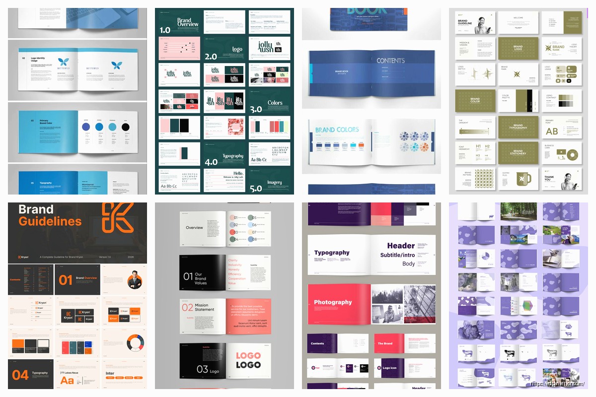
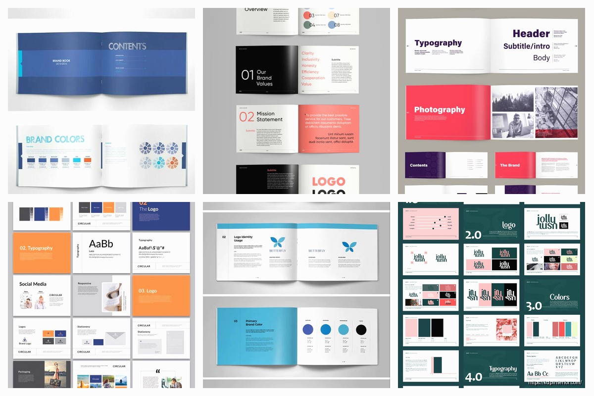
Okay so I just finished redesigning a brand book template for a client last week and honestly the whole thing reminded me why most people overcomplicate this process. You really just need like 5-6 core sections and you’re basically done.
Start With Your Logo Specifications Because Everything Flows From There
The logo section is where everyone starts and honestly that’s the right move. You gotta document the primary logo, then any secondary versions like the icon-only version or horizontal lockup. What I do is create a grid showing each variation with clear space requirements around it.
Clear space is basically the minimum breathing room your logo needs. I usually measure it using an element from the logo itself. Like if you have a letter or shape in your logo, say that element = X, then your clear space is 2X on all sides. Document this with actual measurements because your future self will thank you when you’re trying to explain this to a designer at 11pm before a launch.
Include acceptable logo uses and then the horrible don’ts. Show what happens when someone stretches it, puts it on a busy background, or uses the wrong color version. I literally screenshot bad examples I find in the wild because nothing teaches better than showing “this is what happens when you ignore the rules.”
Minimum Size Requirements Nobody Thinks About
Oh and another thing – minimum sizes. Your logo needs to stay legible whether it’s on a business card or a billboard. I typically set minimums at like 0.5 inches for print and 120px for digital, but test this yourself. Pull up your logo and keep shrinking it until you can’t read it anymore. That’s your minimum.
Color Palette Documentation That Actually Works
This section drives me crazy because I see people mess it up constantly. You need your colors in multiple formats because different applications need different things.
For each color include:
- Pantone number for professional printing
- CMYK values for standard printing
- RGB values for digital screens
- HEX codes for web design
I keep a spreadsheet with all these conversions because trying to remember them is impossible. Last month I was watching The Bear while updating a client’s brand book and realized I’d been using the wrong CMYK conversion for like three pages… had to backtrack and fix everything.
Your primary colors should be like 2-3 max. Then you can have secondary colors and maybe some accent colors. But here’s what nobody tells you – you also need to document your neutral colors. The grays, the off-whites, whatever you use for backgrounds and text. These are probably more important than your accent colors in actual day-to-day use.
Color Usage Rules
Show examples of how colors work together. Create some sample layouts showing primary color as the dominant element, secondary as support, accents as highlights. This is gonna sound weird but I usually create like a percentage rule – 60% primary, 30% secondary, 10% accent. It’s not a hard rule but it gives people a starting framework.
Typography System That Doesn’t Require a Design Degree
Fonts are where brand books either become super useful or completely useless. You need to specify fonts for different use cases.
Pick one font family for headers and one for body text. Maybe a third for accents if you’re feeling fancy but honestly two is usually enough. For each font include:
- The exact font name and where to download it
- Weights you’re using (Regular, Bold, Light, whatever)
- Font sizes for different applications
- Line height and letter spacing specifications
I create a type scale showing H1, H2, H3, body text, captions, all with their actual sizes. For digital I use rem or px, for print I use points. And yeah you need both because you’ll use this brand book for websites AND printed materials.
Wait I forgot to mention – always include fallback fonts. Like if your primary font is some fancy paid typeface, specify what happens on systems that don’t have it. Usually something like “Montserrat, Arial, sans-serif” so there’s a graceful degradation.
Typography Examples in Context
Create actual mockups showing your typography in use. A sample blog post layout, a social media post, a business card. This helps people understand not just what the fonts are but how they should actually look when applied to real content.
Image and Photography Guidelines
This section is super important but everyone skips it or makes it too vague. You need to define the visual style of images that represent your brand.
Are your photos bright and airy or dark and moody? Do you use people or just products? Are images full-color or do you apply filters? I literally create a mood board with 10-15 example images that nail the aesthetic. Then I write out the characteristics – stuff like “natural lighting preferred, minimal props, focus on product details” or whatever applies to your brand.
Include technical specs too:
- Minimum resolution for different uses
- Aspect ratios you commonly need
- File format preferences
- Color profile specifications
If you use specific filters or editing styles, document those. I once spent an entire afternoon trying to recreate the exact filter a client used on Instagram because they never documented it. Don’t be that person.
Graphic Elements and Patterns
Okay so funny story – I didn’t include this section in my own brand book for years and kept recreating elements from scratch every time. Finally documented all my graphic elements and saved probably 10 hours a month.
This includes things like:
- Shapes or patterns you use regularly
- Icon style and specifications
- Line weights and styles
- Border treatments
- Background patterns or textures
If you have custom icons, show the full set with usage guidelines. Specify stroke width, corner radius, whether they’re filled or outlined. These little details maintain consistency across hundreds of applications.
I also include what I call “branded shapes” – like if you always use rounded rectangles with a specific radius, or diagonal lines at a certain angle. Document it with actual measurements so anyone can recreate it.
Texture and Pattern Files
If you use textures or patterns, include the actual files in your brand book package. Nothing worse than seeing “use this texture” with no way to actually access it. I create a folder with all assets and reference it in the document.
Voice and Tone Guidelines
This isn’t strictly design but it’s crucial for brand consistency. How does your brand communicate? Are you formal or casual? Do you use emojis? How about exclamation points?
I break this into:
- Overall brand personality traits
- Words and phrases you use
- Words and phrases you avoid
- Example sentences showing the tone
Show examples of good brand voice versus off-brand voice. Like “We’re excited to announce…” versus “OMG YOU GUYS!!!” – one might be on-brand for you, the other definitely isn’t. Make it obvious.
My cat just knocked over my coffee while I was writing this but anyway – the voice section should also cover different contexts. How you write for social media might differ from email marketing which differs from website copy. Document these variations.
Application Examples and Templates
This is where your brand book becomes actually useful instead of just theoretical. Show your brand applied to real stuff:
- Business cards
- Letterhead
- Email signatures
- Social media templates
- Presentation slides
- Product packaging
- Website layouts
I include at least 2-3 examples of each with annotations pointing out how brand elements are applied. Like “primary color used for header, body text in GT America Regular 16pt, logo positioned with 2X clear space” – that kind of specific callout.
If possible, include actual templates people can use. InDesign files, Canva templates, PowerPoint themes, whatever makes sense for your team. The easier you make it to apply the brand correctly, the more consistently it’ll be used.
File Formats and Organization
Wait I should mention how to actually structure and deliver this thing. I create brand books in two formats usually – a PDF for reference and an online version for easy access.
The PDF should be:
- Fully bookmarked with clickable navigation
- Searchable text throughout
- High enough resolution for screen viewing but not so huge it’s unwieldy
- Includes links to asset folders or cloud storage
I also create an accompanying folder structure with all the actual brand assets organized logically. Something like:
Brand_Assets/
– Logos/
– Colors/
– Fonts/
– Images/
– Templates/
– Guidelines_PDF/
Make it dummy-proof because someone’s gonna be searching for files at midnight before a deadline.
Version Control and Updates
Oh and another thing – include version numbers and dates. Your brand will evolve and you need to track those changes. I put a version number right on the cover and include a changelog at the end showing what changed in each version.
Also specify who owns and maintains the brand book. Is there a brand manager who approves changes? How do people request additions or modifications? This organizational stuff seems boring but prevents chaos later.
Making It Actually Usable
The whole point is creating something people will actually reference and use. Keep it organized with clear sections, use lots of visual examples, make instructions specific not vague. “Use the primary color” is useless. “Use primary blue #0066CC for all call-to-action buttons, minimum size 44px height” is useful.
I typically aim for 20-40 pages depending on brand complexity. Enough detail to be comprehensive but not so long nobody reads it. You can always create expanded sections as separate documents if needed.
Test your brand book with someone who doesn’t know your brand. Hand it to them and see if they can recreate basic branded materials following your guidelines. If they can’t, your documentation needs work.
 Coloring Animals Head Book for Kids, Perfect for ages 2-4, 4-8 | 8.5x11 PDF
1 × $0.00
Coloring Animals Head Book for Kids, Perfect for ages 2-4, 4-8 | 8.5x11 PDF
1 × $0.00  Student Planner Journal 120 pages Ready to Upload PDF Commercial Use KDP Template 6x9" 8.5x11" for Low Content book
1 × $0.00
Student Planner Journal 120 pages Ready to Upload PDF Commercial Use KDP Template 6x9" 8.5x11" for Low Content book
1 × $0.00 
DISCOVER OUR FREE BEST SELLING PRODUCTS
Editable Canva Lined Journal: Express Your Thoughts – KDP Template
Lined Pages Journal 120 pages Ready to Upload PDF Commercial Use KDP Template 6×9 8.5×11 5×8 for Notebooks, Diaries, Low Content
Lined Pages Journal 120 pages Ready to Upload PDF Commercial Use KDP Template 6×9 8.5×11 5×8 for Notebooks, Diaries, Low Content
Cute Dogs Coloring Book for Kids | Activity Book | KDP Ready-To-Upload
Daily Planner Diary : Diary Planners for Everyday Productivity, 120 pages, 6×9 Size | Amazon KDP Interior
Wolf Coloring KDP interior For Adults, Used as Low Content Book, PDF Template Ready To Upload COMMERCIAL Use 8.5×11"
Coloring Animals Head Book for Kids, Perfect for ages 2-4, 4-8 | 8.5×11 PDF
Printable Blank Comic Book Pages PDF : Create Your Own Comics – 3 Available Sizes
Notes KDP interior Ready To Upload, Sizes 8.5×11 6×9 5×8 inch PDF FILE Used as Amazon KDP Paperback Low Content Book, journal, Notebook, Planner, COMMERCIAL Use
Black Lined Journal: 120 Pages of Black Lined Paper Perfect for Journaling, KDP Notebook Template – 6×9
Student Planner Journal 120 pages Ready to Upload PDF Commercial Use KDP Template 6×9" 8.5×11" for Low Content book
Recipe Journal Template – Editable Recipe Book Template, 120 Pages – Amazon KDP Interior