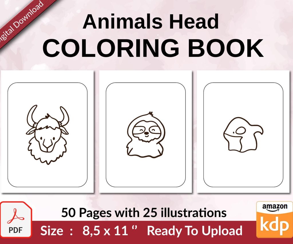
 Coloring Animals Head Book for Kids, Perfect for ages 2-4, 4-8 | 8.5x11 PDF
 Subtotal: $0.00
Amazon KDP guide, KDP book publishing
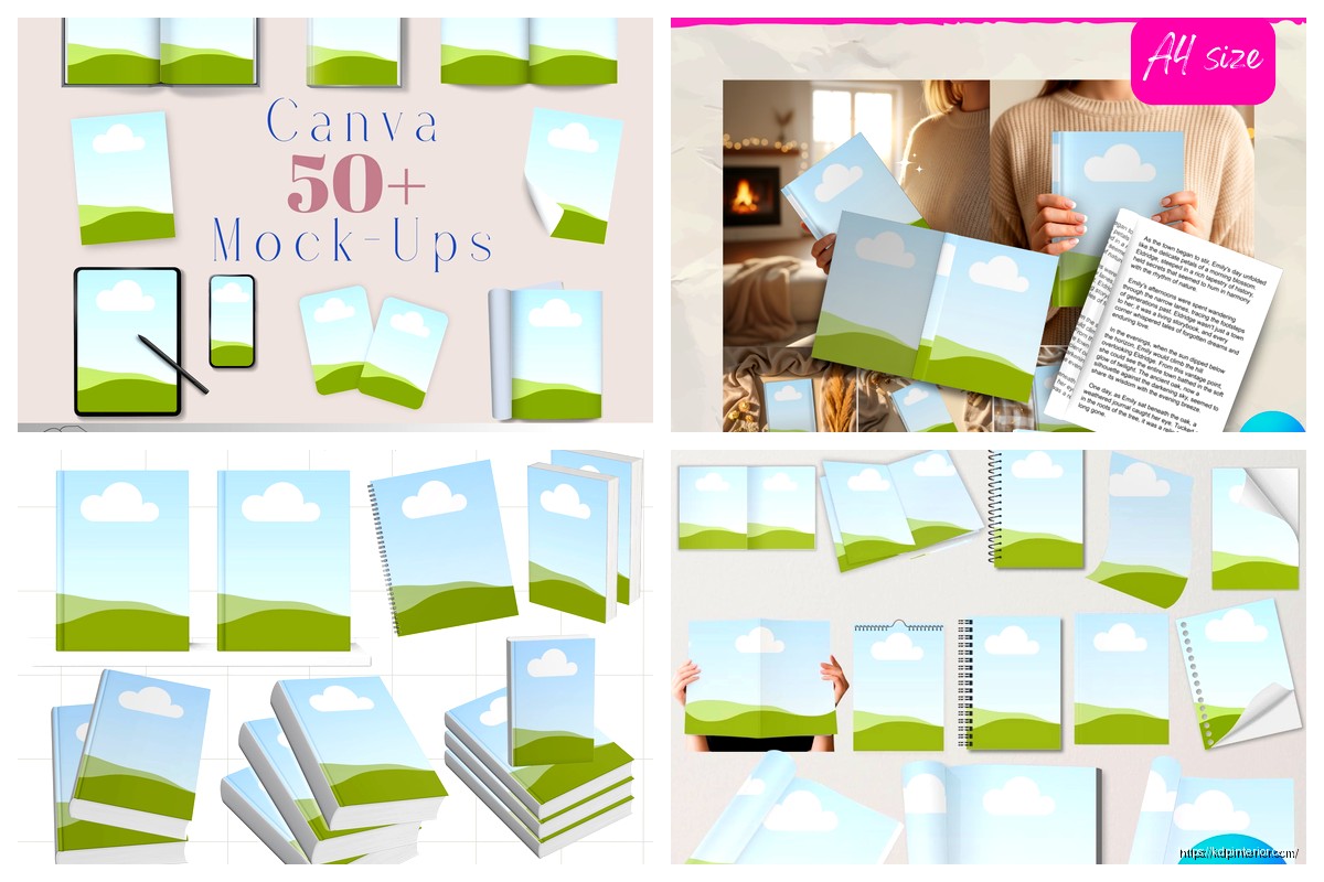
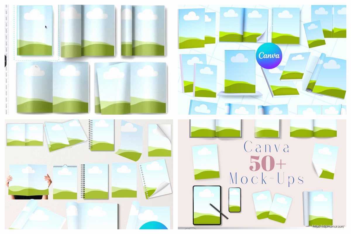
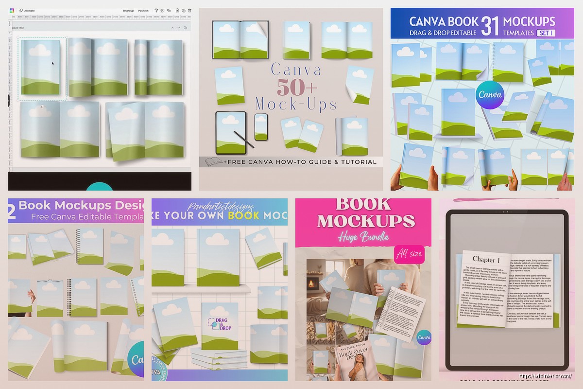
Canva Book Cover Mockup: 3D Visualization
18
May
May
Okay so I just spent like three hours yesterday playing around with Canva’s 3D mockup features and honestly it’s way better than it used to be. Like, I remember two years ago trying to make book covers look realistic and it was… not great. But they’ve updated everything.
So first thing – you gotta understand that Canva has two different ways to do 3D book mockups and people get confused about this all the time. There’s the Smart Mockup feature which is built into Canva now, and then there’s the manual way where you’re basically using their perspective tools and shadows. I use both depending on what I need.
The Smart Mockup Route (Easiest Way)
Go to your Canva homepage and in the search bar type “book mockup” – you’ll see a bunch of templates pop up. The ones that say “mockup” in the title usually have the smart feature built in. Click on one and you’ll see these purple frames or highlighted areas. That’s where you drop your actual book cover design.
Here’s what I do: I design my book cover in a separate Canva file first. Like a standard 6×9 book cover, I’ll make it at 1800×2700 pixels or whatever dimensions. Save that as a PNG. Then go back to your mockup template and click on that purple frame area. It’ll ask you to upload an image – drop your cover in there.
The magic happens automatically. Canva wraps your flat design around the 3D book shape and adds perspective. It’s not perfect but it’s honestly good enough for Amazon listings and social media posts.
Customizing the Smart Mockups
Once your cover is in there you can change the background. I usually go with something neutral – white, light gray, maybe a wood texture if I’m feeling fancy. The backgrounds matter more than you think because Amazon customers are scrolling fast and a cluttered background makes your book blend in.
You can also adjust the book angle in some templates. Not all of them let you do this but the newer ones have a little rotation slider. I keep mine at like a 25-30 degree angle because it shows enough of the spine to look 3D but doesn’t hide the front cover too much.
Oh and another thing – the lighting. Some mockups have adjustable shadows. If you see a shadow element in the layers panel (usually on the left side), click it and you can change the opacity. I usually keep shadows around 30-40% opacity. Too dark looks fake, too light looks like the book is floating.
Manual 3D Mockup Method
Okay so if you want more control or if the smart mockups aren’t doing what you need, you can build one from scratch. This is gonna sound complicated but once you do it twice it becomes muscle memory.
Start with a blank canvas – I use 2000×2000 pixels for square mockups because they work well on Instagram. Create a rectangle that’s roughly the proportions of your book cover. For a 6×9 book that’s a 2:3 ratio so maybe 600×900 pixels on your canvas.
Now here’s the trick – you need to add your cover design to this rectangle. Upload your cover and drag it onto the rectangle. Make sure it fills the whole shape. Then – and this is important – you’re gonna use the perspective tool.
Wait I forgot to mention, you need Canva Pro for the perspective feature. The free version doesn’t have it. I know that’s annoying but honestly if you’re serious about making book covers look professional it’s worth the $13 a month or whatever they charge now.
Using the Perspective Tool
Select your rectangle with the cover on it. In the top toolbar you should see an “Edit image” option or sometimes it’s under effects. Look for “Perspective” or “3D transform” depending on which version of Canva you’re using – they keep changing the interface which drives me crazy.
Click perspective and you’ll see these four corner handles appear. Grab the right side corners and drag them slightly inward and down. This creates that 3D angle like you’re looking at the book from the left side. The left edge should stay pretty much where it is and the right edge gets smaller as it recedes into the background.
Play with it until it looks natural. If you pull too much it looks warped. I usually aim for the right edge to be about 60-70% the height of the left edge.
Adding the Spine
This is where it gets fun. Create another rectangle for the spine. This should be much narrower – maybe 60-80 pixels wide depending on your canvas size. Make it the same height as your book cover.
Fill this spine rectangle with a solid color that matches your cover design. If your cover has a dominant blue, use that blue. If it’s mostly black, use black. The spine color should blend with the front cover.
Now add text to the spine. Your book title vertically oriented. In Canva you can rotate text boxes – I rotate mine to 90 degrees so it reads from bottom to top (that’s standard for most books). Use a small font size, maybe 30-40 point depending on your canvas.
Position this spine rectangle right up against the right edge of your front cover. Then – and this is the part that makes it look realistic – use the perspective tool on the spine too. But this time you’re skewing it in the opposite direction slightly. The spine should look like it’s wrapping around from the front to the side.
Shadows and Depth
Okay so now you’ve got a front cover and spine but it probably looks flat still. You need shadows. Create a new rectangle, make it black, and position it behind your book mockup. Then blur it – Canva has a blur effect under the edit image options. Crank that blur up to like 80-100.
Lower the opacity to maybe 25-35%. Move it slightly down and to the right of your book. This creates a drop shadow that makes the book look like it’s sitting on a surface.
For extra realism add a thin dark line where the spine meets the front cover. Just a 2-3 pixel line in dark gray or black at like 20% opacity. This little detail makes the mockup look way more professional. My cat just knocked over my coffee while I was testing this yesterday and I had to redo the whole thing but anyway.
Background Choices That Actually Work
I’ve tested probably fifty different backgrounds at this point. Here’s what I’ve learned: simple almost always wins. A plain white background with just the shadow works for 80% of uses. Clean, professional, doesn’t distract from the cover design.
For social media posts though you might want something with more personality. Wood textures work well for certain genres – like if you’re doing a rustic romance or a cabin mystery type book. Marble backgrounds look good for non-fiction and self-help books.
You can find textures in Canva’s elements section. Search “wood texture” or “marble texture” and you’ll get tons of options. Drop one in as your background layer (make sure it’s behind everything else in the layers panel).
One thing I do sometimes is add a subtle gradient overlay on the background. Like a white to light gray gradient. It adds depth without being distracting. You can find gradients in the elements section too under “gradients” obviously.
Props and Scene Elements
This is optional but if you wanna make your mockup more interesting you can add props. Coffee cups, glasses, plants, that kind of stuff. Canva has all these elements searchable.
I usually keep it minimal – maybe one or two props max. A coffee cup next to the book, or some reading glasses on top of it. More than that and it starts looking cluttered.
The trick with props is to add shadows to them too so they look like they’re in the same scene as the book. Same technique – duplicate the element, make it black, blur it, lower opacity, position it as a shadow.
Exporting Settings
When you’re done hit that Share button and download as PNG. Make sure you’re downloading at the highest quality – there should be a quality slider or checkbox for “high quality” or something. JPG works too and the file sizes are smaller but PNG preserves more detail especially if you have text on your cover.
For Amazon listings I export at 2000×2000 minimum. Amazon’s image requirements are pretty flexible but bigger is generally better because customers can zoom in. Just don’t go so big that the file size exceeds Amazon’s limits (I think it’s 10MB but double check).
For social media the dimensions matter more. Instagram likes squares (1080×1080) or vertical (1080×1350). Facebook is more flexible. Pinterest loves vertical – I do 1000×1500 for Pinterest mockups.
Common Mistakes I See All the Time
Okay so the biggest mistake is making the perspective too extreme. Like people get excited about the 3D effect and they skew their book cover so much it looks distorted. Keep it subtle. The reader should be able to clearly see your title and cover art.
Another thing – shadows that are too dark or too blurry. You want just enough shadow to create depth but not so much that it looks like your book is in a dark room. Natural lighting is what you’re going for.
And please don’t use busy backgrounds with your book mockups. I see people putting their book covers on backgrounds with like flowers and patterns and all kinds of stuff competing for attention. Your book cover should be the star. Background should be supporting, not competing.
Matching Your Genre
This is something that took me a while to figure out – your mockup style should match your book’s genre. A thriller should probably have a darker, moodier mockup with dramatic shadows. A romance might have softer lighting and maybe a warmer background color.
I was watching this documentary about book marketing last week and they talked about how readers make subconscious judgments based on visual presentation. It’s true. A cozy mystery with a stark black and white mockup feels off. A business book with a cutesy background doesn’t work.
Think about where your reader is mentally and what appeals to them. Non-fiction readers want clean, professional, trustworthy. Romance readers want emotional and warm. Thriller readers want intensity and drama.
Batch Creating Mockups
If you’re doing multiple books – and you should be if you’re serious about KDP – you can create a mockup template and reuse it. Design your mockup setup once with all the shadows and background and props positioned how you like them. Then just swap out the book cover image each time you need a new mockup.
I have like five different mockup templates saved in my Canva account. One for each main genre I publish in. Saves me probably an hour per book launch.
To do this just duplicate your mockup file before you change anything. Keep one as your master template. When you need a new mockup duplicate the master and swap in the new cover design.
Using Mockups in Your Marketing
Once you’ve got your mockup you can use it everywhere. Amazon A+ content if you have Brand Registry, your author website, social media posts, email newsletters, Pinterest pins. Having a good 3D mockup makes your book look more real and tangible which honestly does increase conversions.
I ran a test last month where I used a flat cover image versus a 3D mockup in Facebook ads. Same book, same ad copy, just different images. The mockup version had a 23% higher click-through rate. Not scientific or anything but it was enough to convince me that mockups matter.
The other place mockups work really well is in carousel posts on Instagram. Show your book from different angles – front view, angled view, maybe a flat lay style shot. It gives people multiple looks at your cover and keeps them engaged longer.
Anyway that’s basically my whole process. It sounds like a lot written out but once you do it a few times it becomes pretty quick. My average mockup creation time now is like 15-20 minutes including finding the right background and adjusting everything. Just gotta practice and develop your eye for what looks natural versus what looks fake.
DISCOVER OUR FREE BEST SELLING PRODUCTS
Editable Canva Lined Journal: Express Your Thoughts – KDP Template
Lined Pages Journal 120 pages Ready to Upload PDF Commercial Use KDP Template 6×9 8.5×11 5×8 for Notebooks, Diaries, Low Content
Lined Pages Journal 120 pages Ready to Upload PDF Commercial Use KDP Template 6×9 8.5×11 5×8 for Notebooks, Diaries, Low Content
Cute Dogs Coloring Book for Kids | Activity Book | KDP Ready-To-Upload
Daily Planner Diary : Diary Planners for Everyday Productivity, 120 pages, 6×9 Size | Amazon KDP Interior
Wolf Coloring KDP interior For Adults, Used as Low Content Book, PDF Template Ready To Upload COMMERCIAL Use 8.5×11"
Coloring Animals Head Book for Kids, Perfect for ages 2-4, 4-8 | 8.5×11 PDF
Printable Blank Comic Book Pages PDF : Create Your Own Comics – 3 Available Sizes
Notes KDP interior Ready To Upload, Sizes 8.5×11 6×9 5×8 inch PDF FILE Used as Amazon KDP Paperback Low Content Book, journal, Notebook, Planner, COMMERCIAL Use
Black Lined Journal: 120 Pages of Black Lined Paper Perfect for Journaling, KDP Notebook Template – 6×9
Student Planner Journal 120 pages Ready to Upload PDF Commercial Use KDP Template 6×9" 8.5×11" for Low Content book
Recipe Journal Template – Editable Recipe Book Template, 120 Pages – Amazon KDP Interior