Okay so I just spent the last three weeks testing like 40+ Canva book cover templates and here’s what actually matters when you’re trying to build a design collection that doesn’t look like garbage.
First thing – Canva Pro is basically non-negotiable here. I know, I know, everyone wants the free version to work but you’re gonna hit a wall so fast with the stock photo limitations and the template restrictions. I tried doing a whole romance collection on the free version last year and ended up having to redo everything because half my images had that stupid watermark issue when I tried to use them commercially. Just get the Pro subscription, it’s like $13 a month or whatever and you’ll make that back on your first book sale if the cover doesn’t suck.
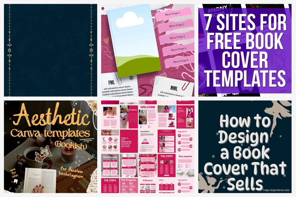
Starting With Template Categories That Actually Sell
The template library in Canva is… chaotic honestly. There’s thousands of book cover templates but probably 60% of them look like they were designed in 2012. What I do is filter by the newest uploads first because Canva’s design team has gotten way better in the past year or so.
For low-content books specifically you want to focus on these categories:
- Journals and notebooks (the biggest moneymaker)
- Planners and organizers
- Activity books (coloring, puzzle books, etc)
- Logbooks and trackers
- Composition notebooks
Fiction covers are a whole different beast and honestly I don’t mess with those as much because the genre expectations are SO specific. Like if you’re doing a thriller you need dark moody colors and sans-serif fonts and if you do it wrong readers will literally skip your book even if it’s good.
The Search Terms That Actually Work
Okay so funny story – I wasted probably 4 hours searching “book cover” in Canva before I realized that’s the worst search term possible. Way too broad. Here’s what actually pulls up usable templates:
Search for stuff like “notebook cover design,” “journal template,” “planner cover,” “workbook layout.” Oh and another thing, if you add “minimalist” or “modern” to any of those searches you filter out a ton of the ugly outdated stuff automatically.
For fiction you gotta search the actual genre names – “romance book cover,” “fantasy novel template,” “thriller cover design.” Canva’s algorithm is pretty literal so being specific helps a ton.
Finding Templates That Don’t Look Like Everyone Else’s
This is gonna sound weird but I actually avoid the templates that show up first in search results. Those are the most popular ones which means 500 other publishers are using the exact same layout. I usually scroll down to like page 3 or 4 of results before I even start saving anything.
Also look for templates that have “editable” or “customizable” in the title because some of these templates have locked elements that you can’t modify which is super annoying when you’re trying to match your brand colors.
Building Your Collection System
So you’re gonna want to organize this stuff or you’ll lose your mind. I learned this the hard way when I had like 87 untitled designs and couldn’t find the gratitude journal cover I’d spent 2 hours perfecting. My cat knocked over my coffee during that design session actually and I almost lost everything before saving it.
Create folders in Canva for different niches:
- One folder for each book type (journals, planners, coloring books, etc)
- Separate folders for different genres if you do fiction
- A “templates to customize” folder for designs you haven’t finished yet
- A “ready to publish” folder for completed covers
Name your files something you’ll actually remember. I use this format: “Niche-Style-Version” like “Gratitude-Floral-v2” or “Fitness-Bold-Blue.” Way easier to find stuff later when you’re uploading to KDP at midnight and can’t remember which file is which.
Customizing Templates Without Breaking Them
Here’s the thing about Canva templates – they’re designed to look good with the elements they came with. When you start swapping stuff out you can accidentally make them look terrible real fast.
Wait I forgot to mention – always duplicate the original template before you start editing. Click that three dots menu and hit “make a copy” so you have the original to go back to if you mess it up. I’ve definitely spent an hour customizing something only to realize I hated it and wished I could start over.
Text and Typography Tips
The fonts that come with templates are usually pretty solid but sometimes you need to change them to match your brand or niche better. Canva Pro has like 3000+ fonts which is overwhelming so here’s my cheat sheet:
For journals and planners stick with clean sans-serif fonts like Montserrat, Poppins, or Raleway. They’re readable and modern looking.
For anything feminine or wellness-related use script fonts but NOT the super curly ones that are impossible to read. Pacifico and Satisfy are good middle-ground options.
For masculine or business stuff go with bold sans-serifs like Bebas Neue or Oswald.
One mistake I see constantly is using too many different fonts on one cover. Stick to 2 fonts maximum – one for the title and one for the subtitle or author name. Three fonts starts looking messy unless you really know what you’re doing.
Photo and Graphics Swapping
The stock photos in Canva templates are hit or miss. Sometimes they’re perfect and sometimes they’re… that generic stock photo look that screams “I didn’t try very hard.”
You can replace photos by clicking on them and hitting the replace button, then searching Canva’s photo library. Pro tip: use really specific search terms. Don’t search “woman” search “woman writing journal morning light” and you’ll get way better results.
For low-content covers I actually prefer using graphics and patterns instead of photos most of the time. Patterns feel more evergreen and less dated. Canva has tons of pattern elements you can search for – florals, geometric, watercolor, etc.
Color Schemes That Don’t Look Amateur
Okay so this is important – don’t just randomly pick colors you like. Look at what’s selling in your niche on Amazon first. If all the top gratitude journals have pink and gold covers there’s probably a reason.
That said, you can use Canva’s color palette generator which is actually pretty decent. Click on any photo in your design and Canva will pull out the main colors from it. You can apply those colors to your text and graphics to make everything cohesive.
I usually stick to 3 main colors per cover – a dominant color (covers like 60% of the design), a secondary color (30%), and an accent color (10%) for highlighting important elements. This is like basic design theory stuff but it actually works.
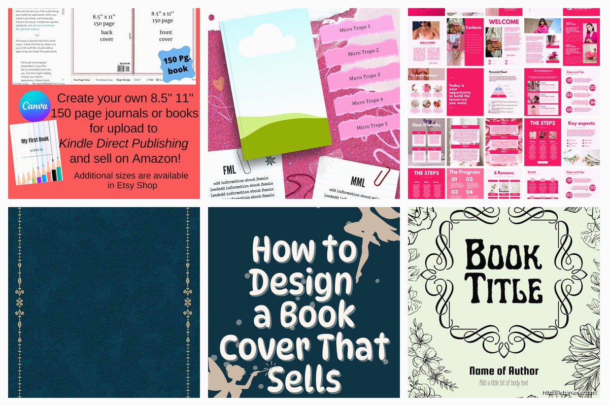
Sizing for KDP Specifications
This trips people up constantly. Canva’s default book cover templates are NOT always sized correctly for KDP. You gotta manually set the dimensions based on your book’s trim size and page count.
KDP requires covers in specific dimensions that include the front cover, spine, and back cover all in one file. The spine width changes based on how many pages your book has. There’s a cover calculator on KDP that tells you the exact dimensions you need.
In Canva, create a custom size document with those dimensions. Most common trim sizes for low-content books:
- 6×9 inches (most journals and notebooks)
- 8.5×11 inches (planners and activity books)
- 5×8 inches (smaller journals)
Make sure you’re working in inches not pixels or centimeters. And add 0.125 inch bleed on all sides – that’s a requirement for KDP printing.
Elements You Can Reuse Across Multiple Covers
Once you’ve built a few covers you’ll start noticing certain elements work really well. Save those as separate files or add them to your favorites in Canva.
I have a whole collection of:
- Corner decorations and borders
- Texture overlays
- Pattern fills
- Font pairings that work well together
You can build brand consistency across a series by reusing the same layout structure with different colors or photos. Like I have a journal template where I just swap the background color and one graphic element and boom – new cover in 10 minutes instead of starting from scratch each time.
Creating Series Looks
If you’re doing a series of books (like a set of 5 different journals) you want them to look related but not identical. Pick one element that stays the same across all covers – maybe the font, or a specific graphic treatment, or the layout structure.
Then change other elements like colors or images so each book is distinct but customers can tell they’re part of the same family. I’m watching this show on Netflix about design and they talked about this exact concept actually, it’s pretty universal.
Quality Control Before Publishing
Before you download and upload to KDP, zoom in to 100% and check every element. Look for:
- Pixelated images (means they’re too low resolution)
- Text that’s too small to read in thumbnail view
- Elements that are too close to the edges (they might get cut off in printing)
- Spelling errors because spellcheck doesn’t always catch everything
Download as PDF Print for the highest quality. PNG works too but PDF Print is what KDP prefers and you’ll get better results.
Also check how your cover looks in thumbnail size. Like really small, the size it’ll appear in Amazon search results. If you can’t read the title or tell what the cover is about when it’s tiny, it’s not gonna convert well.
Templates to Avoid Completely
Not all Canva templates are created equal honestly. Skip anything that:
- Has more than 4 different fonts
- Uses really trendy design elements that’ll look dated in 6 months
- Has locked elements you can’t edit
- Looks cluttered or busy (especially for low-content books)
- Uses those obvious stock photos where people are pointing at things or giving thumbs up
Also be careful with templates that have tons of layers and effects. They might look cool but they can be hard to edit without breaking the whole design. And they sometimes don’t export well which is super frustrating when you’re trying to upload to KDP.
Speed Workflow for Volume Publishing
If you’re publishing multiple books a month like I do you gotta optimize your workflow. Here’s my process:
Find 3-5 templates I like in one sitting. Duplicate them all into my working folder. Then I batch customize them – do all the text changes at once, then all the color swaps, then all the image replacements. It’s way faster than completing one cover start to finish then moving to the next.
I also keep a swipe file of colors and fonts that work well in different niches. Just a simple Google doc with hex codes and font names so I’m not reinventing the wheel every time.
Oh and another thing – save your brand kit in Canva if you’re building a publisher brand. You can save your logo, colors, and fonts so they’re always accessible without searching for them. Saves probably 5 minutes per cover which adds up fast.
The main thing is just not getting paralyzed by all the options. Pick a template, customize it enough that it doesn’t look exactly like the original, make sure it fits your niche, and move on. You can always make a v2 later if the first version doesn’t sell well. Done is better than perfect when you’re building a catalog.
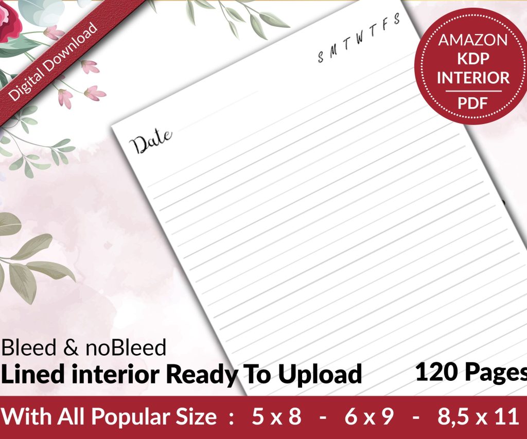 Lined Pages Journal 120 pages Ready to Upload PDF Commercial Use KDP Template 6x9 8.5x11 5x8 for Notebooks, Diaries, Low Content
2 × $0.00
Lined Pages Journal 120 pages Ready to Upload PDF Commercial Use KDP Template 6x9 8.5x11 5x8 for Notebooks, Diaries, Low Content
2 × $0.00  Recipe Journal Template - Editable Recipe Book Template, 120 Pages - Amazon KDP Interior
1 × $0.00
Recipe Journal Template - Editable Recipe Book Template, 120 Pages - Amazon KDP Interior
1 × $0.00 
DISCOVER OUR FREE BEST SELLING PRODUCTS
Editable Canva Lined Journal: Express Your Thoughts – KDP Template
Lined Pages Journal 120 pages Ready to Upload PDF Commercial Use KDP Template 6×9 8.5×11 5×8 for Notebooks, Diaries, Low Content
Lined Pages Journal 120 pages Ready to Upload PDF Commercial Use KDP Template 6×9 8.5×11 5×8 for Notebooks, Diaries, Low Content
Cute Dogs Coloring Book for Kids | Activity Book | KDP Ready-To-Upload
Daily Planner Diary : Diary Planners for Everyday Productivity, 120 pages, 6×9 Size | Amazon KDP Interior
Wolf Coloring KDP interior For Adults, Used as Low Content Book, PDF Template Ready To Upload COMMERCIAL Use 8.5×11"
Coloring Animals Head Book for Kids, Perfect for ages 2-4, 4-8 | 8.5×11 PDF
Printable Blank Comic Book Pages PDF : Create Your Own Comics – 3 Available Sizes
Notes KDP interior Ready To Upload, Sizes 8.5×11 6×9 5×8 inch PDF FILE Used as Amazon KDP Paperback Low Content Book, journal, Notebook, Planner, COMMERCIAL Use
Black Lined Journal: 120 Pages of Black Lined Paper Perfect for Journaling, KDP Notebook Template – 6×9
Student Planner Journal 120 pages Ready to Upload PDF Commercial Use KDP Template 6×9" 8.5×11" for Low Content book
Recipe Journal Template – Editable Recipe Book Template, 120 Pages – Amazon KDP Interior