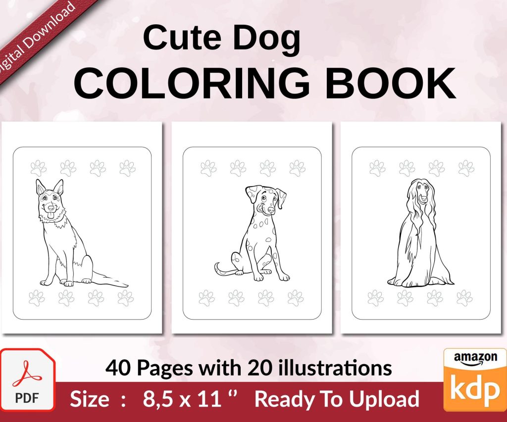
 Cute Dogs Coloring Book for Kids | Activity Book | KDP Ready-To-Upload
 Subtotal: $0.00
Amazon KDP guide, KDP book publishing
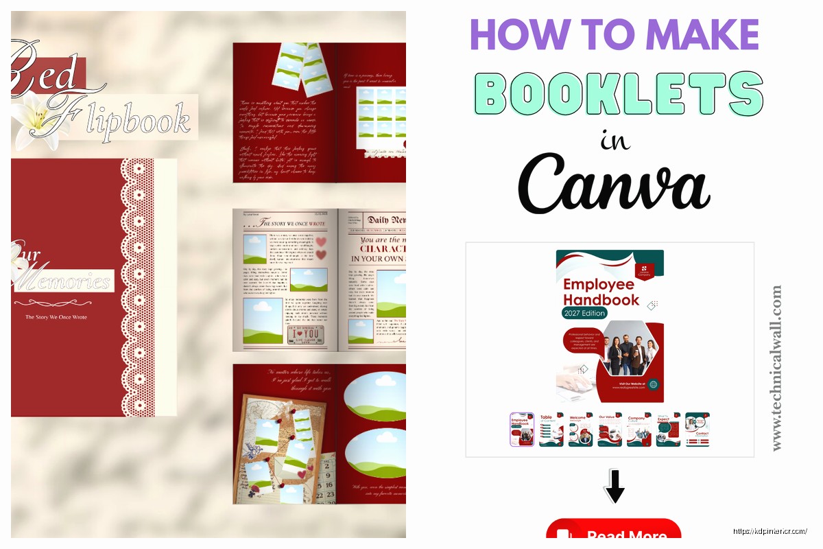
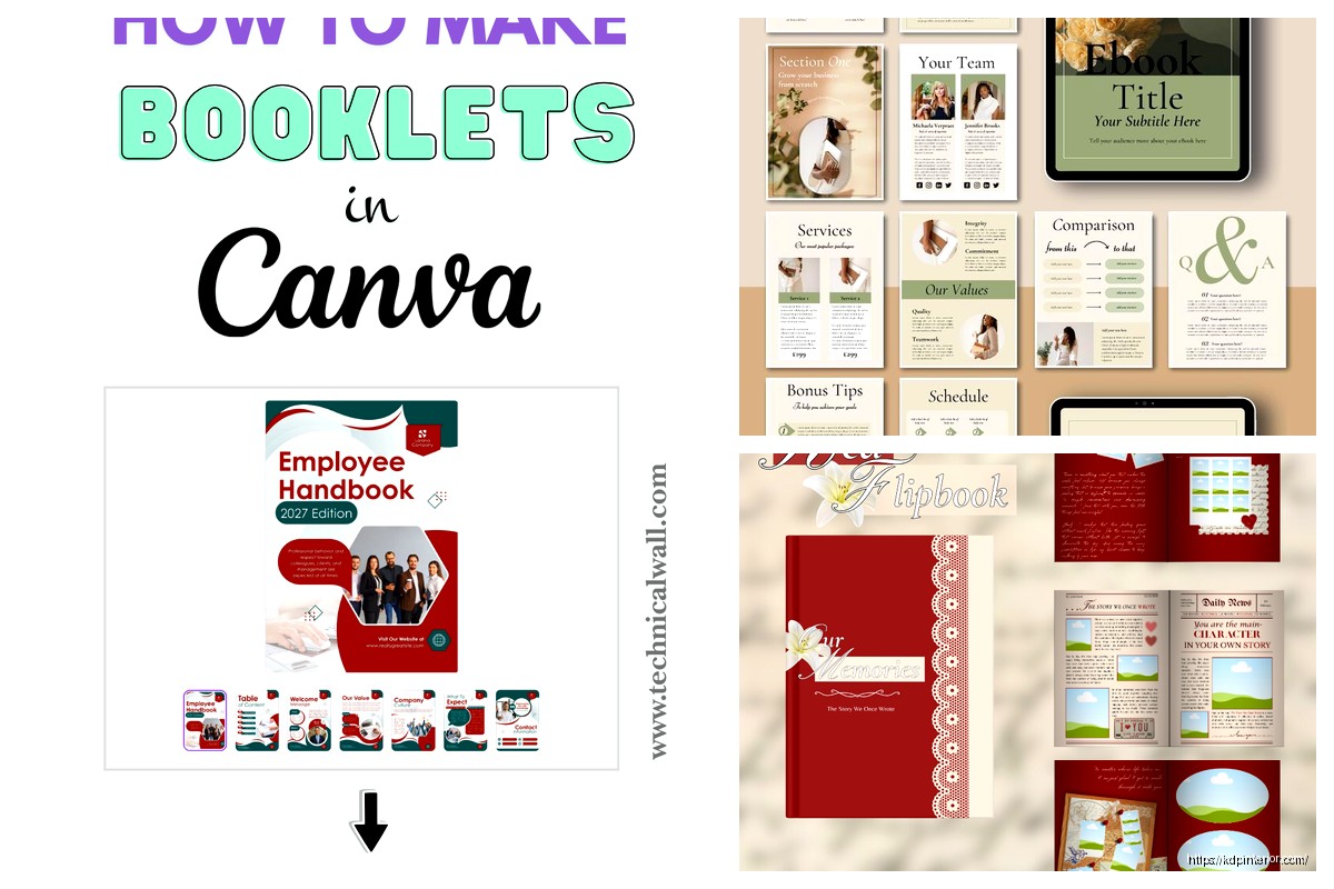
Canva Booklet Template: Small Format Design
18
May
May
Okay so I just spent like three hours yesterday messing with Canva’s booklet templates because I had a client who wanted to do a small format guide for their Etsy shop and honestly the whole small format thing is trickier than you’d think.
Setting Up Your Small Format Booklet in Canva
First thing – Canva calls them “booklets” but what they really mean is anything that’s gonna be folded or printed in a way that’s smaller than standard letter size. The templates they have are decent but here’s where it gets annoying. When you search for “booklet” in Canva you get like a million results and half of them aren’t actually booklet templates, they’re just brochures or pamphlets that someone tagged wrong.
What you actually want is to create a custom size. Go to Create a Design, then Custom Size. For small format booklets that work well on KDP or for print shops, I usually do 5.5 x 8.5 inches. That’s literally just a standard letter page folded in half and it’s super practical because print shops don’t charge extra for weird sizes.
But wait I forgot to mention – if you’re doing this for Amazon KDP specifically, you gotta think about their trim sizes. KDP loves 5 x 8, 5.25 x 8, 6 x 9. So actually I’d recommend starting with 5 x 8 instead because then you can upload directly without reformatting later.
The Bleed Issue Nobody Tells You About
This is gonna sound weird but the biggest mistake I see people make with small format designs is they forget about bleeds. Canva’s regular templates don’t include bleed by default which is insane because any print-on-demand service needs it.
You need to add 0.125 inches (that’s 3mm for the rest of the world) to each edge. So if you want a final size of 5 x 8, you actually create your Canva document at 5.25 x 8.25. Then you keep all your important text and images at least 0.25 inches INSIDE the trim line.
I learned this the hard way when I printed 200 copies of a recipe booklet and the edges were cut off on like 30 of them. My cat knocked over my coffee right in the middle of dealing with that disaster so that was a fun day.
Design Elements That Actually Work for Small Format
Small format is completely different from regular page design. What looks good on a full 8.5 x 11 page looks cramped and cluttered when you shrink it down.
Font sizes need to be bigger than you think. I usually go with:
- Headings: 18-24pt minimum
- Body text: 11-12pt (never below 10pt or people over 40 will hate you)
- Captions: 9-10pt but only if absolutely necessary
The temptation is to cram more content per page because the booklet is small but resist that. White space is your friend here. I do like 0.5-0.75 inch margins minimum and sometimes go even bigger.
Color Choices and Backgrounds
Oh and another thing – small format booklets often get printed in black and white to save costs. Even if you design in color, think about how it’ll look in grayscale. I always duplicate my design and convert it to grayscale in Canva (Effects > Grayscale) just to check.
For backgrounds, solid colors work better than gradients in small format. Gradients can look muddy when printed small. If you want texture, use subtle patterns from Canva’s elements library but keep them light – like 20-30% opacity max.
Using Canva’s Template Library Effectively
Okay so funny story, I once spent two days designing a workbook from scratch only to find there was a perfect template already in Canva that would’ve saved me like 20 hours. So here’s how to actually search for useful templates.
Don’t just search “booklet” – try these terms:
- Workbook
- Journal
- Planner
- Guide
- Magazine (yes really, the layout ideas are good)
Then filter by format. Look for anything that’s portrait orientation and roughly in the size range you need. You can always resize a template by going to Resize in the top menu (you need Canva Pro for this though, worth mentioning).
Customizing Templates Without Breaking Them
When you grab a template, don’t just start typing over stuff randomly. Here’s my process:
First, I unlock all the elements (click the element, then the unlock icon). Then I look at what fonts they used and decide if I’m keeping them or swapping everything to my brand fonts. Consistency matters way more in a booklet than in a single-page design because people are flipping through multiple pages.
Change colors all at once using the Brand Kit feature if you have Pro, or just manually pick 3-4 colors max and stick to them throughout. I usually do one main color, one accent color, one neutral, and black.
Page Layout Strategies for Small Booklets
This is where things get interesting because you gotta think about how pages work together. In a physical booklet, people see two pages at once when it’s open (called a spread). Your left and right pages should complement each other.
I like doing:
- Left page: more text-heavy content
- Right page: images, graphics, or shorter content
Or sometimes I do full-bleed images across both pages for impact. To do this in Canva, you create two separate pages but design them knowing they’ll be side-by-side.
Wait I forgot to mention page numbers. Super important. Add them in the footer, usually centered or on the outside edge (left side for left pages, right side for right pages). Start numbering after your title page and copyright page.
The Fold Line Problem
If your booklet is saddle-stitched (stapled in the middle), content near the center fold gets lost in the gutter. Keep text at least 0.5 inches away from the center on each page. I once put a QR code right in the fold and it was completely unusable, so yeah, learn from my mistakes.
Images and Graphics in Small Format
Images need to be higher resolution for small format because everything’s more compact. I use 300 DPI minimum. Canva’s free images are usually fine but sometimes they’re too low-res for print.
For small booklets, simpler graphics work better than complex illustrations. Icons and line art scale down better than detailed photos. If you’re using photos, crop them tight – you want clear focal points, not wide landscape shots that become tiny and meaningless.
I was watching The Bear while designing last week and it reminded me that good design is like good cooking – less is more, quality over quantity.
Canva Elements That Work Well
These are my go-to elements from Canva’s library for small booklets:
- Simple borders and frames (not the fancy ornate ones)
- Geometric shapes for section dividers
- Line icons (they scale perfectly)
- Minimal pattern backgrounds
- Charts and graphs (Canva’s chart tool is actually pretty good)
Avoid: Lots of different fonts on one page, busy backgrounds, tiny detailed illustrations, neon colors that don’t print well.
Exporting Your Booklet Correctly
This is crucial and where most people mess up. When you’re ready to export, go to Share > Download. Choose PDF Print for anything going to a printer. PNG works if you just need digital files but PDF is always better for printing.
Make sure these settings are ON:
- Flatten PDF (makes file smaller, prevents editing issues)
- Crop marks and bleed (if your printer needs them)
For KDP specifically, you want PDF but DON’T include crop marks or bleed in the file name because KDP’s system gets confused. I export two versions – one with bleed for reference, one without for upload.
Page Order for Printing
Here’s something that confused me for months when I started. If you’re printing a saddle-stitched booklet, the pages don’t go in order. Page 1 and page 20 print on the same sheet, page 2 and page 19 on another sheet, etc.
Most print shops handle this automatically but if you’re doing it yourself you need to figure out the imposition. There are online calculators for this but honestly it makes my brain hurt. I just let the print shop deal with it and send them a PDF with pages in reading order.
Testing Your Design Before Full Print Run
Always do a test print. Always. I print one copy at home on regular paper, fold it, and flip through it. You’ll notice things on paper that you never saw on screen – text that’s too close to edges, colors that look different, pages that feel too busy.
If possible get one printed at the actual print shop you’ll use for the full run. It costs like $5-10 but saves you from disasters. I once had a booklet where the blue looked perfect on screen but printed as purple and I had to redo everything.
Canva Pro Features Worth Using
Okay so I resisted getting Canva Pro for way too long because I’m cheap, but for booklets it’s actually worth it. The resize feature alone saves hours. Brand Kit keeps everything consistent across pages. And the background remover is clutch for product photos if you’re doing that kind of booklet.
The magic recommendations thing is kinda hit or miss but sometimes it suggests good layout variations. And having access to all the premium templates means you’re not starting from scratch every time.
Organizing Multi-Page Projects
When you’re working on a 20-30 page booklet, organization matters. I name each page in Canva (click the three dots on the page thumbnail, then rename). I do like “01-Cover” “02-Copyright” “03-Intro” etc so they stay in order.
Duplicate pages when you want to keep the same layout. Don’t recreate the same layout manually over and over because you’ll inevitably make tiny differences that look inconsistent.
Common Mistakes I See All The Time
People make their booklets too text-heavy. Break up content with bullet points, images, pull quotes, section breaks. Nobody wants to read dense paragraphs in a small format booklet.
Inconsistent margins are another big one. Every page should have the same margins unless you’re deliberately doing something different for impact.
Using too many fonts. Two fonts max – one for headings, one for body text. Maybe a third for special elements but that’s pushing it.
Oh and another thing – not thinking about the cover differently from interior pages. Your cover needs bigger text, bolder graphics, and should work as a standalone image because that’s what people see first when browsing.
Specific Booklet Types and Their Quirks
Recipe booklets need more white space for notes. I usually leave a blank section on each recipe page.
Workbooks need space for people to write. Design with that in mind – dotted lines, blank boxes, etc. Test by actually printing and trying to write in the spaces.
Travel guides need good hierarchy because people are scanning quickly. Use icons, bold headings, and consistent formatting for different types of information.
Planners are the hardest because the functionality matters more than aesthetics. Every page needs to be actually usable not just pretty.
I’ve done probably 50+ different small format booklets at this point and honestly the best teacher is just making stuff and seeing what works. Print it, use it, see what annoys you, fix it in the next version.
The Canva templates are a starting point but you’re gonna wanna customize everything to fit your specific content. Don’t be afraid to delete elements from templates or combine ideas from multiple templates into one design.
DISCOVER OUR FREE BEST SELLING PRODUCTS
Editable Canva Lined Journal: Express Your Thoughts – KDP Template
Lined Pages Journal 120 pages Ready to Upload PDF Commercial Use KDP Template 6×9 8.5×11 5×8 for Notebooks, Diaries, Low Content
Lined Pages Journal 120 pages Ready to Upload PDF Commercial Use KDP Template 6×9 8.5×11 5×8 for Notebooks, Diaries, Low Content
Cute Dogs Coloring Book for Kids | Activity Book | KDP Ready-To-Upload
Daily Planner Diary : Diary Planners for Everyday Productivity, 120 pages, 6×9 Size | Amazon KDP Interior
Wolf Coloring KDP interior For Adults, Used as Low Content Book, PDF Template Ready To Upload COMMERCIAL Use 8.5×11"
Coloring Animals Head Book for Kids, Perfect for ages 2-4, 4-8 | 8.5×11 PDF
Printable Blank Comic Book Pages PDF : Create Your Own Comics – 3 Available Sizes
Notes KDP interior Ready To Upload, Sizes 8.5×11 6×9 5×8 inch PDF FILE Used as Amazon KDP Paperback Low Content Book, journal, Notebook, Planner, COMMERCIAL Use
Black Lined Journal: 120 Pages of Black Lined Paper Perfect for Journaling, KDP Notebook Template – 6×9
Student Planner Journal 120 pages Ready to Upload PDF Commercial Use KDP Template 6×9" 8.5×11" for Low Content book
Recipe Journal Template – Editable Recipe Book Template, 120 Pages – Amazon KDP Interior