-
×
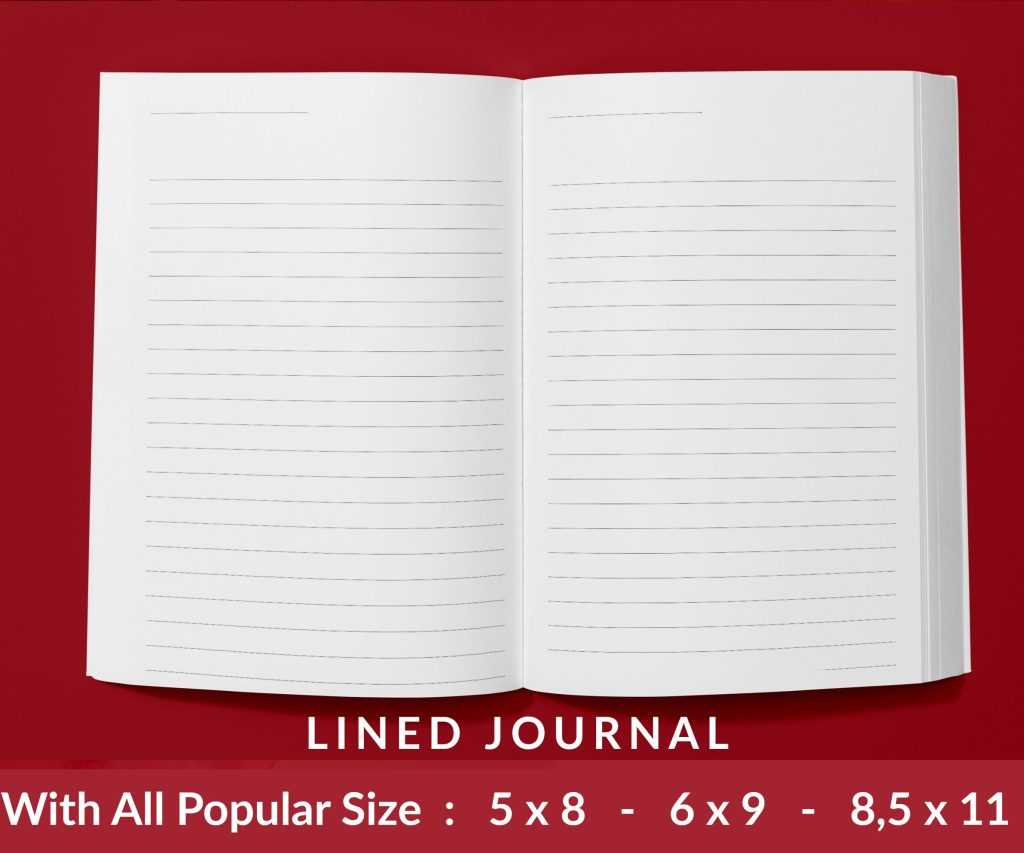 Lined Pages Journal 120 pages Ready to Upload PDF Commercial Use KDP Template 6x9 8.5x11 5x8 for Notebooks, Diaries, Low Content
1 × $0.00
Lined Pages Journal 120 pages Ready to Upload PDF Commercial Use KDP Template 6x9 8.5x11 5x8 for Notebooks, Diaries, Low Content
1 × $0.00
Subtotal: $0.00
Okay so I literally just finished setting up three different cookbook templates in Canva last week for a client and here’s what actually works versus what’s just gonna waste your time.
First thing – don’t just pick whatever cookbook template Canva shows you first. Most of them are sized weird for KDP. You want to go custom dimensions right from the start. I always use 8.5 x 11 inches because that’s the sweet spot for printing costs and people actually like that size for cookbooks. Set your units to inches not pixels, trust me on this.
The bleed thing is gonna trip you up if you’ve never done print books before. KDP needs 0.125 inches on all sides, so your actual design area is smaller than 8.5 x 11. In Canva Pro you can set bleed marks but honestly I just make my page size 8.75 x 11.25 and keep all my important stuff (text, images) at least 0.25 inches from the edges. Yeah it’s extra space but better safe than having your recipe titles cut off.
Here’s where people mess up – they design one gorgeous recipe page and then realize they gotta make 50 more. So you need to set up your master pages first as actual Canva templates you can duplicate.
I create like 4-5 different page layouts:
Each one gets saved as a separate page in the same Canva file. Then when I need a new chicken recipe page, I just duplicate page 3 or whatever and swap out the content.
Oh and another thing – use Canva’s grid system. Hit the ruler icon and make sure “show rulers and guides” is on. I set up guides at 0.5 inches from each edge as my safety zone. Everything important stays inside those guides.
This is gonna sound weird but don’t use fancy script fonts for your recipe instructions. I know they look pretty in the template examples but when someone’s cooking and their hands are covered in flour, they need to read that text from 3 feet away.
My go-to combinations:
The ingredient list needs to be bigger than you think. People are glancing at it while measuring stuff out. I learned this the hard way when my mom tested one of my first cookbooks and called me to complain she couldn’t read anything without her reading glasses.
Font sizes I actually use – recipe title is 28-32pt, section headers are 18-20pt, body text never goes below 11pt. Yeah it means less fits on a page but readability matters more than cramming everything in.
Okay so funny story, I spent like two hours picking this elaborate 6-color palette for a dessert cookbook and my designer friend looked at it and said it looked like a kid’s birthday party. Cookbooks need to feel appetizing and clean, not overwhelming.
Stick to 3-4 colors max:
Earth tones work great – terracotta, sage green, warm beige, dusty blue. I’ve had good luck with Canva’s “Earthy” and “Modern Minimalist” palette suggestions. Just… don’t use neon anything unless it’s specifically a kids cookbook.
This part trips up everyone including me sometimes. Canva’s stock photos are hit or miss for food. Some look amazing, others look like they’re from 2008.
When you’re searching Canva’s photos, filter by “Free” if you’re on the free plan, but honestly Canva Pro is worth it just for the better food photography. I’m talking like way better. The free options are pretty limited and you’ll end up with the same stock photos everyone else uses.
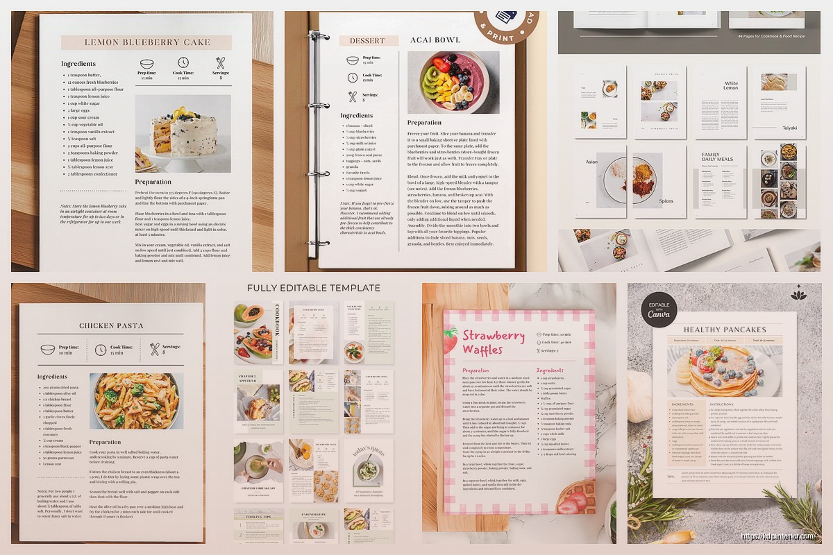
For recipe photos, I always do:
Wait I forgot to mention – if you’re using your own photos, they need to be at least 300 DPI for print. Canva will let you upload potato-quality images but they’ll look terrible printed. Check your image quality by downloading a test page as PDF and zooming in to 200%. If it looks blurry on screen, it’ll be worse printed.
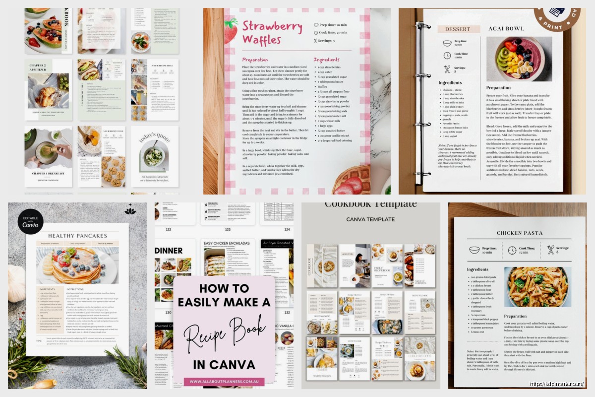
Every recipe page needs these elements and they gotta be consistent across your whole book:
Recipe Title: Top of page, big, bold, can’t miss it
Yield/Servings: I put this right under the title. “Serves 4” or “Makes 24 cookies”
Prep and Cook Time: Super important. People decide what to make based on time. I use little clock icons from Canva elements
Ingredient List: Left side usually, bulleted or checkboxed. Leave some space between items so it doesn’t feel cramped
Instructions: Numbered steps, each step is its own paragraph. I bold any technique words like “fold” or “whisk”
Notes Section: Optional but nice for substitutions or tips. I use a different background color to set it apart
The biggest mistake I see is people making the ingredient list too small or putting it in a weird spot. It should be the second thing you see after the title because that’s what people check first to see if they have everything.
Canva’s got like a million graphics and most of them are terrible for cookbooks. Here’s what actually works:
Line dividers – the simple ones, not the decorative swirly ones. I use thin lines to separate sections
Icons – small simple icons for prep time, cook time, difficulty level. Keep them minimal
Shapes – rectangles with rounded corners make great text boxes for notes or tips. I usually set them to 10% opacity in my accent color
Frames – useful for keeping photos consistent sizes, but don’t use the decorative frames unless it really fits your theme
My cat just knocked over my water bottle while I was working on this yesterday and almost destroyed my keyboard, but anyway – avoid clipart style graphics. They make everything look cheap. If you’re using illustrations, they need to be modern line drawings or watercolor style, not cartoons.
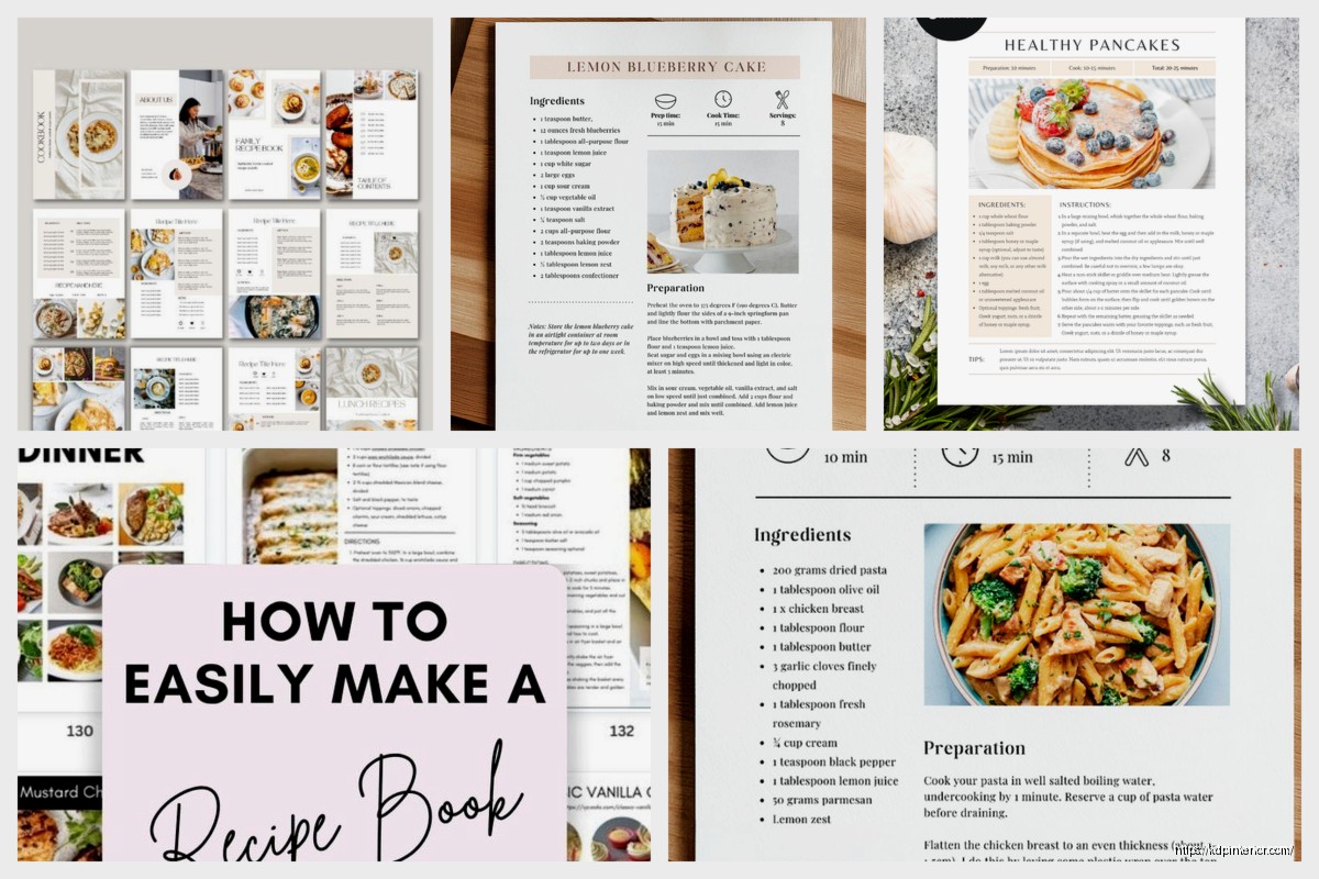
You need more than just recipe pages. A real cookbook has structure:
Title page – book name, your name or brand, simple and clean
Copyright page – yeah you need this even for self-published stuff
Table of contents – I usually do 2 pages, organized by meal type or main ingredient
Introduction or welcome page – optional but adds professionalism. Keep it to one page max
Measurement conversion chart – people love this, stick it near the front or back
Section dividers – “Breakfast,” “Appetizers,” “Desserts,” etc. Full page with just the section name and maybe a relevant image
For section dividers, I go minimal. Large text (like 48-72pt), centered, maybe a subtle background image at 20% opacity. That’s it. Don’t overcomplicate these pages.
Okay so here’s how I actually work through a full cookbook template in Canva without losing my mind:
Set up your master template file with all your page layouts first. This might take 2-3 hours but it saves you days later.
Create your front matter pages – title, copyright, table of contents template (you’ll fill it in last).
Design 3-4 section divider pages.
Now here’s the key – create ONE complete recipe page with all elements positioned perfectly. This is your main template.
Duplicate that page like 50 times (or however many recipes you have).
Go through and update each one with new content. Copy-paste is your friend here.
I usually work on this while watching TV because it’s kinda repetitive. Got through an entire season of that cooking competition show while formatting a 60-recipe cookbook last month.
This is technical but important – in Canva, make all your text boxes slightly bigger than the text inside them. Leave padding. If your ingredient list exactly fills the text box, it’ll look cramped and unprofessional.
For ingredient lists, I create a text box that’s about 3 inches wide and however tall it needs to be. Line spacing set to 1.5 usually. Each ingredient on its own line with a bullet point or checkbox.
Instructions text box is usually wider, maybe 5-6 inches, positioned below or beside the photo. Line spacing 1.5 or 1.75 so it’s easy to read while cooking.
When you’re finally done designing, the export settings matter way more than you’d think. Canva’s default PDF settings are not ideal for KDP.
Download as PDF Print, not PDF Standard. Print quality is way higher.
Make sure “flatten PDF” is checked if you’re using transparency or overlays.
Download each page separately if you’re doing color and black-and-white pages (saves on printing costs for mostly B&W books).
I usually download the whole file as one PDF first, then open it in Adobe or Preview to check every single page. Look for:
Upload that PDF to KDP’s previewer tool before you do anything else. It’ll show you exactly how your book will look printed. I’ve caught so many issues at this stage that would’ve been embarrassing if they’d gone to print.
Using too many different fonts – stick to 2-3 font families max
Not leaving enough white space – cramped pages are hard to read
Inconsistent styling between pages – every recipe should follow the same format
Forgetting page numbers – put them in the footer, small and unobtrusive
Not testing your color scheme in grayscale – if you’re doing a B&W interior, preview it in grayscale to make sure everything’s readable
Making text boxes auto-resize – lock those sizes so your layout stays consistent
The white space thing is huge. New designers try to fill every inch of the page. Don’t do that. Margins and breathing room make your cookbook look professional and expensive, not empty.
Real talk – using Canva’s pre-made cookbook templates can be fine if you customize them enough. The problem is everyone uses the same ones, so your book ends up looking like fifty other cookbooks on Amazon.
I usually grab a template I like, then change the colors, fonts, and layout significantly. Or I’ll use it just to get the dimensions and spacing right, then rebuild everything with my own design choices.
Starting from scratch takes longer but your book looks unique. For your first cookbook though, maybe start with a template and modify it. You gotta learn what works before you can design from zero.
Alright that’s basically everything I’ve learned from doing this way too many times. The key is really just consistency and readability over fancy design. People use cookbooks in their kitchens with messy hands, they need big text and clear layouts, not artistic masterpieces they can’t actually cook from.
DISCOVER OUR FREE BEST SELLING PRODUCTS
Editable Canva Lined Journal: Express Your Thoughts – KDP Template
Lined Pages Journal 120 pages Ready to Upload PDF Commercial Use KDP Template 6×9 8.5×11 5×8 for Notebooks, Diaries, Low Content
Lined Pages Journal 120 pages Ready to Upload PDF Commercial Use KDP Template 6×9 8.5×11 5×8 for Notebooks, Diaries, Low Content
Cute Dogs Coloring Book for Kids | Activity Book | KDP Ready-To-Upload
Daily Planner Diary : Diary Planners for Everyday Productivity, 120 pages, 6×9 Size | Amazon KDP Interior
Wolf Coloring KDP interior For Adults, Used as Low Content Book, PDF Template Ready To Upload COMMERCIAL Use 8.5×11"
Coloring Animals Head Book for Kids, Perfect for ages 2-4, 4-8 | 8.5×11 PDF
Printable Blank Comic Book Pages PDF : Create Your Own Comics – 3 Available Sizes
Notes KDP interior Ready To Upload, Sizes 8.5×11 6×9 5×8 inch PDF FILE Used as Amazon KDP Paperback Low Content Book, journal, Notebook, Planner, COMMERCIAL Use
Black Lined Journal: 120 Pages of Black Lined Paper Perfect for Journaling, KDP Notebook Template – 6×9
Student Planner Journal 120 pages Ready to Upload PDF Commercial Use KDP Template 6×9" 8.5×11" for Low Content book
Recipe Journal Template – Editable Recipe Book Template, 120 Pages – Amazon KDP Interior