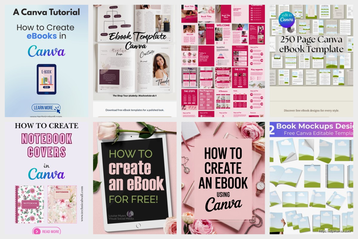
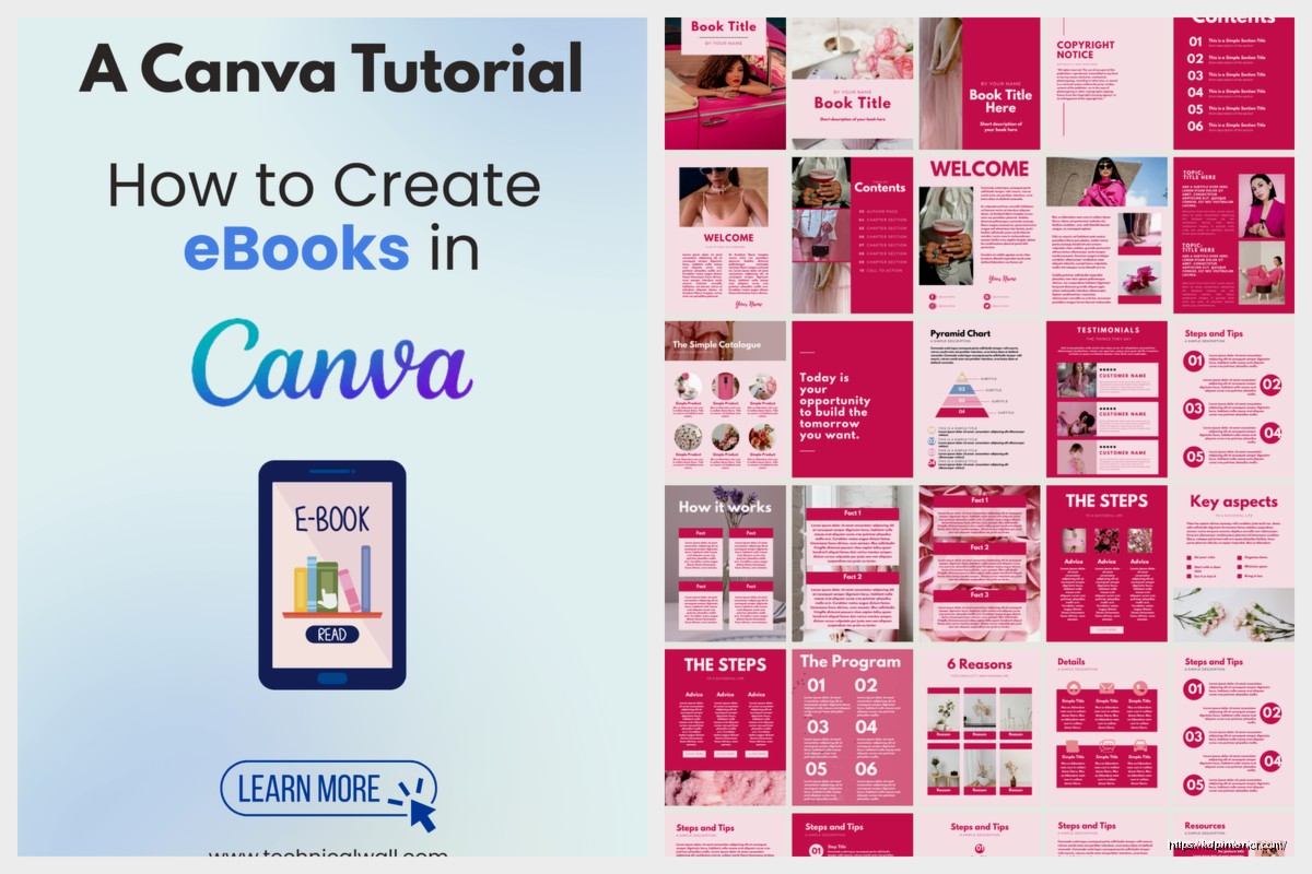
Okay so I’ve been messing around with Canva’s ebook cover templates for like three years now and honestly they’re kinda perfect for when you just need to pump out covers without hiring a designer every single time. Let me walk you through what actually works.
The Template Library Situation
Right so Canva has this massive library of ebook cover templates and the first thing you gotta know is that not all of them are actually good for Amazon. Like some are designed for square formats or weird dimensions that KDP will just reject. What you want is to search specifically for “book cover” not just “ebook” because the results are way different and you’ll get stuff that’s actually 6×9 proportions.
The free templates are honestly fine for starting out but here’s the thing – everyone uses them. I uploaded a romance cover last year using a free template and within two weeks I saw like four other books with basically the same layout. So if you’re serious about this you probably want Canva Pro which is like $13/month or whatever they’re charging now. Totally worth it just for the background remover tool alone.
Setting Up Your Dimensions Correctly
This is where people mess up constantly. KDP wants specific dimensions and if you just grab any template you’re gonna have issues. For a standard 6×9 paperback you need 6.25 x 9.25 inches for the cover (that’s with bleed). But most people are doing ebooks first so you can get away with 1600 x 2560 pixels which is like the standard ebook ratio.
In Canva you wanna go to Custom Size and punch in those pixel dimensions. Don’t use their preset “ebook cover” size because I’ve found it’s slightly off sometimes? Like it’ll look fine in Canva but then when you upload to KDP it gets weird margins.
The Bleed Thing Nobody Explains
Wait I forgot to mention – if you’re doing print books you need bleed. That’s the extra space around the edges so when they cut the book nothing important gets chopped off. KDP wants 0.125 inches on all sides. So your actual cover with bleed would be 6.375 x 9.375 for a 6×9 book. Just add that extra space in Canva and make sure your text and important graphics stay inside the safe zone.
I usually draw a rectangle guide about 0.25 inches from each edge and keep everything inside that. Saved me so many headaches.
Which Templates Actually Convert
Okay so this is gonna sound weird but the templates that look the most “professional” don’t always sell the best. I tested this with like 30 different covers in the self-help niche and the ones that were slightly rough around the edges but had bold text actually got more clicks.
The templates I use most:
- Bold text overlays on photo backgrounds – these work great for non-fiction
- Minimalist geometric designs – good for business books
- Illustrated scene templates – perfect if you’re doing fiction and can customize the characters
- Texture-heavy backgrounds with simple text – surprisingly good for journals and planners
The ones I avoid are anything too trendy because in six months they’ll look dated. Like last year everyone was using that wavy gradient thing and now it screams 2023.
Customizing Without Making It Look Like a Template
Here’s where you actually make the template your own. If you just change the text and colors everyone’s gonna recognize it as a Canva template and that looks cheap honestly.
What I do is layer stuff. Take the base template but then add:
- Extra graphic elements from Canva’s library
- Different fonts – swap out at least the main title font
- Textures or overlays to change the vibe
- Different photos if it’s a photo-based template
Oh and another thing – use the transparency tool. If you set elements to like 60-70% opacity and layer them it creates depth that the original template doesn’t have. Makes it look way more custom.
Font Combinations That Don’t Suck
Fonts are where people really mess up. The default font pairing in templates is usually safe but boring. I keep a list of combinations that work:
For non-fiction: Montserrat Bold for titles with Open Sans for subtitles. Classic but readable as a thumbnail which is what actually matters on Amazon.
For fiction: Depends on genre but Playfair Display with Lato is good for literary stuff. Bebas Neue with Roboto works for thrillers.
Never use more than two fonts. I see people using three or four and it just looks like chaos.
The Photo Problem
Most templates use stock photos from Canva’s library and here’s the issue – those same photos are on thousands of other covers. If you have Pro you get access to better stock photos but they’re still not exclusive.
What I started doing is mixing Canva photos with images from other sources. Pexels and Unsplash are free and you can upload them straight to Canva. Just make sure you check the license because some require attribution.
For people-based covers this matters even more. That same woman-laughing-at-laptop photo is on like every productivity book. Switch it up.
Background Removal Is Your Friend
The background remover in Canva Pro is honestly the best feature. You can take any photo, remove the background, and then layer it over different backgrounds from the template. This alone makes your cover look 10x more custom.
I did this with a cookbook cover last month – took a photo of food from Unsplash, removed the background, put it over a textured template background instead of the original photo. Looked completely different from the template.
Color Psychology or Whatever
Colors matter more than you think for Amazon specifically because people are scrolling through search results fast. You want contrast.
The templates usually have decent color schemes but sometimes you need to punch them up. I use the color wheel in Canva to find complementary colors. Like if your template is mostly blue, adding orange accents makes it pop in thumbnails.
For different genres there’s kind of unwritten rules:
- Red and black – thrillers, true crime
- Pastels – romance, cozy mystery
- Blue and white – business, self-help
- Dark moody colors – horror, dark fantasy
- Bright saturated colors – children’s books, activity books
Don’t fight genre expectations too much. Readers are looking for visual cues about what type of book it is.
Text Hierarchy That Actually Works
The biggest mistake I see is treating all text the same size. Your title needs to be massive – like way bigger than you think. It should be readable in a thumbnail that’s maybe 100 pixels tall.
I test this by shrinking my Canva design down to like 10% and seeing if I can still read the title. If not it’s too small.
Subtitle should be about half the size of the title. Author name even smaller unless you’re already known. Some templates get this right but a lot don’t.
The Subtitle Trap
Oh wait – not every book needs a subtitle on the cover. If your title is clear enough skip it. I used to cram subtitles on everything and it just made covers look cluttered. Now I only add them if the title is vague or if it’s non-fiction where the subtitle explains what the book delivers.
Saving and Exporting Without Losing Quality
Okay so this part is important – always download as PNG not JPG for ebooks. KDP accepts both but PNG keeps better quality especially with text. For print books you might need PDF but that’s a whole other thing.
Make sure you’re downloading at the highest quality setting. In Canva there’s options when you hit download and you want the full quality not compressed.
I keep all my cover files organized in folders by niche because I’ll often reuse elements. Like if I made a good text effect or found a background that worked I’ll go back and grab it for other projects.
Multiple Versions
Here’s something I started doing – create like 3-4 versions of each cover using different templates or variations. Then test them. You can literally just ask people on Facebook groups or Reddit which one they’d click on. The results might surprise you.
I had this journal cover I thought was perfect – minimalist, clean, sophisticated. Tested it against a busier more colorful version and the busy one won by like 70%. Sometimes your taste doesn’t match what actually sells.
The 3D Mockup Thing
Canva has these 3D book mockup templates and honestly they’re kinda gimmicky but they work great for social media marketing. You can take your flat cover design and drop it into a mockup that shows it as a physical book.
I use these for my Facebook ads and product images on my website. They convert better than flat covers for some reason – makes it feel more real even though it’s an ebook.
Just search “book mockup” in Canva and you’ll find a bunch. Drop your cover design in and export it. Takes like 30 seconds.
Common Mistakes I Still See
Even after telling people this stuff they still mess up:
- Using too many design elements – less is more
- Text that’s too small for thumbnails
- Not checking what the cover looks like in grayscale (some people have e-readers without color)
- Ignoring genre conventions and wondering why the book doesn’t sell
- Using the exact template with just text changed
That last one is the biggest. You gotta customize it or you’re just gonna blend in with everyone else using the same template.
Series Branding With Templates
If you’re doing a series you want consistent branding across all covers. Pick one template style and stick with it but change the colors or main image for each book.
I did this with a set of productivity planners – same layout template, same fonts, but different color schemes for each season. People immediately recognized them as part of the same series which helped with sales of the later books.
Canva makes this easy because you can duplicate your design and just swap out elements. Way faster than starting from scratch each time.
My cat just knocked over my coffee but whatever – the point is consistency matters for series more than individual books.
When Templates Aren’t Enough
Look sometimes templates just won’t cut it. If you’re in a super competitive niche like romance or thriller you might need custom design work. But for like 80% of books especially non-fiction and low-content stuff, Canva templates are totally fine.
I still use them for testing new niches. If I’m not sure if a book idea will sell I’m not dropping $200 on a custom cover. I’ll throw together a Canva template cover, test the market, and if it works then maybe upgrade the cover later.
Organization and Workflow
Last thing – keep your templates organized in Canva folders. I have folders for different genres and niches. When I need a new cover I just go into the relevant folder and see what I’ve used before or what templates I’ve saved.
Also save your brand colors as a palette in Canva if you’re building any kind of author brand. Makes it way faster to keep things consistent.
The workflow I use is: find template, customize heavily, test thumbnail size, get feedback, adjust, export, upload to KDP. Usually takes me about an hour per cover now but when I started it was more like 3-4 hours because I was overthinking everything.
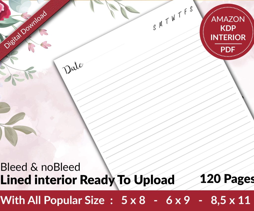 Lined Pages Journal 120 pages Ready to Upload PDF Commercial Use KDP Template 6x9 8.5x11 5x8 for Notebooks, Diaries, Low Content
1 × $0.00
Lined Pages Journal 120 pages Ready to Upload PDF Commercial Use KDP Template 6x9 8.5x11 5x8 for Notebooks, Diaries, Low Content
1 × $0.00 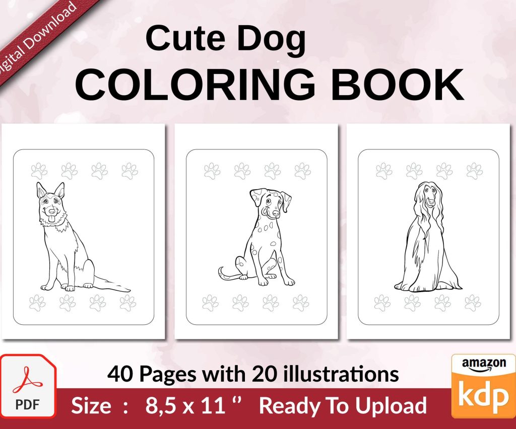 Cute Dogs Coloring Book for Kids | Activity Book | KDP Ready-To-Upload
1 × $0.00
Cute Dogs Coloring Book for Kids | Activity Book | KDP Ready-To-Upload
1 × $0.00 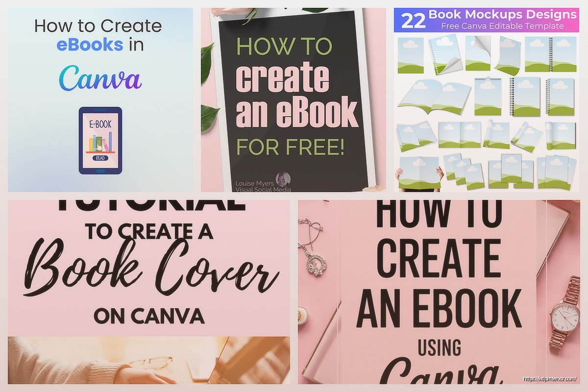
DISCOVER OUR FREE BEST SELLING PRODUCTS
Editable Canva Lined Journal: Express Your Thoughts – KDP Template
Lined Pages Journal 120 pages Ready to Upload PDF Commercial Use KDP Template 6×9 8.5×11 5×8 for Notebooks, Diaries, Low Content
Lined Pages Journal 120 pages Ready to Upload PDF Commercial Use KDP Template 6×9 8.5×11 5×8 for Notebooks, Diaries, Low Content
Cute Dogs Coloring Book for Kids | Activity Book | KDP Ready-To-Upload
Daily Planner Diary : Diary Planners for Everyday Productivity, 120 pages, 6×9 Size | Amazon KDP Interior
Wolf Coloring KDP interior For Adults, Used as Low Content Book, PDF Template Ready To Upload COMMERCIAL Use 8.5×11"
Coloring Animals Head Book for Kids, Perfect for ages 2-4, 4-8 | 8.5×11 PDF
Printable Blank Comic Book Pages PDF : Create Your Own Comics – 3 Available Sizes
Notes KDP interior Ready To Upload, Sizes 8.5×11 6×9 5×8 inch PDF FILE Used as Amazon KDP Paperback Low Content Book, journal, Notebook, Planner, COMMERCIAL Use
Black Lined Journal: 120 Pages of Black Lined Paper Perfect for Journaling, KDP Notebook Template – 6×9
Student Planner Journal 120 pages Ready to Upload PDF Commercial Use KDP Template 6×9" 8.5×11" for Low Content book
Recipe Journal Template – Editable Recipe Book Template, 120 Pages – Amazon KDP Interior