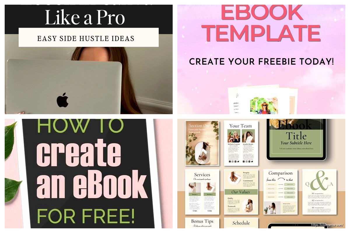
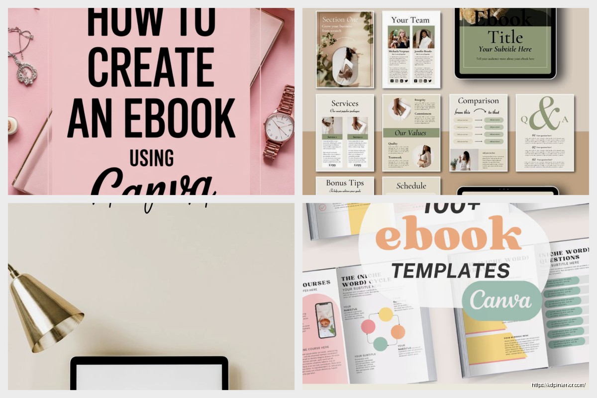
Okay so I literally just finished creating three ebook templates in Canva last night and I’m gonna walk you through exactly what worked because honestly the first one I made was a complete disaster and looked like a PowerPoint from 2003.
Setting Up Your Canva Account for Ebook Design
First thing – you need Canva Pro for this. I know, I know, everyone says you can do it with the free version but you’re gonna be so limited with fonts and templates that you’ll end up frustrated. The Pro version is like $13/month and if you’re serious about making ebooks to sell it pays for itself immediately. I’ve had Pro for maybe 5 years now and the background remover alone has saved me hundreds of hours.
When you log in, don’t click on “Document” like I did the first time. You want to go to custom dimensions. For ebooks I always use 8.5 x 11 inches at 300 DPI. Some people do 8 x 10 or even 6 x 9 but honestly for digital products that people mostly read on tablets or computers, the 8.5 x 11 just works better. Set your unit to inches not pixels because it’s easier to think about actual page sizes.
Choosing the Right Template Structure
So here’s where it gets interesting – Canva has a bunch of ebook templates already but most of them are… not great for actual ebooks you’re gonna sell. They’re designed for like brand guidebooks or corporate reports. What you wanna do is start from scratch but use elements from their template library.
I usually create a master template with these pages:
- Cover page (obviously)
- Copyright/disclaimer page
- Table of contents
- Section divider pages
- Standard content pages with different layouts
- About the author page
The trick is creating this once really well so you can duplicate it for every ebook project. Last month I made a recipe ebook and a productivity planner using the same base template just with different colors and it cut my design time in half.
Cover Design That Actually Converts
Your cover needs to look good as a tiny thumbnail because that’s how people see it on Amazon or wherever. I test this by designing the cover then shrinking it down to like 200 pixels wide on my screen. If I can’t read the title clearly or the image looks muddy, I start over.
Use Canva’s photo library – search for relevant images but avoid the ones that look too stock-photo-ish. You know what I mean, the ones with people in business suits shaking hands or whatever. I look for textures, patterns, or lifestyle shots that feel more authentic.
For fonts on covers I break this rule everyone talks about – I sometimes use three fonts. One for the main title (big and bold), one for the subtitle (complementary but readable), and maybe a script font for a small accent. Just make sure they’re not fighting each other. My dog literally just knocked over my coffee while I’m writing this so if this seems scattered that’s why.
Color Schemes That Work
Canva has this color palette generator that nobody uses and it’s honestly amazing. Upload a photo you like and it’ll pull the exact colors from it. I did this with a sunset photo once and got this gorgeous coral and navy combo that I’ve used on like 15 different ebook covers.
Stay away from pure black backgrounds unless you’re doing something really specific. They look harsh on screens. Use dark grays or navy instead. And white text on those dark backgrounds needs to be slightly off-white (like #F5F5F5) because pure white is too stark and actually harder to read.
Interior Page Layout Basics
This is where people mess up the most. Your interior pages need margins – actual breathing room. I use 0.75 inches on all sides as my minimum. Some designers go down to 0.5 but then your text feels cramped especially on smaller screens.
Create a text box that respects these margins and lock it as your master text box. Every content page should have the same text box dimensions so your ebook feels consistent. You can duplicate this box across pages and just change the content.
Typography for Digital Reading
Okay so funny story – I used to use really decorative fonts for body text thinking it made my ebooks look premium. Then someone left a review saying they couldn’t read past page 10 because their eyes hurt. Ouch. Now I stick with these for body text:
- Montserrat
- Open Sans
- Lora (for something with serifs)
- Quicksand (for casual/friendly content)
- Raleway
Body text should be 11-12 points minimum. I usually go with 12pt because people read these on different devices and some phones or tablets make things smaller. Line spacing at 1.5 is your friend – gives the text room to breathe.
Headings can be fun. I go 24-28pt for main headings and 16-18pt for subheadings. And here’s a weird tip – make your headings a color that matches your cover. It creates this subtle brand consistency throughout the whole ebook.
Using Canva Elements Effectively
The Elements tab in Canva is both a blessing and a curse because there’s SO much stuff. For ebooks I mostly use:
- Simple line dividers between sections
- Geometric shapes for callout boxes
- Icons to break up text-heavy pages
- Frames for images if I’m including photos
Don’t go crazy with elements. I learned this the hard way when I made a social media planner that had like 10 different graphic elements per page and it looked like a scrapbook threw up on it. Less is more. Pick maybe 3-4 element styles and use only those throughout the entire ebook.
Creating Consistent Section Dividers
Section divider pages are underrated. They give readers a mental break and make your ebook feel more professional. I create one divider design and then duplicate it for each section, just changing the text.
Mine usually have:
- A large section number or chapter name
- A simple graphic element (maybe a photo with a color overlay)
- Short description of what’s in that section
These take like 5 minutes to make once you have a template down but they add so much perceived value.
Adding Interactive Elements
If you have Canva Pro you can add clickable links which is huge for digital ebooks. Your table of contents can actually link to the pages – though heads up this only works if you export as PDF and keep the links active.
I also add:
- Links to my website in the footer
- Email signup links on the last page
- Links to related products or resources
Just don’t make everything a link. I’ve seen ebooks with links every other sentence and it’s distracting. Be strategic about it.
The Master Page System
Here’s something that changed everything for me – create master pages for different content types. I have:
Master Page 1: Text-only page with standard margins
Master Page 2: Text + image on right side
Master Page 3: Text + image on left side
Master Page 4: Full-page image with text overlay
Master Page 5: Two-column layout for lists or comparisons
When I start a new ebook I duplicate these masters and just plug in new content. Saves me probably 3-4 hours per project because I’m not rebuilding layouts from scratch.
Canva’s Grid and Alignment Tools
Turn on the ruler and guides – seriously. Click on View at the top and enable both. These help you align everything perfectly which is the difference between looking professional and looking amateur.
Hold Shift when resizing elements to keep proportions locked. I forget this constantly and end up with stretched weird-looking graphics.
Use the alignment tools (the icons at the top when you have something selected) to center things perfectly. Don’t try to eyeball it. Your eyes will lie to you and things will be off by like 3 pixels which somehow our brains notice even if we can’t explain why.
Color Overlays and Transparency Tricks
Want to use a busy photo but still have readable text? Add a shape over the photo, change it to your brand color, then reduce opacity to like 40-60%. Boom – instant professional look.
I do this on cover pages all the time. Find a cool photo, add a dark overlay, put white text on top. Works every single time and looks way more expensive than it is.
Exporting Your Ebook Properly
When you’re done click Download and here’s what matters – choose PDF Print for the highest quality. PDF Standard works too but Print gives you that crisp 300 DPI quality.
Flatten PDF if you want the file smaller and don’t need any editable elements. Don’t flatten if you’re keeping those clickable links I mentioned earlier.
For page ranges you can export the whole thing or individual pages. Sometimes I export just the cover separately at a higher resolution for marketing materials.
Wait I forgot to mention – before you export do a full scroll-through of every page. I cannot tell you how many times I’ve found typos or misaligned elements right before export. Actually check page numbers if you added them, make sure images aren’t pixelated, verify all your links work.
Template Organization Tips
Save your master template as a separate Canva project with “TEMPLATE” in the name so you don’t accidentally edit it. I learned this after destroying my master template while working on a client project at like 2am watching some random Netflix show.
Create folders in Canva for different template types – one for ebook templates, one for covers, one for marketing graphics. The search function in Canva is okay but folders are better when you’ve got dozens of projects going.
Common Mistakes to Avoid
Don’t use too many fonts – I mentioned this already but seriously it’s the #1 amateur mistake. Two fonts max, three if you really know what you’re doing.
Don’t ignore mobile preview. A lot of people read ebooks on phones now. Your design needs to work on small screens even if it’s not optimized for them.
Don’t forget about bleed if you’re doing anything that might get printed. Though for digital-only ebooks this doesn’t matter.
Don’t make your file size massive. If your PDF is over 50MB you probably have too many high-res images. Compress them or reduce the resolution slightly.
The Page Number Question
People always ask if they should add page numbers. For digital ebooks I usually don’t because devices have their own page tracking. But if your ebook has a table of contents with page references then yeah you gotta add them.
Canva doesn’t auto-number pages which is annoying so you have to add text boxes manually. Put them in the footer, small font, centered or in the outer corner. Takes forever but makes it look polished.
Branding Consistency Across Multiple Ebooks
If you’re making a series of ebooks use the same fonts, colors, and general layout structure. People should be able to see two of your covers side by side and know they’re from the same creator.
I have a brand kit saved in Canva with my main colors, fonts, and logo. Every new ebook pulls from this kit so there’s automatic consistency.
Testing Before You Publish
Export your ebook and open it on different devices. Check it on your computer, phone, tablet, whatever you have access to. Colors look different on different screens and sometimes layouts break in weird ways.
Send it to a friend or two and ask if anything looks off. Fresh eyes catch stuff you’ve stared at for too long to notice.
Print a few pages if possible – not the whole thing obviously but like the cover and a couple interior pages. Sometimes things that look good on screen look weird printed and vice versa.
The whole process from blank canvas to finished ebook template takes me maybe 4-6 hours now but when I started it was more like 15-20 hours because I didn’t know these shortcuts. You’re gonna be slower at first and that’s totally normal just keep making templates and you’ll get faster.
 Printable Blank Comic Book Pages PDF : Create Your Own Comics - 3 Available Sizes
2 × $0.00
Printable Blank Comic Book Pages PDF : Create Your Own Comics - 3 Available Sizes
2 × $0.00  Wolf Coloring KDP interior For Adults, Used as Low Content Book, PDF Template Ready To Upload COMMERCIAL Use 8.5x11"
1 × $0.00
Wolf Coloring KDP interior For Adults, Used as Low Content Book, PDF Template Ready To Upload COMMERCIAL Use 8.5x11"
1 × $0.00 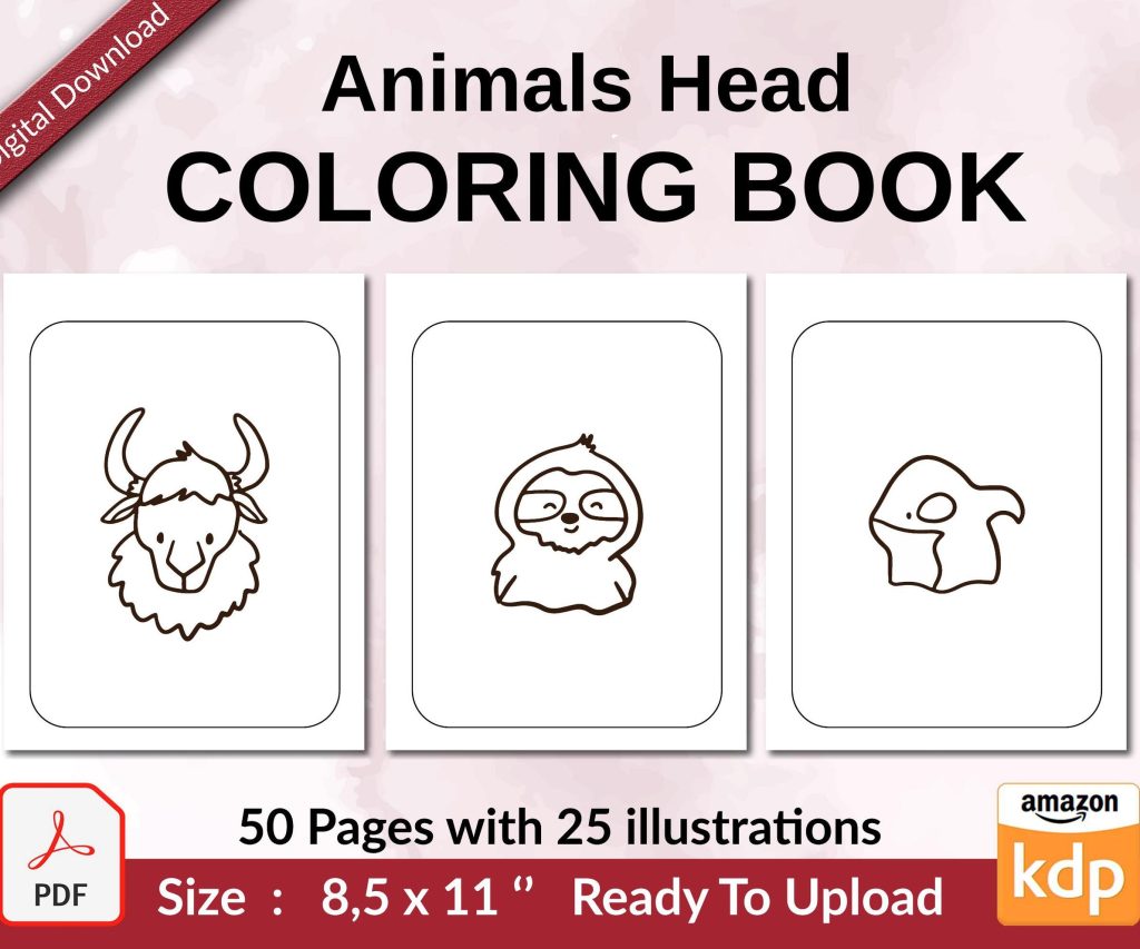 Coloring Animals Head Book for Kids, Perfect for ages 2-4, 4-8 | 8.5x11 PDF
1 × $0.00
Coloring Animals Head Book for Kids, Perfect for ages 2-4, 4-8 | 8.5x11 PDF
1 × $0.00 
DISCOVER OUR FREE BEST SELLING PRODUCTS
Editable Canva Lined Journal: Express Your Thoughts – KDP Template
Lined Pages Journal 120 pages Ready to Upload PDF Commercial Use KDP Template 6×9 8.5×11 5×8 for Notebooks, Diaries, Low Content
Lined Pages Journal 120 pages Ready to Upload PDF Commercial Use KDP Template 6×9 8.5×11 5×8 for Notebooks, Diaries, Low Content
Cute Dogs Coloring Book for Kids | Activity Book | KDP Ready-To-Upload
Daily Planner Diary : Diary Planners for Everyday Productivity, 120 pages, 6×9 Size | Amazon KDP Interior
Wolf Coloring KDP interior For Adults, Used as Low Content Book, PDF Template Ready To Upload COMMERCIAL Use 8.5×11"
Coloring Animals Head Book for Kids, Perfect for ages 2-4, 4-8 | 8.5×11 PDF
Printable Blank Comic Book Pages PDF : Create Your Own Comics – 3 Available Sizes
Notes KDP interior Ready To Upload, Sizes 8.5×11 6×9 5×8 inch PDF FILE Used as Amazon KDP Paperback Low Content Book, journal, Notebook, Planner, COMMERCIAL Use
Black Lined Journal: 120 Pages of Black Lined Paper Perfect for Journaling, KDP Notebook Template – 6×9
Student Planner Journal 120 pages Ready to Upload PDF Commercial Use KDP Template 6×9" 8.5×11" for Low Content book
Recipe Journal Template – Editable Recipe Book Template, 120 Pages – Amazon KDP Interior