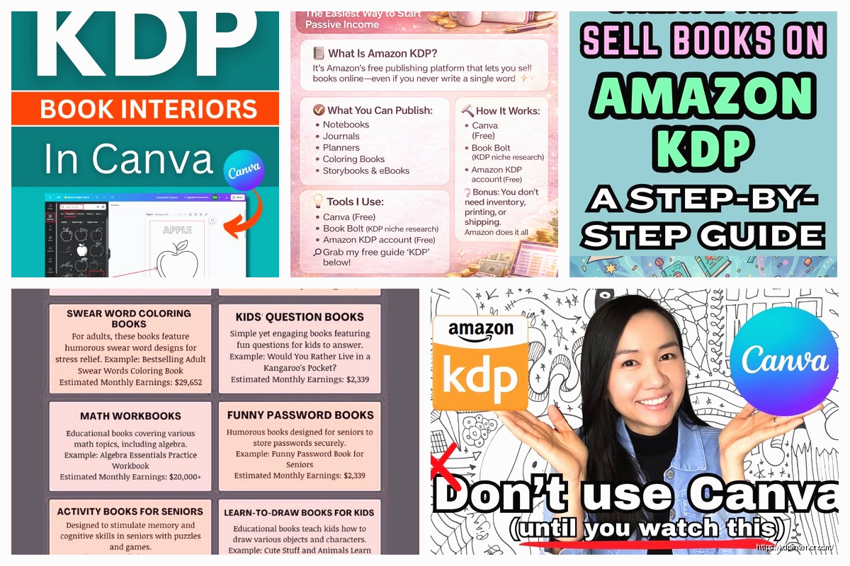
Okay so Canva is basically gonna be your best friend for KDP covers and interiors, I’ve been using it since like 2018 and honestly can’t imagine going back to the Photoshop days even though some people swear by it.
First thing you need to know is get Canva Pro. I know, I know, everyone wants the free version but trust me on this one. The Pro subscription is like $13/month and you get access to thousands of templates, the background remover tool which is clutch for covers, and the ability to resize designs which saves SO much time. I wasted probably six months trying to make the free version work and it’s just… you’re gonna hit walls constantly.
Setting Up Your KDP Dimensions
So the tricky part that nobody tells you upfront is that KDP has super specific dimensions and you gotta get them right or your book looks like garbage when it prints. For covers, you can’t just slap together whatever size you want.
The cover dimensions depend on your page count and paper type. Amazon has this cover calculator on their website – you punch in your trim size (like 6×9 which is the most common for non-fiction and low-content books), your page count, and paper type (white or cream). It spits out the exact dimensions you need.
Here’s what I do: I keep a Google doc with all my standard sizes already calculated. For a 120-page book at 6×9 trim with white paper, your full cover is usually around 12.275 inches wide by 9.25 inches tall. The spine width changes based on page count which is why you need that calculator every single time.
In Canva, go to “Custom Size” and punch in those exact dimensions. Make sure you’re working in inches, not pixels or cm or whatever. I’ve screwed this up more times than I want to admit and had to redo entire covers because I was working in the wrong units like an idiot.
Bleed and Safe Zones Are Not Optional
Oh and another thing – KDP requires 0.125 inch bleed on all sides. This means your background colors and images need to extend past where the actual trim happens. Otherwise you get these ugly white edges on your printed book.
Canva doesn’t have built-in bleed markers which is annoying, so what I do is create guides manually. You can add lines or use the alignment tools to mark where your safe zone is. The safe zone is 0.125 inches IN from each edge – this is where you need to keep all your important text and design elements.
For the spine, you need even more space. Keep text at least 0.0625 inches away from where the spine folds. I learned this the hard way when my first book had the title partially cut off on the spine and I wanted to die.
Building Covers That Don’t Look Like Crap
So for actual cover design, here’s my process. Start with a solid background – either a color, gradient, or photo from Canva’s library. The photo library in Pro is honestly incredible, I rarely need to buy stock photos anymore.
Your title needs to be HUGE and readable in thumbnail size. Like, zoom out to where your cover looks tiny on your screen. Can you still read the title? No? Make it bigger. I see so many new publishers with these elaborate designs and tiny text that looks great full-size but completely disappears on Amazon’s search results.
Use high-contrast colors. Black text on white, white text on dark backgrounds, that kind of thing. I was watching this documentary about book covers last month while designing and they talked about how yellow and black is one of the most attention-grabbing combos, which is why you see it on so many bestsellers.
The back cover needs your book description, author bio, and barcode space. Here’s where people mess up – you need to leave a 2×1.2 inch white rectangle in the lower right corner of the back cover for Amazon’s barcode. Don’t put anything important there or it gets covered up.
Front Cover Elements
Keep it simple, seriously. I know you want to add all these elements and make it look fancy but bestselling covers are usually pretty minimalist. Title, subtitle if you have one, author name, maybe one strong image or graphic element.
For low-content books like journals or planners, you can get away with more decorative stuff. I do a lot of floral patterns and geometric designs for those. Canva has these great element packs you can use – just search for “pattern” or “botanical” or whatever theme you’re going for.
Layer your elements properly. Background first, then any photos or large graphics, then text on top. Use Canva’s transparency feature to make photos blend better with backgrounds – usually around 70-80% opacity looks good.
Interior Pages Are Where It Gets Interesting
Okay so interiors are actually easier than covers in some ways but there’s still specific stuff you need to know. Your interior dimensions are just your trim size – so for a 6×9 book, your Canva canvas is 6×9 inches. Simple.
But you still need margins. KDP requires at least 0.25 inches on the outside edges and 0.375 inches on the inside (gutter) margin. For books over 150 pages, that gutter margin goes up to 0.5 inches.
What I do is create one master template with guides showing these margins, then duplicate it for every page type I need. Way faster than setting up margins every single time.
Low-Content Interiors
For journals, notebooks, planners – these are stupid easy in Canva and honestly where I make most of my money. Create your page design once, duplicate it 100+ times, export as PDF. Done.
Lined pages: use the line element, set it to like 0.5pt thickness, space them evenly. Canva has this duplicate feature where you can copy an element and it maintains spacing, so you make one line, duplicate it, then select both and keep duplicating. Takes like two minutes to fill a page.
Dot grid pages: use small circles, make them like 2-3pt size, arrange in a grid pattern. There are also dot grid elements in Canva’s library you can just drop in.
For planners, I use tables a lot. Canva’s table feature is kinda basic but it works. Or you can just use rectangles and lines to create your own layouts. I made a habit tracker last year that sells pretty consistently and it’s literally just boxes arranged in rows with days of the week at the top.
Exporting for KDP
This is where people screw up constantly so pay attention. When you export your cover, you need to download it as PDF Print. Not PNG, not standard PDF – PDF Print specifically. This maintains the quality and color profiles that print-on-demand needs.
Make sure you select “Flatten PDF” in the settings. This prevents any transparency issues that can cause KDP to reject your file. Been there, had files rejected at 11pm when I was trying to launch the next morning, not fun.
For interiors, same thing – PDF Print, flattened. If you have a ton of pages, Canva might take a minute to process it. My cat knocked over my coffee once while I was waiting for a 200-page interior to export and I just about lost it.
Color vs Black and White
Here’s something that trips people up – if your interior is black and white only, make sure EVERYTHING is actually black and white, not just grayscale. KDP can be picky about this. I convert everything to pure black (#000000) for text and lines.
For coloring books or anything that needs to be black line art, use Canva’s line drawing tools or import SVG files. The quality stays crisp when printed which is essential.
Wait I forgot to mention – check your file size before uploading. KDP has limits on file sizes, especially for color interiors. If your file is too big, reduce the image quality slightly in Canva’s export settings or compress images before adding them.
Templates Are Your Secret Weapon
Once you’ve created one successful cover or interior, save it as a template in Canva. You can reuse the layout and just swap out text, colors, images for new books. I have probably 50+ templates saved at this point.
For series, this is crucial. Keep the same design structure so your books look cohesive on your author page. Just change the colors or main image for each book in the series.
You can also buy Canva templates from other designers if you wanna skip the design work entirely. Etsy has tons of KDP-specific templates. I’ve bought a few when I was in a rush and needed something quick – just make sure they’re actually sized correctly for KDP before you purchase.
Fonts Matter More Than You Think
Canva Pro gives you access to way more fonts which is another reason to upgrade. For covers, you want bold, readable fonts. Script fonts look pretty but they’re usually hard to read in thumbnail size.
My go-to fonts for covers: Bebas Neue for bold titles, Montserrat for subtitles, Libre Baskerville for more traditional book vibes. For interiors, stick with simple readable fonts – Open Sans, Roboto, Lato.
You can also upload your own fonts to Canva if you have specific ones you like. I bought a font bundle last year and uploaded them all, now I have these unique fonts that nobody else is using on their covers.
Common Mistakes I Still See
Using low-resolution images – everything needs to be at least 300 DPI for print. Canva’s library photos are high-res but if you upload your own stuff, make sure it’s quality.
Forgetting about the spine – your spine text needs to read from bottom to top when the book is lying face-up. This is standard for books but people mess it up constantly.
Not testing print quality – order a proof copy before you start selling. I’ve had colors look totally different in print than on screen. That bright blue you loved might print as purple, or your black might look muddy if you used a gray instead of pure black.
Making covers too busy – less is more, I swear. Pick one strong visual element and build around it.
Text too close to edges – I mentioned margins but seriously, give your text room to breathe. Nothing looks cheaper than text cramped right up against the trim line.
Quick Tips That Save Time
Use Canva’s Brand Kit feature to save your colors, fonts, and logos. Makes everything consistent across projects.
Keyboard shortcuts are your friend – Ctrl+D to duplicate, Ctrl+G to group elements, Ctrl+Z when you inevitably mess something up.
The magic resize feature in Pro lets you take one design and instantly resize it for different dimensions. Super helpful if you’re doing the same book in multiple trim sizes.
Save your work constantly. Canva auto-saves but I still manually save every few minutes because I’m paranoid about losing work.
Oh and if you’re doing anything with transparency or layering effects, flatten your design before exporting. Sometimes those effects don’t translate properly to PDF and you’ll get weird artifacts in your print file.
For interiors with lots of repeated pages, use Canva’s duplicate page feature instead of copying and pasting. It’s faster and maintains your layout better.
The color picker tool is amazing for matching colors exactly – click on any color in your design and it’ll give you the hex code so you can use that exact color elsewhere.
I probably use Canva for like 4-5 hours a day when I’m in production mode. It’s just become second nature at this point but yeah, there’s definitely a learning curve at first. Just start with something simple, get it published, then level up your skills from there.
 2022 Planner Template: Stay Organized with our 37 Canva Editable Templates
1 × $7.99
2022 Planner Template: Stay Organized with our 37 Canva Editable Templates
1 × $7.99  Addiction Recovery Journal PDF: Mindfulness Planner for Recovery and Self-Love - 8.5x11
1 × $4.99
Addiction Recovery Journal PDF: Mindfulness Planner for Recovery and Self-Love - 8.5x11
1 × $4.99 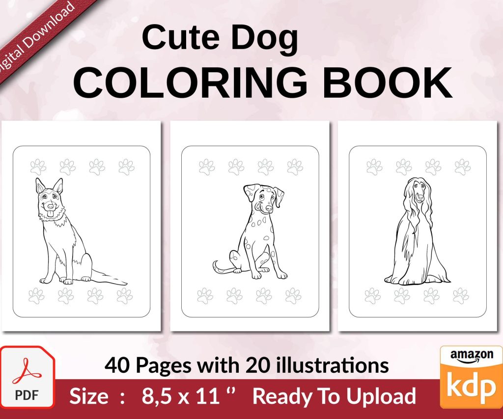 Cute Dogs Coloring Book for Kids | Activity Book | KDP Ready-To-Upload
1 × $0.00
Cute Dogs Coloring Book for Kids | Activity Book | KDP Ready-To-Upload
1 × $0.00 
DISCOVER OUR FREE BEST SELLING PRODUCTS
Editable Canva Lined Journal: Express Your Thoughts – KDP Template
Lined Pages Journal 120 pages Ready to Upload PDF Commercial Use KDP Template 6×9 8.5×11 5×8 for Notebooks, Diaries, Low Content
Lined Pages Journal 120 pages Ready to Upload PDF Commercial Use KDP Template 6×9 8.5×11 5×8 for Notebooks, Diaries, Low Content
Cute Dogs Coloring Book for Kids | Activity Book | KDP Ready-To-Upload
Daily Planner Diary : Diary Planners for Everyday Productivity, 120 pages, 6×9 Size | Amazon KDP Interior
Wolf Coloring KDP interior For Adults, Used as Low Content Book, PDF Template Ready To Upload COMMERCIAL Use 8.5×11"
Coloring Animals Head Book for Kids, Perfect for ages 2-4, 4-8 | 8.5×11 PDF
Printable Blank Comic Book Pages PDF : Create Your Own Comics – 3 Available Sizes
Notes KDP interior Ready To Upload, Sizes 8.5×11 6×9 5×8 inch PDF FILE Used as Amazon KDP Paperback Low Content Book, journal, Notebook, Planner, COMMERCIAL Use
Black Lined Journal: 120 Pages of Black Lined Paper Perfect for Journaling, KDP Notebook Template – 6×9
Student Planner Journal 120 pages Ready to Upload PDF Commercial Use KDP Template 6×9" 8.5×11" for Low Content book
Recipe Journal Template – Editable Recipe Book Template, 120 Pages – Amazon KDP Interior