-
×
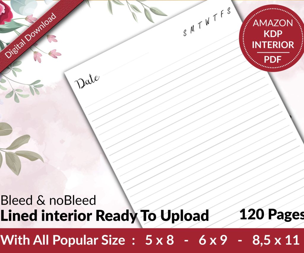 Lined Pages Journal 120 pages Ready to Upload PDF Commercial Use KDP Template 6x9 8.5x11 5x8 for Notebooks, Diaries, Low Content
2 × $0.00
Lined Pages Journal 120 pages Ready to Upload PDF Commercial Use KDP Template 6x9 8.5x11 5x8 for Notebooks, Diaries, Low Content
2 × $0.00
Subtotal: $0.00
Okay so I just spent like three hours yesterday setting up a recipe book template in Canva and honestly it’s way easier than people make it out to be. You just gotta know which buttons to actually click because Canva hides half the good stuff.
First thing – don’t just search “recipe book” and pick whatever looks pretty. That’s what I did my first time and ended up with something that was 8×8 inches when I needed 8×10 for KDP. So go to custom size right away. For Amazon KDP the sweet spot is 8×10 inches with 0.125 inch bleed on all sides. In Canva you’d set it up as 8.25 x 10.25 inches to account for that bleed.
The bleed thing confused me for like six months when I started. Basically Amazon trims your book and if you don’t have that extra bit hanging over the edge you’ll get white lines on your pages. Super unprofessional looking.
You can search Canva’s templates but honestly most of them are kinda generic. I usually start from scratch now because it’s faster than fixing someone else’s weird layout choices. But if you’re just starting out grab one of their cookbook templates and gut it. Keep the page structure, delete all their design elements, start fresh.
Oh and another thing – make sure you’re working in Canva Pro or whatever they call it now. The free version doesn’t let you resize stuff properly and you can’t remove backgrounds which you’re gonna need for recipe photos. I fought with the free version for like two weeks before I finally upgraded. Worth every penny.
This is where people mess up. They design one page then copy it 50 times and then realize they hate the header and have to change it 50 times. Don’t be that person.
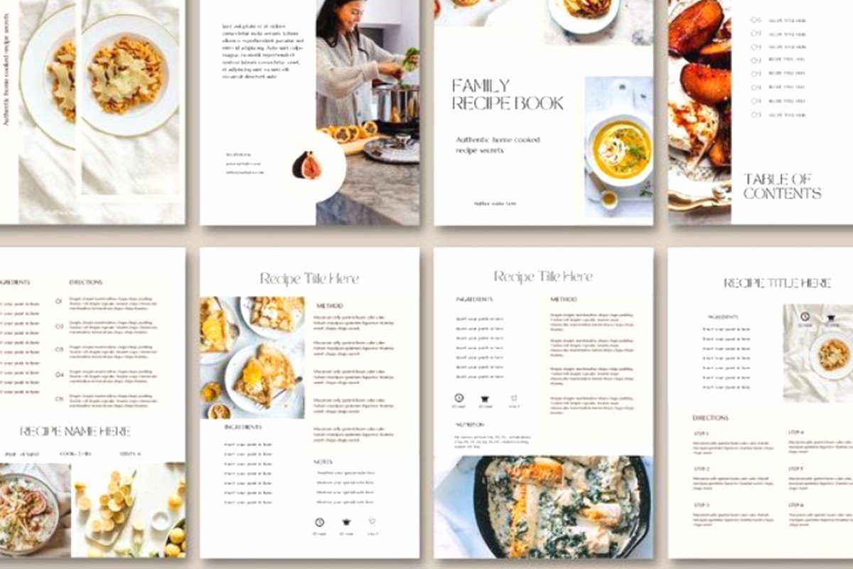
Create your master layouts first. You need maybe 4-5 page types:
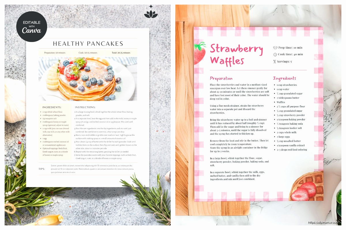
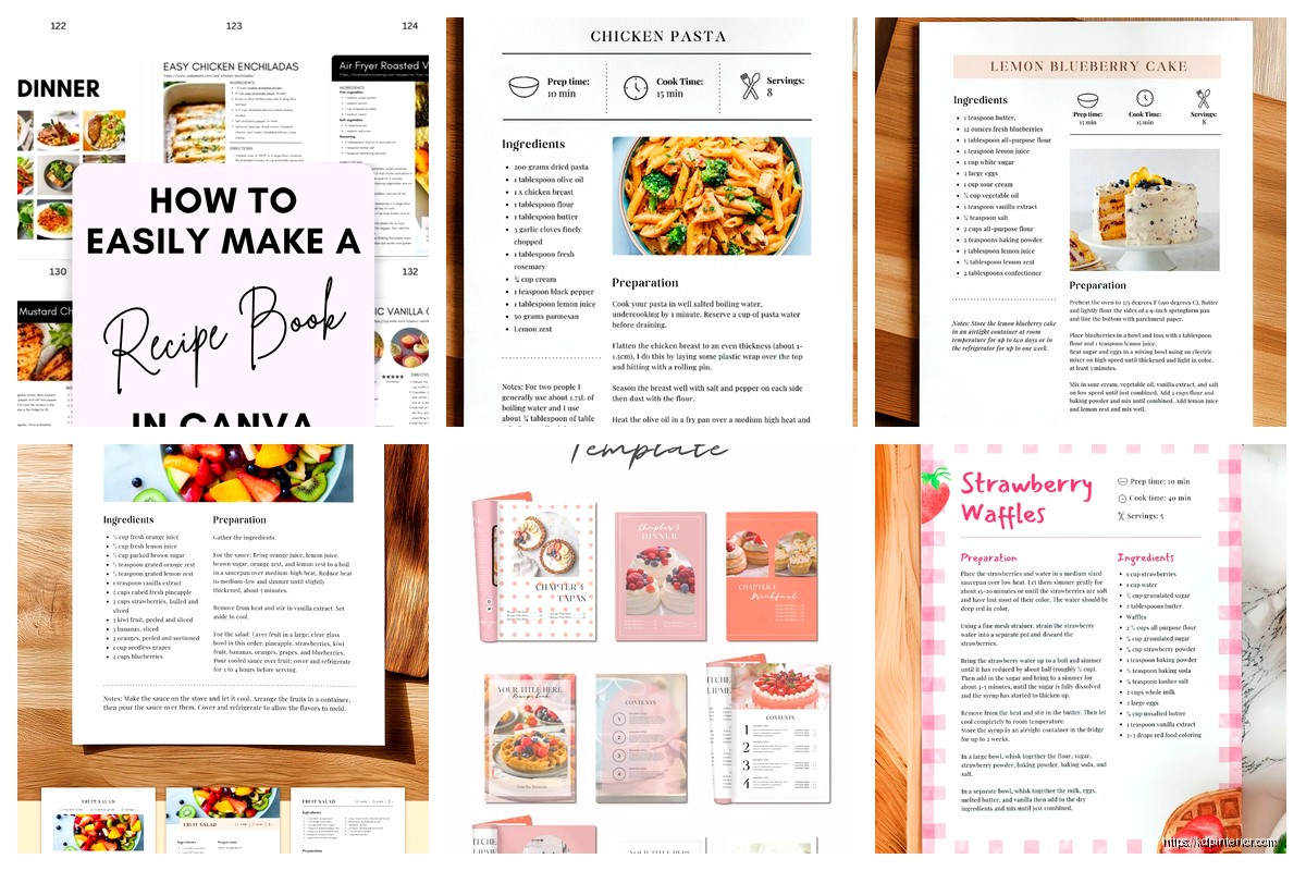
For the recipe page itself I usually do a two-column layout. Left side gets the ingredients list, right side gets the instructions. At the top there’s space for the recipe name and maybe a little descriptor like “prep time 15 min” or whatever.
Wait I forgot to mention – add page numbers right from the start. I always forget and then I’m on page 47 when I remember and it’s annoying. Put them in the bottom corner, small font, nothing fancy.
Okay so photos are where recipe books either look amazing or like garbage. You got a few options here.
You can use Canva’s stock photos but everyone recognizes them. I’ve seen the same pasta photo in like twelve different cookbooks. If you’re gonna use stock photos at least run them through Canva’s photo effects first. Add a filter, adjust the brightness, crop it differently. Make it look less stock-photo-ish.
Better option is taking your own photos if these are your recipes. I use my phone camera which is fine but you gotta have good lighting. Natural light by a window. My cat knocked over a recipe bowl right when I was photographing last week so that was fun. Had to start over.
If you’re doing a low-content style cookbook where it’s more about the layout and people write in their own recipes then you don’t need photos at all. Just make the design elements really clean and leave space for people to add their own.
Don’t use more than two fonts. Recipe title gets one font, body text gets another. That’s it. I see people using like five different fonts and it looks like a ransom note.
For recipe titles I like something a bit fancy but still readable. Playfair Display or Libre Baskerville work good. For the ingredients and instructions use something simple. Montserrat, Open Sans, Lato. Boring but that’s the point – people need to actually read this while they’re cooking with flour on their hands.
Font sizes matter more than you think. Recipe titles should be like 24-28pt. Ingredients list maybe 12-14pt. Instructions can be 11-12pt. You want it readable from a couple feet away because nobody holds a cookbook right up to their face while cooking.
Line spacing is huge. In Canva you can adjust this in the text properties. I use 1.3 or 1.5 for ingredient lists and instructions. Makes it way easier to scan while you’re cooking. Nothing worse than losing your place in a recipe because everything’s crammed together.
This is gonna sound weird but go look at actual physical cookbooks at a bookstore. Not online – in person. See what colors they use. Most successful cookbooks use pretty neutral color palettes with maybe one or two accent colors.
I usually stick with:
That accent color depends on your cookbook theme. Bright red for Italian recipes. Deep green for healthy eating. Warm orange for comfort food. You get it.
Canva has this color palette generator thing that pulls colors from photos. Super helpful if you’ve got a main photo you’re building around. Upload your hero image and it’ll suggest colors that match.
Okay so for each recipe page here’s what I actually include:
Top section: Recipe name in big letters, maybe a subtitle, prep/cook time icons with numbers. I make little icons in Canva using their shapes – a clock for time, a pot for servings, whatever.
Middle section: This is where the photo goes if you’re using one. I usually do a landscape rectangle that’s about 4-5 inches wide. Not full page because you need room for text.
Bottom section: Two columns. Left column ingredients with checkboxes (people like checking stuff off), right column numbered instructions.
The checkbox thing is just a small square outline from Canva’s shapes. Put it next to each ingredient. Makes the cookbook feel more interactive and people actually use it.
Brand kit is your friend. Set up your fonts and colors in the brand kit and they’re always one click away. I didn’t know this existed for like a year and kept manually selecting the same fonts over and over.
Elements library is where you find all the decorative stuff. Search for “food” or “kitchen” and you’ll get illustrations of utensils, ingredients, borders, all that. I usually add little decorative elements in the corners or between sections. Not too many though – maybe 2-3 per page max.
Oh and the duplicate page button is clutch. Once you’ve got one recipe page looking perfect, duplicate it for the next recipe and just swap out the content. Way faster than starting fresh each time.
When you’re done designing you gotta export it right. PDF Print is what you want. Not PNG, not regular PDF. PDF Print keeps everything at high resolution and embeds all the fonts.
In the download settings check “crop marks and bleed” if you’re uploading to KDP. This shows where the trim will happen. I always do a test print through KDP of just like 5 pages to make sure everything looks right before I print the whole book.
One time I didn’t check this and my page numbers got cut off on every page. Had to redo the whole thing. Learn from my mistakes.
When you upload to KDP make sure your interior is set to black and white if you’re only using black text. Color printing costs way more and if you don’t have color photos there’s no point. Your profit margins will thank you.
Trim size should match what you designed. If you did 8×10 in Canva select 8×10 in KDP. Don’t let Amazon resize it or things get weird.
For paper type I usually go with white paper for cookbooks. Cream paper is nice for novels but recipes look better on white. Personal preference though.
Before you make like 50 pages, make 5 and export them. Open the PDF and zoom in. Check if text is crisp, if images look good, if spacing seems right. I caught so many mistakes this way. Headers too close to the top, text boxes overlapping, images too pixelated.
Also view it on your phone. Lot of people browse KDP books on mobile before buying. If your preview looks bad on a phone screen people won’t buy it even if it prints fine.
Too much stuff on one page. White space is good. Your page doesn’t need a border and a background pattern and decorative elements everywhere. Pick like two decorative things per page max.
Inconsistent styling. If page 3 has headers in blue and page 12 has headers in green for no reason, it looks sloppy. Keep everything consistent throughout.
Forgetting about margins. Text too close to the edge gets cut off or ends up in the gutter where the pages bind together. Keep text at least 0.5 inches from all edges, closer to 0.75 inches on the inside margin.
Not numbering pages or having a table of contents. People want to find recipes quickly. Make it easy for them.
Throw in some bonus pages that aren’t recipes. Measurement conversion chart, cooking temperature guide, seasonal produce calendar. Takes like 10 minutes to make these in Canva and people love them. Makes your cookbook feel more complete.
I also add a notes section at the back. Just blank lined pages where people can write their own recipe variations or notes. Super easy to make – just create a page with horizontal lines using Canva’s line tool. Copy paste like 20 times down the page.
Look I’m not gonna lie, your first template is probably gonna take a few hours. Maybe more if you’re picky like me. But once you’ve got it set up you can pump out recipe books pretty quick. I made three different cookbook templates last month and each one after the first took maybe an hour because I knew exactly what I was doing.
The key is just starting and not getting hung up on making it perfect. Make it good enough, test it, adjust based on what looks weird. That’s how you actually learn this stuff rather than watching tutorials forever and never actually doing it.
DISCOVER OUR FREE BEST SELLING PRODUCTS
Editable Canva Lined Journal: Express Your Thoughts – KDP Template
Lined Pages Journal 120 pages Ready to Upload PDF Commercial Use KDP Template 6×9 8.5×11 5×8 for Notebooks, Diaries, Low Content
Lined Pages Journal 120 pages Ready to Upload PDF Commercial Use KDP Template 6×9 8.5×11 5×8 for Notebooks, Diaries, Low Content
Cute Dogs Coloring Book for Kids | Activity Book | KDP Ready-To-Upload
Daily Planner Diary : Diary Planners for Everyday Productivity, 120 pages, 6×9 Size | Amazon KDP Interior
Wolf Coloring KDP interior For Adults, Used as Low Content Book, PDF Template Ready To Upload COMMERCIAL Use 8.5×11"
Coloring Animals Head Book for Kids, Perfect for ages 2-4, 4-8 | 8.5×11 PDF
Printable Blank Comic Book Pages PDF : Create Your Own Comics – 3 Available Sizes
Notes KDP interior Ready To Upload, Sizes 8.5×11 6×9 5×8 inch PDF FILE Used as Amazon KDP Paperback Low Content Book, journal, Notebook, Planner, COMMERCIAL Use
Black Lined Journal: 120 Pages of Black Lined Paper Perfect for Journaling, KDP Notebook Template – 6×9
Student Planner Journal 120 pages Ready to Upload PDF Commercial Use KDP Template 6×9" 8.5×11" for Low Content book
Recipe Journal Template – Editable Recipe Book Template, 120 Pages – Amazon KDP Interior