Okay so I just spent like three weeks testing different comic book cover templates for a client’s graphic novel series and here’s what actually works…
The biggest mistake people make is treating comic covers like regular book covers. They’re not. You need that immediate visual punch because comic readers are scrolling through literally hundreds of thumbnails on Amazon or browsing packed shelves at comic shops. Your cover needs to scream its genre from 150 pixels wide.
Template Basics That Actually Matter
Start with the dimensions right – you want 6.625 x 10.25 inches for standard comic size but honestly most graphic novels on KDP work better at 6 x 9 because it’s cheaper to print and still looks legit. Add 0.125 inch bleed on all sides. So your actual canvas in Photoshop or whatever is 6.25 x 9.25 inches if you’re doing the 6×9 size.
Resolution is non-negotiable – 300 DPI minimum. I’ve seen people try to get away with 150 DPI and it looks like garbage in print. Your file’s gonna be huge but that’s just how it is.
The Layer Structure I Use Every Single Time
Bottom layer is always your background. Could be a city skyline, space scene, whatever fits your story but keep it slightly blurred or desaturated so it doesn’t compete with your characters.
Next layer up is your main character art. This is where people spend 80% of their budget if they’re commissioning art and yeah that’s about right. The character needs to pop – I usually add a subtle glow or rim lighting effect to separate them from the background.
Then you got your secondary elements – supporting characters, action effects, whatever. Keep these at like 60-70% opacity sometimes or just make sure they’re physically behind the main character.
Title layer comes next and oh man this is where it gets tricky. Comic book titles need to be BOLD. I’m talking thick stroke fonts, often with a 3D effect or shadow. You want something that reads clearly even when the thumbnail is tiny.
Font Choices That Don’t Suck
Forget those elegant serif fonts unless you’re doing some literary graphic novel thing. You need display fonts with weight to them. I keep coming back to fonts like BadaBoom, Komika, or even just heavily customized Impact.
The title should take up like 20-25% of the cover real estate. Smaller than that and it disappears in thumbnails. I learned this the hard way with a superhero series where I made the title too tasteful and sales were dead for the first month until I redid it.
Wait I forgot to mention – color contrast is everything. If your background is dark, your title needs to be light with a dark stroke. If your background is light… you get it. But also consider using complementary colors. Blue background? Orange or yellow title. Red background? Cyan or white title.
The Comic Cover Formula That Works
There’s this formula that like 70% of successful comic covers follow and it’s not exciting but it WORKS:
- Main character taking up 50-60% of the cover, positioned slightly off-center
- Dynamic pose – no standing around looking bored, they need to be mid-action or at least in a power stance
- Title across the top third, sometimes breaking into the middle section
- Author name at the bottom, much smaller than the title but still readable
- Series info or issue number in a corner if applicable
You can break this formula once you’re established but for your first series? Just follow it.
Software and Tools
I use Photoshop but honestly Affinity Photo does the same stuff for like $50 one-time payment. GIMP is free but the learning curve is brutal and life’s too short.
For the actual character art, you got options. If you can draw, great – use Clip Studio Paint or Procreate. If you can’t draw (most of us can’t), you’re hiring someone or using stock art.
Fiverr and Upwork have comic artists ranging from $50 to $500+ per cover. The $50 ones are usually hit or miss – I’ve found decent artists at like $150-200 who can deliver clean linework and good composition.
Stock sites like Adobe Stock or Shutterstock have some comic-style illustrations but they’re pretty generic. Everyone’s using the same assets so your cover might look like twelve other books.
This Is Gonna Sound Weird But Templates Can Actually Help
Creative Market and Etsy sell pre-made comic book cover templates for like $15-30. These come with the layer structure already set up, fonts included, sometimes even stock character silhouettes you can work with.
I grabbed a pack of 10 templates last month for $25 and they saved me probably 15 hours of setup time across different projects. You’re still customizing everything but the foundation is there.
The good templates include:
- Multiple artboards for different sizes
- Smart objects for easy image swapping
- Text layers with styles already applied
- Color palette guides
- Print-ready specs with bleeds and safe zones marked
Genre-Specific Stuff
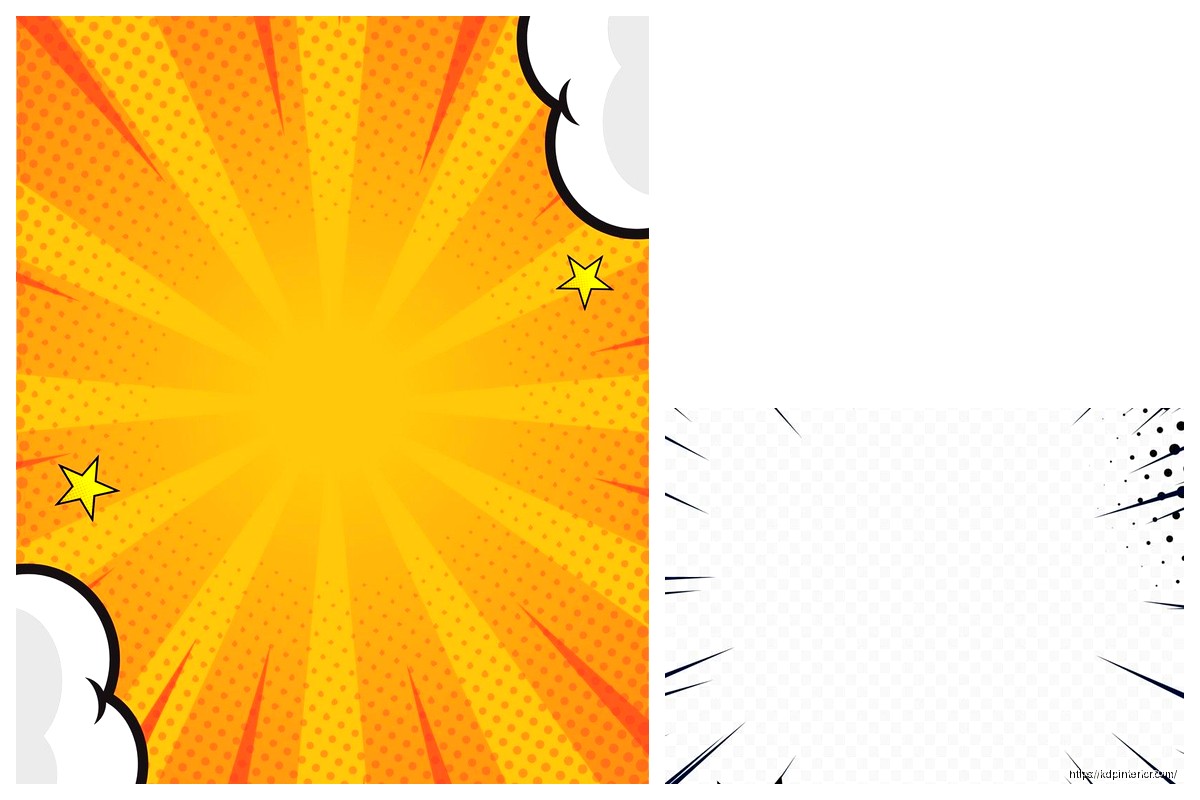
Superhero comics need bright colors, dynamic poses, maybe some speed lines or action effects. Think Marvel/DC style – bold primaries, characters in iconic poses.
Horror graphic novels want darker palettes, maybe some texture overlays to make it feel gritty. I add noise and grain to these covers, sometimes a vignette effect to draw the eye center.
Manga-style covers are different – they often have softer colors, more negative space, characters in less aggressive poses. The title treatment is usually more elegant too.
Sci-fi needs tech elements, glowing effects, maybe some particle overlays. I use a lot of cyan and purple for sci-fi covers because it just reads as futuristic.
The Text Hierarchy Thing
Your cover text needs levels. Title is biggest obviously but then you got:
- Series name or tagline (if you have one) – medium size
- Author name – smaller but still prominent
- Issue number or volume info – tiny, usually in a corner
- Any other credits or publisher info – barely visible, just there for legitimacy
I see people cramming too much text on covers all the time. If you have more than like three text elements, you’re probably overdoing it.
Color Theory Isn’t Just Art School BS
Okay so I was watching this video essay about movie posters while working on a cyberpunk cover and realized comic covers use the same color schemes:
Orange and teal for action stuff – it’s everywhere because it works. Warm character against cool background or vice versa.
Red and black for horror or dark themes – instant mood setter.
Purple and pink for anything mystical or cosmic – I don’t make the rules.
Monochromatic with one accent color – super effective for noir or serious literary graphic novels.
You can use a tool like Adobe Color or Coolors to build palettes that actually work together instead of just guessing.
The Technical Export Settings
When you’re done, you gotta export this thing right. For KDP:
Save as PDF/X-1a:2001 format if you can, or high-quality PDF. Make sure your color profile is set to CMYK not RGB because printing uses CMYK and the colors will shift if you don’t convert.
Actually that reminds me – always do a test print. I order a single proof copy before launching because what looks amazing on screen sometimes looks muddy or oversaturated in print. Cost you like $5-10 but saves you from having 500 books with a cover that looks wrong.
For digital-only releases, you can stick with RGB and export as high-res JPG or PNG. Amazon wants at least 1800 pixels on the longest side for ebook covers.
Adding Effects Without Going Overboard
Comic covers can handle more effects than regular book covers but there’s still a line. Here’s what usually works:
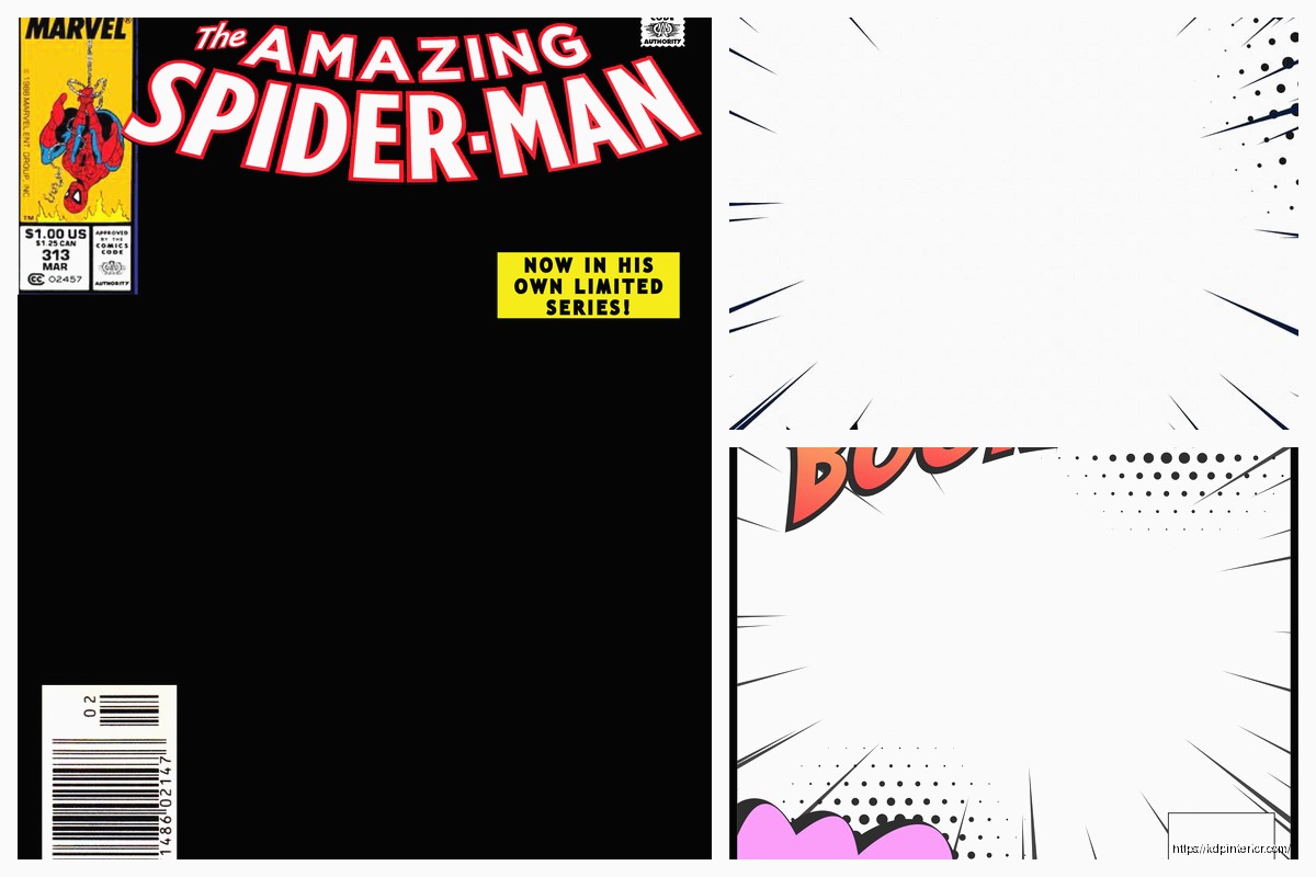
Halftone patterns – those Ben-Day dots that give it that vintage comic feel. Use these sparingly, maybe just in the background or as a texture overlay at like 20% opacity.
Speed lines – radiating lines that show movement or impact. Good for action scenes but don’t cover the whole cover with them.
Speech bubbles or sound effects – can work if they’re part of the composition but honestly I usually skip these for graphic novel covers. They work better for single issue comics.
Glow effects – eyes glowing, energy weapons, whatever. These need to be bright enough to notice but not so bright they blow out the whole composition. My cat jumped on my keyboard once and somehow cranked the glow effect to 100% and it looked like a nuclear explosion.
The Border Question
Some comic covers have borders, some don’t. The bordered look is more traditional – you got your art in a frame with the title above or below it. Modern graphic novels usually go borderless with the art bleeding to the edges.
I prefer borderless because it makes the cover feel bigger and more immersive but if you’re going for a retro vibe, add a border. Just make sure it’s thick enough to register visually – like 0.25 inches minimum.
Series Branding
If you’re doing multiple volumes, you need consistency. Same font for the title across all covers, similar composition structure, maybe a color theme that shifts slightly between volumes.
I worked on a fantasy series where Volume 1 was blue-dominant, Volume 2 shifted to purple, Volume 3 to red – it created this nice progression on the shelf while still looking like they belonged together.
Template the stuff that stays the same – your title treatment, author name placement, any series logos or elements. Then just swap in new character art and backgrounds for each volume.
Common Mistakes I See Constantly
Tiny titles that disappear in thumbnails – already mentioned this but it’s worth repeating.
Too many characters on the cover – focus on one, maybe two max. More than that and it’s visual chaos.
Boring poses – your character standing there looking at the camera is not compelling. Give them something to do, even if it’s just a dramatic stance.
Wrong genre signals – if your dark horror comic has a bright cheerful cover, you’re attracting the wrong readers who’ll leave bad reviews.
Forgetting about the back cover – KDP paperbacks need a full wrap design. Don’t just design the front and slap some text on the back. The spine matters too, especially if your book is thick enough to have readable spine text.
Not checking what the competition is doing – search your genre on Amazon and look at the top sellers. You don’t wanna copy them but you need to understand the visual language readers expect.
Okay so that’s basically everything I’ve figured out through trial and error and working with like probably 50+ comic book covers at this point. The main thing is just make it bold, make it clear, and make sure it looks good at thumbnail size because that’s where 90% of people will first see it.
 Black Lined Journal: 120 Pages of Black Lined Paper Perfect for Journaling, KDP Notebook Template - 6×9
1 × $0.00
Black Lined Journal: 120 Pages of Black Lined Paper Perfect for Journaling, KDP Notebook Template - 6×9
1 × $0.00  Cute Dogs Coloring Book for Kids | Activity Book | KDP Ready-To-Upload
1 × $0.00
Cute Dogs Coloring Book for Kids | Activity Book | KDP Ready-To-Upload
1 × $0.00 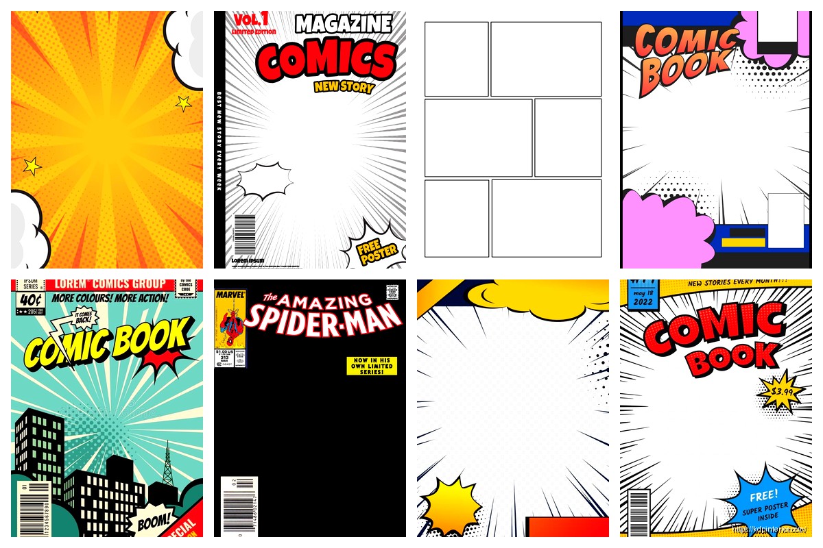
DISCOVER OUR FREE BEST SELLING PRODUCTS
Editable Canva Lined Journal: Express Your Thoughts – KDP Template
Lined Pages Journal 120 pages Ready to Upload PDF Commercial Use KDP Template 6×9 8.5×11 5×8 for Notebooks, Diaries, Low Content
Lined Pages Journal 120 pages Ready to Upload PDF Commercial Use KDP Template 6×9 8.5×11 5×8 for Notebooks, Diaries, Low Content
Cute Dogs Coloring Book for Kids | Activity Book | KDP Ready-To-Upload
Daily Planner Diary : Diary Planners for Everyday Productivity, 120 pages, 6×9 Size | Amazon KDP Interior
Wolf Coloring KDP interior For Adults, Used as Low Content Book, PDF Template Ready To Upload COMMERCIAL Use 8.5×11"
Coloring Animals Head Book for Kids, Perfect for ages 2-4, 4-8 | 8.5×11 PDF
Printable Blank Comic Book Pages PDF : Create Your Own Comics – 3 Available Sizes
Notes KDP interior Ready To Upload, Sizes 8.5×11 6×9 5×8 inch PDF FILE Used as Amazon KDP Paperback Low Content Book, journal, Notebook, Planner, COMMERCIAL Use
Black Lined Journal: 120 Pages of Black Lined Paper Perfect for Journaling, KDP Notebook Template – 6×9
Student Planner Journal 120 pages Ready to Upload PDF Commercial Use KDP Template 6×9" 8.5×11" for Low Content book
Recipe Journal Template – Editable Recipe Book Template, 120 Pages – Amazon KDP Interior