Okay so I just spent like three weeks testing different comic cover templates for a client who wanted to launch a superhero series on KDP and here’s what actually matters when you’re setting these up…
Template Dimensions That Won’t Screw You Over
First thing – and I learned this the hard way back in 2019 – your cover dimensions need to account for bleed. KDP requires 8.5 x 11 inches for most comic formats but you gotta add 0.125 inches on all sides for bleed. So you’re actually working with 8.75 x 11.25 inches in your design software.
The safe zone is where your actual important stuff lives. Keep all text and critical imagery at least 0.25 inches from the trim edge because I’ve seen so many covers where the hero’s face gets chopped off or the title bleeds into oblivion. Not a good look when you’re trying to compete with DC and Marvel knockoffs.
Resolution Settings Nobody Talks About
Set your template to 300 DPI minimum. I know some tutorials say 150 is fine but those people haven’t dealt with Amazon’s print quality issues. Your blacks will look muddy and any gradient work will show banding like crazy.
Color mode needs to be CMYK if you’re doing print, RGB for ebook only. I usually design in RGB then convert because the colors pop more on screen and that’s where 90% of people see your cover first anyway.
Layer Structure That Saves Your Sanity
Oh and another thing – organize your layers from day one or you’ll hate yourself later. I use this structure for every comic cover template:
- Background layer (locked)
- Background elements folder
- Character art folder (sometimes multiple if you’ve got team shots)
- Effects layer (lighting, shadows, all that good stuff)
- Text elements folder
- Logo/branding layer
- Guides and notes layer (non-printing)
The guides layer is where I put notes about font sizes, color codes, and those random 2am thoughts about design changes. My cat walked across my keyboard last month and somehow created the perfect color palette so now I document everything.
Typography Rules for Comic Covers
Title text needs to be HUGE. Like way bigger than you think. I’m talking 72pt minimum for the main title on an 8.5 x 11 cover. Comic covers are visual hierarchy on steroids – your reader should be able to read the title from the thumbnail view which is like 160 pixels wide on Amazon.
Fonts matter more than you’d think. Stay away from:
- Comic Sans (obviously)
- Papyrus (why does this still exist)
- Anything too elegant or script-y unless it’s a romance graphic novel
Bold display fonts work best. I use a lot of fonts from Blambot and Comicraft because they’re designed specifically for comic lettering. Some are free for indie use which is clutch when you’re bootstrapping.
The Outline Trick
Always outline your title text. White text with black outline or vice versa. This makes it readable against ANY background. I learned this from analyzing like 200 top-selling graphic novels on Amazon – literally every single one uses outlined text.
Stroke width should be about 8-12% of your font size. So if you’re using 100pt font, use a 10pt stroke. This keeps it readable without looking like a meme from 2010.
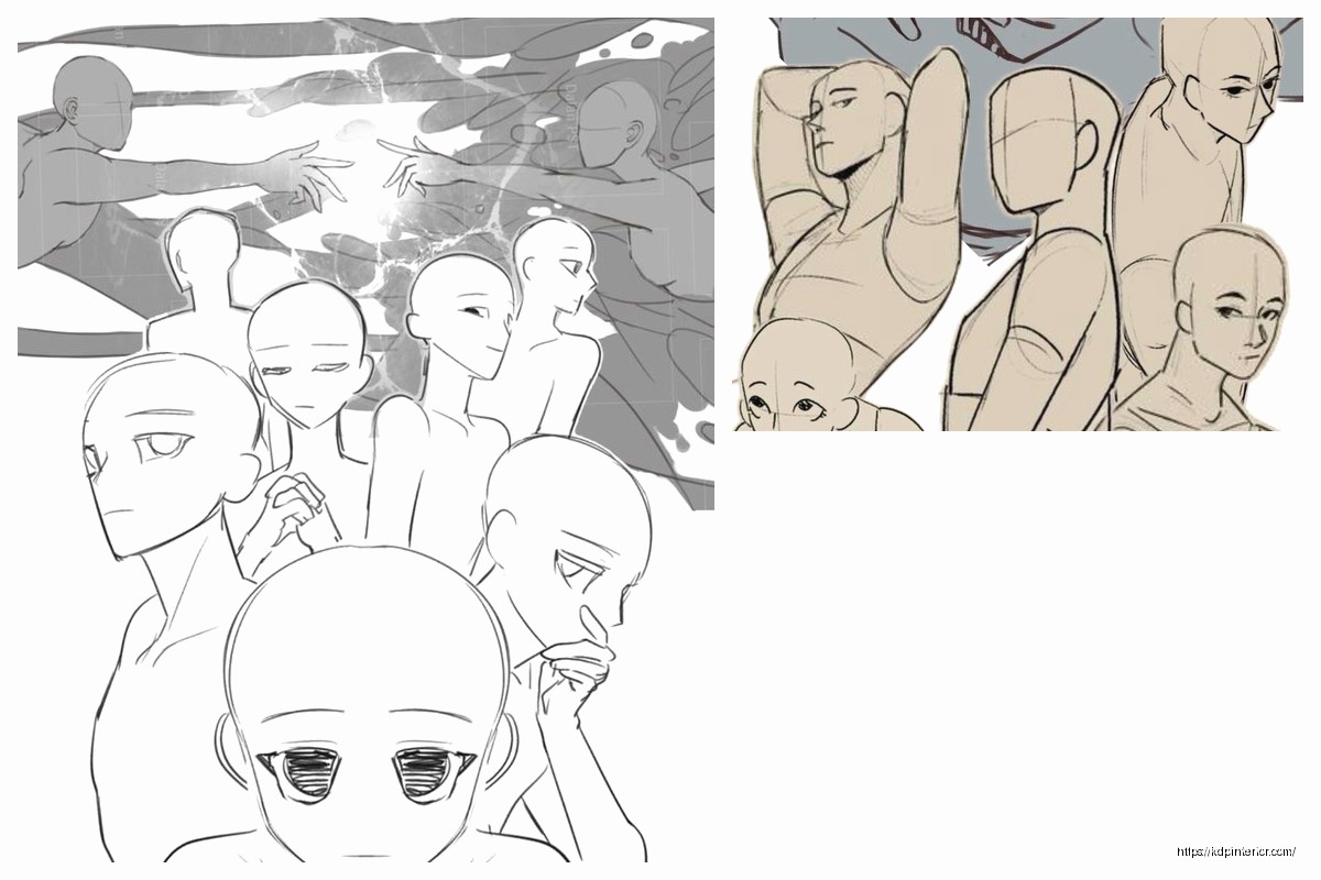
Character Placement Strategy
Okay so funny story – I once designed a cover with the main character dead center and Amazon’s preview cropped it so weirdly that only his shoulder showed in the thumbnail. Total disaster.
The sweet spot for main character placement is slightly off-center, usually in the right third of the cover if you follow rule of thirds. This gives you room for dynamic posing and keeps the thumbnail interesting.
For team shots or multiple characters, use the triangle composition. Put your main hero at the top point, two supporting characters at the base points. Creates visual stability and guides the eye naturally.
The Background Decision
Simple backgrounds work better than complex ones for covers. I know it’s tempting to show off your worldbuilding with detailed cityscapes or whatever but trust me – simple color gradients with maybe one or two environmental elements perform better.
Wait I forgot to mention – test your cover in grayscale. If it doesn’t have good contrast in black and white, it won’t pop in color either. This is like design 101 but so many people skip it.
Color Psychology for Different Genres
Superhero comics = primary colors (red, blue, yellow). It’s cliché but it works.
Horror/thriller graphic novels = deep purples, blacks, sickly greens. I did a zombie series last year and used this desaturated green-gray that tested really well.
Fantasy = rich jewel tones. Think emerald, sapphire, deep burgundy.
Sci-fi = cool blues, cyans, sometimes orange for that Blade Runner vibe everyone’s copying.
Don’t use more than three main colors on your cover. More than that and it looks chaotic unless you really know what you’re doing with color theory.
Template Variations You Actually Need
Create at least three versions of your template:
Version 1: Full wrap cover (for print)
Version 2: Front cover only (for ebook)
Version 3: Social media format (square, 1080×1080)
The spine width changes based on page count so I keep a calculator handy. Amazon’s cover calculator is okay but I use this formula: (page count × 0.002252) + 0.06 inches for the spine width on white paper.
Software Recommendations Real Quick
I use Photoshop for 90% of comic covers because the layer management is superior and you can work with high-res files without your computer dying. GIMP works if you’re on a budget but the interface makes me wanna pull my hair out.
Clip Studio Paint is actually amazing for comic work if you’re doing any illustration yourself. The perspective rulers alone are worth the price.
Canva? Look, I know everyone loves Canva but the resolution limits make it tough for print quality. Fine for ebooks though.
Asset Sources That Don’t Suck
Stock photos from Adobe Stock or Shutterstock for reference materials. DeviantArt has some artists who do custom comic art for reasonable prices – I’ve hired three different artists from there for client projects.
This is gonna sound weird but check out Envato Elements. They have mockups and design elements that can speed up your workflow like crazy. I probably save 5-10 hours per project using their templates as starting points.
The Amazon Thumbnail Test
Before you finalize anything, shrink your cover to 160 pixels wide. Can you still read the title? Can you tell what genre it is? Does the main character still look cool?
If you answered no to any of those, redesign. I know it seems extreme but Amazon thumbnails are where you make or break your sales. Nobody’s clicking through to read your description if the thumbnail doesn’t grab them.
Print vs Digital Considerations
Print covers need to be bolder, higher contrast. Digital covers can use more subtle effects because screens have better color reproduction than print.
For print, avoid gradients that go from dark to light too quickly. Amazon’s printers sometimes create banding that looks terrible. Use noise textures in your gradients to break them up.
Oh and another thing – if you’re doing foil effects or embossing, that’s a whole different ballgame. KDP doesn’t offer those options directly so you’d need to go through IngramSpark or a specialty printer.
Series Branding Elements
If you’re doing a series, establish your template elements early:
- Logo placement (same spot every cover)
- Title font and sizing
- Color scheme or accent color
- Border style if you use one
- Author name treatment
Readers should be able to spot your series from across the room. Look at how The Walking Dead or Saga handles their covers – instantly recognizable even with different artwork each issue.
Common Mistakes I See Constantly
Too much text. Your cover isn’t a billboard for every single detail about your story. Title, subtitle if necessary, author name. That’s it.
Overcomplicated compositions. Simple beats complex almost every time in thumbnail views.
Wrong aspect ratio for the format. I’ve seen people try to use manga proportions for American comic formats and it just looks off.
Ignoring genre conventions. Yeah you wanna be unique but if your superhero comic looks like a romance novel, you’re gonna confuse your target audience.
The Mock Review Strategy
Create mockups of your cover next to bestsellers in your genre. Does it fit? Does it stand out in a good way or does it look amateurish? Be honest with yourself here.
I use Placeit for mockups but you can also just screenshot Amazon search results and photoshop your cover in. Takes five minutes and saves you from publishing something that doesn’t work.
File Formats and Export Settings
For KDP upload, use PDF/X-1a:2001 format. It handles color profiles correctly and Amazon’s system processes them faster.
RGB PDFs for ebook covers, CMYK for print. Name your files clearly – I use “SeriesName_Issue01_Cover_Print_300DPI.pdf” so I never upload the wrong version.
Keep your working files in PSD or whatever native format your software uses. You’ll thank yourself later when you need to make changes. I’ve got like 200GB of cover files backed up because redoing work from scratch is the worst.
Testing and Iteration
A/B test your covers if you’re publishing multiple issues. Swap them out every few weeks and track which versions get better click-through rates. Amazon doesn’t make this easy but you can track it manually through your reports.
Get feedback from actual comic readers, not just your friends who’ll tell you everything looks great. Reddit communities like r/comicbooks can be harsh but honest.
I usually create 3-5 versions of each cover and poll my email list before finalizing. The version I personally like best almost never wins which is humbling but useful.
Anyway that’s pretty much the framework I use for every comic cover template project. The key is setting up your template right the first time so you can pump out variations quickly without reinventing the wheel each time.
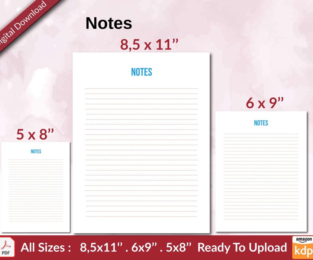 Notes KDP interior Ready To Upload, Sizes 8.5x11 6x9 5x8 inch PDF FILE Used as Amazon KDP Paperback Low Content Book, journal, Notebook, Planner, COMMERCIAL Use
1 × $0.00
Notes KDP interior Ready To Upload, Sizes 8.5x11 6x9 5x8 inch PDF FILE Used as Amazon KDP Paperback Low Content Book, journal, Notebook, Planner, COMMERCIAL Use
1 × $0.00 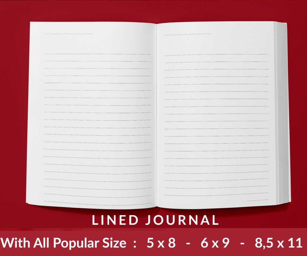 Lined Pages Journal 120 pages Ready to Upload PDF Commercial Use KDP Template 6x9 8.5x11 5x8 for Notebooks, Diaries, Low Content
1 × $0.00
Lined Pages Journal 120 pages Ready to Upload PDF Commercial Use KDP Template 6x9 8.5x11 5x8 for Notebooks, Diaries, Low Content
1 × $0.00 
DISCOVER OUR FREE BEST SELLING PRODUCTS
Editable Canva Lined Journal: Express Your Thoughts – KDP Template
Lined Pages Journal 120 pages Ready to Upload PDF Commercial Use KDP Template 6×9 8.5×11 5×8 for Notebooks, Diaries, Low Content
Lined Pages Journal 120 pages Ready to Upload PDF Commercial Use KDP Template 6×9 8.5×11 5×8 for Notebooks, Diaries, Low Content
Cute Dogs Coloring Book for Kids | Activity Book | KDP Ready-To-Upload
Daily Planner Diary : Diary Planners for Everyday Productivity, 120 pages, 6×9 Size | Amazon KDP Interior
Wolf Coloring KDP interior For Adults, Used as Low Content Book, PDF Template Ready To Upload COMMERCIAL Use 8.5×11"
Coloring Animals Head Book for Kids, Perfect for ages 2-4, 4-8 | 8.5×11 PDF
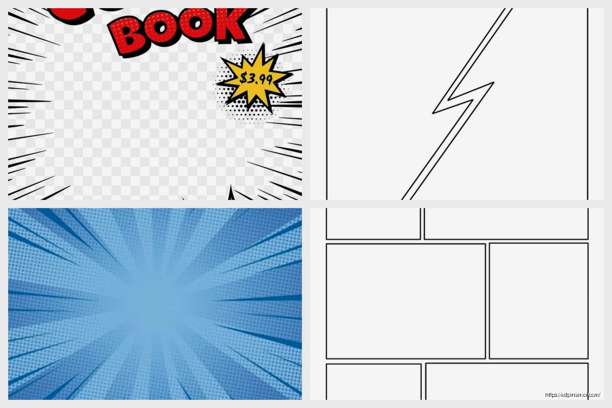
Printable Blank Comic Book Pages PDF : Create Your Own Comics – 3 Available Sizes
Notes KDP interior Ready To Upload, Sizes 8.5×11 6×9 5×8 inch PDF FILE Used as Amazon KDP Paperback Low Content Book, journal, Notebook, Planner, COMMERCIAL Use
Black Lined Journal: 120 Pages of Black Lined Paper Perfect for Journaling, KDP Notebook Template – 6×9
Student Planner Journal 120 pages Ready to Upload PDF Commercial Use KDP Template 6×9" 8.5×11" for Low Content book
Recipe Journal Template – Editable Recipe Book Template, 120 Pages – Amazon KDP Interior