-
×
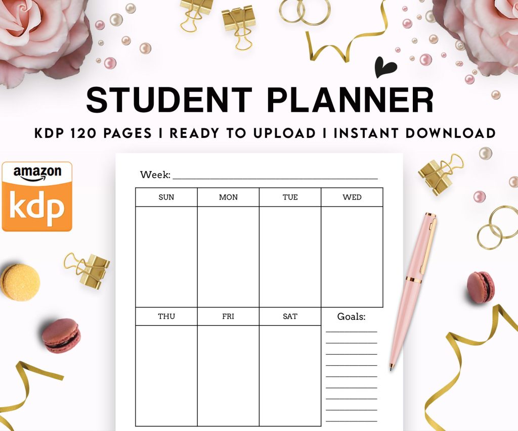 Student Planner Journal 120 pages Ready to Upload PDF Commercial Use KDP Template 6x9" 8.5x11" for Low Content book
1 × $0.00
Student Planner Journal 120 pages Ready to Upload PDF Commercial Use KDP Template 6x9" 8.5x11" for Low Content book
1 × $0.00
Subtotal: $0.00
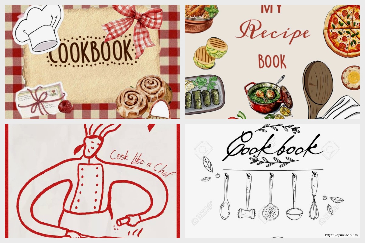
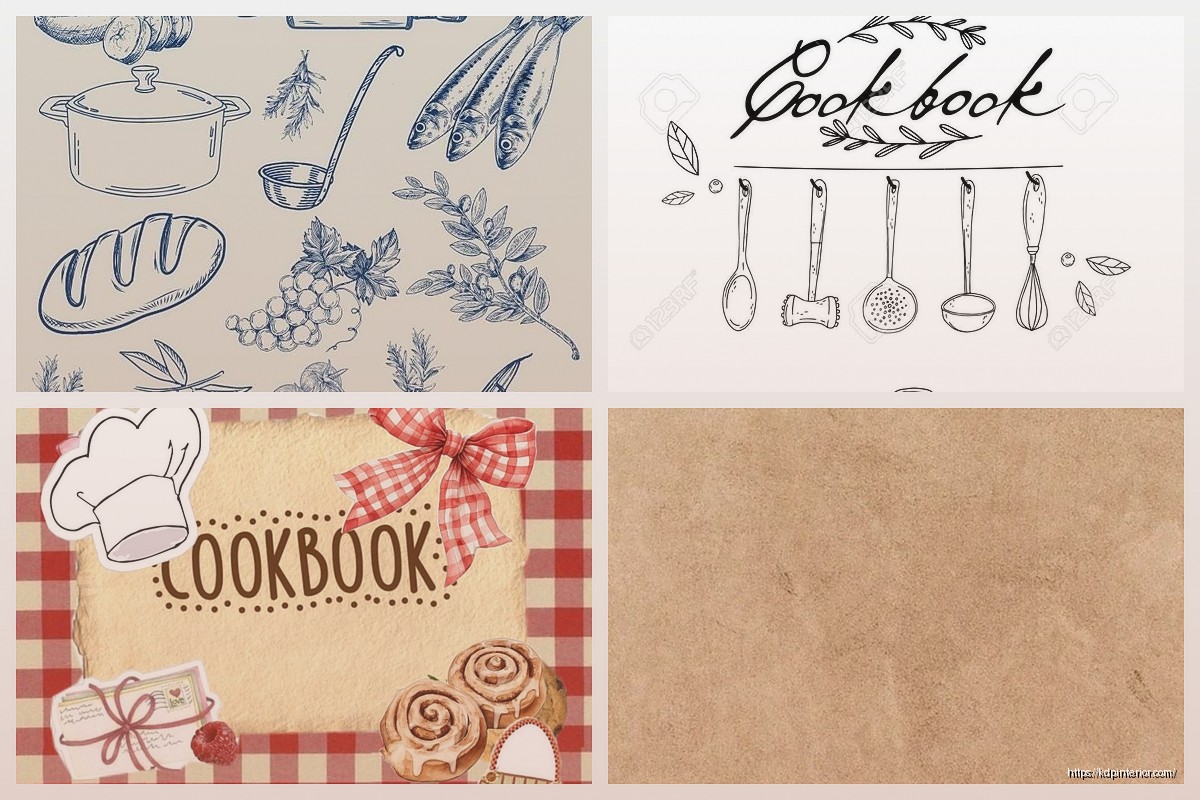
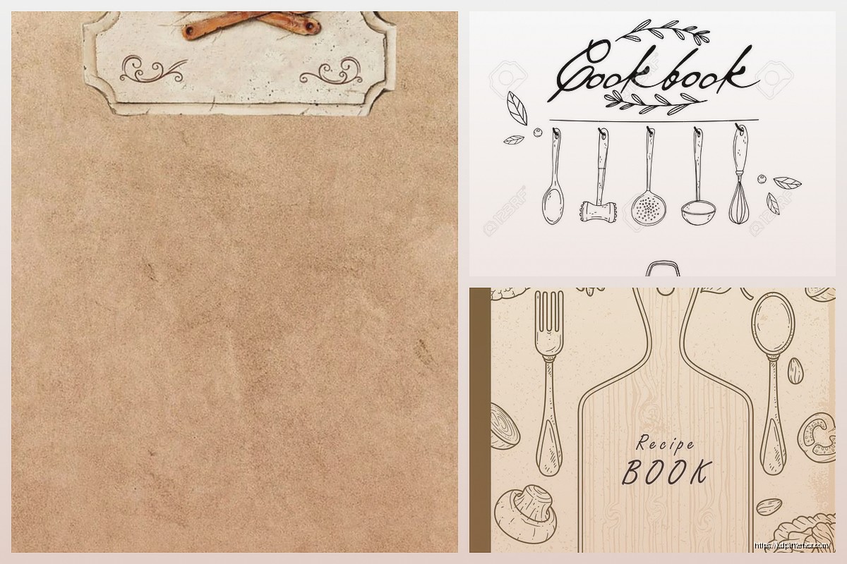
Okay so I just finished redesigning like 15 cookbook covers last month and here’s what actually works – forget all that Pinterest-perfect advice because half of it doesn’t translate to Amazon thumbnails.
Your cover needs to work at like 160 pixels wide. That’s it. I see people obsessing over these gorgeous watercolor illustrations and fancy script fonts, and then the cover shows up on Amazon looking like a blurry mess. Test your cover by shrinking it down on your phone – if you can’t read the title in 2 seconds, you’re gonna lose sales.
The biggest mistake? Too many elements. I learned this the hard way with a Mediterranean cookbook that had olives, tomatoes, herbs, a wooden spoon, AND decorative borders. Looked amazing in Canva at full size… sold maybe 12 copies in three months. Stripped it down to just fresh tomatoes and bold text, sales tripled.
The cookbooks that consistently sell in my portfolio all follow this formula. My “30-Minute Dinners” book is literally just a clock icon and orange text on cream background. Brings in $400-600 monthly because people can actually SEE what it is.
Creative Fabrica has decent cookbook templates for like $1-3 each if you have their subscription. The quality varies wildly though – you gotta filter through a lot of garbage. I usually search “minimalist cookbook cover” because those tend to be cleaner starting points.
Canva Pro is worth it if you’re doing this regularly. Their cookbook templates are honestly hit or miss, but the ability to resize everything and access their photo library saves hours. I was watching The Bear while designing covers last week and just having that quick access to food photography made the whole process way faster.
Creative Market has higher-end templates ($15-40 range) that look more professional out of the box. The “Rustic Recipe Book” bundle I bought last year has paid for itself like 20 times over. You still need to customize obviously, but the typography and layout work is already solid.
If you’re gonna make your own template from scratch – and honestly you probably should once you understand what works – here’s my process:
Start with your dimensions. KDP wants 8.5×11 for most cookbooks (that’s what people expect). Your cover file needs to be 2550×3300 pixels at 300 DPI. Don’t mess with this, Amazon’s preview system is picky.
Create a simple grid system. I use 12 columns with 40px gutters because… actually I don’t remember why, some YouTube tutorial told me to years ago and it just works. Keep your text in the center 8 columns so nothing gets too close to the edges.
Script fonts are dying in cookbook design, thank god. They’re impossible to read at thumbnail size and they all look the same now. What’s working right now:
Title fonts – Bold sans serifs like Montserrat Bold, Raleway ExtraBold, or Bebas Neue. Chunky enough to read small but not aggressive. Serif fonts can work for certain niches (Southern cooking, heritage recipes) but test them at small sizes first.
Subtitle fonts – Something lighter that contrasts with your title. If your title is bold sans serif, your subtitle could be a thinner serif or a different weight of the same font family. Don’t introduce like 4 different fonts, it looks messy.
I usually do title at 120-140pt and subtitle at 36-48pt. That ratio just… works? Your mileage might vary depending on title length obviously.
Oh and another thing – letter spacing matters more than you’d think. I usually add 50-100 tracking to titles so they breathe a bit. Makes them easier to read and feels more modern.
This is gonna sound weird but I track this stuff in a spreadsheet. Certain color combos just perform better for cookbooks:
Stay away from bright yellow backgrounds (looks cheap), purple (reads as dessert-only even if it’s not), and that millennial pink everyone was using in 2019.
Use Adobe Color or Coolors to build palettes if you’re stuck. I usually start with one dominant color that fits my niche, then let the tool suggest complementary colors. Takes like 3 minutes vs agonizing over it for hours.
Stock photos are fine, everyone uses them. The trick is picking images that don’t look obviously stock. Unsplash and Pexels have decent food photography now – search specific dishes not generic “food” or you’ll get the same overdone shots everyone else uses.
What I look for in hero images:
Sharp focus on the main subject, blurred background. Natural lighting, not that weird flash-lit look. Negative space where you can put text without covering important details. Authentic styling – rustic is still in, that ultra-staged food blogger aesthetic is getting tired.
My cat knocked over my coffee while I was selecting images yesterday and honestly the break helped – I was overthinking it. Just pick something that makes the food look appealing and move on.
Center-aligned everything – safest option, works for 80% of cookbooks. Title centered, subtitle centered, maybe a small decorative element or badge at the bottom.
Top-heavy design – title and subtitle in top third, large food image filling bottom two-thirds. This works really well for single-subject cookbooks (Pizza, Cookies, Smoothies).
Background image with overlay – full-bleed food photo with a semi-transparent color overlay, text on top. Looks professional but you gotta nail the contrast or text becomes unreadable.
Geometric frames – title in a circle, square, or arch shape with the food image integrated somehow. Trending right now but might look dated in 2 years, use cautiously.
The worst layout? Split designs where half the cover is one thing and half is another. They never work at thumbnail size, everything gets too small.
Keto/Low-carb – clean, modern, lots of white space. Avoid looking too clinical though, people want food to look appealing. Dark greens and gold accents work well.
International cuisine – you can reference cultural design elements but don’t go overboard with stereotypes. A subtle pattern or color scheme that evokes the region works better than plastering flags everywhere.
Quick/Easy cooking – bold, energetic, often uses numbers prominently (30-Minute, 5-Ingredient). Orange and red perform well here because they convey speed and energy.
Baking/Desserts – softer colors, you can get away with more decorative elements here. Pastels work. Script fonts are slightly more acceptable but still test them at small sizes.
Meal prep/Planning – organized, grid-like layouts work well. Blues and greens signal health and planning. Sometimes showing containers or organized food works better than styled dishes.
I bounce between Canva Pro and Affinity Publisher depending on the project. Canva for quick iterations and client work where they might want to make changes. Affinity for my own books where I want more control and better typography.
Photoshop is overkill unless you’re doing heavy photo editing. Most cookbook covers don’t need it.
My actual workflow: rough sketch on paper (just boxes and text placement), build in Canva, export, test on phone, adjust, repeat. Usually takes 3-5 iterations to get something that works. Don’t expect to nail it first try, you won’t.
Upload your cover to Amazon’s preview tool even before your book is ready. See how it looks in search results next to competitors. This is crucial – your cover doesn’t exist in isolation, it’s competing with 50 other thumbnails.
Text friends the thumbnail and ask “what kind of cookbook is this?” If they can’t tell immediately, redesign.
Check it on mobile, tablet, desktop. The desktop thumbnail is actually smallest, that’s your worst-case scenario.
Using photos with people’s hands in them – sounds minor but it often doesn’t work at thumbnail size, just becomes visual clutter.
Too much text – your subtitle doesn’t need to be “150 Delicious Recipes for Quick Weeknight Dinners Using Fresh Seasonal Ingredients.” Just say “150 Quick Weeknight Recipes.” People can read the description for details.
Ignoring genre conventions – if every successful cookbook in your niche uses certain design elements, there’s a reason. You can differentiate but don’t completely ignore what’s working.
Low resolution images – if your source image is 500px wide and you’re stretching it to 2550px, it’s gonna look terrible. Start with high-res images, minimum 2000px on the shortest side.
Not leaving bleed area – Amazon needs 0.125 inches bleed on all sides for print books. Keep important elements at least 0.25 inches from the edge.
If you’re doing one cookbook and don’t plan to do more, just hire someone on Fiverr for $25-50. Not worth learning all this.
If you’re building a series or doing this regularly, learn the basics. You’ll iterate faster and save thousands long-term. My first 20 covers were rough but now I can bang out a solid design in under 2 hours.
For your first book in a new niche, consider hiring someone to create a template you can then modify for future books. That’s what I did for my healthy cooking series – paid $150 for a pro template, used it as the base for 8 books.
The sweet spot is learning enough to do decent covers yourself but knowing when a project needs professional polish. My general cookbooks I design myself, but when I did a high-end French cooking book last year, I hired a designer because I wanted that premium look I couldn’t quite nail.
Wait I forgot to mention – always save your working files organized by niche. I have a “Cookbook Templates” folder with subfolders for each style. When I need to create something new, I start with a previous cover that performed well and modify it. Saves so much time vs starting from scratch every time.
The goal isn’t to create award-winning design, it’s to create covers that convert browsers into buyers. Sometimes the simplest design wins because it’s the most readable at 160 pixels wide. Keep that in mind when you’re tempted to add more elements or effects.
DISCOVER OUR FREE BEST SELLING PRODUCTS
Editable Canva Lined Journal: Express Your Thoughts – KDP Template
Lined Pages Journal 120 pages Ready to Upload PDF Commercial Use KDP Template 6×9 8.5×11 5×8 for Notebooks, Diaries, Low Content
Lined Pages Journal 120 pages Ready to Upload PDF Commercial Use KDP Template 6×9 8.5×11 5×8 for Notebooks, Diaries, Low Content
Cute Dogs Coloring Book for Kids | Activity Book | KDP Ready-To-Upload
Daily Planner Diary : Diary Planners for Everyday Productivity, 120 pages, 6×9 Size | Amazon KDP Interior
Wolf Coloring KDP interior For Adults, Used as Low Content Book, PDF Template Ready To Upload COMMERCIAL Use 8.5×11"
Coloring Animals Head Book for Kids, Perfect for ages 2-4, 4-8 | 8.5×11 PDF
Printable Blank Comic Book Pages PDF : Create Your Own Comics – 3 Available Sizes
Notes KDP interior Ready To Upload, Sizes 8.5×11 6×9 5×8 inch PDF FILE Used as Amazon KDP Paperback Low Content Book, journal, Notebook, Planner, COMMERCIAL Use
Black Lined Journal: 120 Pages of Black Lined Paper Perfect for Journaling, KDP Notebook Template – 6×9
Student Planner Journal 120 pages Ready to Upload PDF Commercial Use KDP Template 6×9" 8.5×11" for Low Content book
Recipe Journal Template – Editable Recipe Book Template, 120 Pages – Amazon KDP Interior