Okay so I just redesigned like 15 cookbook templates last month and here’s what actually matters for recipe layouts because most people get this completely wrong.
The Header Zone That Nobody Gets Right
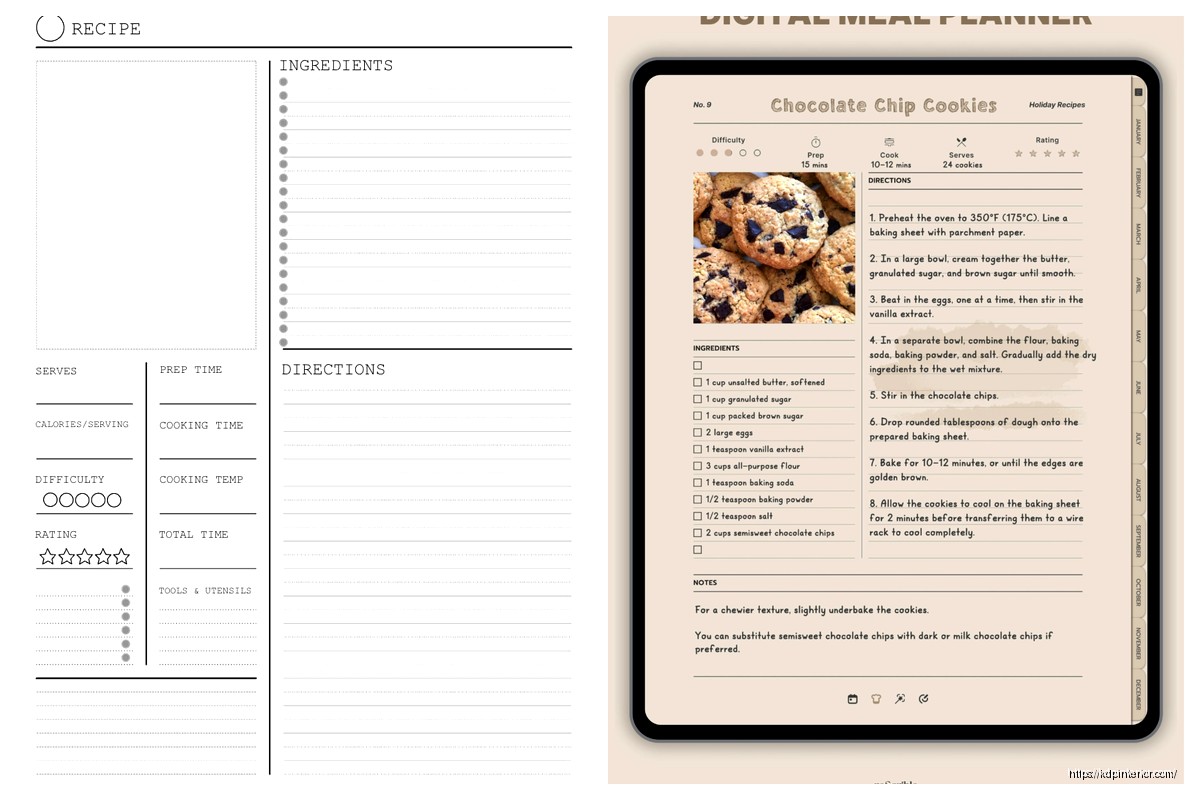
Your recipe title needs to be around 48-60pt if you’re doing an 8×10 book, maybe 36-42pt for 6×9. But here’s the thing – don’t center everything like it’s a wedding invitation. Left-aligned titles with a decorative element on the left margin actually scan better when people are flipping through pages quickly. I tested this with my own pumpkin bread cookbook that did surprisingly well last fall, and the left-aligned version had way better preview-to-sale conversion.
Right under the title you want your prep time, cook time, total time, and servings. Use icons here if you can – little clock symbols, fork and knife stuff. Canva has decent free ones but honestly Noun Project is better if you have the pro account. Make these like 10-12pt with the actual info in bold at maybe 14-16pt. The contrast helps people skim.
Subtitle Strategy
If your recipe needs a subtitle or description line, keep it to one sentence max. Something like “Crispy on the outside, fluffy on the inside” or whatever. I see people writing whole paragraphs here and it’s just… nobody reads that when they’re trying to cook. Put it in 18-20pt italic, maybe a lighter weight font than your title.
The Ingredients Section Layout
This is where I see the most disasters honestly. You need clear visual separation between the ingredients list and the instructions because people glance back and forth constantly while cooking.
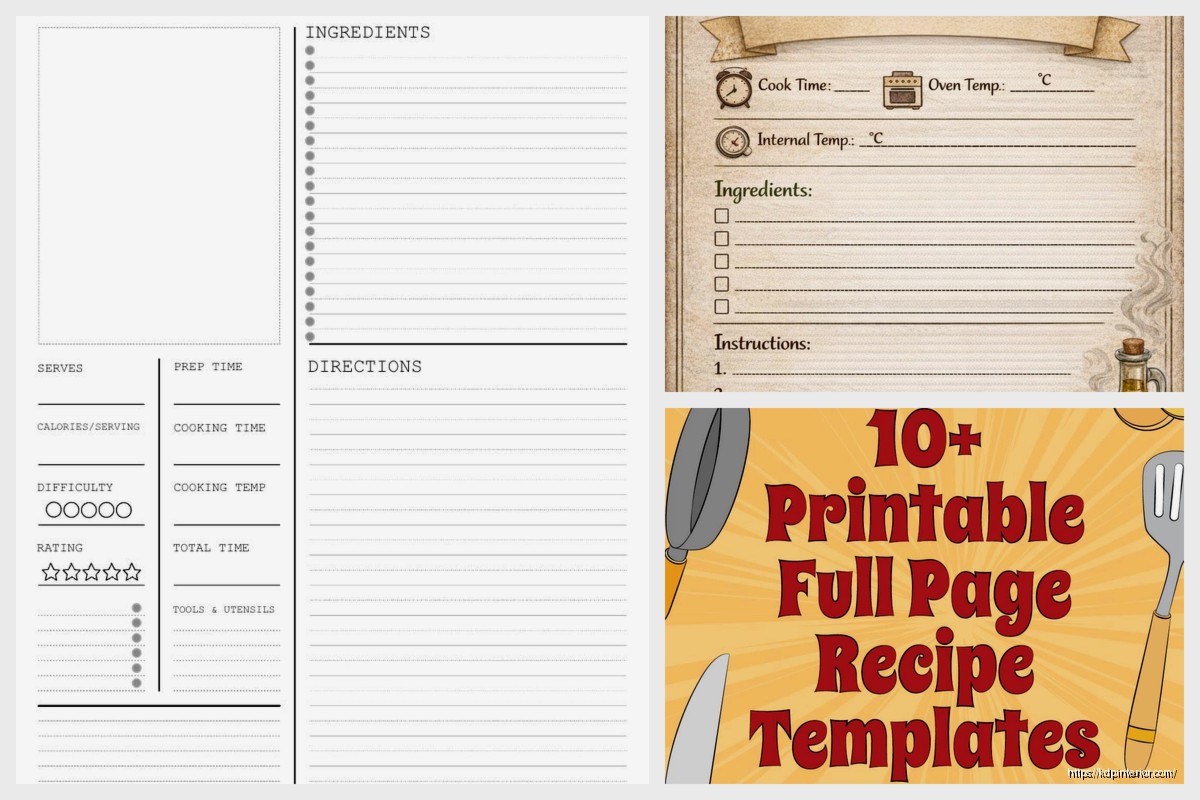
Use a two-column layout if you’re doing 8×10 or larger. Ingredients on the left taking up about 40% of the page width, instructions on the right with 60%. For 6×9 books you gotta stack them vertically which is fine but then you need more white space between sections.
Ingredient List Formatting
- Use actual bullet points or checkboxes – the checkbox thing performs really well because people like checking stuff off
- Amount first, then ingredient, then preparation method: “2 cups flour, sifted” not “flour, 2 cups, sifted”
- Keep it to one line per ingredient when possible
- If something has sub-ingredients like a sauce within the recipe, use a subheading in bold
- Font size around 11-12pt, line spacing at 1.5 or even 1.75
I was watching The Bear while formatting a pasta cookbook and realized they show ingredients lists on screen the same way – super clean, lots of breathing room. That show is actually great reference for cookbook design if you ignore all the chaos.
The Instructions Section That Actually Works
Number your steps. Always. I don’t care if it’s only three steps, number them. Use a bold number that’s slightly larger than your body text – if your instructions are in 11pt, make the numbers 14pt and bold.
Each step should be its own paragraph with space after it. Like 12pt of space minimum. People need to be able to find their place quickly when they look up from the stove.
Step Length
Keep individual steps to 2-3 sentences max. If you’re writing more than that, it should probably be two separate steps. I learned this the hard way when my first bread cookbook had these massive paragraph steps and people complained in reviews about losing their place.
Oh and another thing – if a step has a specific time or temperature, put that in bold within the text. “Bake at 350°F for 25-30 minutes” – that bold number catches the eye when someone’s trying to remember the temp.
Visual Elements and Spacing
You need white space like you need air to breathe. Seriously. Cramped recipe pages look cheap and they’re actually harder to use.
Margins should be at least 0.5 inches on all sides, but I usually do 0.75 inches. Amazon’s KDP can be finicky with bleed anyway so give yourself room.
Between major sections – like between ingredients and instructions – you want at least 24pt of space. Maybe even a decorative line or border element if it fits your cookbook’s style.
Photo Placement Options
This is gonna sound weird but I actually don’t always include photos on the recipe pages themselves. Sometimes I do a photo on the opposite page, sometimes I do a small photo in the top right corner of the recipe page, sometimes no photo at all if it’s a budget project.
When I do include photos on the recipe page:
- Top right corner, roughly 2×2 inches for an 8×10 page
- Make sure it doesn’t crowd the title
- Use a subtle border or shadow to separate it from text
- Or go full-bleed photo on the left page, recipe on the right page – this works great for high-end cookbooks
The full-page photo approach costs more in printing but it looks premium. I used this for a holiday cookie book and even though my margins were tighter, it sold at a higher price point.
Font Choices That Don’t Suck
Okay so for recipe books you need two fonts max, maybe three if you’re using a decorative font for just the title.
Body text (ingredients and instructions): Use a serif font like Garamond, Crimson Text, or even Georgia. These are easier to read in paragraph form. Size 11-12pt depending on the font – some fonts look smaller than others at the same point size.
Titles and headers: Sans-serif like Montserrat, Raleway, or Lato work great. Or a serif like Playfair Display if you want something more elegant. Just make sure there’s clear contrast between your header font and body font.
My dog just knocked over my coffee so hang on… okay back.
Font Weight Hierarchy
Use different weights to create hierarchy without changing fonts:
- Recipe title: Bold or Semi-Bold
- Section headers (Ingredients, Instructions): Bold
- Body text: Regular
- Optional subtitle or notes: Light or Italic
Don’t go crazy with different weights though. Three weights of the same font family is plenty.
The Notes and Tips Section
Put this at the bottom of the recipe, after instructions. Use a different background color – like a light gray box or beige if your book has that kind of color scheme – to visually separate it.
Label it clearly: “Chef’s Note,” “Tips,” “Substitutions,” whatever fits your book’s voice. Keep it brief. Two to three sentences max unless it’s a really complex recipe that needs more guidance.
I use a slightly smaller font here, like 10pt, and sometimes italic to differentiate it from the main instructions.
Nutritional Information Layout
If you’re including nutrition facts, put them at the very bottom in small text, like 8-9pt. You can do a simple line format: “Calories: 250 | Protein: 6g | Carbs: 32g | Fat: 11g”
Or if you wanna get fancy, create a small table. But honestly most low-content cookbook publishers skip detailed nutrition info because it requires real testing or calculation tools.
Template Structure in Design Software
Whether you’re using Canva, InDesign, or whatever, set up your template as a master page or reusable template file.
For Canva:
- Create your layout once with placeholder text
- Use the “Make a copy” feature for each new recipe
- Lock elements you don’t want to accidentally move (like decorative borders or page numbers)
- Save color schemes so you’re consistent across all recipes
For InDesign (which I prefer for bigger projects):
- Set up master pages with your basic structure
- Create paragraph styles for every text element – this is huge for consistency
- Use text boxes that thread together for long instructions
- Save as a template file so you don’t accidentally overwrite it
Common Layout Mistakes I See Constantly
Too many fonts. I reviewed a BBQ cookbook last month that used FIVE different fonts on a single recipe page. It looked like a ransom note.
Not enough contrast between sections. If your ingredients blend into your instructions visually, people will get confused and frustrated.
Centered text for everything. Center alignment looks formal but it’s actually harder to read for lists and paragraphs. Left-align your ingredients and instructions.
Tiny margins. Amazon will cut into your text if you don’t leave enough margin, especially on the inside binding edge. Use at least 0.75 inches there.
Inconsistent spacing. Every recipe page should have the same spatial rhythm – same amount of space between title and ingredients, between ingredients and instructions, etc.
Page Numbers and Headers/Footers
Put page numbers in the bottom outside corners – bottom left for left-hand pages, bottom right for right-hand pages. Size them around 10-11pt.
For headers, you can include the book title on left pages and the chapter name or recipe category on right pages. But keep these subtle – maybe 9pt and in a lighter weight or gray color. They shouldn’t compete with the recipe content.
Some cookbooks skip headers entirely and just do page numbers. That’s fine too, especially for simpler designs.
Color Schemes for Recipe Pages
Most print cookbooks stick to black text on white or cream backgrounds because it’s cheapest to print and easiest to read. But you can add color through:
- Decorative elements like borders or icons
- Background boxes for notes sections
- Section headers
- Page numbers or recipe titles
If you’re doing full color printing anyway (because of photos), you can use more color. But keep body text black for readability.
I did a Mediterranean cookbook with blue accents throughout – blue section headers, blue decorative elements, blue page numbers. It tied into the whole coastal vibe without making it hard to read.
Testing Your Layout Before Publishing
Print out a few sample pages at actual size before you upload to KDP. Seriously. What looks good on screen doesn’t always translate to print.
Check:
- Is the text large enough to read comfortably?
- Do the margins feel spacious enough?
- Can you easily distinguish between ingredients and instructions at a glance?
- Does anything feel cramped or crowded?
I always print 3-4 different recipe layouts and ask my wife which one she’d actually want to use in the kitchen. She’s brutally honest about what works and what doesn’t.
Adaptability for Different Recipe Lengths
Your template needs to flex for short recipes (like a basic vinaigrette with 5 ingredients and 2 steps) and longer ones (like a layered cake with 20 ingredients and 15 steps).
For short recipes, don’t try to fill the whole page. Let there be white space at the bottom. Maybe that’s where you put a larger photo or an extended notes section.
For long recipes that run onto two pages, make sure the break happens at a logical spot – like after the ingredients list, or between logical groups of instructions. And add “continued on next page” at the bottom so people don’t think they’re done.
Wait I forgot to mention – if you’re doing a two-page spread for long recipes, keep the ingredients visible on the left page so people don’t have to flip back and forth. They can glance left to check ingredients while reading instructions on the right.
Special Layout Considerations
Some recipe types need modified layouts. Like if you’re doing a cocktail book, you might want the ingredients in a different visual style – maybe with the liquid measurements in a vertical scale graphic or something.
Baking recipes often benefit from having ingredient weights alongside volume measurements, which takes more space.
Instant Pot or slow cooker recipes need clear timing for different settings.
Just think about how someone will actually use the recipe and adjust your template accordingly. The goal is making cooking easier, not just making something that looks pretty in a preview.
Okay that’s basically everything I’ve learned from doing this for years. Your template should be clean, readable, and consistent across all recipes. Don’t overthink the decorative stuff – functionality matters way more than fancy borders or whatever.
 Editable Canva Lined Journal: Express Your Thoughts - KDP Template
1 × $0.00
Editable Canva Lined Journal: Express Your Thoughts - KDP Template
1 × $0.00  Printable Blank Comic Book Pages PDF : Create Your Own Comics - 3 Available Sizes
1 × $0.00
Printable Blank Comic Book Pages PDF : Create Your Own Comics - 3 Available Sizes
1 × $0.00  Lined Pages Journal 120 pages Ready to Upload PDF Commercial Use KDP Template 6x9 8.5x11 5x8 for Notebooks, Diaries, Low Content
1 × $0.00
Lined Pages Journal 120 pages Ready to Upload PDF Commercial Use KDP Template 6x9 8.5x11 5x8 for Notebooks, Diaries, Low Content
1 × $0.00 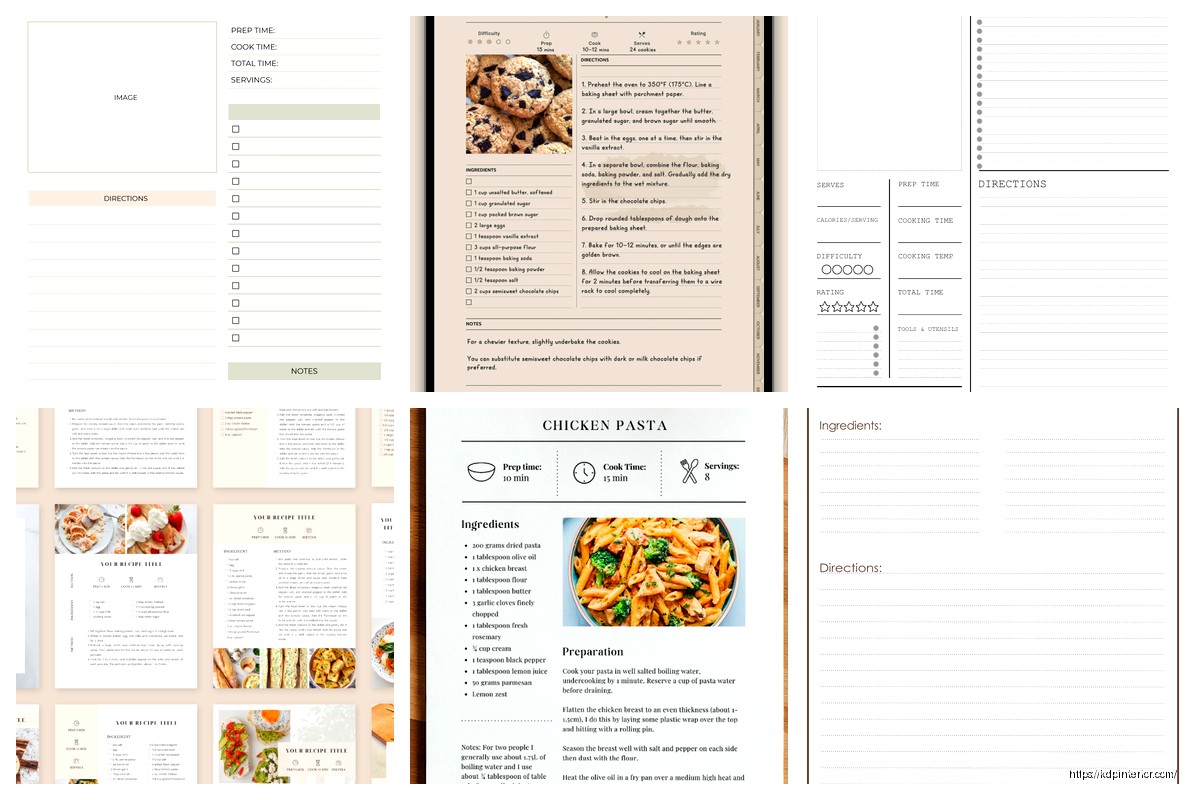
DISCOVER OUR FREE BEST SELLING PRODUCTS
Editable Canva Lined Journal: Express Your Thoughts – KDP Template
Lined Pages Journal 120 pages Ready to Upload PDF Commercial Use KDP Template 6×9 8.5×11 5×8 for Notebooks, Diaries, Low Content
Lined Pages Journal 120 pages Ready to Upload PDF Commercial Use KDP Template 6×9 8.5×11 5×8 for Notebooks, Diaries, Low Content
Cute Dogs Coloring Book for Kids | Activity Book | KDP Ready-To-Upload
Daily Planner Diary : Diary Planners for Everyday Productivity, 120 pages, 6×9 Size | Amazon KDP Interior
Wolf Coloring KDP interior For Adults, Used as Low Content Book, PDF Template Ready To Upload COMMERCIAL Use 8.5×11"
Coloring Animals Head Book for Kids, Perfect for ages 2-4, 4-8 | 8.5×11 PDF
Printable Blank Comic Book Pages PDF : Create Your Own Comics – 3 Available Sizes
Notes KDP interior Ready To Upload, Sizes 8.5×11 6×9 5×8 inch PDF FILE Used as Amazon KDP Paperback Low Content Book, journal, Notebook, Planner, COMMERCIAL Use
Black Lined Journal: 120 Pages of Black Lined Paper Perfect for Journaling, KDP Notebook Template – 6×9
Student Planner Journal 120 pages Ready to Upload PDF Commercial Use KDP Template 6×9" 8.5×11" for Low Content book
Recipe Journal Template – Editable Recipe Book Template, 120 Pages – Amazon KDP Interior