-
×
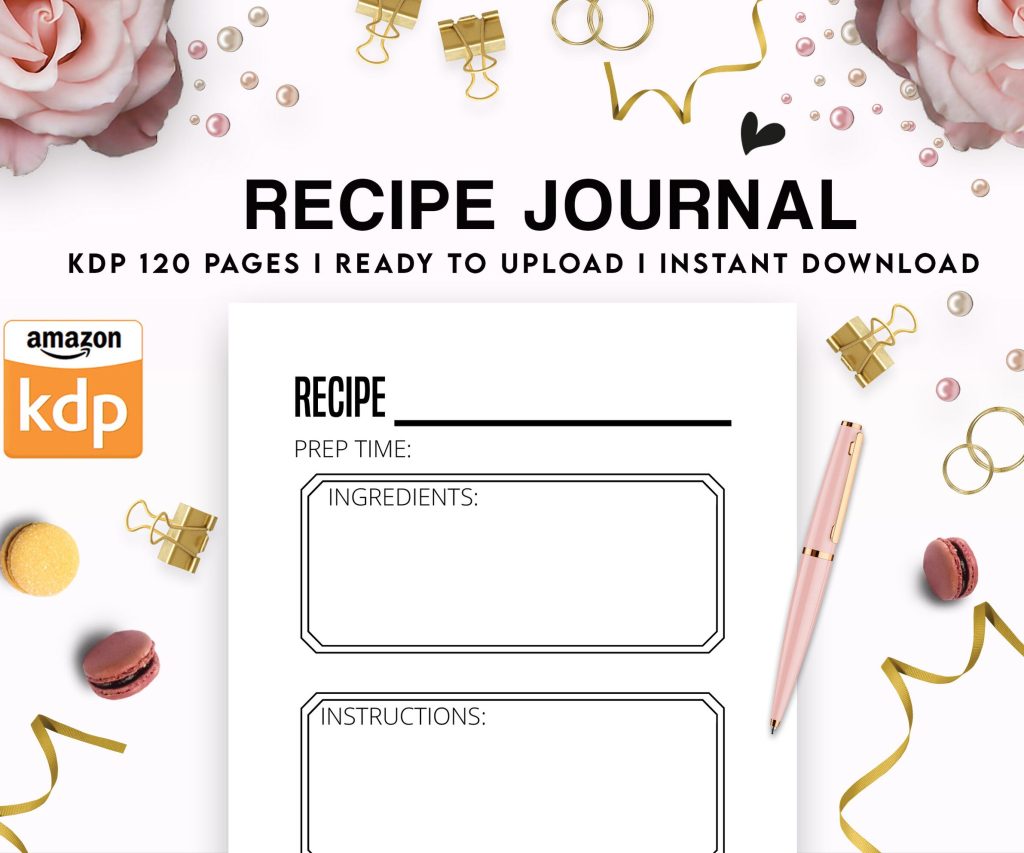 Recipe Journal Template - Editable Recipe Book Template, 120 Pages - Amazon KDP Interior
1 × $0.00
Recipe Journal Template - Editable Recipe Book Template, 120 Pages - Amazon KDP Interior
1 × $0.00
Subtotal: $0.00
Recipe Journal Template - Editable Recipe Book Template, 120 Pages - Amazon KDP Interior
1 × $0.00 Subtotal: $0.00
Okay so booklet covers are weirdly tricky and I spent like three hours last Tuesday trying to figure out why my mini book mockup looked amazing on my screen but completely fell apart when someone viewed it on their phone and honestly the answer is gonna sound stupid but it’s all about your canvas dimensions from the start.
First thing – and I cannot stress this enough – you gotta work in the actual trim size you’re planning. Most people designing these mini booklets are doing either 5×8 or 6×9 inches because that’s what prints cheap on KDP, but I’ve seen people design in like random sizes and then try to squeeze everything down later and it just… doesn’t work. Your text gets muddy, your images pixelate, the whole thing looks amateur.
So here’s what I do every single time now. Open whatever design software you’re using – I bounce between Canva Pro and Affinity Publisher depending on if I’m being lazy or not – and create a custom dimension. Let’s say you’re doing a 6×9 booklet. You need 300 DPI minimum for print. That means your canvas should be 1800×2700 pixels if you’re working digitally. Yeah it seems huge but trust me.
The bleed is where people mess up constantly. KDP wants 0.125 inches of bleed on all sides for paperbacks. That’s an extra 37.5 pixels per side at 300 DPI. So your actual working canvas with bleed becomes 1875×2775 pixels. But here’s the thing – you can’t put important text or images in that bleed area OR in the 0.125 inch safe zone inside the trim. So effectively you’re designing in an even smaller space.
I made this mistake with a recipe booklet last month where I put the subtitle right at the edge and KDP’s reviewer flagged it immediately. Had to redo the whole thing.
Your mini book cover needs like three levels max. Title, subtitle, and maybe author name or a tiny tagline. That’s it. I see people trying to cram five different text elements and it looks like a ransom note.
Title should be HUGE. I’m talking 72pt minimum for a 6×9 cover, sometimes I go up to 120pt if it’s a short punchy title. The goal is someone scrolling Amazon on their phone during their lunch break should be able to read it instantly. Test this yourself – pull up your design on your phone from across the room. Can you read it? No? Make it bigger.
Subtitle can be like 24-36pt depending on length. And here’s something I learned from watching my own sales data – subtitles that explain the benefit perform better than clever ones. “50 Gratitude Prompts for Daily Reflection” beats “Journey Into Thankfulness” every single time in my niche testing.
Okay so funny story, I used to think you needed fancy color theory knowledge but honestly you just need contrast and restraint. Pick two colors, maybe three if one is neutral. That’s it.
I use this trick now where I go to Coolors.co and generate palettes until something feels right for the topic, then I only use two of those colors plus white or black. My best-selling budget planner has navy blue and coral. That’s the whole color scheme. Simple but it pops in thumbnails.
The thumbnail test is crucial – your cover at 500 pixels wide should still look clear and the title readable. Amazon shows covers tiny in search results and if yours is a muddy mess of six colors, people scroll right past. I tested this with identical content but different covers and the high-contrast simple design got 3x more clicks.
Oh and another thing – avoid gradients if you’re printing. They look amazing on screen but can print weird with banding issues. Solid colors are your friend.
You don’t need custom illustrations unless you’re trying to compete in the super saturated niches. Most of my mini book covers use simple geometric shapes or public domain photos from Unsplash.
If you’re using photos, they need to be high res – minimum 300 DPI at the size you’re placing them. I download the largest size available and then scale down in my design program, never up. Scaling up looks terrible when printed.
For geometric designs, I actually prefer these because they’re easier to make look professional without much skill. Circles, rectangles, triangles arranged in interesting ways with your text overlaid. There’s this booklet I made about morning routines that’s literally just three overlapping circles in different shades of blue with white text. It’s been my second best seller for eight months.
Pattern backgrounds can work but keep them subtle. I tried a busy floral pattern once and it competed too much with the text. Now I use patterns at like 20-30% opacity maximum.
Don’t use more than two fonts. Seriously. One for the title, one for subtitle/author name. That’s the rule.
And they need to contrast – if your title is a bold serif font, make your subtitle a clean sans-serif. Or vice versa. I usually go with a chunky attention-grabbing font for titles (think Bebas Neue, Montserrat Bold, Oswald) and then something readable but subtle for subtitles (Open Sans, Lato, Roboto).
Script fonts are dangerous territory. They look elegant but become completely unreadable at thumbnail size. I’ve used them exactly twice in 200+ covers and both times I made them MASSIVE to compensate.
Letter spacing matters more than people think. Sometimes bumping up the tracking (space between letters) by like 50-100 makes a title way more readable and gives it a premium feel. I do this especially with all-caps titles.
For mini books and booklets, honestly the author name doesn’t need to be prominent unless you’re building a recognizable brand. I put mine small at the bottom, maybe 18pt, because people buying a “Weekly Meal Planner” don’t really care who made it – they care that it solves their problem.
But if you’re doing a series, keep your name placement consistent across all covers so people start recognizing your brand. Same font, same position, same size.
Canva is where most people start and honestly it’s fine for booklet covers. The free version works but Pro gives you better fonts and the transparent background feature which is super useful. Their templates are hit or miss – some are great starting points, others look like everyone else’s covers.
I switched to Affinity Publisher for more control but there’s a learning curve. It’s a one-time purchase though which beats Adobe’s subscription if you’re doing this regularly.
For super simple designs, even PowerPoint or Google Slides can work. I know that sounds janky but I’ve made functional covers in PowerPoint when I needed something quick. Just export as PDF at highest quality.
Before you upload anything, create a 3D mockup and look at it on different devices. There are free mockup generators online or you can use Placeit. Seeing your flat design on an actual book shape shows problems you miss otherwise.
I caught a spacing issue with a journal cover because the mockup made it obvious that my title was too close to the top edge. Looked fine flat, looked weird on the 3D version.
Also – and this is gonna sound paranoid but whatever – I text the mockup image to myself and open it on my phone. That’s the real test. If it doesn’t grab my attention in my text messages, it won’t grab attention on Amazon.
Colors print darker than they appear on screen. Like consistently. I now lighten my backgrounds by about 10-15% before finalizing because I got burned on this with a “light blue” cover that printed almost navy.
Test prints are worth it if you’re doing a big launch. KDP’s proof copy is like $4-5 shipped. Order it, see how your cover actually looks, adjust if needed. I do this for any book I think will sell more than 50 copies.
Matte vs glossy finish changes how colors look too. Glossy makes colors more vibrant but shows fingerprints. Matte is more sophisticated but can look a bit dull if your design doesn’t have enough contrast. I usually go matte for journals and planners, glossy for colorful cookbooks or kids stuff.
Okay so depending what your mini book is about, the cover approach changes a bit. Planners and journals need to communicate organization and calm – think clean layouts, lots of white space, maybe some gold accents. My cat knocked over my coffee on a planner cover design last week and honestly the water stain looked better than my original background so… sometimes accidents work out.
Recipe booklets should show food or at least suggest it with colors. Warm oranges, reds, greens. I avoid showing actual food photos on covers now because the licensing gets complicated and stock food photos often look fake.
Activity books for kids need bold primary colors and playful fonts. These can be busier than adult covers because parents are choosing them, not kids, and parents want to see “value” which sometimes means more visual elements.
This is technical but important – your title needs to be readable at 50 pixels wide. That’s roughly how small it appears in some Amazon widgets and mobile views. Go to Canva or whatever, create a 50px wide version of your cover. Can you read the title? If not, simplify or enlarge.
I keep a little checklist now:
– Title readable at 50px
– Overall design recognizable at 100px
– All text readable at 500px
– Colors work in grayscale (some people have color blindness)
That last one is something I never thought about until someone mentioned they couldn’t distinguish my green and red cover elements. Now I make sure my designs work even without color through contrast alone.
Save your final cover as PDF for KDP upload. In Canva, choose PDF Print with crop marks and bleed. In other software, make sure you’re exporting at 300 DPI minimum.
Keep a high-res PNG backup too at like 3000px on the longest side. You’ll need this for marketing, social media, creating ads, whatever.
Don’t compress your files before uploading to KDP. Their system does its own compression and if you pre-compress you’re just degrading quality twice.
File name should be simple – “BookTitle_Cover_Final.pdf” – because you’ll have multiple versions and you don’t wanna upload the wrong one. I’ve done this. It’s annoying.
Wait I forgot to mention – KDP’s cover calculator is useful for getting exact dimensions with spine width if you’re doing a wrap-around cover, but for mini booklets under 100 pages the spine is super thin so most people just do front covers. The calculator is at kdp.amazon.com/cover-calculator if you need it.
Honestly the biggest thing is just starting. Your first booklet cover will probably be mediocre and that’s fine. I look at my early covers and cringe but they still sold because the content was solid. You get better by doing it repeatedly and paying attention to which designs get clicks versus which ones don’t.
DISCOVER OUR FREE BEST SELLING PRODUCTS
Editable Canva Lined Journal: Express Your Thoughts – KDP Template
Lined Pages Journal 120 pages Ready to Upload PDF Commercial Use KDP Template 6×9 8.5×11 5×8 for Notebooks, Diaries, Low Content
Lined Pages Journal 120 pages Ready to Upload PDF Commercial Use KDP Template 6×9 8.5×11 5×8 for Notebooks, Diaries, Low Content
Cute Dogs Coloring Book for Kids | Activity Book | KDP Ready-To-Upload
Daily Planner Diary : Diary Planners for Everyday Productivity, 120 pages, 6×9 Size | Amazon KDP Interior
Wolf Coloring KDP interior For Adults, Used as Low Content Book, PDF Template Ready To Upload COMMERCIAL Use 8.5×11"
Coloring Animals Head Book for Kids, Perfect for ages 2-4, 4-8 | 8.5×11 PDF
Printable Blank Comic Book Pages PDF : Create Your Own Comics – 3 Available Sizes
Notes KDP interior Ready To Upload, Sizes 8.5×11 6×9 5×8 inch PDF FILE Used as Amazon KDP Paperback Low Content Book, journal, Notebook, Planner, COMMERCIAL Use
Black Lined Journal: 120 Pages of Black Lined Paper Perfect for Journaling, KDP Notebook Template – 6×9
Student Planner Journal 120 pages Ready to Upload PDF Commercial Use KDP Template 6×9" 8.5×11" for Low Content book
Recipe Journal Template – Editable Recipe Book Template, 120 Pages – Amazon KDP Interior