Okay so last month I spent like three days straight building templates for a client and honestly, templates are one of those things where if you set them up right the first time, you’ll save yourself hundreds of hours down the road. Let me walk you through exactly how I do this because there’s a specific order that matters.
Starting With Your Actual Dimensions
First thing – and I cannot stress this enough – you need to know your trim size before you do anything else. Amazon KDP has specific trim sizes they accept and if you go rogue with some weird custom size, you’re gonna hate yourself during upload. The most common ones I use are 6×9 inches for most books, 8.5×11 for workbooks or planners, and 5×5 or 8×8 for square books if you’re doing like journals or photo books.
Here’s what most people screw up though… they forget about the bleed. Amazon requires 0.125 inches of bleed on all sides if you’re doing anything that goes to the edge of the page. So your actual document size in whatever program you’re using needs to be 6.25 x 9.25 inches if you’re doing a 6×9 book with bleed. Without bleed it’s just the straight 6×9.
I usually create both versions honestly because sometimes I’m doing books with borders and designs that bleed off the page, other times I’m doing simple text-only books where bleed doesn’t matter.
Choosing Your Software (This Matters More Than You Think)
So you’ve got options here and they all have tradeoffs. I’m gonna be real with you about each one because I’ve used all of them at different points.
Microsoft Word – Look, people give Word a lot of crap for book design but for simple templates especially text-heavy books, it works fine. The big advantage is most people already have it and know how to use it. Set up your page size under Page Layout, set your margins (I do 0.75 inches on the outside edges, 0.875 or 1 inch on the inside/gutter for binding), and you’re basically good. The header and footer tools are actually pretty decent once you figure out how to do different odd/even pages.
Adobe InDesign – This is what I use for anything complex or when I’m doing low-content books with repeating design elements. It’s professional-grade and honestly worth learning if you’re serious about this. The master pages feature alone is worth it… you can set up your template once and apply it to 200 pages instantly. But yeah, it’s a subscription and there’s a learning curve. I spent like two weeks watching YouTube tutorials when I first started and my dog kept barking during every video which was super annoying but whatever.
Canva – Plot twist, Canva actually works pretty well for certain types of books. I use it mostly for low-content stuff like planners, journals, coloring books. The big limitation is it’s not great for long text-based books and you have to download each page as a separate file usually then compile them into a PDF. But for visual templates where you’re duplicating pages, it’s fast.
Affinity Publisher – This is like InDesign but you pay once instead of subscribing. I switched to this for some projects and it does like 90% of what InDesign does. Good middle ground if you don’t wanna commit to Adobe.
Setting Up Margins and Gutters (Don’t Skip This)
Okay so funny story, I published my first three books without really understanding gutter margins and when I got the proof copies, the text was like disappearing into the spine. Had to redo everything. Learn from my mistakes here.
The gutter is the inside margin where the book binding is. You need extra space there because the book curves when you open it. Amazon’s calculator tool will tell you the minimum gutter margin based on page count, but here’s my cheat sheet that I use:
- Under 100 pages: 0.5-0.625 inches gutter
- 100-300 pages: 0.75-0.875 inches gutter
- 300-500 pages: 0.875-1 inch gutter
- Over 500 pages: 1-1.25 inches gutter
For the outside margins (top, bottom, outside edge), I usually do 0.75 inches minimum. Some people go smaller but then you risk the text feeling cramped. For workbooks or planners where people write in them, I go bigger like 1 inch all around except the gutter.
Setting This Up in InDesign
When you create a new document in InDesign, check the “Facing Pages” option. This makes it show like an open book which is way easier to design with. Then in margins, make sure you’re setting the “Inside” margin (that’s your gutter) different from the “Outside” margin.
Under Layout, go to Margins and Columns and you can adjust these anytime. I usually set up a 1-column layout for regular books but sometimes I do 2-column for workbooks or activity books.
Master Pages Are Your Best Friend
If you’re using InDesign or Affinity Publisher, master pages are how you create elements that repeat on every page without manually placing them each time. This is where the real template magic happens.
I typically create at least three master pages:
- A-Master – This is my base page with just margins set up, nothing else
- B-ContentLeft – Left-side pages with page numbers, headers, any decorative elements
- C-ContentRight – Right-side pages, mirror of the left but flipped
Sometimes I’ll add more like a chapter opening master page that’s different, or blank pages for when I need them between sections.
To create a master page in InDesign, look at the Pages panel (Window > Pages if you don’t see it). Right-click in the top section where it says “A-Master” and duplicate it or create a new one. Double-click to edit it.
On your master pages, this is where you add:
- Page numbers (Type > Insert Special Character > Markers > Current Page Number)
- Headers or footers with book title or chapter names
- Decorative borders or design elements that repeat
- Any background colors or textures
The page number thing in InDesign is actually really smart… you insert this marker that just says like “A” but when you apply that master to actual pages, it automatically numbers them correctly. Saves so much time.
Typography Setup (This Makes or Breaks Readability)
Okay so I was watching this documentary about fonts last week – actually it was playing while I worked – and it made me think about how much the font choice actually matters for book templates.
For body text, you want a serif font. Serifs are those little feet on the letters and they help guide your eye along the line. Don’t use sans-serif for body text in print books, it’s harder to read in long form. Good options:
- Garamond (my go-to, classic and readable)
- Baskerville
- Caslon
- Georgia (if you need something more casual)
- Minion Pro
Font size for body text should be 10-12 point depending on the font. Some fonts look bigger than others at the same point size. Garamond I usually do at 11pt, Georgia at 10pt. Line spacing (leading) should be 120-145% of your font size. So if you’re using 11pt font, your leading should be around 13-14pt.
Set this up as a Paragraph Style. In InDesign, Window > Styles > Paragraph Styles. Create a new style called like “Body Text” and set all your specs – font, size, leading, alignment (justified usually for books), hyphenation settings, spacing before/after paragraphs.
Then create styles for:
- Chapter titles
- Section headings
- Subheadings
- Block quotes
- Bullet lists
- Numbered lists
- Captions if you have images
This way when you’re actually filling in content, you just select text and click the style. Everything stays consistent automatically.
Headers and Footers
I usually put page numbers in the footer, centered or on the outside corner. Headers often have the book title on left pages and chapter title on right pages, or vice versa. Keep the header text small, like 9pt, and maybe use italic or small caps so it doesn’t compete with body text.
In InDesign, you add text frames on your master pages for this. Draw a text box where you want the header, type your text or insert the page number marker, style it how you want.
One trick… if you want chapter titles to automatically appear in headers, you gotta use the Running Header feature which is kinda advanced. Honestly for most of my books I just manually type the chapter name in the header on the master page I use for that chapter. It’s less automated but easier to control.
Building Templates for Different Book Types
Wait I forgot to mention this earlier but you’re gonna need different template setups depending on what kind of book you’re making. Let me break down the main types I use.
Text-Only Books (Novels, Non-Fiction)
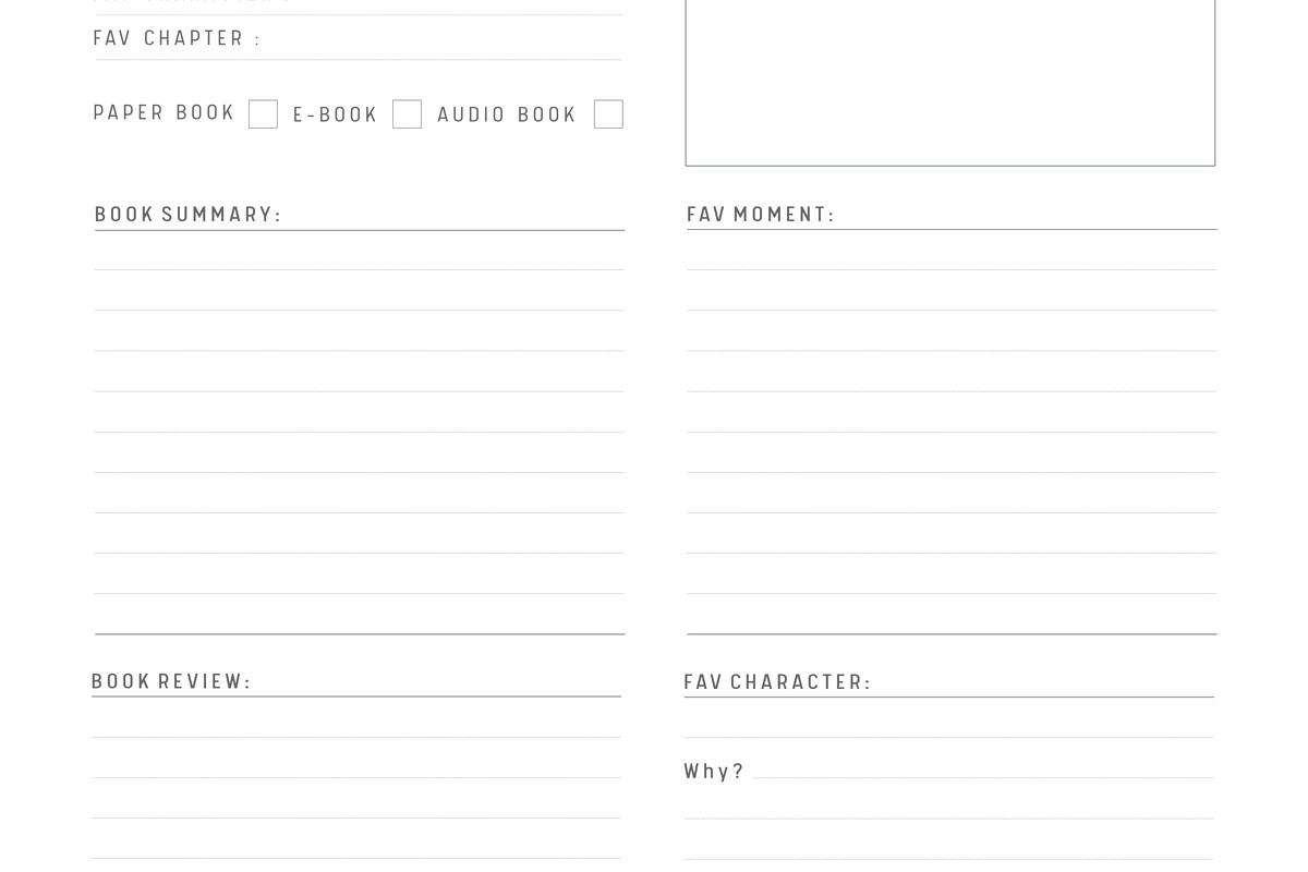
These are the simplest. Set up your margins, create your paragraph styles, set up master pages with page numbers and maybe headers. Front matter (title page, copyright page, table of contents) usually doesn’t have page numbers showing or uses Roman numerals. I create separate master pages for front matter vs main content.
One thing that tripped me up initially… Amazon KDP needs your page numbering to start fresh at the main content. So front matter is numbered separately (or not at all) and then Chapter 1 starts at page 1. You do this with Sections in InDesign.
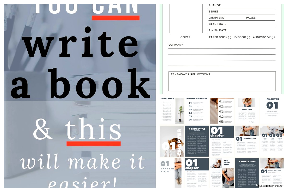
Low-Content Books (Journals, Planners, Notebooks)
These templates are more about repeating design elements. I’ll create like 5-10 different page designs then duplicate them to fill out the book.
For a lined journal, I’m literally just creating horizontal lines at consistent spacing. For planners, I’m setting up grids, date fields, to-do lists, etc.
My client canceled last month so I spent like four hours comparing lined journal templates and honestly the spacing between lines matters more than you’d think. Too close together (less than 0.25 inches) and it’s hard to write in. Too far apart (more than 0.4 inches) and it feels wasteful. I settled on 0.3 inches for most journals.
For these books, I often use Canva because the duplication is faster, but InDesign is better if you’re doing complex designs. In InDesign you can set up guides and grids (View > Grids & Guides) and snap objects to them which keeps everything perfectly aligned.
Workbooks and Activity Books
These need more white space for people to write or draw. I usually do wider margins, bigger spacing between elements, and clear section breaks.
Text is usually bigger too, like 12-14pt body text. If it’s for kids, even bigger. And you’re mixing text with blank spaces, lines for writing, boxes for checking, etc.
I create multiple master pages for different activity types. One master for question-and-answer pages, another for fill-in-the-blank, another for drawing space, etc. Then I apply the right master to each page as I build out the book.
Coloring Books
Totally different beast. These are usually single-sided (image on right page, left page blank or has a copyright notice). I do these at 8.5×11 mostly.
The template here is pretty minimal… just the page size set up correctly and maybe a small copyright line at the bottom of each blank page. The actual content (the line art for coloring) is what takes time, but that’s not really a template thing.
One tip though… make sure your line weight is thick enough. I use 2-3pt lines minimum for coloring book art. Thinner than that and it doesn’t print well or is too hard to color within.
Creating Reusable Design Elements
So once you’ve got your basic template set up, you wanna create little design elements you can reuse across books. This is where you build up a library that speeds up future projects.
In InDesign, I use the CC Libraries feature (Window > CC Libraries). I save things like:
- Decorative borders and frames
- Divider lines or ornaments
- Chapter heading designs
- Text boxes with pre-styled formatting
- Color swatches for branded books
Then when I start a new book project, I just drag these elements from my library instead of recreating them. Saves so much time.
If you’re using Canva, they have a similar Brand Kit feature where you can save colors, fonts, and logos. And you can save entire page designs as templates to reuse.
Exporting Your Template for Actual Use
Okay so you’ve built this beautiful template… now what? You need to actually save it in a way that you can reuse it without messing up the original.
In InDesign: Save it as an .indd file (the normal InDesign format) but put it in a specific Templates folder. Some people save as .indt (InDesign Template) which creates a copy every time you open it so you can’t accidentally overwrite the original. I do this sometimes but honestly I just keep my templates in a separate folder and am careful.
Before saving, delete any placeholder text or images that were just there for testing. Or if you want to keep placeholder text to show where content goes, use the actual placeholder text feature (Type > Fill with Placeholder Text) so it’s obvious it’s not real content.
In Word: Save as a .dotx file (Word Template). File > Save As and choose Word Template from the format dropdown. This way when you open it, it creates a new document based on the template.
In Canva: You can’t really save custom templates in the free version, so I just duplicate my template project each time I need it. In Canva Pro you can save custom templates though.
Testing Your Template (Do This Before Publishing)
This is gonna sound obvious but you need to actually test your template with real content before you commit to it for a book. I learned this the hard way.
Take a chapter or section of actual text – like 10-20 pages worth – and flow it into your template. Look for:
- Is the text readable and comfortable to look at?
- Are the margins big enough? Does text disappear into the gutter?
- Do page numbers appear correctly?
- Are headers/footers positioned well?
- How does it look with different amounts of text on a page?
- What happens with paragraphs that break across pages?
Export it as a PDF (the format you’ll upload to KDP) and check the PDF carefully. Sometimes things shift during export.
Then – and this is important – order a physical proof copy. Amazon lets you order proofs before you publish. I do this for every new template I create because the digital file looks different from the physical book. Colors might be darker, text might look smaller, margins might feel different.
I’ve tweaked basically every template I use based on feedback from physical proofs. It’s an extra cost (proofs cost like $3-10 depending on page count) but it’s worth it.
Organizing Multiple Templates
Once you start building up a collection of templates, organization becomes important. I keep a folder structure like this:
- Templates
- Novels – 6×9
- Novels – 5×8
- Workbooks – 8.5×11
- Journals – 6×9
- Planners – 8.5×11
- Square Books – 8×8
Inside each folder, I have the base template file plus a README text file that notes things like “gutter is 0.875 inches, includes bleed, body text is Garamond 11pt” so I don’t have to open the file to remember the specs.
Advanced Template Features Worth Learning
If you’re getting serious about this, there’s some advanced stuff that’ll level up your templates.
Table of Contents Automation
In InDesign, you can set up automatic TOC generation based on paragraph styles. So if all your chapter titles use the “Chapter Title” style, InDesign can scan the document and create a TOC with page numbers automatically. Layout > Table of Contents.
This is amazing for longer books where you might add or remove pages and don’t wanna manually update the TOC every time.
 Black Lined Journal: 120 Pages of Black Lined Paper Perfect for Journaling, KDP Notebook Template - 6×9
1 × $0.00
Black Lined Journal: 120 Pages of Black Lined Paper Perfect for Journaling, KDP Notebook Template - 6×9
1 × $0.00  Editable Canva Lined Journal: Express Your Thoughts - KDP Template
1 × $0.00
Editable Canva Lined Journal: Express Your Thoughts - KDP Template
1 × $0.00 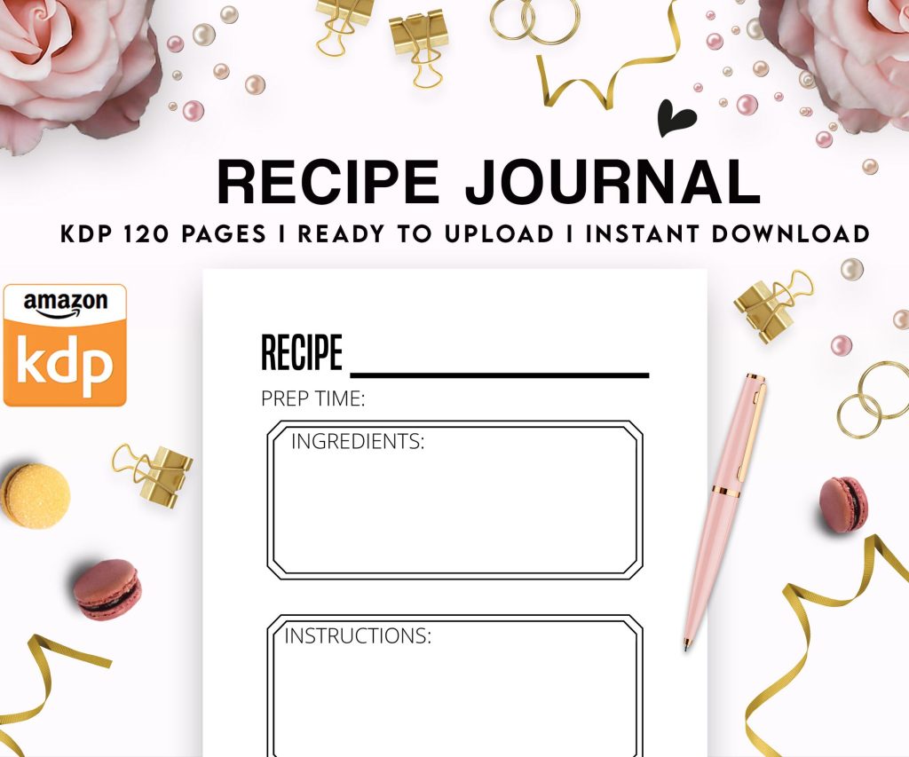 Recipe Journal Template - Editable Recipe Book Template, 120 Pages - Amazon KDP Interior
1 × $0.00
Recipe Journal Template - Editable Recipe Book Template, 120 Pages - Amazon KDP Interior
1 × $0.00 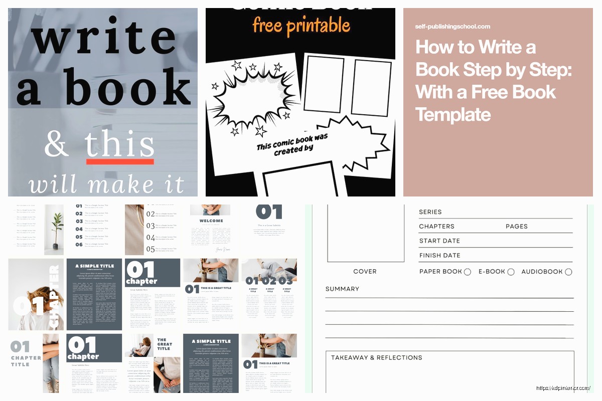
DISCOVER OUR FREE BEST SELLING PRODUCTS
Editable Canva Lined Journal: Express Your Thoughts – KDP Template
Lined Pages Journal 120 pages Ready to Upload PDF Commercial Use KDP Template 6×9 8.5×11 5×8 for Notebooks, Diaries, Low Content
Lined Pages Journal 120 pages Ready to Upload PDF Commercial Use KDP Template 6×9 8.5×11 5×8 for Notebooks, Diaries, Low Content
Cute Dogs Coloring Book for Kids | Activity Book | KDP Ready-To-Upload
Daily Planner Diary : Diary Planners for Everyday Productivity, 120 pages, 6×9 Size | Amazon KDP Interior
Wolf Coloring KDP interior For Adults, Used as Low Content Book, PDF Template Ready To Upload COMMERCIAL Use 8.5×11"
Coloring Animals Head Book for Kids, Perfect for ages 2-4, 4-8 | 8.5×11 PDF
Printable Blank Comic Book Pages PDF : Create Your Own Comics – 3 Available Sizes
Notes KDP interior Ready To Upload, Sizes 8.5×11 6×9 5×8 inch PDF FILE Used as Amazon KDP Paperback Low Content Book, journal, Notebook, Planner, COMMERCIAL Use
Black Lined Journal: 120 Pages of Black Lined Paper Perfect for Journaling, KDP Notebook Template – 6×9
Student Planner Journal 120 pages Ready to Upload PDF Commercial Use KDP Template 6×9" 8.5×11" for Low Content book
Recipe Journal Template – Editable Recipe Book Template, 120 Pages – Amazon KDP Interior