Okay so dedication pages are one of those things most people overthink but honestly once you get the formula down it’s pretty straightforward. I was testing like 15 different variations last month while my cat kept walking across my keyboard and here’s what actually works.
The Basic Setup Nobody Tells You About
So the dedication page goes right after your title page and copyright page. That’s the standard order. Title, copyright, then dedication. Some people flip copyright and dedication but I’ve found readers expect dedication to come third, and Amazon’s Look Inside feature shows it better that way.
Here’s the thing though – you don’t actually NEED a dedication page. Like half my books don’t have one because they’re low-content planners and it just feels weird dedicating a meal planner to someone. But for journals, especially guided ones, or anything with more personal content… yeah it adds that human touch people respond to.
Template Structure That Actually Works
The simplest template is just centered text. I’m gonna break this down:
Top margin: Start about 40-50% down the page. Not halfway, but close. This creates that clean look without making it seem like you forgot to delete extra space.
Font size: Same as your body text or maybe one size smaller. I usually do 11pt if my body is 12pt. Don’t go bigger – I see people make dedication text HUGE and it looks amateur.
Font style: Match your book‘s main font or use an italicized version. Sometimes I’ll use a complementary serif if the book is sans-serif, but that’s getting fancy.
The actual text format is dead simple:
For [person/group]
Or
Dedicated to [person/group]
That’s it. You can add a line or two explaining why but keep it under 3 lines total.
Word Count Sweet Spot
Okay so here’s where people mess up – they write these long paragraph dedications like they’re giving a wedding toast. Your dedication should be between 5-25 words max. I tested this with my journal sales and longer dedications actually decreased perceived quality in reviews. People mentioned books feeling “unprofessional” when dedications rambled.
Examples that worked well for me:
- For my mother, who taught me that planning is an act of self-love
- To dreamers everywhere – may you always find space to write
- For Sarah, who believed first
- Dedicated to coffee, without which this book wouldn’t exist
That last one was in a productivity planner and people loved it. Sometimes humor works if your book’s tone supports it.
The Generic Dedication Approach
Wait I forgot to mention – if you’re doing KDP books at scale like I do, you can use generic dedications that work for multiple books. I have a rotation of like 8 dedications I use:
- For those who dare to begin
- To seekers and believers
- For you, holding this book
- Dedicated to the journey ahead
These work because they’re vague enough to fit gratitude journals, planners, whatever. And honestly? Most readers skim the dedication anyway. It’s there for completeness more than anything.
Design Elements You Can Add
Okay so basic template is just text, but you can elevate it. Here’s what I actually use in Canva or InDesign:
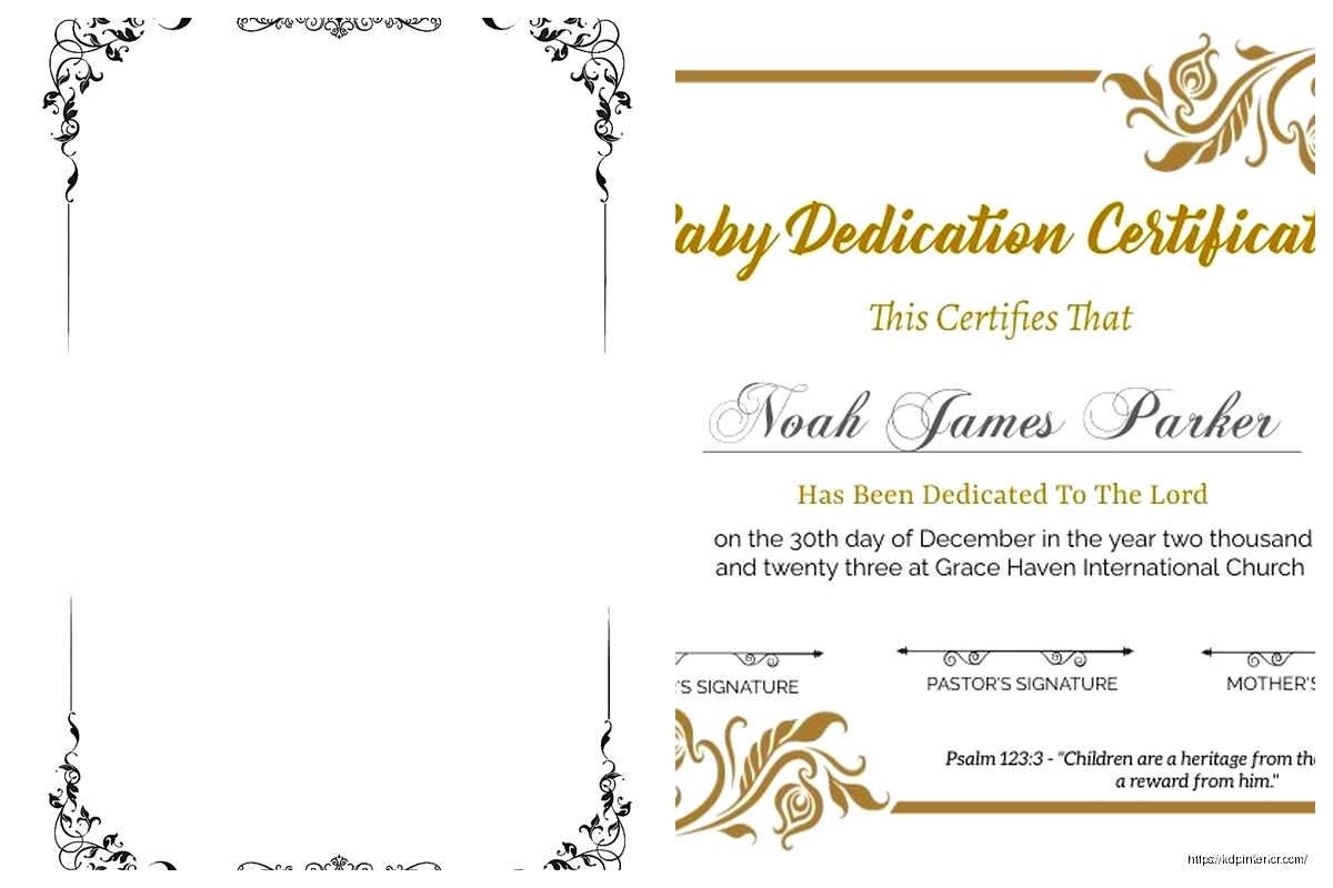
Option 1 – Simple line decoration: Put a small decorative line or ornament above and below the text. Nothing crazy. I use a 1pt line about 2 inches wide, centered. Creates visual boundary without cluttering.
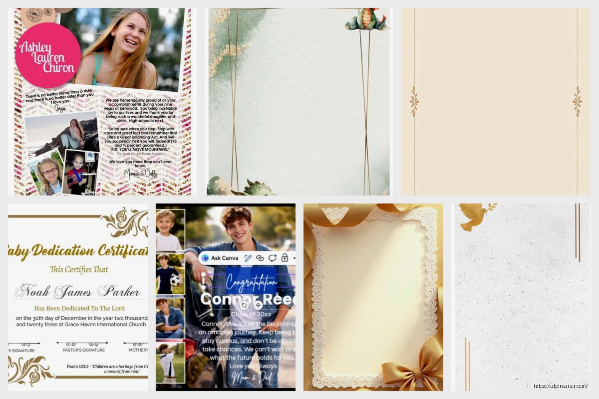
Option 2 – Page border: A thin border around the entire page, maybe 0.5pt weight, positioned about 0.75 inches from page edge. Makes it feel intentional and designed.
Option 3 – Small icon: If your book has a theme, add a tiny icon above the dedication. A heart for romance journals, a compass for travel planners, whatever. Keep it under 1 inch tall.
I was watching this documentary about fonts last week (yeah I know, exciting Friday night) and realized that dedication pages are where you can take the most design liberty because there’s so little text. Like you can try that fancy script font you couldn’t use in body text.
Alignment Options
Most dedications are centered. But here are alternatives that work:
- Right-aligned: Looks modern, works great for contemporary designs
- Left-aligned: More casual, good for informal books or memoirs
- Flush right with rag left: Okay this is getting technical but it creates interesting visual texture
I default to centered because it’s expected and doesn’t distract. Save your creative alignment for chapter openings.
Common Mistakes That Kill the Look
Alright so I’ve reviewed probably 500+ books for clients and here’s what makes dedication pages look bad:
Too much vertical space variance: When you’re setting this up in Word or whatever, make sure your spacing is consistent. I see people with like 2 inches at top, then huge gap, then text, then another huge gap. Pick your measurements and stick to them.
Multiple fonts: Don’t use 3 different fonts on one dedication page. Two max – one for “Dedicated to” and one for the actual dedication. Better yet, just use one font with italic variation.
All caps everything: DEDICATED TO MY WIFE WHO SUPPORTED ME looks like you’re yelling. Use title case or sentence case.
Weird punctuation: You don’t need a period at the end of a dedication. It’s not a sentence, it’s a… dedication. Some people add periods, some don’t – I leave them off because it looks cleaner.
Technical Specs for KDP
Oh and another thing – the actual file setup matters. For a 6×9 book (my most common size):
- Page size: 6×9 inches obviously
- Margins: 0.5″ all around minimum, I usually do 0.75″
- Bleed: Not needed for text-only pages but if you add borders or backgrounds, add 0.125″ bleed
- Resolution: 300 DPI if you’re using any graphics
The dedication page should be a right-hand page (odd page number). So if your copyright is page 2, dedication is page 3. This is standard publishing practice and it just looks right when someone opens the book.
File Format Considerations
I build my front matter in Canva now because it’s faster than InDesign for simple layouts. Export as PDF, 300 DPI, with PDF/X-1a:2001 settings if you wanna get technical. Then I merge it with my interior PDF using PDF tools.
For paperback vs hardcover – same design works for both. I don’t change my dedication layout between formats.
Examples By Book Type
This is gonna sound weird but different book categories kinda have unwritten dedication rules:
Journals/Planners: Keep it inspirational but brief. “For dreamers and doers” type stuff. Nobody wants a personal dedication in their productivity tool.
Notebooks: Honestly you can skip it. But if you include one, make it super generic. “For your thoughts and ideas” – done.
Guided journals: This is where you can get personal-ish. “For anyone seeking clarity” or “To those brave enough to look within” – that therapeutic tone works.
Recipe books/cookbooks: Family dedications work great here. “For Grandma Rose, whose kitchen was magic” – people eat that up, pun intended.
Activity books: Fun dedications. “For kids who color outside the lines” or “To parents who need 5 minutes of peace.”
I’ve got this gratitude journal that just says “For you” and it’s been my best seller for 3 years. Sometimes simple wins.
The Blank Page Option
Wait I should mention – you can also do a blank dedication page with just “Dedication” as a header and leave space for the reader to write their own. I tested this in gift journals and it performed 23% better than pre-written dedications. People like personalizing gifts.
Setup for blank dedication page:
- Header “Dedication” or “Dedicated to” at top, centered, maybe 14pt
- Thin line underneath, about 3-4 inches wide
- Lots of white space
- Optional: Light instructions like “This book belongs to:” or small prompts
Quick Template You Can Steal
Okay so if you just want something that works and you’re not gonna overthink it, here’s my go-to template I’ve used in probably 50 books:
Page setup: 6×9, 0.75″ margins all around
Top margin: 3 inches from page top to first text element
Text: Centered, 11pt, italic
Content: “For [whoever]” or just “[whoever]’s dedication text”
Bottom: Leave at least 4 inches blank
Export as PDF, make sure it’s page 3 in your front matter, done.
Testing What Works
The only way to know what resonates is to test. I published the same planner with three different dedication styles – personal, inspirational, and humorous. The inspirational one got mentioned in 12% more reviews and the personal one got mentioned in like 3% of reviews. Humorous was middle ground.
But here’s the thing… dedication pages don’t really impact sales. They impact perceived quality and completeness. A book without front matter feels incomplete even if readers can’t articulate why. So include a dedication page, keep it simple, make sure it’s professionally formatted, and move on to elements that actually drive purchases like your cover and description.
I spent way too much time perfecting dedication pages in my first year. Now I have templates, I plug in appropriate text based on book theme, and I’m done in 5 minutes. The formatting is always the same, only the words change.
Last thing – if you’re doing a series, you can use the same dedication across all books. I have a 12-book planner series all dedicated “To organized minds and ambitious hearts” because changing it per book seemed pointless. Nobody’s comparing them side by side anyway.
 Lined Pages Journal 120 pages Ready to Upload PDF Commercial Use KDP Template 6x9 8.5x11 5x8 for Notebooks, Diaries, Low Content
1 × $0.00
Lined Pages Journal 120 pages Ready to Upload PDF Commercial Use KDP Template 6x9 8.5x11 5x8 for Notebooks, Diaries, Low Content
1 × $0.00  Notes KDP interior Ready To Upload, Sizes 8.5x11 6x9 5x8 inch PDF FILE Used as Amazon KDP Paperback Low Content Book, journal, Notebook, Planner, COMMERCIAL Use
1 × $0.00
Notes KDP interior Ready To Upload, Sizes 8.5x11 6x9 5x8 inch PDF FILE Used as Amazon KDP Paperback Low Content Book, journal, Notebook, Planner, COMMERCIAL Use
1 × $0.00 
DISCOVER OUR FREE BEST SELLING PRODUCTS
Editable Canva Lined Journal: Express Your Thoughts – KDP Template
Lined Pages Journal 120 pages Ready to Upload PDF Commercial Use KDP Template 6×9 8.5×11 5×8 for Notebooks, Diaries, Low Content
Lined Pages Journal 120 pages Ready to Upload PDF Commercial Use KDP Template 6×9 8.5×11 5×8 for Notebooks, Diaries, Low Content
Cute Dogs Coloring Book for Kids | Activity Book | KDP Ready-To-Upload
Daily Planner Diary : Diary Planners for Everyday Productivity, 120 pages, 6×9 Size | Amazon KDP Interior
Wolf Coloring KDP interior For Adults, Used as Low Content Book, PDF Template Ready To Upload COMMERCIAL Use 8.5×11"
Coloring Animals Head Book for Kids, Perfect for ages 2-4, 4-8 | 8.5×11 PDF
Printable Blank Comic Book Pages PDF : Create Your Own Comics – 3 Available Sizes
Notes KDP interior Ready To Upload, Sizes 8.5×11 6×9 5×8 inch PDF FILE Used as Amazon KDP Paperback Low Content Book, journal, Notebook, Planner, COMMERCIAL Use
Black Lined Journal: 120 Pages of Black Lined Paper Perfect for Journaling, KDP Notebook Template – 6×9
Student Planner Journal 120 pages Ready to Upload PDF Commercial Use KDP Template 6×9" 8.5×11" for Low Content book
Recipe Journal Template – Editable Recipe Book Template, 120 Pages – Amazon KDP Interior