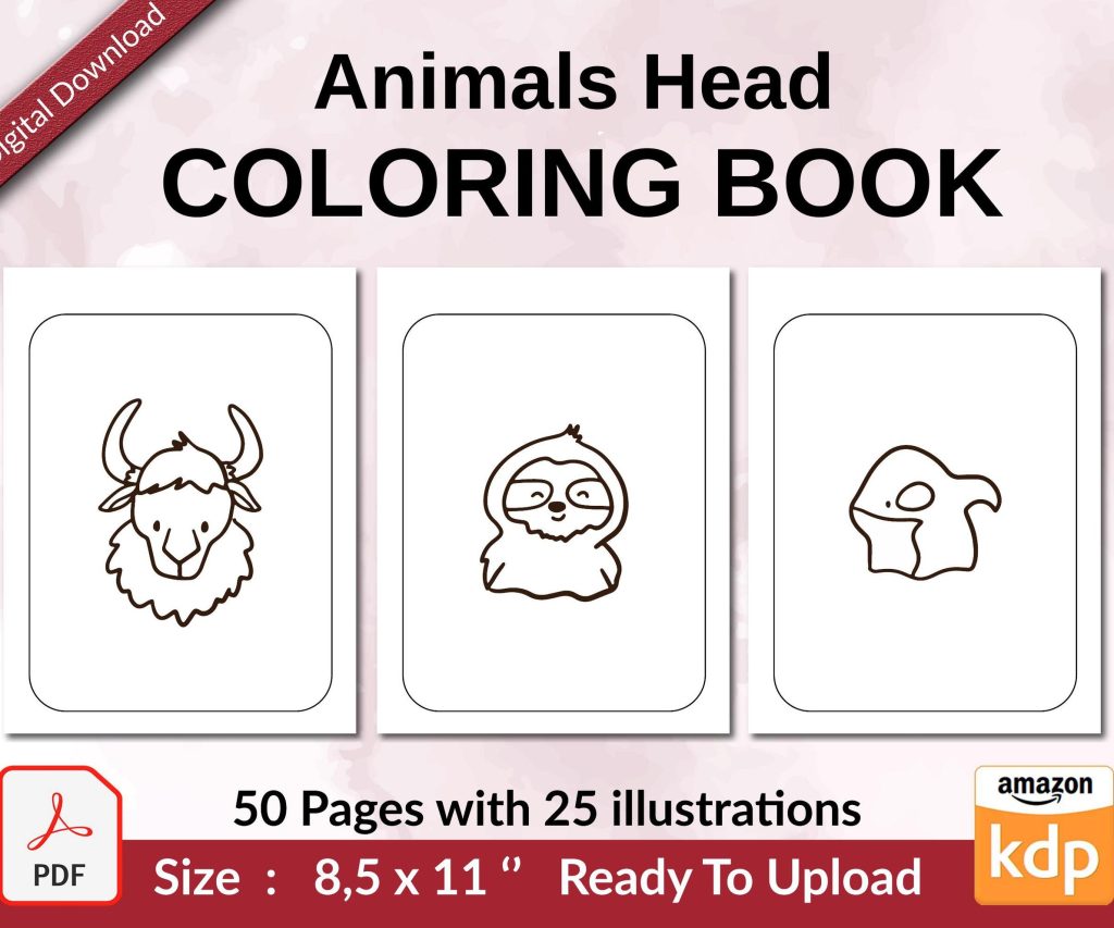
 Coloring Animals Head Book for Kids, Perfect for ages 2-4, 4-8 | 8.5x11 PDF
 Subtotal: $0.00
Amazon KDP guide, KDP book publishing
Dust Jacket Template: Hardcover Wrap Design
27
Apr
Apr
Okay so dust jackets are honestly way easier than people make them out to be once you understand the geometry of it all. I was literally up til 2am last Tuesday figuring this out for a client’s poetry collection and my cat kept stepping on the keyboard but anyway here’s what you actually need to know.
The Basic Math That Nobody Explains Right
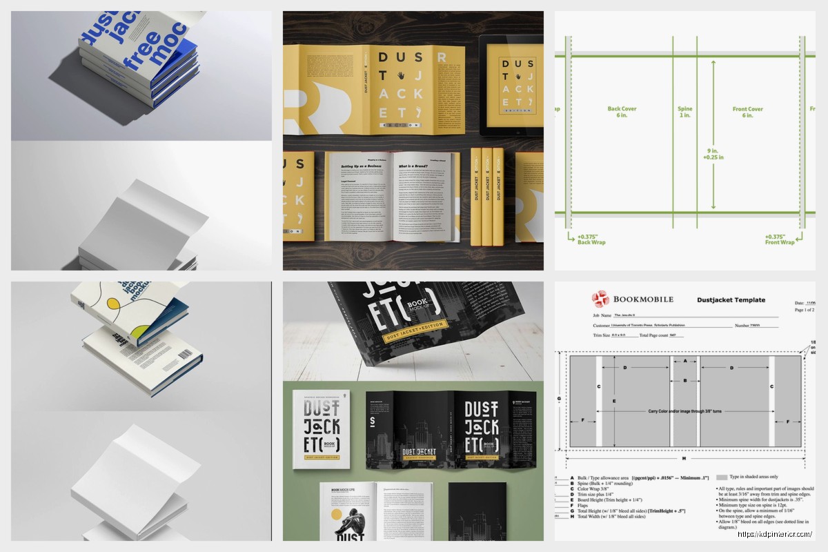
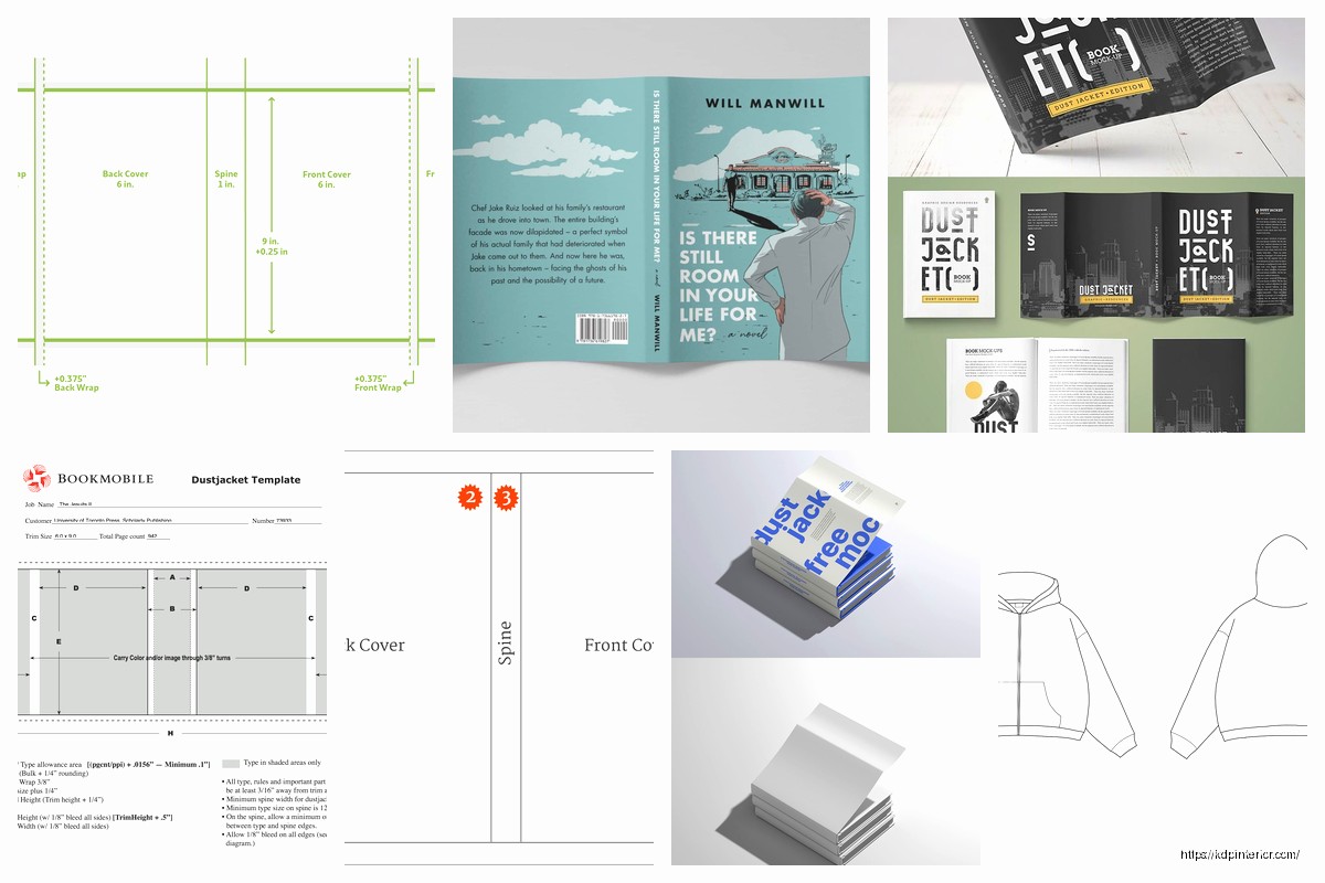
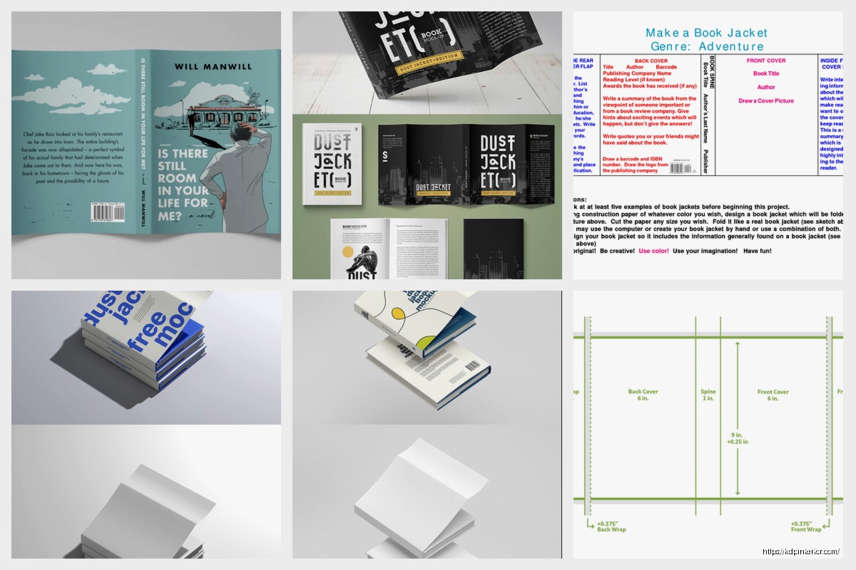
So a dust jacket is basically just a big rectangle that wraps around your hardcover book. The template has five sections – front cover, front flap, spine, back flap, and back cover. The flaps are what fold inside the hardcover boards and they’re usually 3-4 inches wide.
Here’s the formula I use every single time:
Total width = trim width + spine width + trim width + (2 × flap width)
Total height = trim height + bleed top + bleed bottom
Most printers want 0.125″ bleed on all sides. Some want 0.25″ but that’s rare for dust jackets. Always check your printer specs first because I’ve had to redo templates at least a dozen times from assuming.
Real Example Because Abstract Math Is Useless
Let’s say you’ve got a 6×9 inch hardcover with a 0.5 inch spine and you want 3.5 inch flaps:
Total width = 6 + 0.5 + 6 + (2 × 3.5) = 19.5 inches
Total height = 9 + 0.125 + 0.125 = 9.25 inches
Your canvas in Photoshop or InDesign would be 19.5 × 9.25 inches. That’s your starting point.
Calculating Spine Width The Right Way
This is where everyone screws up including me for like the first year. Spine width depends on page count and paper type. You can’t just guess it.
For standard 50-60# offset paper, the rule of thumb is roughly 0.0025 inches per page. So a 200-page book would be around 0.5 inches. But thicker paper like 70# or coated stock changes everything.
Most POD services have spine calculators on their websites. IngramSpark has a good one. KDP Print doesn’t really do dust jackets through their regular service which is annoying but you can go through IngramSpark for the same distribution.
I always add like 0.0625″ (1/16th inch) to whatever the calculator tells me because printing isn’t perfect and a slightly loose jacket is way better than one that’s too tight. Nobody’s gonna complain that the dust jacket slides around a tiny bit but they’ll definitely notice if it’s stretched so tight it warps.
The Page Count Confusion Thing
Quick thing – when they ask for page count, they mean total pages in the book block. Not just the numbered pages. Count everything including blank pages at the front and back. I missed this distinction once on a 180-page book and the spine was completely wrong.
Setting Up Your Template File
I use InDesign for this but Photoshop works too if you’re more comfortable there. Affinity Publisher is solid if you don’t wanna pay Adobe’s ridiculous subscription.
Create your document with the dimensions you calculated. Set up guides for each section:
- First guide at bleed edge (0.125″ from left)
- Second guide at front cover edge (flap width + bleed)
- Third guide at spine start (flap width + trim width + bleed)
- Fourth guide at spine end (flap width + trim width + spine width + bleed)
- Fifth guide at back cover start (flap width + trim width + spine width + trim width + bleed)
- Sixth guide at back flap edge (total width – flap width – bleed)
- Last guide at bleed edge (total width – bleed)
Do the same for top and bottom with your vertical bleed. This is tedious but you only gotta do it once per book size.
Design Considerations That Actually Matter
Okay so here’s what I learned from having books come back looking weird. The spine is gonna crease when they fold the jacket around the book. Any design element that crosses from the front cover onto the spine or back cover onto the spine needs to account for this.
I keep critical stuff like text and faces at least 0.25″ away from where the spine creases happen. Backgrounds and patterns can flow across but anything you care about seeing clearly should stay in the safe zones.
Text on the Spine
Spine text runs vertically but here’s the thing nobody tells you – different countries have different standards for which direction it reads. In the US, spine text typically reads top to bottom when the book is standing upright. In Europe it’s often bottom to top.
For POD books going worldwide, I usually go with US standard since that’s where most sales happen. Font size depends on spine width obviously but I never go below 12pt even on thin spines. Better to have large readable text than trying to cram your whole subtitle on there.
Wait I forgot to mention – keep spine text centered vertically AND account for the fact that the book block might not be perfectly centered in the case. I usually keep spine text in the absolute center third of the spine width to be safe.
The Flap Copy Situation
Front flap is for book description, back flap is for author bio usually. Standard format but you can switch it if you want. The flaps are gonna fold inside so nothing on them will be visible when the book is on a shelf.
Margins on flaps should be at least 0.5″ on all sides. I go with 0.75″ because it looks less cramped. Font size around 10-11pt for body text. Nobody’s reading flap copy from across the room so you can go smaller than cover text.
One thing that drives me crazy is when people put crucial information only on the flaps. Like if your book has trigger warnings or is part of a series, put that on the back cover too. People browse books without opening the flaps all the time.
Barcode Placement and ISBN Stuff
Your hardcover ISBN is different from your paperback ISBN. Don’t use the same one. The barcode usually goes on the back cover bottom right corner, about 0.5″ from the edges.
Some printers want you to supply the barcode, others generate it for you. IngramSpark generates it automatically which is nice. If you’re supplying your own, make sure it’s the right size – standard book barcode is EAN-13 format, usually around 1.5″ wide by 1″ tall.
The barcode needs to be on a light background. If your back cover is dark, put a white or light colored box behind the barcode. I’ve seen people try to reverse the barcode to white on dark background and it doesn’t scan properly.
Color Mode and Resolution
CMYK color mode, not RGB. This is non-negotiable for print. Your blues and purples are gonna look different in CMYK so convert early and design in CMYK from the start.
300 DPI minimum for images. I usually work at 400 DPI for covers because they’re big and visible. Vector graphics are best for text and logos obviously.
Oh and another thing – use embedded fonts or outline your text before exporting the final PDF. I had a whole batch of books print with Arial substituted for a custom font once because I forgot to embed. Cost me like $400 to reprint.
The Color Shift Problem
Printed colors never match your screen exactly. Your monitor shows RGB, the printer uses CMYK. Get a physical proof if you can. IngramSpark charges like $25-40 for a proof copy which is worth it for the first book in a series or if you’re doing a special edition.
I keep a printed color reference sheet of common colors I use – specific CMYK values that I know print well. Saves me from redesigning covers that looked great on screen but came out muddy in print.
Export Settings That Won’t Mess You Up
PDF/X-1a format is the industry standard. High quality print settings. Include bleed, don’t include crop marks unless the printer specifically asks for them.
Flatten transparency if you’re using InDesign. Embed all fonts. Convert spot colors to process colors unless you’re paying extra for spot color printing which you probably aren’t.
Your PDF should be:
- PDF/X-1a:2001 compliant
- CMYK color mode
- Fonts embedded/outlined
- 300 DPI minimum
- Bleed included (usually 0.125″)
- Single page, not spreads
Common Mistakes I See All The Time
People put important text or images right at the edge where it’ll get cut off. Use your margins. The safe zone is at least 0.25″ inside the trim line, I prefer 0.5″ for anything critical.
Wrong spine width is probably the number one issue. Double check your page count, paper type, and use the printer’s calculator. Then add a tiny bit extra.
Forgetting that the dust jacket wraps around a 3D object. What looks good flat doesn’t always work when it’s wrapped around boards and a spine. I literally fold paper mockups now for complex designs to see how it’ll actually look.
Using images that are too low resolution. You can’t just grab something off Google Images at 72 DPI and expect it to print clearly at 6×9 inches. It’ll look pixelated and terrible.
Templates and Resources You Can Actually Use
IngramSpark has downloadable templates for standard sizes. They’re InDesign files which is helpful. You can modify them for your design.
BookBaby also has templates and their specs are pretty clear. I think they have both InDesign and Photoshop versions.
If you’re making your own from scratch, create a template file you can reuse. I have templates saved for 5×8, 5.5×8.5, 6×9, and 8×10 hardcovers with different spine widths. Just duplicate and modify the design for each new book.
This Is Gonna Sound Weird But
I keep a physical ruler next to my desk and I literally measure the printed proof with it. Digital measurements are great but sometimes you need to see if that 0.25″ margin actually feels like enough space in real life. I caught a few design issues this way that looked fine on screen.
Working With Designers or Doing It Yourself
If you’re hiring a designer, give them the exact specs from your printer. Don’t make them guess. Send them the spine width calculation, the total dimensions, the bleed requirements, everything.
If you’re doing it yourself, start simple. Solid color backgrounds are totally fine. A good photo and clean typography beats a complicated design that’s executed poorly. I’ve seen gorgeous minimalist dust jackets outsell busy complicated ones.
Canva has dust jacket templates now but honestly they’re kinda limiting. You can use Canva for the design elements and then assemble everything in a proper design program. That’s what I did when I was starting out and didn’t know InDesign well.
The Proofing Stage You Shouldn’t Skip
Always order a proof. Always. I don’t care if you’ve done a hundred books, order the proof. I skipped it once on a client project because we were rushing for a launch date and there was a weird color shift that made the author’s face look orange on the back flap. Had to delay the launch anyway to fix it.
Check the proof for:
- Color accuracy (or close enough)
- Text readability, especially on the spine
- Image quality and sharpness
- Proper fit around the book (not too tight or loose)
- Flaps fold correctly without bunching
- Barcode scans properly
Take the dust jacket off and put it back on a few times. Make sure it’s not gonna rip or wear badly. The paper stock matters here – too thin and it’ll tear, too thick and it won’t fold nicely.
Paper Stock and Finish Options
Most POD services use 100# gloss or matte text weight for dust jackets. Gloss is shiny and makes colors pop but shows fingerprints. Matte is more elegant feeling and hides wear better.
I prefer matte for literary fiction and non-fiction, gloss for stuff with bright colorful covers like children’s books or genre fiction with illustrated covers. But that’s just personal preference.
Some printers offer spot UV or foil stamping on dust jackets but it’s expensive and usually only worth it for special editions or if you’re printing large quantities offset.
The dust jacket paper is separate from your case cover underneath. The case is usually printed too but simpler – maybe just the title on the spine. Some people do full printed cases under the dust jacket which looks nice if someone takes the jacket off but adds cost.
Okay I think that covers the main stuff you need to know. The first one you do is gonna take forever and you’ll probably make mistakes but save your template and it gets way faster after that.
DISCOVER OUR FREE BEST SELLING PRODUCTS
Editable Canva Lined Journal: Express Your Thoughts – KDP Template
Lined Pages Journal 120 pages Ready to Upload PDF Commercial Use KDP Template 6×9 8.5×11 5×8 for Notebooks, Diaries, Low Content
Lined Pages Journal 120 pages Ready to Upload PDF Commercial Use KDP Template 6×9 8.5×11 5×8 for Notebooks, Diaries, Low Content
Cute Dogs Coloring Book for Kids | Activity Book | KDP Ready-To-Upload
Daily Planner Diary : Diary Planners for Everyday Productivity, 120 pages, 6×9 Size | Amazon KDP Interior
Wolf Coloring KDP interior For Adults, Used as Low Content Book, PDF Template Ready To Upload COMMERCIAL Use 8.5×11"
Coloring Animals Head Book for Kids, Perfect for ages 2-4, 4-8 | 8.5×11 PDF
Printable Blank Comic Book Pages PDF : Create Your Own Comics – 3 Available Sizes
Notes KDP interior Ready To Upload, Sizes 8.5×11 6×9 5×8 inch PDF FILE Used as Amazon KDP Paperback Low Content Book, journal, Notebook, Planner, COMMERCIAL Use
Black Lined Journal: 120 Pages of Black Lined Paper Perfect for Journaling, KDP Notebook Template – 6×9
Student Planner Journal 120 pages Ready to Upload PDF Commercial Use KDP Template 6×9" 8.5×11" for Low Content book
Recipe Journal Template – Editable Recipe Book Template, 120 Pages – Amazon KDP Interior