-
×
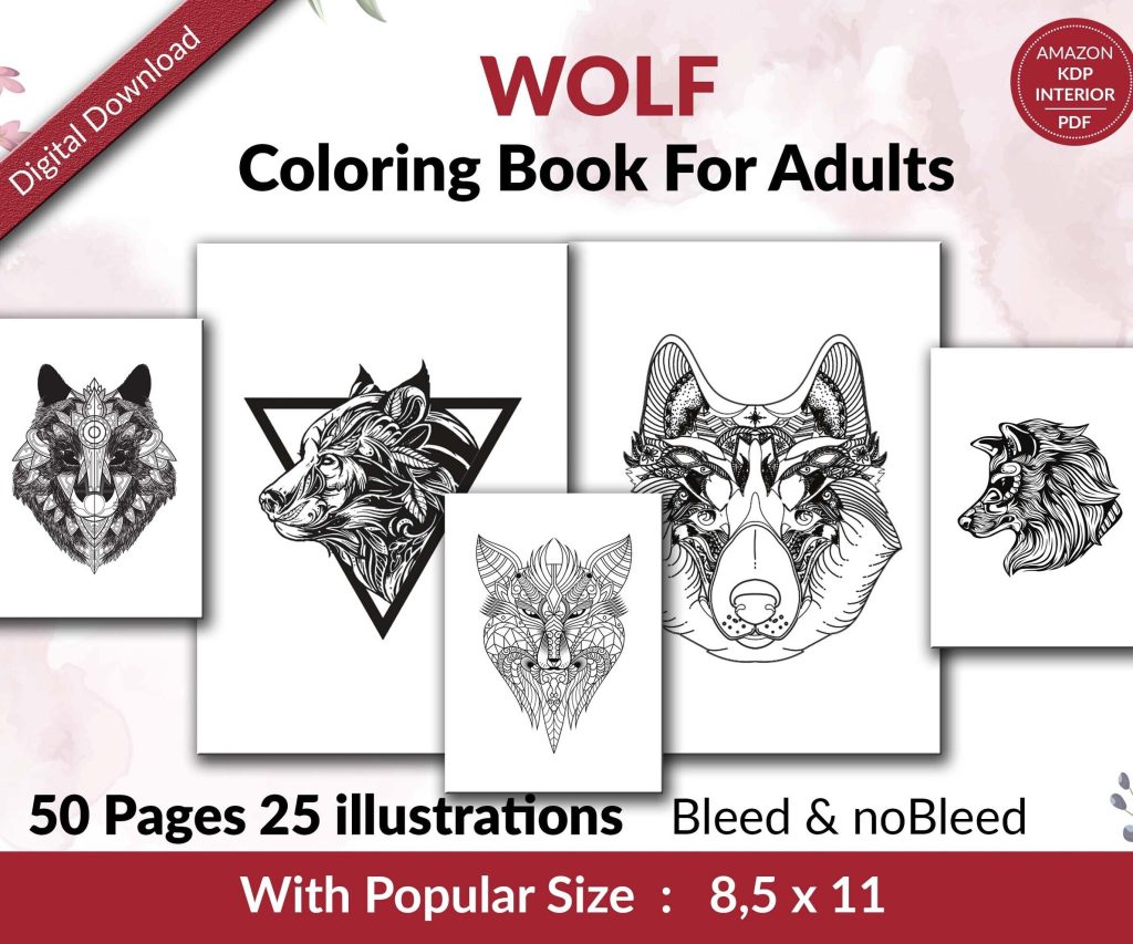 Wolf Coloring KDP interior For Adults, Used as Low Content Book, PDF Template Ready To Upload COMMERCIAL Use 8.5x11"
1 × $0.00
Wolf Coloring KDP interior For Adults, Used as Low Content Book, PDF Template Ready To Upload COMMERCIAL Use 8.5x11"
1 × $0.00
Subtotal: $0.00
Okay so I just redesigned like 30 ebook covers last month and here’s what actually matters for digital-first design – and I mean covers that people see on their phones first, not in some bookstore.
The biggest mistake everyone makes is designing for print dimensions. Your cover is gonna be viewed at 120 pixels wide on Amazon most of the time. That’s it. That’s smaller than your thumb on a phone screen. So all those intricate details and fancy fonts you’re obsessing over? Nobody sees them.
I design everything at 1600×2560 pixels now. Yeah yeah, KDP says minimum 1000 pixels on the shortest side but trust me, go bigger. You can always scale down and it looks crisp. Going up from small files? That’s when things get blurry and pixelated.
Here’s the thing though – I actually design the thumbnail view FIRST now. I know that sounds backwards but create a 120px wide version before you do anything else. If your cover doesn’t work at thumbnail size, it doesn’t work period. I learned this the hard way after publishing a beautiful cover with this gorgeous script font and… nobody could read the title. Sales were awful until I redesigned it.
Your cover needs to communicate three things in under three seconds:
That’s it. People are scrolling through dozens of covers. My cat literally walked across my keyboard while I was testing this last week and somehow published a draft cover, but anyway – you’ve got maybe 3 seconds of attention.
Forget elegant thin fonts. Forget script fonts unless they’re REALLY bold. You need thick, chunky fonts that hold up when compressed.
I use these font weights religiously now:
Sans serif fonts perform better for digital. I know, I know, traditional publishing loves their serifs but Amazon thumbnails don’t care about tradition. Montserrat Bold, Bebas Neue, Oswald, Anton – these are your friends.
Oh and another thing – letter spacing matters way more than you think. Tighten that tracking. When fonts are small, extra space between letters makes words harder to read. I usually go -50 to -100 in Photoshop or whatever you’re using.
This is gonna sound obvious but I see people mess this up constantly. Your title needs to PUNCH through the background. Not just “be visible” – it needs to punch.
I test every cover in grayscale now. If the text disappears when you remove color, your contrast is garbage. Add a stroke, add a shadow, put a semi-transparent box behind it, whatever. Just make it readable.
Dark text on light backgrounds or light text on dark backgrounds. That’s it. No dark blue text on black backgrounds even if it looks “moody.” Nobody can read it at thumbnail size.
Here’s where I changed my whole approach – backgrounds need to be SIMPLE or BLURRED. If you’re using stock photos (and let’s be real, most of us are), you gotta either:
I was watching this documentary about design last night and they talked about “visual hierarchy” which is just a fancy way of saying some things should be more important than others. Your background should fade back. Your title should come forward.
Wait I forgot to mention – don’t use more than three main colors. Seriously. Pick your main color, an accent color, and maybe one more. I see covers with like 7 different colors and they just look chaotic on a phone screen.
Okay so here’s my actual template structure that I use for like 80% of my covers now:
Top third: Genre indicators (small graphics, symbols, or just solid color)
Middle third: Title in huge bold text
Bottom third: Author name and maybe a subtitle
This works because when people see thumbnails, that middle section is what they focus on. I tested this with heat mapping software (okay fine, I just asked people where they looked first) and everyone goes straight to the center.
Even though we’re going simple, you still need depth. Here’s my layer structure in Canva or Photoshop:
That texture overlay is key – it adds visual interest without cluttering things up. I use subtle paper textures, grain, or even just noise. Makes digital covers feel less flat.
Different genres have different expectations and you gotta respect that. Romance needs certain visual cues, thriller needs others.
Romance: Script fonts are okay here if they’re bold, intimate imagery, warm colors, couples or symbolic objects
Thriller: Bold sans serif, dark colors, high contrast, mysterious imagery
Self-help: Clean, minimal, bright colors, geometric shapes
Fantasy: Ornate elements but keep them simple, rich colors, atmospheric backgrounds
I published a sci-fi ebook last year with a super minimalist cover and it tanked because people thought it was literary fiction. Redesigned it with more obvious sci-fi elements (geometric patterns, cooler color palette) and sales picked up. Genre signaling matters.
Most text effects look terrible at small sizes. Drop shadows get muddy. Glows disappear. Here’s what actually works:
Solid stroke: 3-5 pixel stroke in contrasting color – this is your best friend
Subtle drop shadow: Keep it tight, maybe 2-3 pixels max offset
Gradient text: Can work but keep it subtle, high contrast colors only
What doesn’t work: outer glow, complex layer styles, multiple effects stacked together. They all turn into mush at thumbnail size.
Oh and pro tip – if you’re using Canva (which is totally fine btw, I use it for quick covers), duplicate your text layer and put a slightly larger version behind it in a contrasting color. Instant readable text.
This is gonna sound weird but one of my best-performing cover templates is just text on a semi-transparent box. Like a colored rectangle with 60-70% opacity behind the title. Super simple but it WORKS because:
I probably overuse this technique but when something works…
Save your final cover as RGB (not CMYK – that’s for print). JPEG at maximum quality for upload to Amazon. Keep your PSD or Canva file obviously, but the upload file should be JPEG.
Color space matters – sRGB is what you want. Adobe RGB looks different on different screens and monitors. sRGB is the web standard.
File size – keep it under 5MB but honestly under 2MB is better. Amazon’s compression is pretty good but why risk it.
Before you publish anything, do these tests:
I use this website called Pickfu sometimes to test covers with real people. Costs like $50 per poll but you get actual feedback from your target audience. Worth it for books you’re serious about.
Things I see all the time that don’t work:
Also stop putting quotes or review snippets on the cover. Nobody can read them at thumbnail size anyway. Save that for the product description.
I rotate between a few tools depending on complexity:
Canva Pro: Like 90% of my covers now, especially low-content books. Templates are decent starting points. The background remover tool alone is worth the subscription.
Photoshop: When I need more control or complex compositions. Overkill for most ebook covers honestly.
Affinity Designer: One-time purchase, does everything Photoshop does for covers. Good middle ground.
Don’t sleep on Canva though. I know “real designers” look down on it but I’m making $15k/month on KDP and probably 60% of those covers are Canva. Results matter more than tools.
You need good source material. Here’s where I get stuff:
Always check the license. Commercial use with no attribution required – that’s what you need. Don’t mess around with unclear licenses.
Your first design probably isn’t gonna be the winner. I usually create 3-4 variations of each cover concept. Change the colors, move elements around, try different fonts. Then test them.
Sometimes the cover I think is best performs worst. That’s why testing matters. Your opinion doesn’t matter – sales data matters.
I’ll redesign covers that aren’t performing after like 30 days. If a book isn’t selling and everything else is decent (description, keywords, etc), the cover’s probably the issue. Don’t be precious about it.
This is boring but important – organize your templates by genre and style. I have folders like “Romance – Bold Title” and “Thriller – Dark Minimalist” with base templates I can customize quickly.
Also keep a swipe file of covers that perform well. Not to copy, but to understand what’s working in your genre right now. Trends change. What worked in 2020 looks dated now.
Okay so that’s basically my entire approach to digital-first ebook covers. The main thing is just remember that thumbnail is everything. Design for the small version first and you’ll be fine. Most people do it backwards and wonder why their covers don’t convert.
DISCOVER OUR FREE BEST SELLING PRODUCTS
Editable Canva Lined Journal: Express Your Thoughts – KDP Template
Lined Pages Journal 120 pages Ready to Upload PDF Commercial Use KDP Template 6×9 8.5×11 5×8 for Notebooks, Diaries, Low Content
Lined Pages Journal 120 pages Ready to Upload PDF Commercial Use KDP Template 6×9 8.5×11 5×8 for Notebooks, Diaries, Low Content
Cute Dogs Coloring Book for Kids | Activity Book | KDP Ready-To-Upload
Daily Planner Diary : Diary Planners for Everyday Productivity, 120 pages, 6×9 Size | Amazon KDP Interior
Wolf Coloring KDP interior For Adults, Used as Low Content Book, PDF Template Ready To Upload COMMERCIAL Use 8.5×11"
Coloring Animals Head Book for Kids, Perfect for ages 2-4, 4-8 | 8.5×11 PDF
Printable Blank Comic Book Pages PDF : Create Your Own Comics – 3 Available Sizes
Notes KDP interior Ready To Upload, Sizes 8.5×11 6×9 5×8 inch PDF FILE Used as Amazon KDP Paperback Low Content Book, journal, Notebook, Planner, COMMERCIAL Use
Black Lined Journal: 120 Pages of Black Lined Paper Perfect for Journaling, KDP Notebook Template – 6×9
Student Planner Journal 120 pages Ready to Upload PDF Commercial Use KDP Template 6×9" 8.5×11" for Low Content book
Recipe Journal Template – Editable Recipe Book Template, 120 Pages – Amazon KDP Interior