-
×
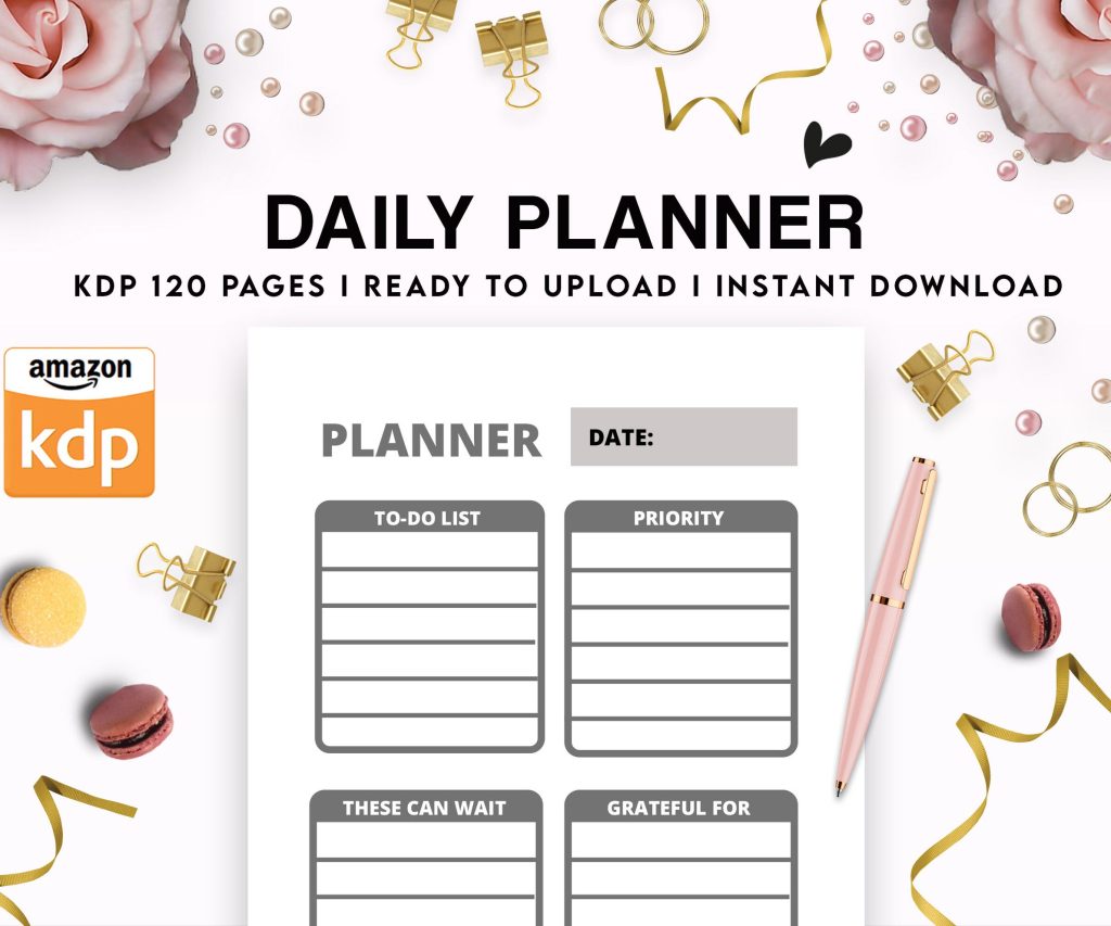 Daily Planner Diary : Diary Planners for Everyday Productivity, 120 pages, 6×9 Size | Amazon KDP Interior
1 × $0.00
Daily Planner Diary : Diary Planners for Everyday Productivity, 120 pages, 6×9 Size | Amazon KDP Interior
1 × $0.00
Subtotal: $0.00
Daily Planner Diary : Diary Planners for Everyday Productivity, 120 pages, 6×9 Size | Amazon KDP Interior
1 × $0.00 Subtotal: $0.00
Okay so I just spent like three hours yesterday reformatting preview chapters for a client and honestly the difference between a preview that converts and one that tanks is literally just… formatting. I know that sounds stupid but hear me out.
First thing – Amazon’s gonna give you either 10% of your book or five pages, whichever is longer. Most people think they can just upload whatever and Amazon handles it but nah, you gotta be strategic here. I learned this the hard way back in 2018 when my cookbook preview ended mid-recipe and sales were absolute garbage for like two months before I figured it out.
So here’s what you do. Count your pages manually in whatever program you’re using – Word, Vellum, Atticus, whatever. If your book is 200 pages, that’s 20 pages of preview. But and this is important, you need to actually PLAN where those 20 pages end. Don’t just let it cut off randomly in the middle of a paragraph about character backstory or some random point in your how-to guide.
I always structure my preview chapters to end on what I call a “soft cliffhanger” – not like a thriller cliffhanger but more like… you’ve given them enough value that they trust you know what you’re talking about, but they’re curious about the next section.
For non-fiction this means:
For fiction it’s:
Wait I forgot to mention – your TOC needs to be in that preview. I see so many authors skip this and it’s like… why would you do that? The TOC is literally a sales page for your book’s content.
I format mine with actual descriptive chapter titles, not just “Chapter One” or whatever. Like instead of “Chapter 3: Marketing” I’ll write “Chapter 3: The 72-Hour Launch Strategy That Got Me 47 Reviews.” People skim that TOC in the preview and they’re already mentally buying.
Oh and another thing, make sure your TOC is hyperlinked even in the preview. Some readers will click around and if it works smoothly they subconsciously trust the book more. I use Vellum for this now because trying to do hyperlinks manually in Word made me wanna throw my laptop out the window last year.
This is gonna sound weird but your front matter is taking up preview real estate so make it COUNT. I used to do like:
That’s six pages before we even GET to chapter one. Now I do:
My cat literally just knocked over my coffee while I’m writing this, hang on.
Okay back. So yeah, save the dedication and “also by” stuff for the BACK of the book. In the preview you want maximum content, minimum fluff.
Here’s where people mess up constantly. They write these long introductions about why they wrote the book, their credentials, blah blah. Readers don’t care yet. They will care AFTER you’ve proven you’re worth reading.
I keep intros to like 300-500 words max now. Hit these points fast:
Then get into the actual content. The preview needs to showcase your writing style and expertise, not your life story.
Okay so funny story, I once published a preview where I’d formatted everything beautifully in my document but forgot that Kindle Create would reformat certain elements. Lost like a week of sales before someone emailed me saying the preview looked “broken.”
Use consistent heading styles. If you’re using H2 for chapter titles, use H3 for main sections within chapters, H4 for subsections. Don’t just bold things randomly. Amazon’s preview generator respects proper heading hierarchy and it makes the preview way more scannable.
I see people doing all caps for emphasis or using weird fonts and that stuff doesn’t translate well to Kindle previews. Stick with:
This drives me nuts when I see it wrong. You want either first-line indents OR space between paragraphs, not both. Most traditional publishers use first-line indents with no space. I actually prefer a small space between paragraphs for non-fiction because it’s easier to scan on screens.
For fiction, go traditional – first line indent, no extra spacing. Looks more professional and readers expect it.
If you’ve got images, make sure they’re showing up in your preview correctly. Go to your book’s Amazon page and click “Look Inside” to check. I had a client once whose infographic was showing up as a tiny thumbnail in the preview even though it looked fine in the uploaded file.
For images in previews:
Actually make sure you check mobile preview because like 60% of readers are browsing on phones now. What looks good on desktop might be unreadable on a phone screen.
I cannot stress this enough – your opening sentence shows up in search results sometimes and it’s definitely the first thing people see when they click “Look Inside.” Don’t start with weather or someone waking up or “In this book you will learn…”
Start with something that either:
I tested this with two similar books last month. One started with “Making money on Amazon isn’t as hard as you think” and the other started with “I made $847 in one day selling a 30-page planner I created in two hours.” Guess which one had a 40% better conversion rate?
Whatever voice you’re using in the full book needs to be OBVIOUS in the preview. If your book is casual and conversational, don’t write a stuffy formal preview chapter. If it’s academic, don’t suddenly get all chatty in chapter one.
I wrote a preview once where I was trying too hard to sound “professional” and then the actual book was way more relaxed and personal. Got some annoyed reviews about that. Now I just write how I write and let the preview reflect that from word one.
Bullet points, numbered lists, block quotes – these all need to be formatted correctly in your source file. Don’t just use asterisks or hyphens and hope Amazon figures it out. Use actual list formatting in Word or whatever you’re using.
For block quotes in non-fiction (like testimonials or important callouts), I use a slightly smaller font and indent them. Makes them stand out without being distracting.
Remember that last chapter in your preview? That’s your last chance to hook them before they decide to buy or bounce. I always end my preview chapters with either:
Don’t end on something boring like “In conclusion, this chapter covered…” Nobody’s buying after reading that.
Okay this is super important – before you publish, you gotta actually CHECK what your preview looks like. Here’s my process:
Upload your book to KDP but don’t publish it yet. Wait like 24-48 hours (I know it’s annoying) and then go look at your book’s preview page. Sometimes it takes a while for the preview to generate properly.
Check these things specifically:
If something’s wrong, fix it in your source file and re-upload. Yeah it’s a pain but way better than leaving a broken preview up there killing your conversions.
This is random but your preview needs to match your book description and metadata. If your description promises “step-by-step instructions” but your preview is all theory and philosophy, that’s a disconnect. Make sure the preview delivers on whatever promise your blurb makes.
Just gonna rapid-fire these because I’m seeing them every week:
Also and this might just be me being picky, but centered text for body paragraphs drives me insane. Center your title page, sure. Don’t center actual content.
For cookbooks I always make sure at least one complete recipe is in the preview with a photo. For self-help I include one actionable exercise. For fiction I focus on voice and character more than plot setup.
Romance needs to establish the romantic tension in that preview. Thrillers need to show you can build suspense. Business books need to prove you know what you’re talking about with specific examples or data.
Whatever your genre is, the preview needs to deliver the core experience readers expect from that genre. Sounds obvious but you’d be surprised how many previews are just generic intro material that could be from any book.
Wait I forgot to mention – some authors get fancy with custom fonts and that almost never works well in Kindle previews. Stick with standard fonts. Your creativity should be in the content not in trying to use some decorative typeface that’s gonna render weird on half the devices out there.
Alright I think that covers most of it. Just remember the preview is literally your sales page, treat it like one. Every element should be pulling its weight to convince someone to click buy.
DISCOVER OUR FREE BEST SELLING PRODUCTS
Editable Canva Lined Journal: Express Your Thoughts – KDP Template
Lined Pages Journal 120 pages Ready to Upload PDF Commercial Use KDP Template 6×9 8.5×11 5×8 for Notebooks, Diaries, Low Content
Lined Pages Journal 120 pages Ready to Upload PDF Commercial Use KDP Template 6×9 8.5×11 5×8 for Notebooks, Diaries, Low Content
Cute Dogs Coloring Book for Kids | Activity Book | KDP Ready-To-Upload
Daily Planner Diary : Diary Planners for Everyday Productivity, 120 pages, 6×9 Size | Amazon KDP Interior
Wolf Coloring KDP interior For Adults, Used as Low Content Book, PDF Template Ready To Upload COMMERCIAL Use 8.5×11"
Coloring Animals Head Book for Kids, Perfect for ages 2-4, 4-8 | 8.5×11 PDF
Printable Blank Comic Book Pages PDF : Create Your Own Comics – 3 Available Sizes
Notes KDP interior Ready To Upload, Sizes 8.5×11 6×9 5×8 inch PDF FILE Used as Amazon KDP Paperback Low Content Book, journal, Notebook, Planner, COMMERCIAL Use
Black Lined Journal: 120 Pages of Black Lined Paper Perfect for Journaling, KDP Notebook Template – 6×9
Student Planner Journal 120 pages Ready to Upload PDF Commercial Use KDP Template 6×9" 8.5×11" for Low Content book
Recipe Journal Template – Editable Recipe Book Template, 120 Pages – Amazon KDP Interior