Amazon KDP guide, KDP book publishing
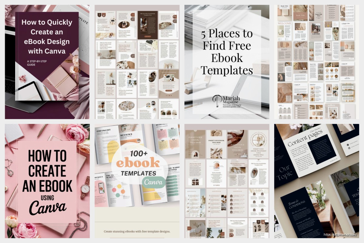
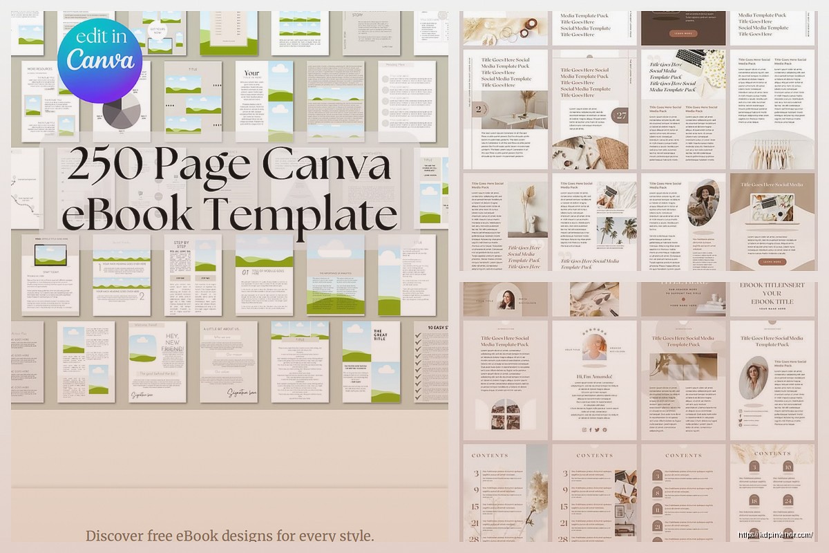
Ebook Template: Digital Book Formatting Guide

Mar
Okay so I just reformatted like three ebooks last week and honestly the biggest mistake people make is thinking they need some fancy software when you really just need a solid template and basic knowledge of how ebook readers actually work.
The File Format Thing Everyone Gets Wrong
Look, Amazon wants a Word doc or EPUB file. That’s it. I see people spending hours in InDesign or trying to code HTML from scratch and it’s just… you don’t need that headache. I’ve uploaded over 200 books and probably 95% of them started as simple Word documents.
Here’s what actually matters – your Word doc needs to be clean. And I mean CLEAN. No random spacing, no tabs except for paragraph indents, no funky fonts that won’t translate. Use styles for everything. Every single heading needs to be formatted with Heading 1, Heading 2, whatever. Don’t just make text bigger and bold it. That’s gonna mess up your navigation when Amazon converts it.
Setting Up Your Base Template
Start with these page setup basics:
- Margins: 0.5 inches all around (ereaders ignore this mostly but it helps while you’re editing)
- Font: Stick with Georgia, Garamond, or Times New Roman for body text
- Size: 12pt for body, scale up from there for headings
- Line spacing: 1.15 or 1.5 – single spacing looks cramped on screens
Oh and another thing – turn on paragraph formatting marks in Word (that ¶ symbol button). You need to see where all your hard returns and spaces are hiding because those will show up in weird places in your final ebook.
Front Matter That Actually Works
Your front matter is basically everything before Chapter 1. I structure mine like this every single time:
- Title page (just the title and your name, centered)
- Copyright page (date, your name, “All rights reserved” – keep it simple)
- Table of Contents (let Word auto-generate this from your heading styles)
- Optional: dedication or author note
The TOC is where people mess up constantly. You HAVE to use Word’s built-in TOC feature. Go to References > Table of Contents > Insert. It’ll only work if you’ve been using heading styles which is why I’m so annoying about that earlier point.
I learned this the hard way when my first ebook had a manual TOC and none of the links worked. Customer complained and left a 2-star review specifically about navigation being broken. Never again.
Chapter Formatting That Doesn’t Look Amatuer
Each chapter needs:
- A page break before it (Insert > Page Break, not just hitting Enter a bunch)
- Chapter heading in Heading 1 style
- First paragraph with no indent (this is traditional book formatting)
- All other paragraphs with first-line indent of 0.3 inches
Wait I forgot to mention – never use the space bar to create indents. Set up your paragraph style to automatically indent. Right-click on Normal style, modify it, go to Format > Paragraph, and set that first-line indent. This’ll save you from having weird spacing issues later.
My cat just knocked over my coffee while I’m writing this and honestly that’s the kind of chaos that happens when you’re trying to format ebooks at 11pm but anyway…
Images and Graphics Without the Headaches
If you’re adding images, here’s the deal – they need to be high enough quality but not so huge they make your file size balloon. I aim for:
- 300 DPI for any image
- JPG format (smaller file size than PNG usually)
- Max width of 600 pixels for full-width images
- Centered with text wrapping set to “In line with text”
Amazon has a file size limit and if you go over you either can’t upload or they charge you delivery fees which eat into your royalties. Keep your total file under 50MB, ideally under 20MB.
This is gonna sound weird but I actually test every image by zooming way out in Word to see if it still looks clear. If it gets pixelated at 50% view, it’s not high enough quality.
The Hyperlink Situation
Your TOC will have automatic hyperlinks but you might want to add others – like linking to your website in the back matter or creating footnotes. Word handles this fine but test it obsessively.
Insert hyperlinks using Ctrl+K (or Insert > Hyperlink). For footnotes, use Word’s built-in footnote feature under References. Don’t try to manually create superscript numbers and link them yourself. Just don’t. The automatic feature works way better with ebook conversion.
Back Matter That Sells More Books
Okay so after your last chapter, you need back matter. This is where you can actually make more money by pointing readers to your other books. My standard back matter:
- Author bio (2-3 paragraphs max, nobody wants your life story)
- Other books by you with covers and links
- Call to action (leave a review, join your email list)
- Copyright and ISBN info again if you want
The “other books” section is money. I use a simple format – small cover image (100-150px wide), title, one-sentence description, and a hyperlink to the Amazon page. When someone finishes your book and likes it, they’re hot leads for your other stuff.
Styles and Consistency
I cannot stress this enough – use Word styles for EVERYTHING. Your life will be so much easier. Here’s my basic style setup:
Normal style: Body text, 12pt, first-line indent 0.3″, justified alignment
Heading 1: Chapter titles, 18pt, bold, centered, page break before
Heading 2: Section breaks within chapters, 14pt, bold, left-aligned
Heading 3: Sub-sections if needed, 12pt, bold, left-aligned
No Indent: First paragraph of chapters or after section breaks, same as Normal but no indent
Create these once in your template, save it, and reuse it forever. I have like five different templates for different genres/formats and it saves me hours.
Text Alignment Weirdness
For body text, you want justified alignment (flush left and right). But here’s the thing – some designers hate justified text in ebooks because it can create weird spacing on narrow screens. I still use it because it looks more professional to me and I haven’t gotten complaints.
For chapter headings, center them. For section headings, left-align. This is just standard book formatting that readers expect.
Special Elements People Always Ask About
Quotes or excerpts: Use a Block Quote style – indented on both sides, maybe italicized, definitely in a smaller font like 11pt.
Lists: Use Word’s built-in bullet or numbered lists. Don’t manually type bullets or numbers.
Scene breaks: Three centered asterisks (* * *) or a centered # symbol. Add extra space before and after. Don’t just use blank lines because those might disappear in conversion.
Epigraphs: Those quotes at the start of chapters. Right-align or center them, use italics, smaller font. Make them distinct.
The Conversion Process to EPUB
Once your Word doc is perfect, you’ve got options. You can upload directly to KDP and let Amazon convert it, or you can create an EPUB first using Calibre (free software).
I usually go straight to KDP with the Word file for fiction. For non-fiction with complex formatting, I’ll sometimes use Calibre to create an EPUB first so I can preview exactly how it’ll look. Calibre lets you edit the EPUB file if something’s wonky.
To use Calibre: Import your Word doc, click “Convert books”, choose EPUB as output format, and adjust settings. The main things I tweak are:
- Look & Feel > Remove spacing between paragraphs (uncheck this)
- Table of Contents > Force use of auto-generated TOC
- Structure Detection > Insert page breaks before (set to //h:h1)
Then convert and preview using Calibre’s built-in viewer or load it onto an actual Kindle device.
Testing Before You Publish
This is critical – preview your ebook on multiple devices before going live. I test on:
- Kindle Previewer (free from Amazon)
- My actual Kindle device
- Kindle app on phone
- Kindle app on iPad
Things that look fine in Word can be broken in the ebook. I once had an entire chapter disappear because of a weird page break issue. Caught it in preview, thank god.
Check every chapter transition, every image, every hyperlink. Click through your entire TOC. Zoom in and out to see how text reflows. This is tedious but essential.
Common Formatting Mistakes I See Constantly
Double spaces after periods: Old typing habit but ebooks don’t need this. Do a find-and-replace to fix them all.
Manual line breaks everywhere: People hit Enter to create space instead of adjusting paragraph spacing in styles. This creates chaos.
Inconsistent chapter numbering: Decide if you’re doing “Chapter 1” or “Chapter One” or just “1” and stick with it.
Forgetting alt text for images: Right-click images, go to Format Picture, Alt Text, and add a description. Helps with accessibility.
Using headers and footers: Don’t. Ebooks don’t really support these and they’ll just cause problems.
Advanced Template Features
Once you’ve got the basics down, you can get fancier. I have templates with:
- Custom fonts embedded (only for KDP, not EPUB – check licensing)
- Drop caps at chapter starts (first letter enlarged and dropped)
- Decorative scene break images instead of asterisks
- Text boxes for sidebars (use sparingly, they’re tricky in ebooks)
Drop caps are fun but they’re honestly a pain to format correctly. You need to use a Drop Cap style and then test extensively because they render differently on every device.
The ISBN Question
You don’t need an ISBN for Kindle ebooks. Amazon assigns an ASIN automatically. If you’re also distributing to Apple Books, Kobo, etc., you’ll need an ISBN for each format. But for just KDP? Skip it.
I mention this because people waste money buying ISBNs they don’t need for digital-only releases.
Updating Your Template Over Time
My template from 2018 looks nothing like my current one. I’ve refined it based on what works. Keep notes on formatting issues you encounter and update your template accordingly.
I have a Word doc that’s literally just my master template with sample text for every element – chapter heading, subheading, body text, block quote, bullet list, numbered list, image placement, everything. When I start a new book, I open that, save it with a new name, and start replacing the sample text with my actual content.
This approach has probably saved me hundreds of hours over the years. And honestly gotta say it’s way less stressful than starting from scratch every single time wondering if you remembered all the little formatting things.
Anyway that’s basically the whole process. Start with clean Word formatting, use styles religiously, test on multiple devices, and don’t overthink it. Most readers just want a book that’s easy to read without weird formatting glitches. Give them that and you’re golden.
DISCOVER OUR FREE BEST SELLING PRODUCTS
Editable Canva Lined Journal: Express Your Thoughts – KDP Template
Lined Pages Journal 120 pages Ready to Upload PDF Commercial Use KDP Template 6×9 8.5×11 5×8 for Notebooks, Diaries, Low Content
Lined Pages Journal 120 pages Ready to Upload PDF Commercial Use KDP Template 6×9 8.5×11 5×8 for Notebooks, Diaries, Low Content
Cute Dogs Coloring Book for Kids | Activity Book | KDP Ready-To-Upload
Daily Planner Diary : Diary Planners for Everyday Productivity, 120 pages, 6×9 Size | Amazon KDP Interior
Wolf Coloring KDP interior For Adults, Used as Low Content Book, PDF Template Ready To Upload COMMERCIAL Use 8.5×11"
Coloring Animals Head Book for Kids, Perfect for ages 2-4, 4-8 | 8.5×11 PDF
Printable Blank Comic Book Pages PDF : Create Your Own Comics – 3 Available Sizes
Notes KDP interior Ready To Upload, Sizes 8.5×11 6×9 5×8 inch PDF FILE Used as Amazon KDP Paperback Low Content Book, journal, Notebook, Planner, COMMERCIAL Use
Black Lined Journal: 120 Pages of Black Lined Paper Perfect for Journaling, KDP Notebook Template – 6×9
Student Planner Journal 120 pages Ready to Upload PDF Commercial Use KDP Template 6×9" 8.5×11" for Low Content book
Recipe Journal Template – Editable Recipe Book Template, 120 Pages – Amazon KDP Interior