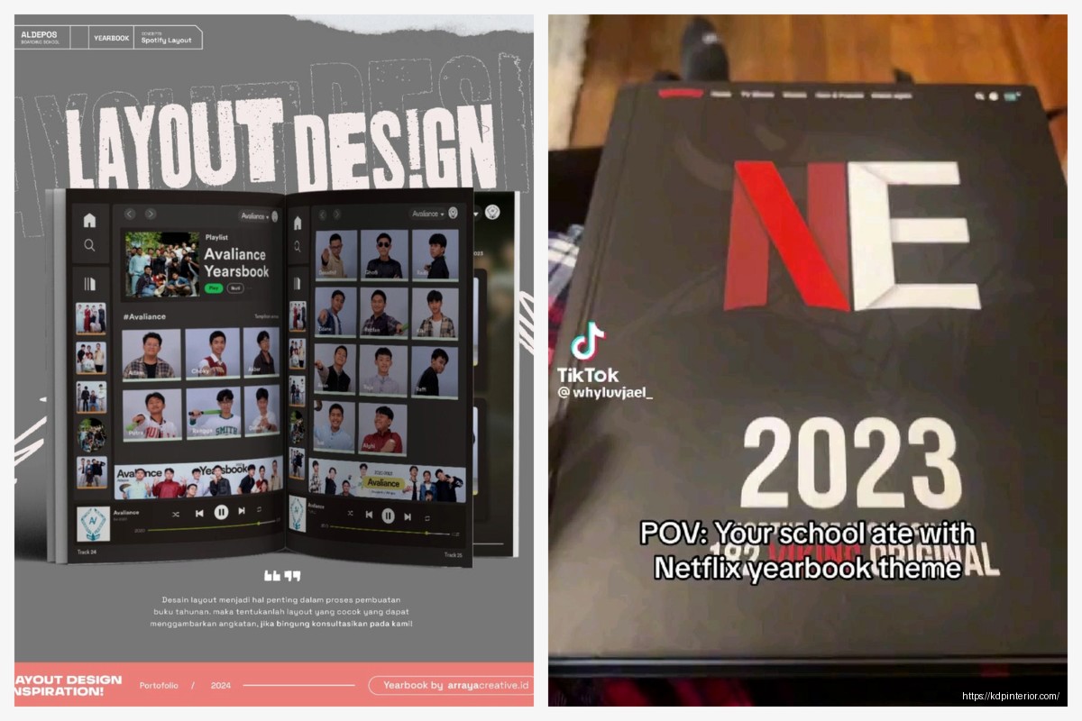
Okay so I was just looking through some yearbook samples last week because someone asked me about creating one as a low-content product and honestly the whole thing sent me down this rabbit hole of what actually makes a good yearbook template…
The first thing you gotta understand is that school yearbooks have this weird structure that’s super consistent across basically every school. Like there’s this formula and once you see it you can’t unsee it. You’ve got your opening pages which are usually like 4-6 pages of welcome messages, school motto, that kind of stuff. Then it breaks into sections – administration and staff, grades (usually going from youngest to oldest or vice versa), clubs and organizations, sports teams, and then the senior section which is always beefier because seniors get more space for their photos and quotes.
I spent like three hours going through actual yearbook PDFs from different schools and the layout patterns are remarkably similar. Most use a grid system where you’re fitting anywhere from 4 to 9 student photos per page depending on the grade level. Elementary schools tend to go bigger with the photos – maybe 4 or 6 per page with more white space. High schools pack them in tighter, especially for underclassmen where you might see 8 or 9 headshots on a single spread.
Wait I forgot to mention the margins thing. Yearbooks need serious margins because they’re usually perfect bound or saddle stitched and you don’t want faces disappearing into the gutter. I learned this the hard way when I was designing a planner template once and didn’t account for binding… totally different product but same principle applies.
The color schemes in yearbook samples are actually pretty interesting. Most schools stick to their school colors obviously but the good ones use like a 60-30-10 rule. So if your school colors are blue and gold you’d have maybe 60% neutral (white, gray, black), 30% of your primary school color, and 10% of the accent color. The samples that look amateur are the ones that just blast school colors everywhere with no breathing room.
Oh and another thing about fonts – yearbooks almost always use a combination of serif and sans-serif fonts. The body text for names and descriptions is usually a clean sans-serif like Arial or Helvetica because it’s gotta be readable at smaller sizes. Then the headers and section dividers use either a bold sans-serif or sometimes a serif font for that more traditional academic look. I’ve seen some samples that try to get creative with script fonts and it almost never works because script fonts at small sizes are just impossible to read.
The photo treatment is where you see the most variation in samples. Traditional yearbooks just use straight rectangular photos with maybe a thin border. More modern ones will do rounded corners, drop shadows, or even tilted photos for a scrapbook effect. Personally I think the tilted photo thing looks dated now but that’s just me. The cleanest samples I’ve seen stick to simple rectangular frames with consistent spacing.
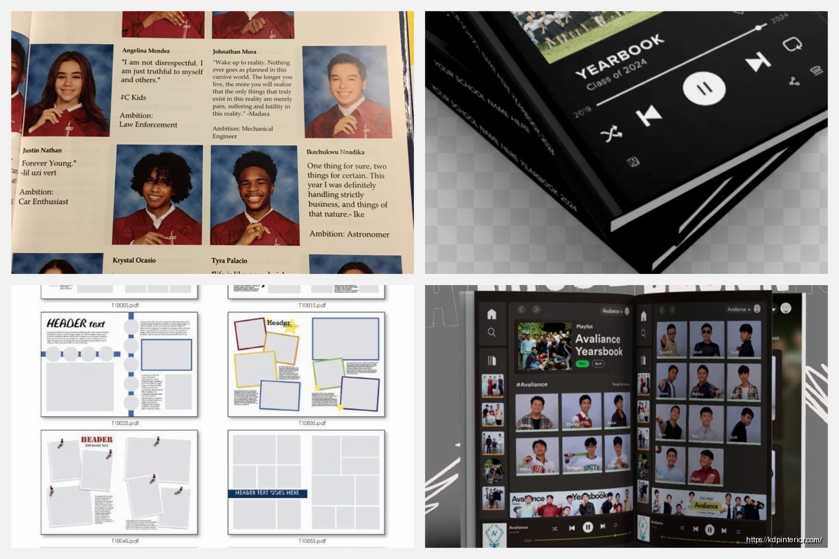
Let me talk about the senior section because that’s like the crown jewel of any yearbook. Each senior typically gets more real estate – usually a larger photo plus a smaller candid or baby photo, their full name, a quote, and then lists of their activities, awards, future plans. The layout for this is usually either a full page with 2-4 seniors or a half-page spread. Some samples include “senior superlatives” pages where you’ve got “most likely to succeed” or “class clown” type categories with photos.
The sports section in yearbook samples follows this pretty standard format too. You’ve got team photos (the formal ones where everyone’s in uniform arranged in rows), action shots from games, and then usually a roster listing all the players. The better samples integrate stats or highlights from the season. Like “Varsity Football – Record: 8-3, Conference Champions” that kind of thing.
This is gonna sound weird but I was watching this documentary about typography while working on this stuff and it made me realize how much white space matters in yearbook design. The samples that feel cramped and overwhelming are the ones that try to fit too much on each page. The ones that look professional have generous margins, consistent spacing between photos, and they’re not afraid to let a page breathe a little.
Okay so funny story – my cat knocked over my coffee right onto a stack of sample printouts I had and it actually made me notice something. The yearbooks that use matte paper stock photograph way better than glossy. The glossy ones had this terrible glare in all my photos and the coffee just beaded up on them. Matte paper gives you better color reproduction for photos and it’s easier to write on if people are signing each other’s yearbooks.
The index section at the back is something a lot of people forget about but it’s super important. It’s alphabetically listed names with page numbers so you can find people quickly. Some samples also include a “memories” or “events” section that highlights big moments from the school year – homecoming, prom, field trips, school plays, that kinda thing.
Division pages are another element you see in basically every sample. These are the full-page or spread designs that separate major sections. So like before you get into the sophomore class photos there’s a division page that says “SOPHOMORES” or “CLASS OF 2026” with some design elements that match the overall yearbook theme. These usually have more creative freedom – you’ll see collages of photos, graphic elements, patterns, whatever fits the theme.
The cover design is obviously crucial and looking at samples there’s definitely trends. Right now I’m seeing lots of minimalist covers with just the school name, year, and maybe a simple graphic element or the school mascot. The busy collage-style covers seem less popular than they were like 10 years ago. Most samples use a hardcover format with either a matte or glossy laminate finish.
Oh wait I should mention endsheets because those are easy to overlook. Endsheets are those first and last pages that are attached to the cover. In yearbook samples these are often a solid color matching school colors or sometimes they have a subtle pattern or design element. Some schools use them for additional signatures or to print the school fight song or alma mater.
The candid photos sections are where yearbooks really show personality. These are the unposed shots from throughout the year – kids in the cafeteria, hallway scenes, classroom moments, pep rallies. The ratio is usually like 60-70% formal portraits and 30-40% candids. The candids break up all those rows of headshots and make the book feel more alive.
For clubs and organizations the format is usually a group photo plus a paragraph description of what the club does and their accomplishments that year. Some samples list all the members, others just show the photo. Depends on how many clubs you’ve got and how much space you’re working with.
I’ve noticed that elementary school yearbooks have a totally different vibe than high school ones. Elementary samples use brighter colors, bigger fonts, more playful graphics. The photos are larger and there’s usually more focus on classroom activities and field trips rather than sports and clubs. The whole tone is more cheerful and less formal.
Middle school yearbooks kinda sit in this awkward middle ground where they’re trying to be more mature than elementary but they’re not quite as serious as high school yearbooks. The samples I’ve seen use moderate photo sizes and a mix of playful and traditional design elements.
Template-wise if you’re creating a yearbook product for KDP or another platform you want to build in flexibility. Leave placeholder text that’s obvious, use a consistent grid system that can accommodate different numbers of photos, and create master pages for recurring elements like headers and page numbers.
The technical specs matter too – most yearbooks are 8.5×11 inches in the US though some schools do 9×12 for a more premium feel. Page count varies wildly depending on school size but I’ve seen samples ranging from like 50 pages for a small elementary school to 300+ pages for a large high school. The paper weight is usually around 80-100 lb text weight so it feels substantial but not too thick.
Honestly the biggest thing I learned from analyzing all these samples is that consistency is everything. Pick your fonts, pick your color scheme, pick your photo frame style, and then stick with it throughout the entire book. The samples that look chaotic are the ones where every section has a different design approach and nothing feels cohesive.
One more thing about the faculty section – this usually comes near the front and includes headshots of teachers, administrators, counselors, support staff. Sometimes there’s a brief bio or quote from each person. The principal or superintendent usually gets a full page with a letter to the students.
 Black Lined Journal: 120 Pages of Black Lined Paper Perfect for Journaling, KDP Notebook Template - 6×9
1 × $0.00
Black Lined Journal: 120 Pages of Black Lined Paper Perfect for Journaling, KDP Notebook Template - 6×9
1 × $0.00  Lined Pages Journal 120 pages Ready to Upload PDF Commercial Use KDP Template 6x9 8.5x11 5x8 for Notebooks, Diaries, Low Content
1 × $0.00
Lined Pages Journal 120 pages Ready to Upload PDF Commercial Use KDP Template 6x9 8.5x11 5x8 for Notebooks, Diaries, Low Content
1 × $0.00 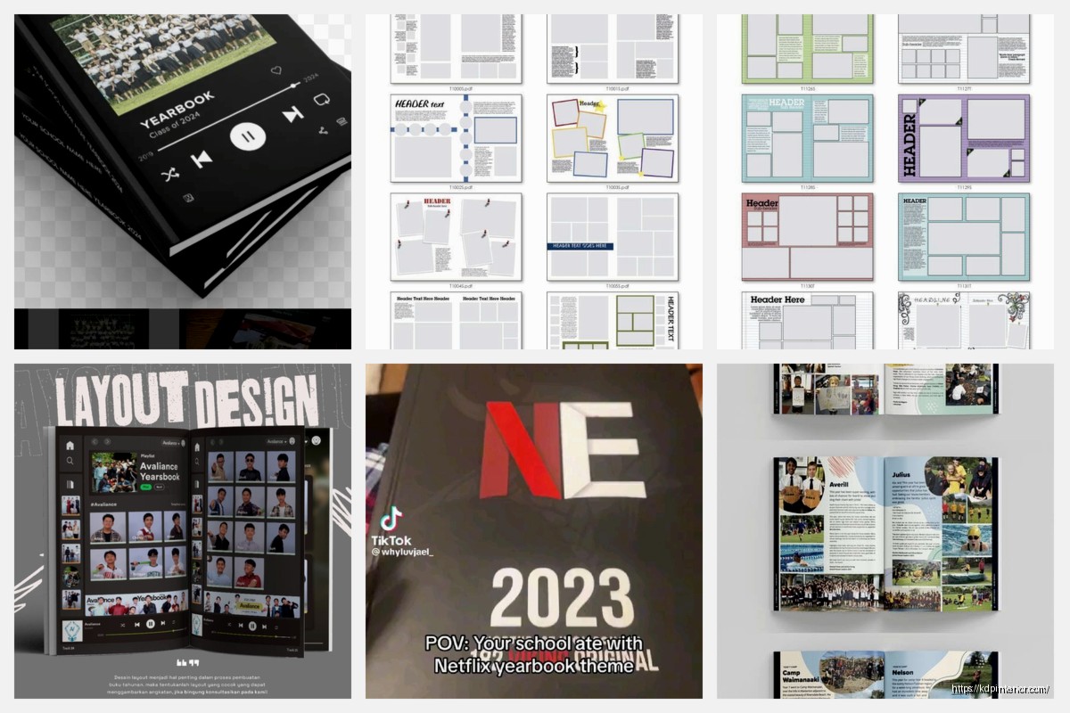
DISCOVER OUR FREE BEST SELLING PRODUCTS
Editable Canva Lined Journal: Express Your Thoughts – KDP Template
Lined Pages Journal 120 pages Ready to Upload PDF Commercial Use KDP Template 6×9 8.5×11 5×8 for Notebooks, Diaries, Low Content
Lined Pages Journal 120 pages Ready to Upload PDF Commercial Use KDP Template 6×9 8.5×11 5×8 for Notebooks, Diaries, Low Content
Cute Dogs Coloring Book for Kids | Activity Book | KDP Ready-To-Upload
Daily Planner Diary : Diary Planners for Everyday Productivity, 120 pages, 6×9 Size | Amazon KDP Interior
Wolf Coloring KDP interior For Adults, Used as Low Content Book, PDF Template Ready To Upload COMMERCIAL Use 8.5×11"
Coloring Animals Head Book for Kids, Perfect for ages 2-4, 4-8 | 8.5×11 PDF
Printable Blank Comic Book Pages PDF : Create Your Own Comics – 3 Available Sizes
Notes KDP interior Ready To Upload, Sizes 8.5×11 6×9 5×8 inch PDF FILE Used as Amazon KDP Paperback Low Content Book, journal, Notebook, Planner, COMMERCIAL Use
Black Lined Journal: 120 Pages of Black Lined Paper Perfect for Journaling, KDP Notebook Template – 6×9
Student Planner Journal 120 pages Ready to Upload PDF Commercial Use KDP Template 6×9" 8.5×11" for Low Content book
Recipe Journal Template – Editable Recipe Book Template, 120 Pages – Amazon KDP Interior