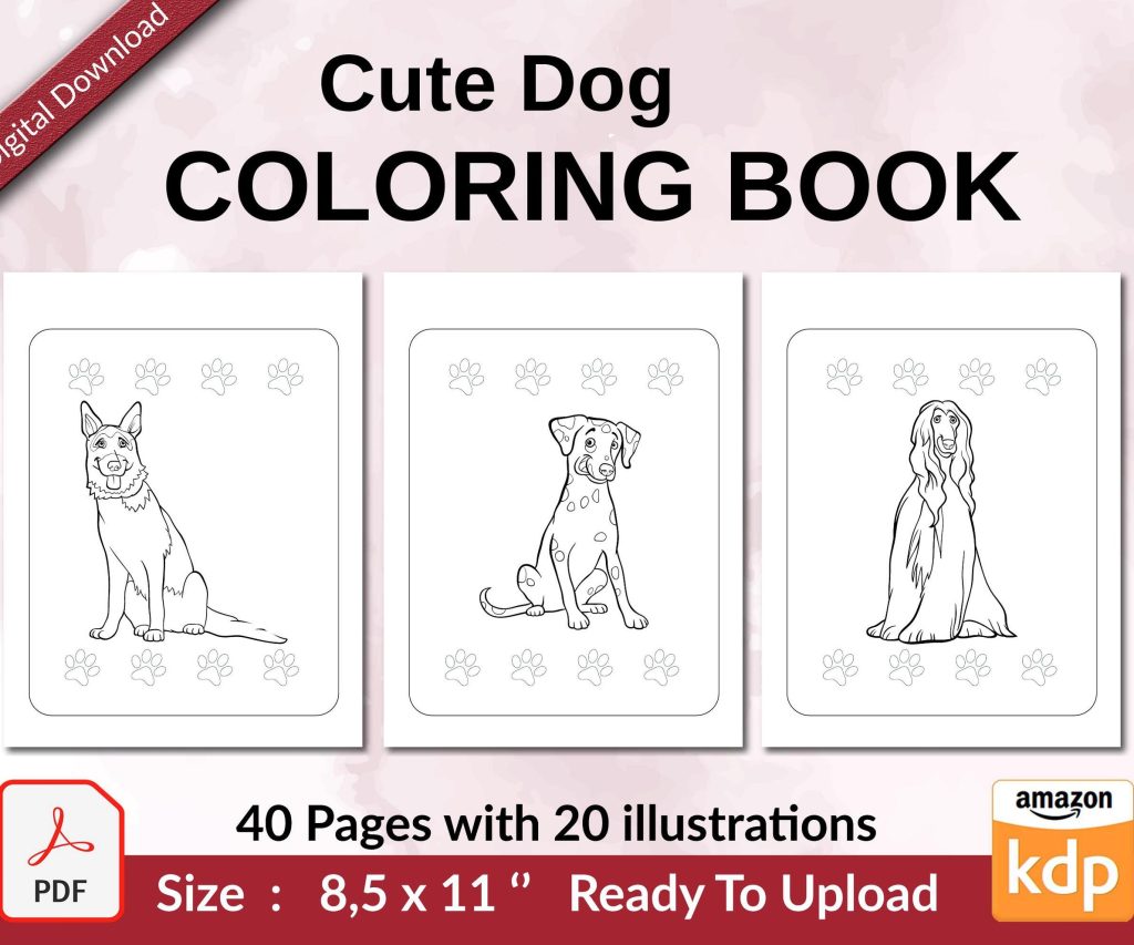
 Cute Dogs Coloring Book for Kids | Activity Book | KDP Ready-To-Upload
 Subtotal: $0.00
Amazon KDP guide, KDP book publishing
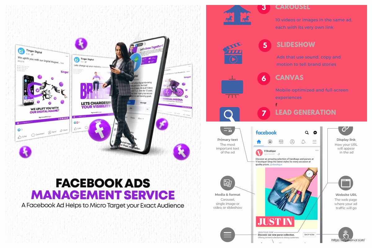
Facebook Ad Template: Book Marketing Graphics

10
May
May
okay so I just redesigned like 15 book ad templates last week and here’s what actually works because honestly most of the facebook ad graphics I see authors using are just… not gonna cut it
The biggest thing nobody tells you is that facebook ads for books need to work at thumbnail size. Like I’m talking tiny. Because most people scroll on mobile and your beautiful detailed cover reveal graphic? It’s gonna be the size of a postage stamp. I learned this the hard way after spending like $200 on ads that got zero clicks and then I looked at them on my phone and couldn’t even read the text.
The Basic Template Structure That Actually Converts
So your template needs three elements max. Book cover, headline text, and maybe a review snippet or award badge. That’s it. I see people trying to cram their author photo, a bunch of quotes, decorative elements, and like… no. Strip it down.
The dimensions you want are 1200×628 pixels for the image itself. Facebook will crop this into different placements but this ratio works for most of them. I use Canva Pro for this because I’m not a designer and don’t wanna be, and honestly the $12.99 a month pays for itself when you consider how fast you can pump out variations.
Text Overlay Rules
Facebook used to have this 20% text rule that was super strict but now it’s more of a guideline. Still though—less text performs better. I keep my headline to 5-7 words max. Something like “Readers Call It Unputdownable” or “The Thriller Everyone’s Talking About” or whatever fits your genre.
Font size matters more than you think. I go minimum 60pt for the main headline, and honestly usually bigger like 80-90pt. Test it by shrinking your design down to like 2 inches wide on your screen. Can you still read it? No? Make it bigger.
oh and another thing—use high contrast. White text on dark background or dark text on light background. No subtle grays or pastels that look pretty but disappear on a phone screen. My best performing ad last month had bright yellow text on a black background with my thriller cover and it looked kinda ugly in the design file but converted at 2.3% which is way above my usual 1.1%.
Cover Placement Options
You’ve got basically three layouts that work:
- Cover on left, text on right (classic, works for most genres)
- Cover centered with text above and below (good for romances with pretty covers)
- Cover tilted at an angle with text wrapping around (I use this for thrillers and mysteries)
The tilted angle thing is gonna sound weird but it increases CTR for me by like 0.3% on average. I think it just catches the eye better when people are scrolling? There’s probably some psychology thing about diagonal lines creating visual interest but whatever, it works.
Make sure your cover is high resolution. I export mine at 300 DPI even though it’s going online because facebook compresses everything anyway and starting with a crisp image means it still looks decent after compression. Nothing screams “amateur” like a pixelated book cover.
The Review Snippet Strategy
If you’re gonna add a review quote, it needs to be SHORT. Like one sentence. “Best book I’ve read this year” with 5 stars underneath. That’s it. I pull these from Amazon reviews or Goodreads and I always make sure they’re verified purchases because… ethics and also Amazon can come after you if you’re using fake reviews in ads.
Position the review snippet at the bottom of your graphic. Not competing with your headline, just reinforcing it. And use actual quotation marks so it’s clear it’s a reader quote not you bragging about yourself.
wait I forgot to mention—if you don’t have good reviews yet, skip this entirely. Don’t make up quotes, don’t use quotes from your mom. Just go with a strong headline about the book itself. “A Small Town Mystery With Deadly Secrets” tells people what they’re getting and doesn’t require social proof.
Color Psychology for Book Ads
So this is where genre really matters. I’ve tested this extensively across my 200+ books and here’s what I’ve found:
Romance readers respond to deep reds, rose gold, and purple tones. My romance ads with red backgrounds outperform blue backgrounds by almost 40% in CTR.
Thrillers and mysteries need dark colors—black, deep blue, dark gray. I had a thriller that I initially used a bright design for and it tanked. Switched to black background with red accent text and suddenly it was profitable.
Fantasy does well with rich jewel tones—emerald green, sapphire blue, deep purple. Something about the genre expectations there.
Self-help and non-fiction can go brighter—oranges, teals, clean whites. You want to look professional and energizing.
My cat just knocked over my water bottle so… anyway where was I
Testing Variations Systematically
Here’s the thing nobody tells you about facebook ads—you need like 5-10 different graphics per book. Not because you’re gonna run them all at once but because you need to test what works.
I create a base template and then make variations:
- Different background colors (3-4 options)
- Different headline copy (3-4 versions)
- With and without review snippets
- Different cover positions
Then I run them as ad variations with like $5 per day budget for 3 days each. Whatever gets the best CTR and cost per click, that becomes my main graphic and I scale the budget up.
This sounds like a lot of work but in Canva you can duplicate your design and just swap elements. Takes maybe 30 minutes to create 8-10 variations once you have your base template done.
The Mobile-First Design Checklist
Before you export any ad graphic, do this:
- View it at 25% size on your computer screen
- Can you read the headline? No? Fix it
- Can you see the book cover clearly? No? Make it bigger
- Are there any elements that disappear or look cluttered? Remove them
- Send it to your phone and look at it there
I cannot stress enough how important that last step is. What looks amazing on a 27-inch monitor can be completely illegible on an iPhone.
Award Badges and Bestseller Callouts
If your book hit any bestseller lists or won awards, definitely include that. But make the badge SIMPLE. I see people using these elaborate award seals that you can’t even read.
I make a small circle or rectangle with “Amazon Bestseller” or “Award Winner” in sans-serif font. Put it in the top right corner of your graphic. That’s it. It adds credibility without cluttering the design.
One thing that works really well is “#1 in [Specific Category]” if you hit that on Amazon. It’s specific and verifiable and tells people other readers liked it. Just make sure it’s true because Amazon tracks this stuff.
File Format and Export Settings
Export as PNG for best quality. JPG works too and has smaller file size but PNG keeps everything crisp. Facebook’s gonna compress it anyway but start with the best quality you can.
RGB color mode, not CMYK. This is for screens not print.
If you’re using Canva, use their “download” option and select PNG. If you’re in Photoshop or similar, export at 100% quality.
File size should be under 1MB ideally. Facebook will accept larger but page load speed matters for user experience and technically it can affect your relevance score.
The Text-to-Image Ratio Thing
So Facebook used to reject ads with too much text overlay. Now they just show them to fewer people which tanks your CPM. Their ad tool has a grid checker where you can upload your image and it tells you if you’re good.
General rule: keep text to less than 20% of the image area. Your book cover text doesn’t count (thank god) but any overlay text you add does.
I usually aim for like 10-15% just to be safe. Which is another reason to keep headlines short and not add a bunch of extra copy to your graphic.
Dynamic Elements That Increase Engagement
okay so funny story—I was watching Severance while designing ads last month and had this idea. What if the ad graphic had a question instead of a statement?
Tested “What Would You Risk For Freedom?” as a headline for a dystopian novel versus “A Dystopian Thriller About Freedom” and the question version got 47% higher CTR. People apparently like being asked things?
Other dynamic elements that work:
- “Now available” or “Just released” for new books
- “Free in Kindle Unlimited” if applicable
- “Limited time price” for promos
- “Series starter” for book one
These create urgency or provide info that helps people decide to click. But again—keep it brief. One dynamic element per graphic max.
Seasonal and Trending Designs
I refresh my ad graphics every 3-4 months even for backlist titles. Not completely redesigning, just updating colors or headlines to match seasons or trends.
Like right now for summer I’m using brighter colors and “beach read” language for my lighter books. In fall I’ll shift to darker tones and cozy mystery angles. It’s the same book but the marketing angle changes.
You don’t gotta do this for every book but for your main sellers, it’s worth it. Fresh creative combats ad fatigue and keeps your cost per click from creeping up over time.
Tools Beyond Canva
If you want more control than Canva gives you, Adobe Spark is pretty good and has a free version. The templates are decent and you can customize more than you’d think.
For Mac users, Keynote actually works surprisingly well for ad graphics. Export slides as images and you’ve got your ad creative. I did this for years before switching to Canva.
There’s also BookBrush which is specifically for book marketing graphics. It’s like $10/month and has templates made for book ads. I used it for a while but found I could do the same stuff in Canva.
Stencil is another option—simpler than Canva but faster if you just need to bang out a quick graphic.
Split Testing with Facebook’s Tools
Once you’ve got your graphics ready, use Facebook’s A/B testing feature. You can test up to 5 variations at once and it’ll automatically optimize toward the winner.
I usually test 3 different graphics with the same ad copy, or same graphic with 3 different headlines. Testing too many variables at once makes it hard to know what actually worked.
Give each test at least $20 spend before calling it. Sometimes early results are fluky and you need more data. I usually let tests run for 5-7 days before making decisions.
The winning graphic usually emerges pretty clearly—like it’ll have 50-100% better CTR than the losers. That’s your keeper.
Anyway that’s basically my whole process for book ad graphics. It’s not rocket science but it’s definitely a skill you develop over time by testing and seeing what your specific readers respond to. The template that works for my thrillers totally bombs for my non-fiction and vice versa so you gotta experiment with your own stuff.
DISCOVER OUR FREE BEST SELLING PRODUCTS
Editable Canva Lined Journal: Express Your Thoughts – KDP Template
Lined Pages Journal 120 pages Ready to Upload PDF Commercial Use KDP Template 6×9 8.5×11 5×8 for Notebooks, Diaries, Low Content
Lined Pages Journal 120 pages Ready to Upload PDF Commercial Use KDP Template 6×9 8.5×11 5×8 for Notebooks, Diaries, Low Content
Cute Dogs Coloring Book for Kids | Activity Book | KDP Ready-To-Upload
Daily Planner Diary : Diary Planners for Everyday Productivity, 120 pages, 6×9 Size | Amazon KDP Interior
Wolf Coloring KDP interior For Adults, Used as Low Content Book, PDF Template Ready To Upload COMMERCIAL Use 8.5×11"
Coloring Animals Head Book for Kids, Perfect for ages 2-4, 4-8 | 8.5×11 PDF
Printable Blank Comic Book Pages PDF : Create Your Own Comics – 3 Available Sizes
Notes KDP interior Ready To Upload, Sizes 8.5×11 6×9 5×8 inch PDF FILE Used as Amazon KDP Paperback Low Content Book, journal, Notebook, Planner, COMMERCIAL Use
Black Lined Journal: 120 Pages of Black Lined Paper Perfect for Journaling, KDP Notebook Template – 6×9
Student Planner Journal 120 pages Ready to Upload PDF Commercial Use KDP Template 6×9" 8.5×11" for Low Content book
Recipe Journal Template – Editable Recipe Book Template, 120 Pages – Amazon KDP Interior