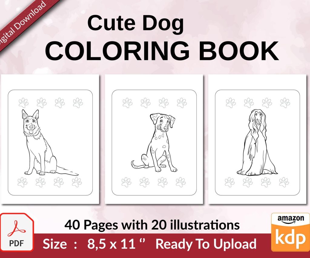
 Cute Dogs Coloring Book for Kids | Activity Book | KDP Ready-To-Upload
 Subtotal: $0.00
Amazon KDP guide, KDP book publishing
Facebook Background Template: Author Page Design
11
May
May
Okay so I just redesigned my author page background last week and honestly the whole process is way easier than people make it out to be, but there’s like… specific dimensions you gotta get right or Facebook just crops everything weird.
The main thing is Facebook cover photos are 820 pixels wide by 312 pixels tall for desktop, but then on mobile it shows as 640 by 360, which is super annoying because you basically need to design for both or your text gets cut off. I learned this the hard way when I put my tagline right at the bottom and mobile users literally couldn’t see it at all.
Getting Your Dimensions Right
So here’s what actually works: create your template at 820 x 312 but keep everything important in the center 640 x 360 area. Think of it like a safe zone. I use Canva for this because they actually have a Facebook cover template built in, but you can use Photoshop or whatever. My cat knocked over my coffee while I was working on this yesterday and I almost lost the whole file but anyway.
The profile picture sits in the lower left corner and it’s 170 x 170 pixels, but Facebook displays it at different sizes depending on device. On your author page it overlaps your cover photo so you need to account for that space. Don’t put important text or graphics in that bottom left area or it’ll be hidden.
What Actually Makes Sense for Author Pages
For author pages specifically, you want people to immediately understand what you write. I see so many authors using generic stock photos of libraries or coffee cups and it’s like… okay but what’s your genre? Your background should communicate:
- Your genre or niche super clearly
- Your author name in readable font
- Maybe a tagline if you have one that’s actually good
- Visual elements that match your book covers
I write mostly low-content books and some ebooks about self-publishing, so my background has a clean workspace vibe with subtle elements like notebooks and a laptop. Nothing too cluttered. One of my friends writes romance and she uses soft colors with elegant typography, which makes sense for her brand.
Design Elements That Actually Work
Typography is huge here. Don’t use script fonts unless they’re REALLY readable at small sizes. I made this mistake with my first design and people on mobile couldn’t read my name at all. Sans-serif fonts work better for digital, especially Montserrat, Poppins, or Raleway. Keep font sizes at minimum 40pt for main text.
Color-wise, you want contrast but not like… blinding contrast. I use a dark blue background with white text because it’s easy on the eyes and matches my book cover color schemes. If your books have a consistent color palette, pull from that. Your background should feel like an extension of your brand.
The Branding Consistency Thing
This is gonna sound obvious but your Facebook background should match your other platforms. If your Amazon author page has one vibe and your Facebook has a completely different vibe, it confuses people. I keep the same color scheme across Amazon, my website, Facebook, and Instagram. It’s just easier and looks more professional.
Oh and another thing, include subtle visual hierarchy. Your name should be the biggest element, then your tagline or genre, then any decorative stuff. People scan from left to right, top to bottom, so put your most important info top-left if possible, but remember that profile picture placement.
Tools I Actually Use
Canva is honestly the easiest option. They have free templates but the paid ones are better if you can swing the $13/month. I’ve been using Canva Pro for like three years and it’s worth it just for the background remover and brand kit features.
If you want more control, Photoshop works but it’s overkill for most authors unless you’re already comfortable with it. GIMP is the free alternative but the learning curve is steeper.
For stock photos, Unsplash and Pexels are free and actually decent quality. Canva also has a huge stock library. Just make sure you’re not using the exact same image everyone else uses. I see that one photo of a typewriter on like every third author page and it’s so overdone.
Actually Making the Template
Start with your background layer. This could be a solid color, gradient, or photo. If you use a photo, darken it or add an overlay so text is readable. I usually add a semi-transparent dark layer over photos at like 50-60% opacity.
Then add your text layers. Put your author name prominently, probably in the upper left or center. Add your genre or tagline below that in smaller text. Keep everything aligned and balanced, don’t just randomly place stuff.
Add any graphic elements last. This could be book covers, icons related to your genre, or decorative shapes. Don’t go overboard though. I see authors cramming like 10 book covers onto their background and it just looks messy.
The Mobile Preview Thing
Wait I forgot to mention this earlier but it’s super important. Always preview how your design looks on mobile before you finalize it. In Canva you can’t really preview the mobile crop, which is annoying, so what I do is create a second artboard at 640 x 360 and copy my design over to see what gets cut off.
Facebook’s mobile app crops from the center, so the left and right edges get cut off first. If you have text near the edges, it’ll disappear on mobile. Keep everything centered or at least within that safe zone I mentioned.
Text Readability Issues
Make sure there’s enough contrast between your text and background. Use white text on dark backgrounds or dark text on light backgrounds. Avoid putting text over busy parts of photos unless you add a solid shape behind the text.
Drop shadows can help text pop but don’t overdo it. A subtle shadow with like 50% opacity is enough. I see people using massive shadows that make text look weird.
Letter spacing matters too. Tight letter spacing can make text hard to read, especially in all caps. I usually increase letter spacing to 5-10% for headings.
Common Mistakes I See All The Time
Low resolution images are the biggest issue. If you upload a blurry background, it looks unprofessional. Stick to at least 820 x 312 but honestly I design at double that (1640 x 624) and then export at the right size so it’s crisp on retina displays.
Too much text is another problem. Your background isn’t a billboard. Just your name, maybe a tagline, that’s it. I’ve seen authors try to list all their books or their entire bio and it’s just cluttered.
Ignoring brand colors is a mistake. If your books are all dark and moody and your Facebook background is bright pink, that’s confusing. Stay consistent.
Updating Your Background
I update mine every few months or when I release a new book. It keeps your page looking active and current. You don’t need to completely redesign it, just refresh elements or swap in a new book cover.
When you have a new release, definitely update your background to feature that book. It’s free advertising to everyone who visits your page. I put my newest book cover on the right side of my background for about 2-3 months after release.
The Technical Upload Process
When you’re ready to upload, go to your Facebook author page and click on your existing cover photo. Select “Upload Photo” and choose your file. Facebook will let you reposition it slightly but not much.
After uploading, check it immediately on your phone. Seriously, do this every time. I’ve uploaded designs that looked perfect on desktop and terrible on mobile.
If something looks off, don’t just leave it. Go back, adjust your design, and re-upload. It takes like 10 minutes to fix but leaving a bad background up looks sloppy.
File Format and Size
Save as PNG for best quality, especially if you have text or graphics with sharp edges. JPG works too and has smaller file size but can get compressed weird. Keep your file under 100KB if possible so it loads fast.
Facebook compresses images anyway so don’t stress too much about having a massive file. I usually export at high quality PNG and let Facebook handle compression.
Design Inspiration Sources
Look at successful authors in your genre and see what they’re doing. Don’t copy them but notice patterns. Romance authors tend to use softer colors and elegant fonts. Thriller authors use darker, edgier designs.
Pinterest has tons of author branding examples. Search “author Facebook cover” or “Facebook banner design” and you’ll find hundreds of ideas.
Dribbble and Behance show more professional design work if you want something elevated. Most of it’s not specifically for authors but you can adapt concepts.
Seasonal Updates
Some authors do seasonal backgrounds which is kinda cool but also extra work. I did a winter-themed one last December with snow and it performed well, got more engagement than usual. But it’s not necessary.
If you do seasonal updates, keep your branding consistent. Just add seasonal elements, don’t completely change your whole aesthetic.
Testing What Works
Honestly the only way to know if your background is working is to test different versions. I’ve tried minimalist designs, busy designs, photo backgrounds, solid colors… minimalist with one clear focal point performs best for me.
Track your page engagement after updating your background. If you see a drop in likes or comments, your design might be confusing or off-putting. If engagement goes up, you’re probably on the right track.
You can also just ask your readers. Post in your group or on your page asking for feedback. People will tell you if something’s hard to read or looks weird.
One last thing, don’t overthink this. Your background is important but it’s not gonna make or break your author career. Get something decent up there that represents your brand and move on to actually writing and marketing your books. I spent like two weeks obsessing over my first background design and honestly could’ve used that time better elsewhere.
DISCOVER OUR FREE BEST SELLING PRODUCTS
Editable Canva Lined Journal: Express Your Thoughts – KDP Template
Lined Pages Journal 120 pages Ready to Upload PDF Commercial Use KDP Template 6×9 8.5×11 5×8 for Notebooks, Diaries, Low Content
Lined Pages Journal 120 pages Ready to Upload PDF Commercial Use KDP Template 6×9 8.5×11 5×8 for Notebooks, Diaries, Low Content
Cute Dogs Coloring Book for Kids | Activity Book | KDP Ready-To-Upload
Daily Planner Diary : Diary Planners for Everyday Productivity, 120 pages, 6×9 Size | Amazon KDP Interior
Wolf Coloring KDP interior For Adults, Used as Low Content Book, PDF Template Ready To Upload COMMERCIAL Use 8.5×11"
Coloring Animals Head Book for Kids, Perfect for ages 2-4, 4-8 | 8.5×11 PDF
Printable Blank Comic Book Pages PDF : Create Your Own Comics – 3 Available Sizes
Notes KDP interior Ready To Upload, Sizes 8.5×11 6×9 5×8 inch PDF FILE Used as Amazon KDP Paperback Low Content Book, journal, Notebook, Planner, COMMERCIAL Use
Black Lined Journal: 120 Pages of Black Lined Paper Perfect for Journaling, KDP Notebook Template – 6×9
Student Planner Journal 120 pages Ready to Upload PDF Commercial Use KDP Template 6×9" 8.5×11" for Low Content book
Recipe Journal Template – Editable Recipe Book Template, 120 Pages – Amazon KDP Interior