Okay so last month I had this client come to me with a manuscript that was like, 150 pages in Calibri font with random spacing and I nearly lost it. Here’s the thing about book formatting that nobody tells you until you’ve already screwed up your first three launches…
Manuscript Basics That’ll Save Your Butt
Right off the bat, you gotta understand that Amazon KDP and traditional publishers have different expectations, but there’s this sweet spot in the middle that works for basically everything. I learned this the hard way back in 2017 when I submitted a cookbook with photos that looked amazing on my screen and turned into pixelated garbage on actual Kindles.
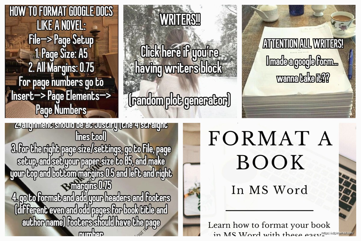
Start with a Word doc or Google Doc. I know everyone wants to be fancy with Scrivener or Vellum (and honestly Vellum is incredible if you’re on Mac), but Word is industry standard for manuscripts. Publishers expect .docx files. Amazon accepts them. Just use Word.
The Font Situation
Use Times New Roman 12pt or Courier New 12pt for your manuscript. That’s it. I don’t care if you think Garamond looks prettier or whatever. When you’re submitting to agents or doing traditional publishing, they want Times New Roman or Courier. My dog just knocked over my coffee and honestly that’s how I feel when I see manuscripts in Comic Sans or something wild.
For your actual published book, that’s different. On KDP, the font gets converted anyway, but if you’re doing print books, you’ve got more options. Garamond, Baskerville, Caslon… these are all solid serif fonts that are easy to read. For the love of god don’t use Arial or Helvetica for body text in a print book. Sans serif fonts are for headings and covers, not for 300 pages of text.
Margins and Spacing Because This Gets Messy
Okay so for manuscripts (like what you’d send to an agent or keep as your master file):
- 1-inch margins on all sides
- Double-spaced lines
- Left-aligned text (not justified)
- 0.5-inch first-line indent for paragraphs
Do NOT put extra spaces between paragraphs in a manuscript. That’s a formatting thing people do for blog posts and it drives editors crazy. You indent the first line, that’s how you show a new paragraph.
Wait I forgot to mention – your first paragraph of each chapter doesn’t get indented. And paragraphs after scene breaks don’t get indented either. That’s just the way it’s done and I have no idea why but every published book does it this way.
For Your Actual Published Book
This is where it gets different. When you’re formatting for KDP or IngramSpark or whatever:
- Single-spaced lines
- Justified text (flush on both left and right sides)
- Same indent situation – first line of paragraphs about 0.2-0.3 inches
- Margins depend on your trim size
I spent like three hours last Tuesday comparing margin sizes because I was watching The Last of Us and got distracted by how the formatting would work for a post-apocalyptic journal-style book, which is totally not what I was supposed to be working on but whatever.
Page Headers and Numbers
In manuscripts, put your last name and the page number in the top right corner of every page except the first page. Use the header function in Word, don’t manually type it on each page because that’s insane.
For published books, headers usually have the book title on left-side pages (verso) and chapter title or author name on right-side pages (recto). Page numbers can go top outside corners or bottom center. Just be consistent. Oh and another thing – front matter pages (copyright, dedication, table of contents) use Roman numerals (i, ii, iii, iv) and then you switch to regular numbers (1, 2, 3) when Chapter One starts.
First Page of Your Manuscript
Top left corner, single-spaced:
- Your real name
- Your address
- Your phone number
- Your email
Top right corner:
- Word count (round to nearest thousand)
- Genre
Then drop down about a third of the page and center your title in ALL CAPS. Under that, centered, put “by Your Name.” Then drop down four lines and start your first chapter.
This is gonna sound weird but I still format my manuscripts this way even though I’m only self-publishing now, because it keeps me organized and honestly it just looks professional when I send beta versions to my ARC readers.
Chapter Formatting That Actually Matters
Each chapter starts on a new page. Use page breaks, don’t just hit Enter a bunch of times. In Word, that’s Ctrl+Enter on PC or Command+Enter on Mac.
Chapter headings can be:
- Chapter One (spelled out)
- Chapter 1 (numeral)
- Just “1” or “ONE”
- A chapter title without numbers
- Both number and title like “Chapter 1: The Beginning”
I’ve done all of these across my 200+ books and honestly what works depends on your genre. Thrillers and mysteries tend to use numbers. Literary fiction often uses titles without numbers. Romance goes both ways. Check what bestselling books in your genre do and copy that.
Put your chapter heading about 4-6 lines down from the top of the page. Don’t start it right at the margin like you’re trying to save paper. White space is your friend.
Scene Breaks vs Chapter Breaks
Scene breaks within a chapter are usually shown with a blank line and either:
- Three asterisks centered (* * *)
- A single centered symbol like # or a decorative dingbat
- Just extra white space (risky because it can get lost in formatting)
I use the three asterisks method because it’s foolproof when you’re converting to ebook formats. Amazon’s converter won’t mess it up.
Front Matter and Back Matter Structure
Okay so this is where most beginners mess up because they don’t realize books have a specific order for all the stuff before and after the actual story.
Front Matter Order:
- Half-title page (just the book title, nothing else)
- Also by page (your other books)
- Title page (book title, subtitle if you have one, author name)
- Copyright page
- Dedication (optional)
- Epigraph (optional – that fancy quote some authors put in)
- Table of Contents (for nonfiction usually, sometimes for fiction)
- Foreword (written by someone else)
- Preface or Introduction (written by you)
You don’t need all of these. Most of my fiction books just have: Also by, Title page, Copyright, and then straight to Chapter One. My nonfiction books have more front matter because readers expect it.
Back Matter Order:
- Acknowledgments
- About the Author
- Also by the Author
- Sneak peek of your next book
- Request for reviews
Back matter is prime real estate for self-publishers. This is where you sell your other books, build your email list, whatever. Traditional publishers do this too now but we figured it out first.
Copyright Page Essentials
Your copyright page needs:
- Copyright © [Year] by [Your Name or Pen Name]
- All rights reserved statement
- ISBN (for print books – KDP gives you free ones)
- Publisher name (can be your own imprint)
- Disclaimer if it’s fiction (“This is a work of fiction…”)
- Edition information (First Edition, Second Edition, etc.)
You can add stuff like “Cover design by whoever” or “Edited by whoever” if you want. I always credit my cover designers because they deserve it and it makes them more likely to give me rush jobs when I need them.
Special Formatting for Different Genres
This is where it gets specific and honestly where you can make or break your book’s professional appearance.
Fiction Novels
Pretty straightforward. Everything I mentioned above applies. One thing though – if you’re writing literary fiction, you can get away with more experimental formatting. Regular commercial fiction, stick to the standards. Nobody wants to read a thriller with weird font choices.
Nonfiction Books
You gotta have a table of contents. Clickable in ebooks. Nonfiction readers want to jump around.
Use heading styles properly – Heading 1 for chapters, Heading 2 for main sections within chapters, Heading 3 for subsections. This is gonna make your life so much easier when you convert to ebook because the converter uses these to build your navigation.
Include an index if your book is over 200 pages and reference-heavy. Yeah it’s a pain to create, but it adds value and looks professional.
Poetry Collections
Poems are centered on the page or left-aligned depending on the style. Each poem starts on a new page usually. Page numbers are often at the bottom center. My cat just walked across my keyboard but actually that’s kind of how poetry formatting feels sometimes – you need to preserve the exact line breaks and spacing the poet intended.
Cookbooks and How-To Books
Images need to be at least 300 DPI for print. For ebooks, Amazon recommends 72 DPI but I usually go higher. Size them appropriately – don’t put a 10MB image in an ebook, nobody wants a 400MB download.
Use text boxes sparingly. They can mess up reflowable ebook formatting. If you’re doing a fixed-layout ebook, that’s different, but most text-heavy books should be reflowable.
Dialogue Formatting Rules Nobody Tells You
Each speaker gets a new paragraph. Every single time. Even if it’s just one word.
Dialogue tags and action beats follow specific patterns:
“I’m leaving,” she said.
“I’m leaving.” She grabbed her coat.
She grabbed her coat. “I’m leaving.”
Notice the punctuation. When the dialogue tag (she said) comes after dialogue, you use a comma inside the quotes, not a period. When you have an action beat (She grabbed her coat), that’s a separate sentence, so you use a period inside the quotes.
This seems picky but readers notice when it’s wrong. They might not know why the book feels amateur, but they’ll feel it.
Widows, Orphans, and Other Annoying Things
A widow is when the last line of a paragraph appears alone at the top of a new page. An orphan is when the first line of a paragraph appears alone at the bottom of a page. Both look bad.
In Word, you can control this under Paragraph settings – check “Widow/Orphan control.” For print books, you might need to manually adjust by adding or cutting a few words to make things flow better.
Also watch out for rivers – those weird white space patterns that form vertically through justified text when word spacing gets wonky. You fix these by rewording sentences or adjusting hyphenation settings.
Ebook-Specific Formatting Gotchas
Okay so ebooks are their own beast. What looks good in print can break in ebook format.
Don’t use tabs to indent paragraphs. Use the first-line indent function in paragraph settings or CSS if you’re coding in HTML. Tabs create weird spacing on different devices.
Don’t use text boxes. They don’t convert well.
Don’t use headers and footers with page numbers because ebooks don’t have fixed pages. You can have chapter headers but make them part of the text, not in the header function.
Keep your images in-line with text, not wrapped or floated. Amazon’s converter handles in-line images way better.
The KDP-Specific Stuff
When you upload to KDP, you can use their previewer tool and honestly you better check every single page. I still find formatting glitches even after 200+ books. The converter does weird things sometimes.
For ebooks, KDP accepts:
- .doc or .docx (Word documents)
- .html or .htm
- .epub (they’ll convert it)
- .mobi (older format)
I usually upload Word docs for simple text-heavy books and HTML/EPUB for anything with complex formatting. You have more control with HTML but it requires knowing basic code or using a program like Calibre or Sigil.
For print books through KDP Print, upload a PDF. Make sure it’s press-ready – fonts embedded, RGB colors converted to CMYK, correct trim size, proper margins including gutter (the extra space toward the spine).
Trim Sizes and When They Matter
KDP offers specific trim sizes. Most popular for novels:
- 5″ x 8″ – standard for most fiction
- 6″ x 9″ – good for nonfiction, thicker novels
- 5.25″ x 8″ – slightly different, also common
- 8.5″ x 11″ – workbooks, textbooks, some nonfiction
Margins need to account for the binding. A 200-page book needs less gutter space than a 500-page book because the pages don’t curve as much toward the spine. KDP has templates you can download that show the safe zones.
My client canceled last week so I spent a few hours comparing the spine width calculations for different page counts and paper types. White paper creates a thicker spine than cream paper for the same page count because cream paper is denser. This matters when you’re designing your cover wrap.
Hyphenation Yes or No
For manuscripts, turn hyphenation off. Editors want to see your actual word choices without automatic breaks.
For print books, turn hyphenation on but use it sparingly. Manual hyphenation gives you more control. Too much hyphenation makes text look choppy, not enough creates big gaps in justified text.
For ebooks, don’t hyphenate at all. Let the device handle text flow. Different screen sizes need different breaking points anyway.
Special Characters and Formatting Marks
Use proper em dashes (—) not double hyphens (–). In Word, type two hyphens and it usually auto-converts, or use Alt+0151 on PC or Option+Shift+Minus on Mac.
Use proper ellipses (…) not three periods. It’s a single character with specific spacing. In Word, type three periods and it auto-converts usually.
Use smart quotes (“”) not straight quotes (“”). Word does this automatically if you have AutoFormat turned on. Straight quotes look terrible in professionally published books.
Use an en dash (–) for ranges like “pages 10–15” or “2010–2015.” It’s shorter than an em dash but longer than a hyphen.
Italics vs Underline vs Bold
In manuscripts, you used to underline words that should be italicized in the final book. This is old-school from typewriter days. Now just use italics.
Use italics for:
- Thoughts in fiction
- Emphasis
- Foreign words
- Book titles, movie titles, ship names
- Letters or diary entries within your story
Use bold sparingly, usually just for headings or maybe keywords in nonfiction.
Never underline in a finished book. Underlines are for hyperlinks now, and using them for emphasis looks dated.
Table of Contents – How to Not Screw This Up
For print books, you can manually type your TOC. For ebooks, you need a clickable TOC.
In Word, use the built-in TOC function under References. It’ll pull from your Heading styles. This creates a clickable TOC that converts properly to ebook formats.
Your TOC should include:
- All chapters
- Major sections of front matter (Foreword, Introduction)
- Major sections of back matter (Acknowledgments, About the Author)
Don’t include every single subsection or it gets cluttered. Main navigation points only.
 Editable Canva Lined Journal: Express Your Thoughts - KDP Template
1 × $0.00
Editable Canva Lined Journal: Express Your Thoughts - KDP Template
1 × $0.00 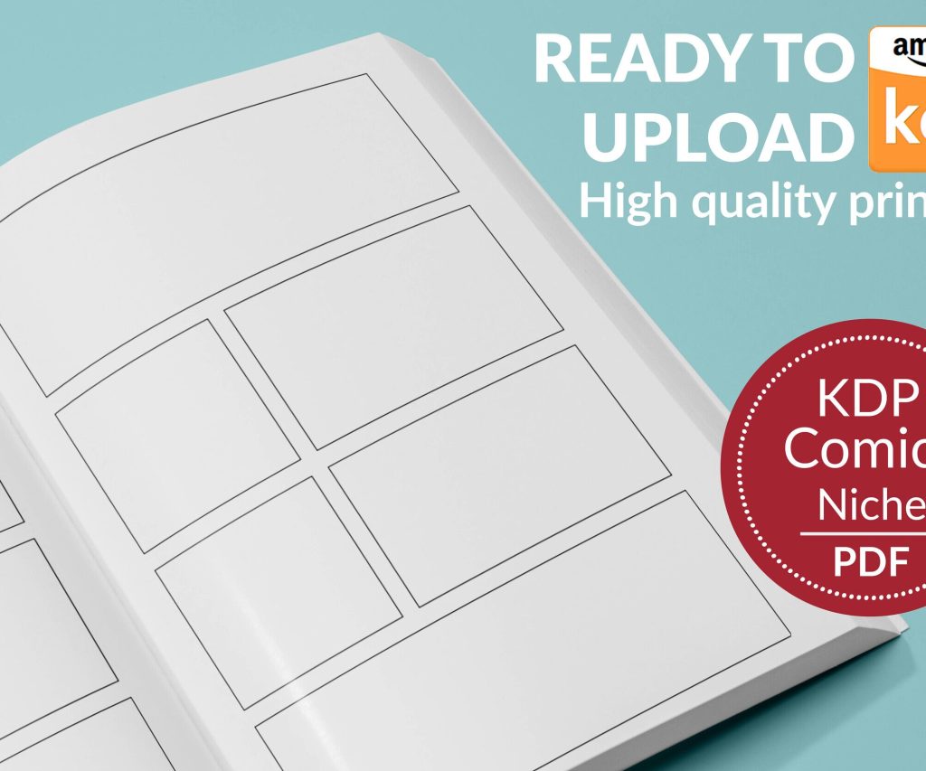 Printable Blank Comic Book Pages PDF : Create Your Own Comics - 3 Available Sizes
1 × $0.00
Printable Blank Comic Book Pages PDF : Create Your Own Comics - 3 Available Sizes
1 × $0.00 
DISCOVER OUR FREE BEST SELLING PRODUCTS
Editable Canva Lined Journal: Express Your Thoughts – KDP Template
Lined Pages Journal 120 pages Ready to Upload PDF Commercial Use KDP Template 6×9 8.5×11 5×8 for Notebooks, Diaries, Low Content
Lined Pages Journal 120 pages Ready to Upload PDF Commercial Use KDP Template 6×9 8.5×11 5×8 for Notebooks, Diaries, Low Content
Cute Dogs Coloring Book for Kids | Activity Book | KDP Ready-To-Upload
Daily Planner Diary : Diary Planners for Everyday Productivity, 120 pages, 6×9 Size | Amazon KDP Interior
Wolf Coloring KDP interior For Adults, Used as Low Content Book, PDF Template Ready To Upload COMMERCIAL Use 8.5×11"
Coloring Animals Head Book for Kids, Perfect for ages 2-4, 4-8 | 8.5×11 PDF
Printable Blank Comic Book Pages PDF : Create Your Own Comics – 3 Available Sizes
Notes KDP interior Ready To Upload, Sizes 8.5×11 6×9 5×8 inch PDF FILE Used as Amazon KDP Paperback Low Content Book, journal, Notebook, Planner, COMMERCIAL Use
Black Lined Journal: 120 Pages of Black Lined Paper Perfect for Journaling, KDP Notebook Template – 6×9
Student Planner Journal 120 pages Ready to Upload PDF Commercial Use KDP Template 6×9" 8.5×11" for Low Content book
Recipe Journal Template – Editable Recipe Book Template, 120 Pages – Amazon KDP Interior