Okay so I just spent like three hours yesterday setting up a Google Docs template for someone’s cookbook and here’s what actually matters for publishing standards…
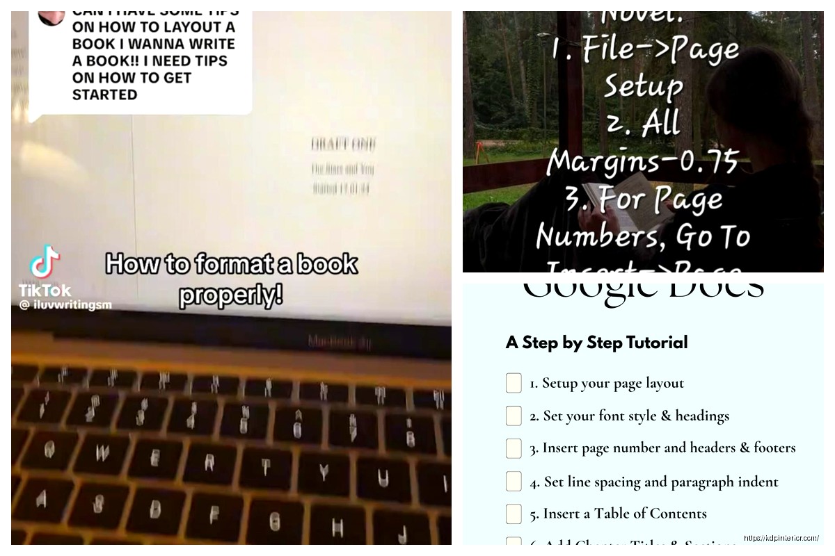
First thing – and this trips people up constantly – you gotta change your page setup BEFORE you start formatting anything. Click File > Page Setup and here’s where most people mess up. Set your trim size right here. If you’re doing a standard 6×9 book (which is like 80% of what I publish), you need custom dimensions. Type in 6 inches width and 9 inches height. Don’t use the preset Letter or A4 because Amazon’s gonna reject that or your formatting will look completely off when it converts.
Margins are where it gets weird. Amazon KDP needs different margins for left and right pages because of the gutter – that’s the part that gets eaten by the binding. I usually go with 0.75 inches on the outside edges and 0.9 inches on the inside. Top and bottom can be 0.75 inches each. Now Google Docs doesn’t have a “mirrored margins” option like Word does which is annoying but you work around it by just using slightly bigger margins on both sides.
Font Selection That Won’t Get Rejected
Use standard fonts. I cannot stress this enough. Times New Roman, Garamond, Georgia – these are your friends. I see people trying to get fancy with decorative fonts and then their book looks like a ransom note. For body text, go with 11pt or 12pt. I personally use 11.5pt Garamond for most books because it gives you a nice professional look without eating up too many pages.
Your chapter headings can be bigger obviously. I do 18pt or 20pt for chapter titles, maybe bold them. Don’t go crazy with colors unless you’re doing a children’s book or something very specific. Black text on white pages. Boring works.
Oh and another thing – line spacing matters more than you think. Use 1.15 or 1.5 line spacing. Single spacing looks cramped and weird in print. Double spacing is for manuscripts you’re submitting to agents, not finished books. I learned this the hard way when my first book looked like a middle school essay.
Paragraph Formatting
Okay so this is gonna sound nitpicky but it matters. First line indentation should be 0.3 to 0.5 inches. You set this by clicking Format > Align & Indent > Indentation Options. Put that measurement in “First Line” indent.
BUT – and this is important – your first paragraph of each chapter shouldn’t be indented. It should be flush left. That’s the industry standard. Every paragraph after that gets indented. You can set this up with paragraph styles which I’ll get to in a second.
Don’t use extra spacing between paragraphs unless you’re doing a scene break. Regular fiction or non-fiction? No extra space between paragraphs. Just the indent shows where a new paragraph starts. If you DO need a scene break, use a single centered symbol like *** or ### or just three blank lines.
Setting Up Styles Properly
This is where Google Docs actually shines compared to some other options. You can create paragraph styles that you reuse throughout the whole document.
Click on the style dropdown (it says “Normal text” by default) and hover over any style like “Heading 1” then click the arrow and select “Update Heading 1 to match.” But first, format a paragraph exactly how you want it – right font, size, spacing, everything.
I create custom styles for:
– Chapter Titles (Heading 1)
– Section Headers (Heading 2)
– Body Text (Normal Text modified)
– First Paragraph (no indent version)
– Block Quotes if needed
Wait I forgot to mention – turn off auto-capitalization and auto-correct for this. It’ll mess with your formatting. Go to Tools > Preferences and uncheck those boxes.
Headers and Footers for Page Numbers
Insert > Headers & Footers > Page Number. Here’s the thing though – you probably don’t want page numbers on your title page or copyright page. So you gotta work around Google Docs limitations a bit.
Put your front matter (title page, copyright, dedication) in a separate document. I know this sounds annoying but trust me it’s easier. Your main manuscript starts with Chapter 1, and THAT’s where you start page numbering.
For the header or footer style, I usually put page numbers centered at the bottom or in the outer corners (right side for right pages, left side for left pages). But again, Google Docs doesn’t do different odd/even pages automatically, so centered bottom is your safest bet.
Some people like to put the book title or author name in headers. That’s fine for non-fiction. For fiction it can look amateurish unless you’re already established. My cat just knocked over my coffee while I’m writing this, great.
Front Matter Setup
Your book needs this stuff in order:
– Title page (just the title and your name, centered, nice and simple)
– Copyright page (copyright year, your name, “All rights reserved,” ISBN if you have one, publisher info)
– Dedication if you want one
– Table of Contents for non-fiction (Google Docs can auto-generate this from your heading styles which is super helpful)
Each of these should start on a new page. Use Insert > Break > Page Break. Don’t just hit Enter a bunch of times because that’ll shift around when you convert to PDF.
Chapter Formatting
Every chapter should start on a new page. Page break before each one.
Chapter heading should be maybe 2-3 inches from the top of the page, not right at the margin. This is called a “chapter drop” and it looks more professional. You can do this with extra line breaks ABOVE the chapter title or by setting spacing before the paragraph in Format > Line & Paragraph Spacing > Add Space Before Paragraph.
The chapter number and title can be on the same line or separate lines. Like:
Chapter One
The Beginning
or just
Chapter One: The Beginning
Whatever matches your genre expectations. Thrillers and mysteries tend to be more minimalist. Romance can be more decorative. Non-fiction is usually straightforward.
Special Characters and Formatting
If you need em dashes – these things – use Insert > Special Characters or just type two hyphens and Google Docs usually auto-converts them. Make sure you’re using real em dashes (—) not just double hyphens (–) in your final version.
Ellipses should be the actual ellipsis character (…) not three periods, though honestly most readers won’t notice. You can find it in Special Characters too.
Italics for emphasis, internal thoughts, book titles, foreign words. Bold is rarely used in body text except maybe for the first line of a chapter sometimes or for emphasis in non-fiction.
Back Matter
After your last chapter you might want:
– Author bio
– List of other books
– Acknowledgments
– Sneak peek of next book
Same formatting rules apply. Page breaks between sections. Keep it simple and readable.
Exporting for KDP
Okay so funny story, I once uploaded a Google Doc directly to KDP and it looked terrible. The formatting got all weird. Here’s what actually works:
File > Download > PDF Document (.pdf)
Make sure when you download it says “PDF” not “Microsoft Word” because the Word conversion can mess up spacing sometimes. The PDF preserves everything exactly as you see it.
Before you download though, go through the ENTIRE document in Print Preview (File > Print but don’t actually print, just look at it). This shows you exactly what the PDF will look like. Check that:
– Page breaks are where you want them
– Nothing weird is happening with margins
– All fonts look right
– Images if you have any are positioned correctly
Common mistakes I see: Widows and orphans. That’s when you have a single line of a paragraph alone at the top or bottom of a page. Looks unprofessional. You gotta manually adjust by adding or removing a word or two to make the paragraph break better. Google Docs doesn’t have automatic widow/orphan control like Word does, so you’re doing this manually.
Images and Graphics
If you’re adding images – like for a cookbook or travel guide or whatever – use Insert > Image and select “In line” for text wrapping. This keeps images anchored to specific paragraphs so they don’t float around weirdly.
Images should be at least 300 DPI for print. Lower resolution looks pixelated. You can check this before inserting by looking at the image properties on your computer.
Center your images usually, and give them a little breathing room with line breaks above and below. Captions can go underneath in a smaller font size or italics.
Table of Contents for Non-Fiction
If you set up your heading styles correctly (Heading 1 for chapters, Heading 2 for sections), you can auto-generate a TOC.
Put your cursor where you want the TOC (usually after the copyright page). Then Insert > Table of Contents. Choose the style you like – with page numbers or with links. For a print book you want page numbers. For an ebook you want links.
The TOC will update automatically if you add or change headings. Just right-click it and select “Update table of contents.”
Final Checks Before Upload
Read through the PDF on your computer. Then read it again. I know it’s boring but you’ll catch formatting issues you missed.
Things to look for:
– Consistent spacing between chapters
– Page numbers are sequential and correct
– No weird font changes you didn’t intend
– All italics and bold formatting came through
– Images are clear and positioned right
– No random extra page breaks creating blank pages (unless you want them for pacing)
Print a test copy if you can. I always order a proof copy from KDP before I approve it for sale. The screen version looks different than physical print. Colors might shift, margins might feel different, fonts might look bigger or smaller than you expected.
One More Thing About Trim Sizes
Different trim sizes work better for different genres. 6×9 is standard for most non-fiction and some fiction. 5×8 is popular for novels, especially in certain genres like mystery or romance. 8.5×11 is for workbooks, journals, textbooks.
Larger trim size = fewer pages but higher printing cost. Smaller trim size = more pages but might look more “book-like” depending on content.
Whatever size you pick, stay consistent across a series. Readers notice when Book 1 is 6×9 and Book 2 is suddenly 5×8.
Alright so that’s basically everything I do when setting up a Google Doc for publishing. The key is getting all this right BEFORE you start writing or at least before you’re done with your first draft. Reformatting a 300-page document after the fact is gonna drive you crazy. Set up your template, save it, and use it for every project.
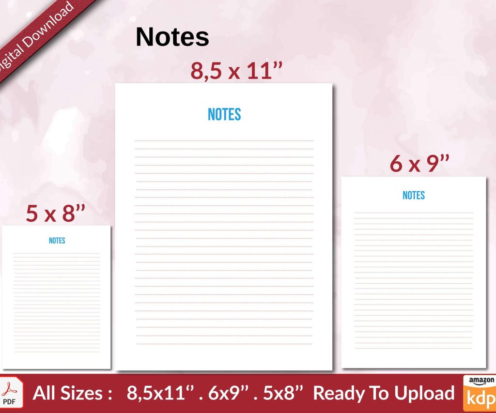 Notes KDP interior Ready To Upload, Sizes 8.5x11 6x9 5x8 inch PDF FILE Used as Amazon KDP Paperback Low Content Book, journal, Notebook, Planner, COMMERCIAL Use
1 × $0.00
Notes KDP interior Ready To Upload, Sizes 8.5x11 6x9 5x8 inch PDF FILE Used as Amazon KDP Paperback Low Content Book, journal, Notebook, Planner, COMMERCIAL Use
1 × $0.00  Black Lined Journal: 120 Pages of Black Lined Paper Perfect for Journaling, KDP Notebook Template - 6×9
1 × $0.00
Black Lined Journal: 120 Pages of Black Lined Paper Perfect for Journaling, KDP Notebook Template - 6×9
1 × $0.00 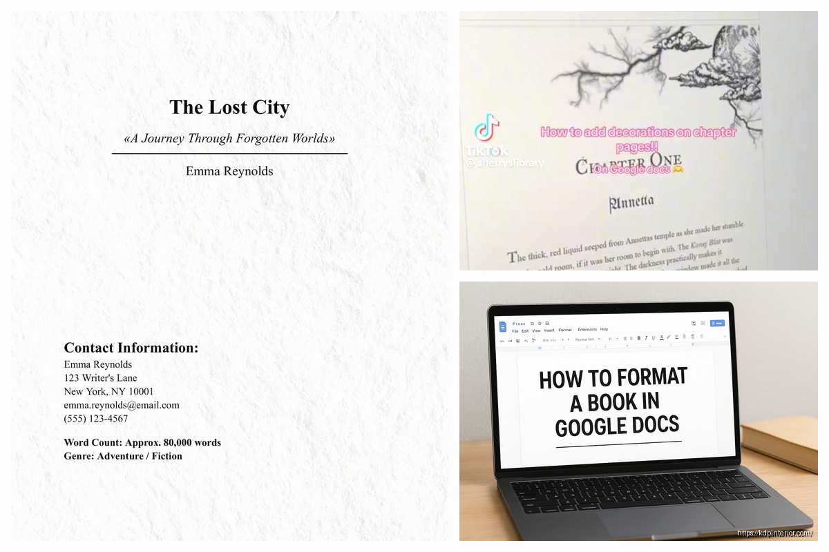
DISCOVER OUR FREE BEST SELLING PRODUCTS
Editable Canva Lined Journal: Express Your Thoughts – KDP Template
Lined Pages Journal 120 pages Ready to Upload PDF Commercial Use KDP Template 6×9 8.5×11 5×8 for Notebooks, Diaries, Low Content
Lined Pages Journal 120 pages Ready to Upload PDF Commercial Use KDP Template 6×9 8.5×11 5×8 for Notebooks, Diaries, Low Content
Cute Dogs Coloring Book for Kids | Activity Book | KDP Ready-To-Upload
Daily Planner Diary : Diary Planners for Everyday Productivity, 120 pages, 6×9 Size | Amazon KDP Interior
Wolf Coloring KDP interior For Adults, Used as Low Content Book, PDF Template Ready To Upload COMMERCIAL Use 8.5×11"
Coloring Animals Head Book for Kids, Perfect for ages 2-4, 4-8 | 8.5×11 PDF
Printable Blank Comic Book Pages PDF : Create Your Own Comics – 3 Available Sizes
Notes KDP interior Ready To Upload, Sizes 8.5×11 6×9 5×8 inch PDF FILE Used as Amazon KDP Paperback Low Content Book, journal, Notebook, Planner, COMMERCIAL Use
Black Lined Journal: 120 Pages of Black Lined Paper Perfect for Journaling, KDP Notebook Template – 6×9
Student Planner Journal 120 pages Ready to Upload PDF Commercial Use KDP Template 6×9" 8.5×11" for Low Content book
Recipe Journal Template – Editable Recipe Book Template, 120 Pages – Amazon KDP Interior