 Cute Dogs Coloring Book for Kids | Activity Book | KDP Ready-To-Upload
 Subtotal: $0.00
Amazon KDP guide, KDP book publishing
Google Docs Book Layout: Interior Design Guide
11
Mar
Mar
Okay so I just spent like three hours yesterday setting up a book interior in Google Docs and honestly it’s way easier than people make it out to be, you just gotta know which buttons to click.
Setting Up Your Document First
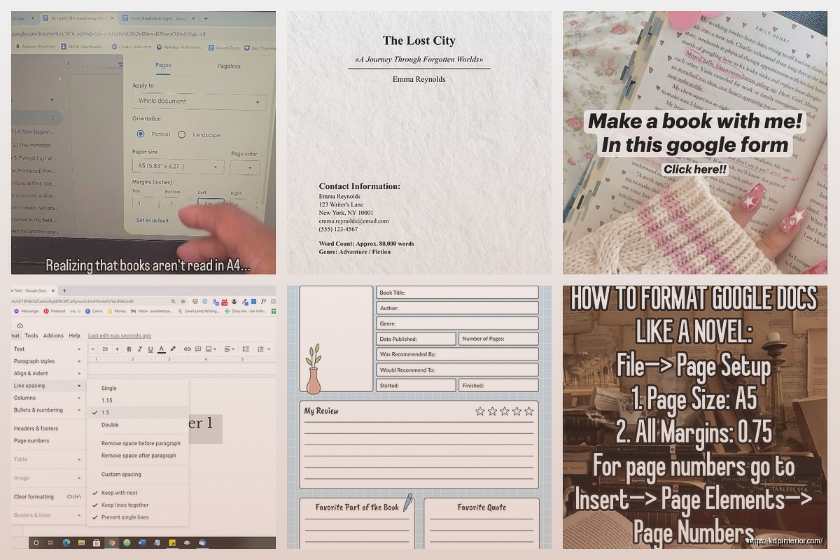
First thing – don’t use the default page setup because it’s gonna be all wrong for your book. Go to File > Page Setup and this is where most people mess up already. Your trim size matters here. Most KDP books are either 6×9 or 5×8 inches, so you need to set custom dimensions.
Click on the paper size dropdown and scroll all the way down to “Custom” – type in your width and height. For a 6×9 book that’s obviously 6 inches wide by 9 inches tall. Margins are where it gets tricky though. I usually do 0.75 inches on top and bottom, then 0.5 inches on the outside edge and 0.75 inches on the inside (that’s your gutter for binding).
Oh and another thing – make sure you set this to “Apply to whole document” before you click OK or you’ll be doing it again in like five minutes when you realize only one page changed.
Margins and the Whole Mirror Thing
Wait I forgot to mention – you need to enable “Different odd & even” pages if you want your book to look professional. This is under the same Page Setup menu. Why? Because in real books, the page numbers and headers switch sides. Left page has stuff on the left, right page has stuff on the right.
Actually scratch that, let me explain it better. When you open a physical book, the left page (verso) and right page (recto) are mirror images of each other in terms of margins. The gutter (binding edge) needs more space so text doesn’t disappear into the spine.
Google Docs doesn’t have automatic mirror margins like Word does which is annoying, so you kinda have to work around it. What I do is just use slightly larger inside margins on both sides – like 0.75 or even 0.8 inches – and call it good enough. Most readers won’t notice a tiny difference between left and right pages.
Headers and Page Numbers That Don’t Suck
This is gonna sound weird but headers are where Google Docs actually shines compared to some other programs. Double-click at the top of any page to enter the header area. You’ll see “Options” appear on the right side.
Check these boxes:
– Different first page (so your title page doesn’t have a header)
– Different odd & even (so headers can alternate sides)
For page numbers, go to Insert > Page Numbers > More Options. Here’s what I do – I select “Show on first page” as OFF because nobody puts a page number on the title page. Then I choose to start numbering from the first actual chapter page, not the front matter.
Position them either centered at bottom (easiest) or alternating top corners if you wanna get fancy. Top right on odd pages, top left on even pages. To do this you’ll need to insert the page number separately in an odd page header and an even page header.
My cat just knocked over my coffee while I was testing this yesterday and I lost like twenty minutes of formatting, so save your work constantly.
Chapter Headings and Typography
Okay so fonts. Do NOT use anything decorative or weird for your body text. Seriously. I’ve seen people try to publish books in Comic Sans and it’s… just no.
For fiction, use:
– Garamond (classic, easy to read)
– Georgia (good for digital)
– Times New Roman (boring but works)
For nonfiction:
– Calibri (clean, modern)
– Arial (basic but professional)
– Helvetica if you have it
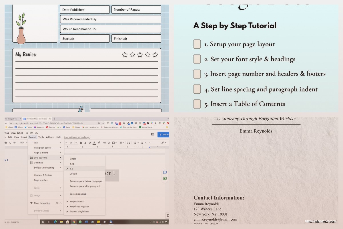
Body text should be 11pt or 12pt. I usually go with 11pt for 6×9 books because 12pt can look kinda large and eat up your page count. Line spacing should be 1.15 or 1.2 – you set this by selecting your text, then Format > Line & Paragraph Spacing.
Chapter titles can be bigger – I do 18pt or 20pt, usually in the same font as body text but bold. Some people like a different font for chapter headings which is fine, just don’t go crazy.
Paragraph Formatting That Looks Like a Real Book
Here’s the thing nobody tells you – real books don’t have spaces between paragraphs. They use first-line indents instead. Highlight all your body text, then go to Format > Align & Indent > Indentation Options. Set “Special indent” to “First line” and put 0.3 or 0.5 inches.
But wait – the first paragraph after a chapter heading shouldn’t be indented. That’s just how books work. So you’ll need to manually remove the indent from those paragraphs. Pain in the butt but it looks professional.
Remove the spacing between paragraphs too. Format > Line & Paragraph Spacing > Remove space after paragraph. By default Google Docs adds extra space and it looks wrong for books.
Section Breaks for Chapter Starts
Each chapter should start on a new page, obviously. Don’t just hit Enter a bunch of times like a maniac – use actual page breaks. Put your cursor at the end of a chapter and go to Insert > Break > Page Break (or just hit Ctrl+Enter on PC, Cmd+Enter on Mac).
Some people like chapters to always start on odd pages (right-hand side when you open the book). Google Docs doesn’t have an “odd page section break” option, so you gotta do this manually. If a chapter ends on an odd page, insert TWO page breaks so the next chapter lands on the next odd page. The in-between page just stays blank.
Front Matter and Back Matter
Don’t forget your front matter – that’s title page, copyright page, maybe a dedication or table of contents. These usually use roman numerals for page numbers (i, ii, iii) instead of regular numbers, but honestly Google Docs makes this annoying to set up. I usually just don’t number the front matter pages at all. Start your page numbering from Chapter 1.
Back matter is your About the Author page, other books you’ve published, maybe a request for reviews. This stuff goes after your last chapter.
Styles and Consistency
Okay so funny story – I used to format everything manually and then realized Google Docs has styles that can save you hours. Select a chapter heading you’ve formatted how you like it. Then go to the toolbar where it says “Normal text” and click the dropdown. Hover over “Heading 1” or whichever heading level you want, and click “Update Heading 1 to match.”
Now every time you apply Heading 1 to text, it’ll use your formatting. This is huge for consistency across your whole book.
Do the same for body text – format one paragraph perfectly, then update the “Normal text” style to match it.
Images and Graphics If You Need Them
For nonfiction books you might need images. Insert them with Insert > Image, then click on the image and you’ll get wrapping options. For books, I almost always use “In line” so the image sits between paragraphs and moves with your text.
Resize images by dragging the corners – keep them proportional. Don’t make them too close to the margins or they might get cut off when printed. Leave at least 0.25 inches of space from any edge.
Center your images usually, unless you’ve got a specific design reason not to. Select the image and hit Ctrl+Shift+E (or Format > Align & Indent > Center).
Exporting for KDP
When you’re done, you need to export as PDF for KDP. Go to File > Download > PDF Document. This gives you a print-ready file most of the time.
Before you upload to KDP though – and I cannot stress this enough – check your PDF carefully. Open it in Adobe Reader or whatever and flip through every single page. Look for:
– Weird page breaks
– Text too close to margins
– Images that shifted
– Headers showing up where they shouldn’t
– Page numbers that are wrong
I usually find at least three things I need to fix on the first export. It’s normal.
The Bleed Issue
Wait I forgot to mention bleed. If your book has images or design elements that go to the edge of the page, you need to set up bleed. That’s an extra 0.125 inches on all sides that gets trimmed off.
Honestly? Google Docs isn’t great for bleed. If you need full-bleed images, you might wanna use a different program. But for text-only books or books with simple centered images, Google Docs works fine.
Table of Contents Automation
If you used heading styles (which you should’ve), you can auto-generate a table of contents. Put your cursor where you want the TOC, then Insert > Table of Contents. Pick the style with page numbers.
The TOC will update automatically if you change your headings. Right-click on it and select “Update table of contents” if you add new chapters.
Checking Your Line Count
KDP charges you based on page count, so you wanna know how many pages your book is gonna be. Google Docs shows you the page count at the bottom left of the screen. But remember – this is with YOUR trim size settings. If you set up 6×9 pages, you’re seeing 6×9 page count.
For a 50,000-word novel in 6×9 trim, 11pt font, you’re looking at around 200-250 pages usually. Nonfiction with more white space might be more.
Common Mistakes to Avoid
Don’t use double spaces after periods – that’s a typewriter thing and it looks wrong in books. Do a find-and-replace to fix this if you’ve got the habit. Find two spaces, replace with one space.
Don’t use straight quotes – use curly quotes. Google Docs usually does this automatically but check your apostrophes especially. Tools > Preferences > check “Use smart quotes.”
Don’t use underlining for emphasis – use italics. Underlining is for typewriters and hyperlinks, not books.
Don’t use more than one font for body text. Maybe two if you’ve got a really good design reason, but probably just one.
Final Thoughts on the Whole Process
The biggest thing is just gonna be checking your work multiple times. I always export the PDF, then read it on my tablet or phone to see how it actually looks. You’ll catch stuff you missed on the computer screen.
Also test-print a few pages if you can, especially if you’re doing a paperback. Colors look different printed, and sometimes your margins that looked fine on screen are actually too tight in physical form.
Google Docs isn’t perfect for book formatting – programs like Vellum or Atticus are way more powerful – but it’s free and it works. I’ve published probably 30+ books formatted entirely in Google Docs and they look professional enough that readers don’t complain.
Just take your time with the setup and you’ll be fine.
DISCOVER OUR FREE BEST SELLING PRODUCTS
Editable Canva Lined Journal: Express Your Thoughts – KDP Template
Lined Pages Journal 120 pages Ready to Upload PDF Commercial Use KDP Template 6×9 8.5×11 5×8 for Notebooks, Diaries, Low Content
Lined Pages Journal 120 pages Ready to Upload PDF Commercial Use KDP Template 6×9 8.5×11 5×8 for Notebooks, Diaries, Low Content
Cute Dogs Coloring Book for Kids | Activity Book | KDP Ready-To-Upload
Daily Planner Diary : Diary Planners for Everyday Productivity, 120 pages, 6×9 Size | Amazon KDP Interior
Wolf Coloring KDP interior For Adults, Used as Low Content Book, PDF Template Ready To Upload COMMERCIAL Use 8.5×11"
Coloring Animals Head Book for Kids, Perfect for ages 2-4, 4-8 | 8.5×11 PDF
Printable Blank Comic Book Pages PDF : Create Your Own Comics – 3 Available Sizes
Notes KDP interior Ready To Upload, Sizes 8.5×11 6×9 5×8 inch PDF FILE Used as Amazon KDP Paperback Low Content Book, journal, Notebook, Planner, COMMERCIAL Use
Black Lined Journal: 120 Pages of Black Lined Paper Perfect for Journaling, KDP Notebook Template – 6×9
Student Planner Journal 120 pages Ready to Upload PDF Commercial Use KDP Template 6×9" 8.5×11" for Low Content book
Recipe Journal Template – Editable Recipe Book Template, 120 Pages – Amazon KDP Interior