Amazon KDP guide, KDP book publishing
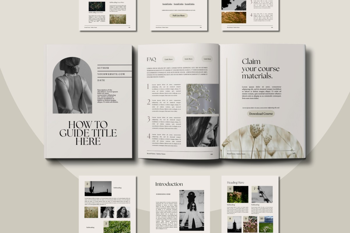
Guidebook Template: Reference Book Format

Apr
Okay so I just finished reformatting three of my reference guidebooks last month and honestly the whole “reference book format” thing clicked way better than when I was trying to force them into regular ebook layouts.
The Basic Structure That Actually Works
Right so the main difference between a regular guidebook and a reference format is people aren’t gonna read it cover to cover. They’re jumping around looking for specific info which means your table of contents needs to be insanely detailed. Like I’m talking chapter, section, subsection level detail. I learned this the hard way when someone left a 3-star review saying they couldn’t find the info about pruning schedules in my gardening guide even though it was RIGHT THERE in chapter 4. But my TOC just said “Chapter 4: Seasonal Maintenance” which… yeah not helpful.
Your template should start with a super functional TOC that links directly to each section. In KDP you can do this with HTML anchors or if you’re using Word just make sure all your headings are properly styled so the TOC auto-generates with links.
Front Matter Setup
Title page obviously but then I always include a “How to Use This Guide” page right after. Sounds basic but you gotta tell people this is a reference book not a novel. Something like “This guide is organized for quick reference. Use the detailed table of contents or index to jump directly to the information you need.”
Then your mega-detailed TOC. Then I usually throw in a quick reference page or chart if it makes sense for the topic. Like for my hiking guide I have a one-page difficulty rating chart, for the cooking substitutions guide there’s a conversion table right up front.
Content Organization Tricks
The big thing with reference formats is you need consistent structure on every single page. I use what I call the “entry format” where each topic gets the same treatment:
- Bold header with the main topic
- Quick definition or overview paragraph
- Bulleted key points
- Detailed explanation if needed
- Cross-references to related sections
- Example or illustration when relevant
This consistency means readers learn the pattern and can scan faster. I tested this with my tech troubleshooting guide and time-on-page metrics actually went DOWN which sounds bad but for reference books it’s perfect because it means people found their answer quickly.
Oh and another thing – headers need to be descriptive not cute. I used to write creative headers like “When Your Garden Gets Thirsty” but for reference format it needs to be “Watering Frequency by Plant Type” so someone scanning can actually find it.
The Chunking Method
Break everything into small chunks. I’m talking 200-300 words max per section before you hit another header. My dog keeps interrupting me right now wanting to go out but anyway… where was I.
Right so chunking. Reference books live or die on scannability. Wall of text = death. Even if you’re explaining something complex you gotta break it up with subheaders every few paragraphs.
I structure most entries like:
Main Topic Header (H2)
Brief intro paragraph
Subtopic 1 (H3)
Content chunk
Subtopic 2 (H3)
Content chunk
And I use visual breaks too. Horizontal rules between major sections, boxes or callouts for important warnings or tips. KDP lets you do basic formatting with borders and background shading if you’re using HTML or you can just use bold text blocks.
Index Requirements
Okay so this is gonna sound like overkill but you NEED an index for reference books over like 100 pages. Not just the TOC but an actual alphabetical index at the back. I skip this on shorter guides under 75 pages but anything bigger and people expect it.
Creating an index is honestly tedious. I use a spreadsheet where I list every important term, concept, name, whatever, then note which page it appears on. Then alphabetize and format. There’s software that can help but for my niche topics I find it faster to just do it manually while binge-watching something mindless.
The index should include:
- Main topics and subtopics
- Alternative terms people might search for
- Cross-references (see also…)
- Page numbers obviously
Layout and Formatting Specifics
For KDP I usually go with 6×9 trim size for reference guides. Gives you enough real estate for tables and charts without being unwieldy. Margins at 0.75 inches all around except 1 inch on the binding side.
Font choice matters more than you’d think. I use regular serif fonts like Garamond or Georgia at 11pt for body text. Headers in the same font family but bold and sized up – H1 at 18pt, H2 at 14pt, H3 at 12pt. Keep it simple because you want maximum readability not design awards.
Line spacing at 1.15 or 1.2 works better than single-space for reference books because again… scannability. People’s eyes need to track easily down the page.
Tables and Charts
If your reference book has comparative info you gotta use tables. I fought this for so long trying to format everything as lists but tables are just clearer for certain data.
Keep tables simple with clear headers. Don’t get fancy with colors if you’re doing print books because they show up as grayscale anyway unless you’re doing color interior which gets expensive. Bold the header row, use borders to separate columns, that’s it.
For charts or diagrams I create them in Canva at high resolution (300 dpi minimum) and embed them as images. Make sure they’re still readable when the book is at actual size – zoom your PDF to 100% and check because what looks good on your computer screen might be tiny and illegible in the actual book.
Navigation Elements
Running headers are super useful for reference books. I put the chapter title on the left page header and section title on the right page header. Helps people orient themselves when they’re flipping through.
Page numbers obviously but I like to include the total page count too like “Page 47 of 203” in the footer. Some people think it looks cluttered but for reference materials I think it’s helpful.
Cross-referencing is huge. Whenever you mention a related topic include a note like “(see page XX)” or “(see Section 3.2)”. This creates a web of connections that makes the book way more useful. I literally go through and add these on a second pass after everything’s laid out and I know the final page numbers.
Sidebar and Callout Boxes
Use these strategically for:
- Quick tips that don’t fit the main flow
- Warnings or cautions
- Real-world examples
- Related resources or further reading
I format these with a border and maybe a light gray background. Keep the text inside shorter than regular paragraphs – 2-3 sentences max usually.
Don’t overdo it though. Too many callouts and the page looks chaotic. I aim for maybe one every 3-4 pages maximum.
Back Matter Essentials
After your main content and index you want:
Appendices if you have supplementary material that’s useful but would bog down the main text. Reference tables, extended examples, resource lists, whatever makes sense for your topic.
Glossary for any specialized terminology. Alphabetical, keep definitions concise. I usually do like one sentence definition plus maybe one example sentence.
Bibliography or Resources if you’re citing sources or want to point readers to additional information. I keep this pretty minimal for most of my guides but for anything research-heavy it’s important for credibility.
About the Author page super brief. Like 2-3 sentences about your expertise plus maybe mention your other books if relevant.
Digital vs Print Considerations
Wait I forgot to mention this earlier but you gotta think about whether this is ebook-only or also print.
For ebook versions of reference books the navigation is different. You rely more on the linked TOC and less on page numbers obviously. I actually create slightly different versions – the ebook version has more hyperlinks throughout the text jumping between sections, while the print version has page number references.
Tables can be tricky in ebooks because screen sizes vary. I keep them simple with max 3-4 columns and make sure they’re formatted to reflow. Or sometimes I just convert complex tables to images for the ebook version.
Print reference books are honestly where this format shines though. People like having physical reference materials they can tab, highlight, write in. I price my reference guides higher than regular books because they’re more utility than entertainment.
Testing Your Layout
Before you publish proof that thing thoroughly. I order a print proof for every reference book and actually use it. Like sit down with it and try to find specific pieces of information the way a reader would. Is the TOC detailed enough? Can you find things via the index? Are cross-references accurate?
I caught so many issues this way. Page number references that were wrong because I edited after creating them. Index entries pointing to the wrong pages. Charts that were too small to read. Headers that broke weird across pages.
The KDP previewer is okay but it doesn’t catch everything. Physical proof or at minimum a PDF you view at actual size is essential.
Common Mistakes I See
People try to make reference books too pretty. Fancy fonts, elaborate formatting, decorative elements everywhere. Reference books need to be functional first. Clean and clear beats beautiful every time.
Not enough white space. Cramming too much on each page makes it hard to scan. Leave breathing room.
Inconsistent formatting. If you use bold for key terms you gotta do it everywhere not just randomly. Same with how you format examples or handle cross-references.
Forgetting about the reader who jumps in middle. Every section should make sense on its own without requiring someone to have read everything before it. Include context or cross-references to prerequisite info.
Quick Template Checklist
When I start a new reference guide I literally have this checklist:
- Title page formatted
- How to Use This Guide page written
- Detailed TOC with 3 levels minimum
- Consistent header hierarchy established
- Entry format template created
- Cross-reference system planned
- Running headers set up
- Callout box style defined
- Table format standardized
- Index structure decided
- Back matter sections outlined
Having this stuff decided before I write the actual content saves so much time. I just plug information into the established format rather than figuring out structure as I go.
The whole point is making information accessible fast. That’s what people are paying for with reference books – not your writing style or narrative flow but the ability to find exactly what they need in under a minute. Structure everything around that goal and you’ll create something people actually use instead of just download and forget about.
DISCOVER OUR FREE BEST SELLING PRODUCTS
Editable Canva Lined Journal: Express Your Thoughts – KDP Template
Lined Pages Journal 120 pages Ready to Upload PDF Commercial Use KDP Template 6×9 8.5×11 5×8 for Notebooks, Diaries, Low Content
Lined Pages Journal 120 pages Ready to Upload PDF Commercial Use KDP Template 6×9 8.5×11 5×8 for Notebooks, Diaries, Low Content
Cute Dogs Coloring Book for Kids | Activity Book | KDP Ready-To-Upload
Daily Planner Diary : Diary Planners for Everyday Productivity, 120 pages, 6×9 Size | Amazon KDP Interior
Wolf Coloring KDP interior For Adults, Used as Low Content Book, PDF Template Ready To Upload COMMERCIAL Use 8.5×11"
Coloring Animals Head Book for Kids, Perfect for ages 2-4, 4-8 | 8.5×11 PDF
Printable Blank Comic Book Pages PDF : Create Your Own Comics – 3 Available Sizes
Notes KDP interior Ready To Upload, Sizes 8.5×11 6×9 5×8 inch PDF FILE Used as Amazon KDP Paperback Low Content Book, journal, Notebook, Planner, COMMERCIAL Use
Black Lined Journal: 120 Pages of Black Lined Paper Perfect for Journaling, KDP Notebook Template – 6×9
Student Planner Journal 120 pages Ready to Upload PDF Commercial Use KDP Template 6×9" 8.5×11" for Low Content book
Recipe Journal Template – Editable Recipe Book Template, 120 Pages – Amazon KDP Interior