Okay so I just wrapped up a hardcover mockup project for a client last week and honestly the whole premium format visual thing is way more important than most KDP authors realize…
Look hardcover mockups aren’t just about slapping your cover on a 3D template and calling it done. Like you actually need to think about how you’re presenting your book because that’s what separates the $9.99 paperback crowd from people charging $29.99 for hardcovers.
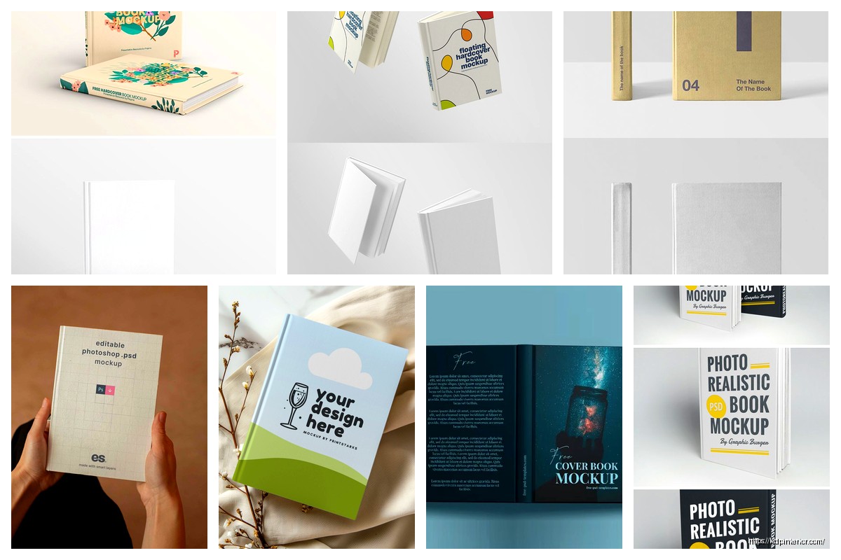
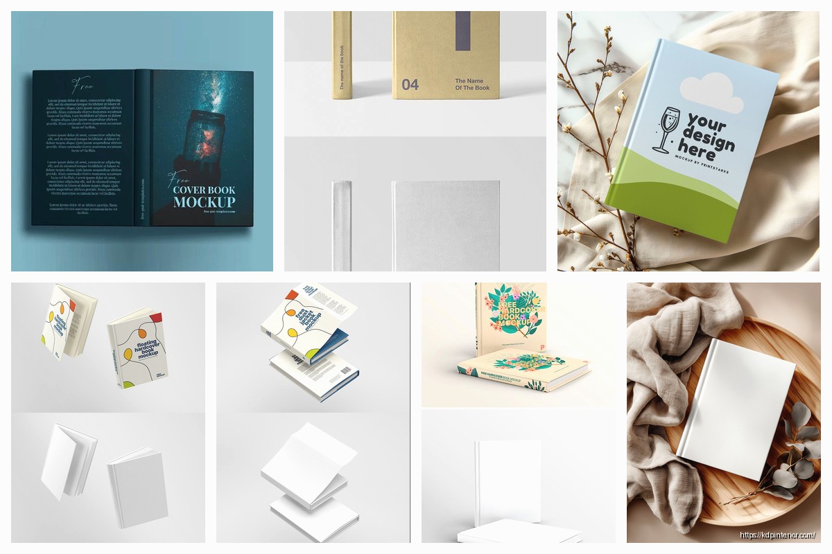
First thing – and I cannot stress this enough – you need actual hardcover-specific mockup templates. Don’t just use your paperback mockups with different dimensions. Hardcovers have dust jackets, they have that satisfying thickness, the spine is different. I see authors all the time using Placeit or Covervault templates meant for paperbacks and just… no. The proportions are wrong and anyone who’s held a hardcover knows something looks off.
Where to Actually Get Good Hardcover Mockups
So here’s what I use and recommend. Placeit has a dedicated hardcover section but you gotta dig for it – it’s not front and center. They’ve got maybe 30-40 solid hardcover templates versus like 200+ paperback ones. The ones I use most are the straight-on view with the book slightly open showing the first page, and the angled view on a wooden surface because that screams “premium” for some reason.
Creative Market is where I spend too much money honestly. There are designers who create these insanely detailed hardcover mockup PSDs. My go-to is this bundle I bought like two years ago for $29 that has 15 different scenes – books on marble countertops, stacked hardcovers, books with coffee cups (cliche but it works). The quality is just… chef’s kiss. You need Photoshop though which is annoying if you don’t already have it.
Vecteezy and Freepik have free options but they’re hit or miss. I downloaded probably 50 free hardcover mockups before finding 3 that actually looked professional enough to use. The free ones often have weird lighting or the book proportions look cartoonish. But if you’re just starting out and can’t drop money on mockups yet they’ll work for basic marketing.
The Smart Layer Thing Everyone Messes Up
When you’re working with PSD mockups the smart layers are gonna be your best friend or your worst nightmare depending on if you do this right. So you open the PSD in Photoshop, find the smart object layer (usually labeled something obvious like “YOUR COVER HERE”), double click it, paste your cover design, save and close that window. The mockup updates automatically.
But here’s what nobody tells you – your cover needs to be the EXACT dimensions the smart layer expects. I wasted like three hours once trying to figure out why my cover looked stretched and pixelated. Turns out the smart layer was set for 2550×4200 pixels and I was dropping in a 2400×3600 file. Always check the smart layer dimensions first before you start editing.
Oh and another thing – hardcover spines are thicker than paperback spines obviously. Your spine width calculation is different. For KDP hardcover the spine width is page count times 0.002347 plus 0.1875 inches. I keep this in a Notes app on my phone because I can never remember it. So a 300-page hardcover has a spine width of about 0.89 inches. Your mockup needs to reflect that chunkiness or it looks like a sad paperback pretending to be fancy.
Styling and Scene Selection That Actually Sells
Okay so this is gonna sound weird but I tested this extensively with Facebook ads last year – the background and styling of your mockup matters as much as the cover itself for premium formats. A hardcover floating on a white background gets like 40% less engagement than the same book styled on a wooden desk with soft shadows and maybe a plant in the background.
Lifestyle mockups convert better for hardcovers specifically. Think about it – when people buy a $25+ hardcover they’re not just buying information they’re buying an experience. They want that book on their coffee table, on their nightstand, on a shelf visible during Zoom calls. Your mockup should show them that vision.
I use these scene elements: natural wood surfaces (not fake looking laminate), soft natural lighting (harsh shadows look cheap), minimal props (a pair of reading glasses, a coffee cup, a succulent plant), and neutral backgrounds (cream, beige, soft gray, never pure white for hardcovers).
Wait I forgot to mention – dust jacket mockups vs. case laminate mockups. KDP offers both finishes. Dust jacket is that removable paper cover over the hardcover board underneath. Case laminate is where the cover design is printed directly on the hard board. Most traditional publishers use dust jackets, most KDP authors go case laminate because it’s simpler.
Your mockup should match your actual format. If you’re doing case laminate your mockup shouldn’t show a dust jacket with flaps. Seems obvious but I’ve seen authors confuse customers with mismatched mockups. The KDP cover templates are different for each finish too so double check you’re designing for the right one.
My Actual Workflow for Creating Premium Visuals
This is how I do it now after years of trial and error. First I create the cover design in Canva or Adobe InDesign depending on the project complexity. Export at 300 DPI minimum – anything less looks pixelated when you zoom in on mockups.
Then I open my mockup PSD in Photoshop, replace the smart layer with my cover, and export as a high-res PNG. But here’s the thing – I create at least 3-4 different mockup variations for every hardcover. One straight-on professional shot for Amazon A+ Content, one lifestyle scene for social media, one angled view showing page edges for ads, and one stacked or grouped shot if I’m promoting multiple books.
For the lifestyle shots I sometimes add custom elements in Canva after exporting from Photoshop. Like I’ll take the book mockup PNG, drop it into a Canva template with a styled background scene, add some text overlay if it’s for ads. This hybrid approach gives you more control over the final composition.
My cat knocked over my coffee while I was working on a mockup last week and I honestly thought about using that as a “organic accident” shot for social media but decided against it ha.
Dimension and Format Specifics for KDP
KDP hardcovers come in specific trim sizes and you need mockups that match. The available sizes are 5×8, 5.5×8.5, 6×9, 7×10, and 8.5×11 inches. The 6×9 is the most common for nonfiction and novels. If you’re doing a 6×9 hardcover your mockup needs to show those proportions or it’ll look off to anyone familiar with book sizes.
The page thickness visualization matters too. A 150-page hardcover looks different than a 400-page hardcover when viewed from the side or at an angle. Some mockup templates let you adjust the spine thickness which is super helpful. Others are fixed at a certain thickness so you gotta choose a mockup that matches your actual page count roughly.
Interior matters for premium positioning even though you’re just showing the cover. If your mockup shows the book slightly open and the first page is visible, make sure that page looks good. I create a fake title page or first page spread just for mockups sometimes. Shows attention to detail that premium buyers notice.
Tools Beyond Photoshop If You’re Not a Designer
Okay so real talk not everyone wants to learn Photoshop or pay for Creative Cloud. I get it. Here are alternatives that actually work for hardcover mockups.
BookBrush is designed specifically for authors and has great hardcover templates. It’s browser-based so no downloads, you just upload your cover and pick a scene. They have 3D hardcover mockups, lifestyle scenes, and even animated mockups which are cool for social media. It’s like $10/month or something which is way cheaper than Adobe.
Canva added mockup features recently and while they’re not as sophisticated as dedicated tools they’re improving. You can find hardcover mockup templates in Canva if you search specifically for “hardcover book mockup” but the selection is limited. Good for quick social media posts though.
DIYBookCovers has mockup generators included with their membership. I don’t use them much personally but I know authors who swear by them. The quality is decent and they’re constantly adding new scenes.
Smartmockups is another browser-based option with good hardcover templates. They focus on realistic lighting and shadows which elevates the quality. Pricing is similar to BookBrush.
Marketing Applications for Premium Visuals
Here’s why this all matters beyond just looking pretty. Amazon A+ Content for hardcovers needs high-quality visuals. You get those comparison modules, the image modules, the lifestyle images sections. A professional hardcover mockup in your A+ Content can boost conversions by 5-10% easy.
Facebook and Instagram ads – the algorithm favors high-quality images. A crisp hardcover mockup on a styled background stops the scroll better than a plain cover image. I’ve tested this across probably 50 campaigns now. The mockup ads consistently get lower cost per click.
Your author website should showcase hardcover editions with premium mockups if you’re trying to position yourself as a serious author. Nobody’s impressed by floating book covers on white backgrounds anymore. Show your hardcover in a library setting, on a desk, held in someone’s hands.
Email marketing – when you’re announcing a new hardcover release or a special edition use those lifestyle mockups. It builds perceived value. “My new book is available in premium hardcover” hits different when you show an actual premium-looking visual versus just text.
BookTok and Bookstagram – if you’re doing any social media marketing for your books you NEED good mockups because you can’t always create physical photos. A well-designed hardcover mockup with the right aesthetic fits right into bookish content feeds.
Common Mistakes That Scream Amateur
Low resolution exports. If your mockup looks crispy on your laptop but pixelated when you post it you exported at too low a DPI. Always 300 DPI minimum for print mockups even if it’s going online.
Wrong proportions like I mentioned before. Hardcovers aren’t just thick paperbacks. The dust jacket overhang, the board thickness, the spine width – these details matter.
Over-styling. I see authors add like 10 props around their book mockup and it becomes cluttered. Premium looks clean and intentional. One or two complementary props max.
Inconsistent branding across mockups. If you’re creating multiple mockup images for a launch campaign they should feel cohesive. Similar color palettes, similar styling, similar lighting. Don’t use a rustic wood scene for one image and a modern minimalist scene for another unless you’re intentionally showing versatility.
Using obviously fake shadows or lighting. The mockup templates with baked-in shadows usually look better than trying to add your own in Canva or whatever. Trust the template designer’s lighting setup.
Not matching your actual book finish. Case laminate books have a different look than dust jacket books. Your mockup should represent what customers will actually receive.
Advanced Techniques I Use for Clients
When I’m doing mockups for consulting clients who are launching premium hardcovers I’ll create a whole mockup suite. Like 10-15 different images they can use across all marketing channels. Each one serves a specific purpose.
The hero image – this is your main marketing visual. Usually a front-facing hardcover on a styled surface with beautiful lighting. This goes on your website homepage, in press kits, as your Facebook cover photo, everywhere you need to make a strong first impression.
The detail shots – close-ups showing the spine, showing the book slightly open to reveal quality interior pages, showing the dust jacket flaps if applicable. These go in A+ Content or on product listing image slots 2-3.
The lifestyle integrations – the book on a nightstand, the book being held while sitting in a cozy chair, the book on a coffee table with other design elements. These are for social media and ads where you’re selling the experience not just the book.
The comparison shots – if you offer paperback and hardcover showing them side by side helps customers understand the premium difference. I’ll create a mockup with both formats visible showing the size and quality difference.
The series/collection shots – if you have multiple books showing them together as a hardcover collection looks amazing. Stacked, arranged on a shelf, fanned out on a surface. This encourages bundle purchases.
Oh wait another thing – animated mockups are getting more popular. Like a 3-4 second video loop showing the book rotating or the cover slightly opening. BookBrush and Placeit both offer these now. They work great as Facebook video ads or Instagram stories. The movement catches attention better than static images.
For 3D mockups you can even get into Blender or Cinema 4D if you’re really ambitious but that’s overkill for most authors honestly. The ROI isn’t there unless you’re doing this professionally for multiple clients.
I think the biggest mindset shift is treating hardcover mockups as essential marketing assets not just nice-to-haves. You’re competing against traditional publishers who have entire design teams creating premium visuals. Your mockups need to match that quality level or customers perceive your book as lower quality even if the content is amazing.
The investment in good mockup tools or templates pays for itself if even one extra hardcover sale comes from better visuals. And hardcover margins are way better than paperback margins so that ROI calculation is pretty favorable. I’d rather spend $50 on premium mockup templates and sell 5 extra hardcovers at $10 profit each than save the $50 and miss those sales.
Anyway that’s basically my whole approach to hardcover mockups. Test different styles, see what resonates with your specific audience, and always prioritize quality over quantity. Three amazing mockups beat ten mediocre ones every time.
 Editable Canva Lined Journal: Express Your Thoughts - KDP Template
1 × $0.00
Editable Canva Lined Journal: Express Your Thoughts - KDP Template
1 × $0.00  Wolf Coloring KDP interior For Adults, Used as Low Content Book, PDF Template Ready To Upload COMMERCIAL Use 8.5x11"
1 × $0.00
Wolf Coloring KDP interior For Adults, Used as Low Content Book, PDF Template Ready To Upload COMMERCIAL Use 8.5x11"
1 × $0.00  Student Planner Journal 120 pages Ready to Upload PDF Commercial Use KDP Template 6x9" 8.5x11" for Low Content book
1 × $0.00
Student Planner Journal 120 pages Ready to Upload PDF Commercial Use KDP Template 6x9" 8.5x11" for Low Content book
1 × $0.00 
DISCOVER OUR FREE BEST SELLING PRODUCTS
Editable Canva Lined Journal: Express Your Thoughts – KDP Template
Lined Pages Journal 120 pages Ready to Upload PDF Commercial Use KDP Template 6×9 8.5×11 5×8 for Notebooks, Diaries, Low Content
Lined Pages Journal 120 pages Ready to Upload PDF Commercial Use KDP Template 6×9 8.5×11 5×8 for Notebooks, Diaries, Low Content
Cute Dogs Coloring Book for Kids | Activity Book | KDP Ready-To-Upload
Daily Planner Diary : Diary Planners for Everyday Productivity, 120 pages, 6×9 Size | Amazon KDP Interior
Wolf Coloring KDP interior For Adults, Used as Low Content Book, PDF Template Ready To Upload COMMERCIAL Use 8.5×11"
Coloring Animals Head Book for Kids, Perfect for ages 2-4, 4-8 | 8.5×11 PDF
Printable Blank Comic Book Pages PDF : Create Your Own Comics – 3 Available Sizes
Notes KDP interior Ready To Upload, Sizes 8.5×11 6×9 5×8 inch PDF FILE Used as Amazon KDP Paperback Low Content Book, journal, Notebook, Planner, COMMERCIAL Use
Black Lined Journal: 120 Pages of Black Lined Paper Perfect for Journaling, KDP Notebook Template – 6×9
Student Planner Journal 120 pages Ready to Upload PDF Commercial Use KDP Template 6×9" 8.5×11" for Low Content book
Recipe Journal Template – Editable Recipe Book Template, 120 Pages – Amazon KDP Interior