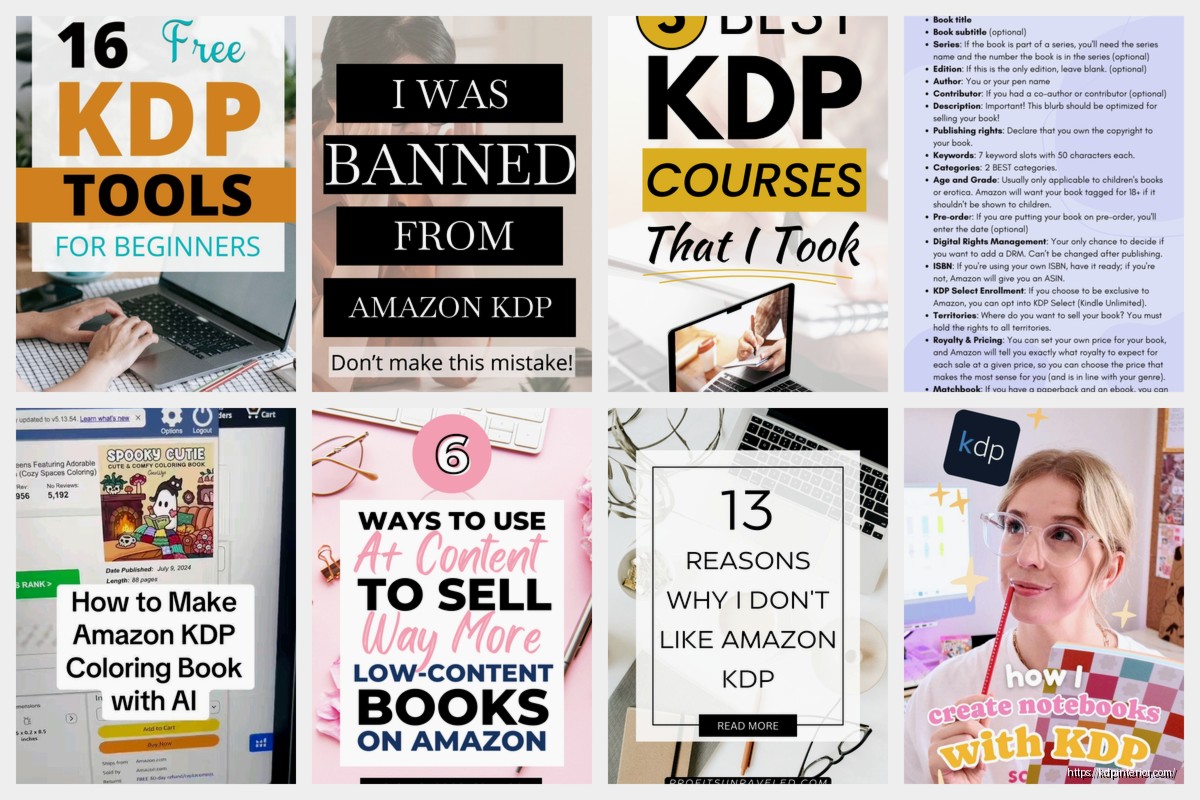
Okay so A+ Content on KDP is honestly one of those features that most people don’t even realize exists until they accidentally stumble on it, and then they’re like wait I could’ve been using this the whole time?
First thing – you need to understand that A+ Content is ONLY available for paperbacks and hardcovers enrolled in KDP’s Expanded Distribution. Not ebooks. I spent like two hours one night trying to figure out why I couldn’t find the option for one of my journals before I realized I hadn’t checked the expanded distribution box. Face palm moment for sure.
What Actually Is A+ Content
It’s basically Amazon letting you add enhanced product descriptions with images, formatted text blocks, comparison charts and all that good stuff. You’ve seen it if you’ve ever shopped for like kitchen gadgets or supplements – those fancy product pages with the lifestyle photos and feature callouts. Same thing but for books.
The catch is it shows up on your Amazon detail page BELOW the regular book description. So people gotta scroll down to see it. But here’s the thing – when people are seriously considering buying your book they DO scroll. They’re looking for reasons to hit that buy button or reasons to bounce.
Getting Access to A+ Content
You need to meet these requirements and honestly they’re not that hard:
- Have a paperback or hardcover listed (ebooks don’t qualify which is annoying)
- Be enrolled in Expanded Distribution – this is just a checkbox when you’re publishing
- Have a professional or semi-professional cover because Amazon reviews these
- Your account needs to be in good standing obviously
Once you’ve got those covered you’ll find the A+ Content option in your KDP bookshelf. It’s not super obvious – you gotta click on the three dots next to your book (the ellipsis menu thing) and then look for “A+ Content Manager” or sometimes it just says “Create A+ Content.”
Wait I forgot to mention – it takes like 7 business days for Amazon to review and approve your A+ Content so don’t wait until launch day to set this up. I learned that the hard way with a cookbook I was launching last year. Submitted the A+ Content two days before launch and it didn’t go live until almost two weeks later.
What You Can Actually Include
Amazon gives you these module templates to work with. You’re not designing from scratch which is honestly good because it keeps everything looking professional and consistent. The modules include:
Standard Image & Text – basic layout with an image on one side and text on the other. This is gonna be your workhorse module.
Standard Image & Light Text – same but with lighter text overlay on images. I don’t use this one much.
Standard Comparison Table – this is KILLER if you have multiple books in a series. You can show all your books side by side with features listed.
Standard Four Image & Text – four images in a grid with text. Good for showing different features or benefits.
Standard Single Image & Highlights – one big image with bullet points. Works well for showing what’s inside the book.
You can mix and match these modules and I think the limit is like 5 or 7 modules per A+ Content page. Don’t quote me on that number but it’s somewhere in that range.
Images Are Everything Here
Okay so this is where people mess up the most. Your images need to be high quality and they need to be at least 1000 pixels on the shortest side. Amazon’s pretty strict about this.
I use Canva for creating all my A+ images. My dog was literally barking at the mailman while I was trying to design my last set of images and I just gave up and came back to it later because you really need to focus on making these look good.
Things that work well for images:
- Mockups of your book in use – like a journal on someone’s desk with a coffee cup
- Sample pages from inside the book (make sure they’re clear and readable)
- Lifestyle shots that show the benefit or use case
- Icons and graphics that highlight features
- Before and after comparisons if that applies to your book
Don’t use images with text overlay that’s super tiny because people are viewing this on phones a lot of the time. Keep text big and readable.
Also Amazon will reject images that have like price comparisons or promotional language or anything that mentions reviews or ratings. Keep it focused on the book itself and what’s inside.
Where to Get Images If You’re Not a Designer
Besides Canva which I already mentioned, you can use stock photo sites like Unsplash or Pexels for background images. Just make sure you have the rights to use them commercially. Depositphotos is another one I use sometimes when I need something specific.
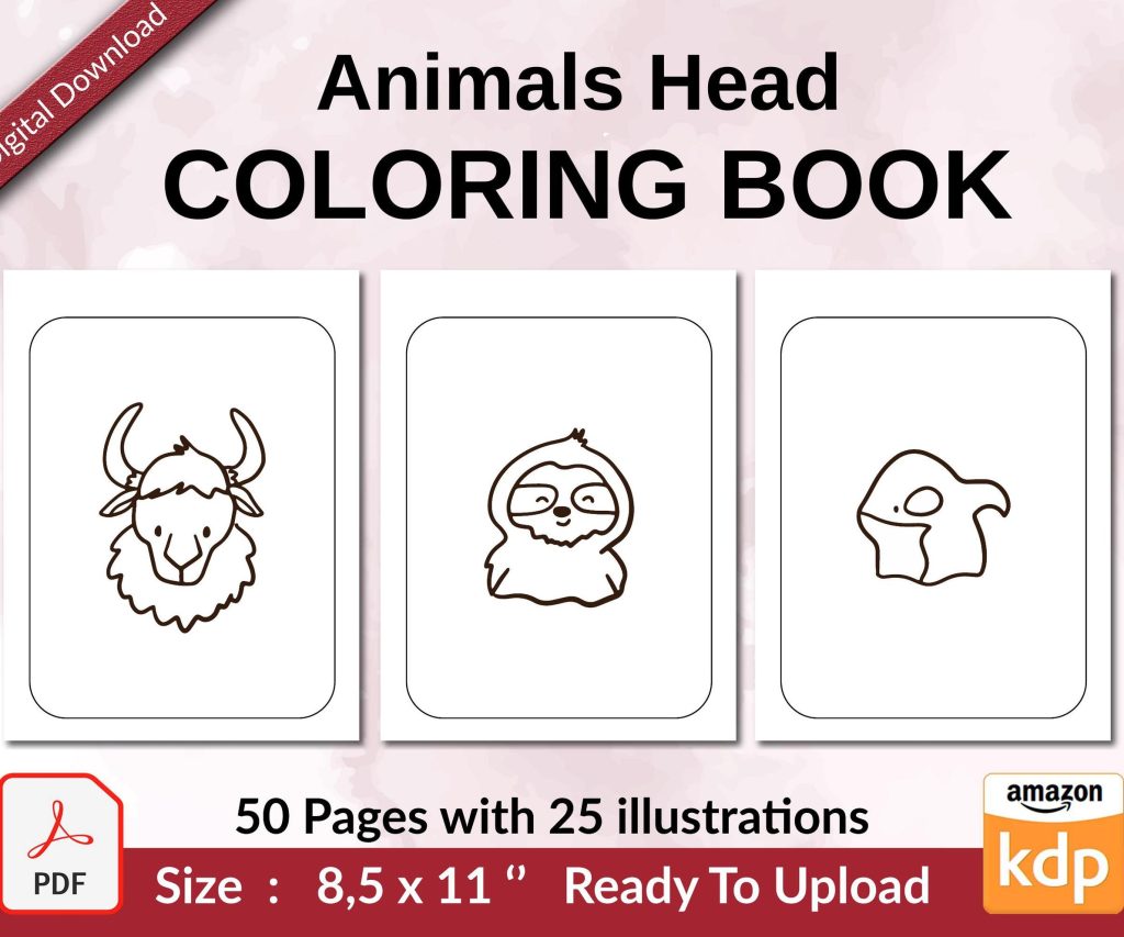
If you’ve got a book with interior content worth showing off – planners, journals, workbooks, coloring books – screenshot that stuff. Those pages YOU created so you definitely have the rights. Just make them look clean and professional.
Writing the Text Sections
The text you include in your A+ modules should complement your main book description not just repeat it. This is where you can go deeper into specific features or benefits.
For my low content books like planners and journals I focus on:
- What’s actually inside – how many pages, what kind of paper, specific features
- Who it’s perfect for – different use cases and audiences
- Unique selling points that make mine different from competitors
- The benefit or transformation someone gets from using it
Keep paragraphs short. Like really short. People are scanning not reading every word. Three sentences max per paragraph.
Use headers and subheaders to break things up. Make it skimmable.
Oh and another thing – you can use basic formatting like bold text to emphasize key points but you can’t use hyperlinks or anything fancy like that. Keep it simple.
Strategy for Different Book Types
This is gonna sound weird but I approach A+ Content differently depending on what kind of book I’m working on.
For fiction books – use the space to give readers a better sense of the story world, introduce main characters without spoiling anything, show what other books are in the series. That comparison table module is perfect for series books.
For non-fiction – break down the chapters or sections, show sample pages, list out key takeaways or lessons. Make it super clear what someone’s gonna learn.
For low-content books (my bread and butter) – show interior pages, highlight specific features like page count or paper type, demonstrate different ways to use it. For a planner I’ll show the monthly spread, weekly spread, habit tracker, whatever makes it special.
For kids books – show interior illustrations, maybe introduce characters, highlight any educational components. Parents wanna see what they’re buying.
Common Mistakes to Avoid
Don’t make your A+ Content just a longer version of your description. It should ADD information not repeat it.
Don’t use blurry or pixelated images. Amazon will reject them and even if they don’t customers will notice and it looks unprofessional.
Don’t forget about mobile users. Like 60-70% of people are shopping on phones so your images and text need to work on small screens.
Don’t submit and forget. You can update your A+ Content anytime. I go back and refresh mine every few months especially if I’m seeing a dip in conversions.
Don’t use someone else’s copyrighted images. Sounds obvious but I’ve seen people grab random Pinterest images and wonder why they got rejected.
The Approval Process
Once you submit your A+ Content it goes into review. Usually takes 5-7 business days like I mentioned earlier but I’ve had some approved in 3 days and others take almost 2 weeks.
Amazon checks for:
- Image quality and specifications
- Content guidelines compliance – no prohibited claims or language
- Copyright and trademark issues
- Overall quality and professionalism
If they reject it they’ll usually tell you why. Fix whatever they flagged and resubmit. Not a big deal.
I was watching The Bear the other night while waiting for an A+ submission to get approved and it’s like that scene where Carmen is obsessing over every detail of the menu – that’s how you should think about your A+ Content. Every element matters.
Does It Actually Work
Okay so the real question – does this stuff actually increase sales? From my testing yeah it does but it’s not like magic overnight results.
Books with A+ Content tend to convert better when people are already on the fence. It’s that extra push that gives them confidence to buy. I’ve seen conversion rate improvements anywhere from like 5% to 20% depending on the book and how good the A+ Content is.
It also helps with reducing returns because people have a better understanding of what they’re getting. Fewer surprises = fewer returns.
The biggest impact I’ve seen is on books where the interior really matters – planners, journals, workbooks, activity books. Being able to SHOW people what’s inside instead of just describing it makes a huge difference.
Tracking Performance
You can’t directly track A+ Content performance in KDP but you can look at your conversion rate before and after adding it. Check your sales reports and see if there’s an uptick in conversion percentage.
Also watch your reviews. If people stop mentioning “not what I expected” type complaints that’s a good sign your A+ Content is setting better expectations.
Quick Tips That Actually Matter
Use your best image first. The top module gets seen the most so don’t bury your most compelling visual.
If you have multiple books in a series or related books use that comparison table module. Cross-selling works.
Update seasonal content if you have seasonal books. I have holiday planners where I refresh the A+ Content images each year to keep them current.
Test different layouts and approaches. You can edit your A+ Content anytime so if something’s not working try a different module arrangement.
Don’t stress about making it perfect. Done is better than perfect. You can always improve it later.
Look at how traditional publishers use A+ Content for their books. Search for bestselling books in your genre and scroll down to see what they’re doing. Not to copy but to get ideas.
Make sure your A+ Content matches your cover and description style. Everything should feel cohesive and like it’s all part of the same book package.
The reality is most self-publishers don’t bother with A+ Content because it seems complicated or they don’t know it exists. That’s actually good for you because it’s an easy way to look more professional than your competition. Takes a few hours to set up properly but it keeps working for you 24/7 after that.
 Coloring Animals Head Book for Kids, Perfect for ages 2-4, 4-8 | 8.5x11 PDF
1 × $0.00
Coloring Animals Head Book for Kids, Perfect for ages 2-4, 4-8 | 8.5x11 PDF
1 × $0.00 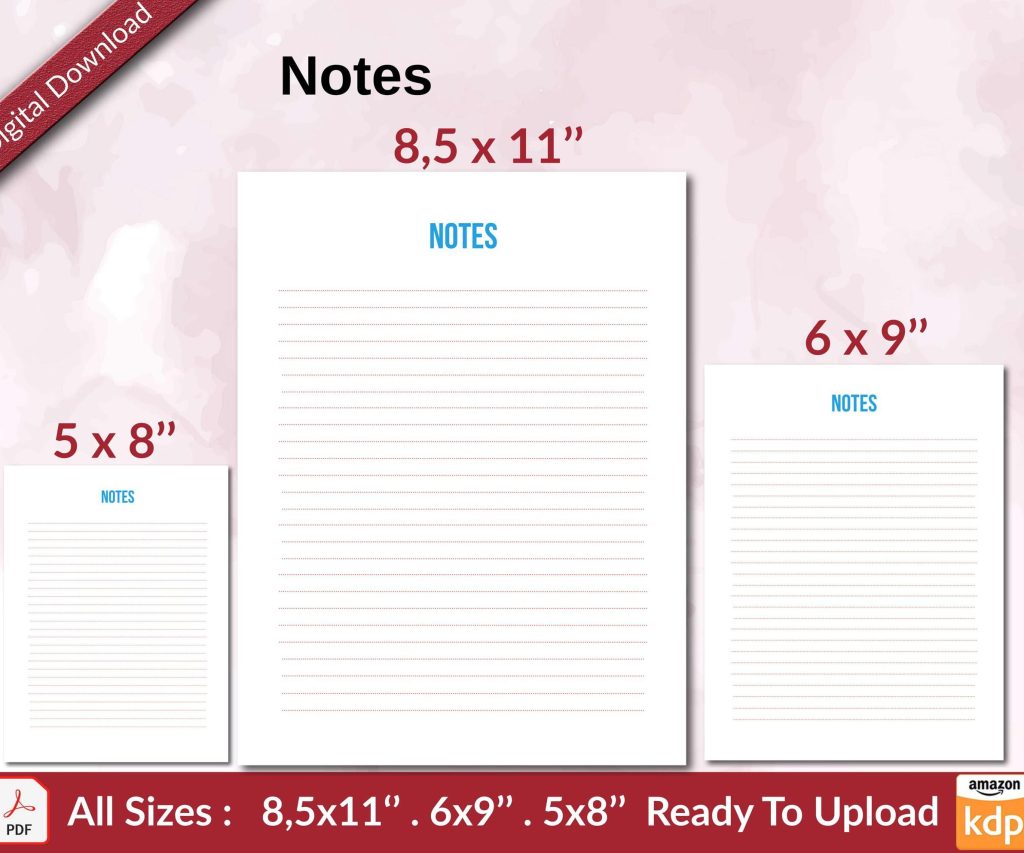 Notes KDP interior Ready To Upload, Sizes 8.5x11 6x9 5x8 inch PDF FILE Used as Amazon KDP Paperback Low Content Book, journal, Notebook, Planner, COMMERCIAL Use
1 × $0.00
Notes KDP interior Ready To Upload, Sizes 8.5x11 6x9 5x8 inch PDF FILE Used as Amazon KDP Paperback Low Content Book, journal, Notebook, Planner, COMMERCIAL Use
1 × $0.00 
DISCOVER OUR FREE BEST SELLING PRODUCTS
Editable Canva Lined Journal: Express Your Thoughts – KDP Template
Lined Pages Journal 120 pages Ready to Upload PDF Commercial Use KDP Template 6×9 8.5×11 5×8 for Notebooks, Diaries, Low Content
Lined Pages Journal 120 pages Ready to Upload PDF Commercial Use KDP Template 6×9 8.5×11 5×8 for Notebooks, Diaries, Low Content
Cute Dogs Coloring Book for Kids | Activity Book | KDP Ready-To-Upload
Daily Planner Diary : Diary Planners for Everyday Productivity, 120 pages, 6×9 Size | Amazon KDP Interior
Wolf Coloring KDP interior For Adults, Used as Low Content Book, PDF Template Ready To Upload COMMERCIAL Use 8.5×11"
Coloring Animals Head Book for Kids, Perfect for ages 2-4, 4-8 | 8.5×11 PDF
Printable Blank Comic Book Pages PDF : Create Your Own Comics – 3 Available Sizes
Notes KDP interior Ready To Upload, Sizes 8.5×11 6×9 5×8 inch PDF FILE Used as Amazon KDP Paperback Low Content Book, journal, Notebook, Planner, COMMERCIAL Use
Black Lined Journal: 120 Pages of Black Lined Paper Perfect for Journaling, KDP Notebook Template – 6×9
Student Planner Journal 120 pages Ready to Upload PDF Commercial Use KDP Template 6×9" 8.5×11" for Low Content book
Recipe Journal Template – Editable Recipe Book Template, 120 Pages – Amazon KDP Interior