Okay so the whole KDP cover template situation is honestly way simpler than people make it out to be, but there’s some stuff Amazon doesn’t exactly spell out clearly and I’ve messed this up enough times to know where everyone gets stuck.
First thing – you gotta download the actual template from KDP itself, not some random Pinterest link or sketchy forum post. I made that mistake in like 2019 and ended up with a file that had wrong dimensions and my cover looked stretched on the thumbnail. Go to your KDP dashboard, start creating a new book project, and when you get to the cover section there’s this little link that says “download a cover template” or something similar. Click that, enter your book specs – page count, paper type, trim size – and it spits out a PDF and a PNG file usually.
The page count thing is crucial because Amazon calculates spine width based on how many pages you have. So if you’re doing a 120-page paperback, the spine is gonna be thinner than a 300-page one, obviously. White paper vs cream paper also changes the calculation slightly because cream paper is technically thicker. I always round UP if I’m between page counts, like if I think it’ll be 118 pages, I tell the template generator 120 just to be safe.
The Files You Actually Get
Amazon gives you a few different files when you download and honestly you only need like two of them. There’s the full cover template which shows the front cover, spine, and back cover all laid out flat. This is the one you’re actually gonna design on. Then there’s usually a barcode file – ignore that, Amazon adds the barcode automatically when you upload so don’t even worry about it.
The template has these pink lines or red lines depending on when they updated it last, and those are your bleed lines, trim lines, and safe zones. The bleed is the extra 0.125 inches on all sides where your background images should extend. Trim line is where they actually cut the book. Safe zone is where you should keep all your important text and images because anything outside that might get cut off or look too close to the edge.
I cannot stress this enough – keep your text INSIDE the safe zone. I’ve seen so many covers where the subtitle is right up against the edge and it looks amateurish. My cat literally walked across my keyboard once while I was positioning text and I didn’t notice she’d moved it slightly outside the safe zone until after I uploaded. Had to redo the whole thing.
Software You Can Use
Everyone asks what program to use and honestly it depends on what you already know. Photoshop is the obvious choice if you have it, but Adobe’s subscription model is like $30-50/month which is annoying if you’re just starting out. I use Photoshop because I’ve been using it forever but there are definitely cheaper options.
Canva works and a lot of people swear by it. The free version is pretty limited but Canva Pro is like $13/month or something. You can upload the KDP template as a background image and design right on top of it. The thing that drives me nuts about Canva is the resolution – you gotta make sure you’re downloading at the highest quality possible, usually 300 DPI, or your cover will look fuzzy. I’ve had students send me Canva covers that looked great on screen but pixelated when printed.
GIMP is free and it’s basically Photoshop’s weird cousin. Takes some getting used to but it’s powerful once you figure it out. The interface is clunky though, not gonna lie.
Affinity Designer or Affinity Photo are one-time purchases, like $70 or something, and they’re actually really good. I recommend these if you’re serious about doing multiple books and don’t want to deal with subscriptions.
Setting Up Your Design File
Okay so once you’ve got your software picked out, you need to set up the actual file correctly. This is where people mess up dimensions all the time.
Let’s say you’re doing a 6×9 paperback with 150 pages. Your full cover template is gonna be something like 12.5 inches wide (that’s both covers plus the spine plus bleed) by 9.25 inches tall (height plus bleed). The exact dimensions are in the template file Amazon gives you – there’s usually text right on the template that tells you the final size.
Create your design file at EXACTLY those dimensions. Set your resolution to 300 DPI minimum. I usually do 400 DPI for print stuff just to be extra safe. Color mode should be RGB for KDP even though that seems wrong since print is usually CMYK. Amazon converts it on their end and their system is optimized for RGB uploads.
Import the template file as a locked background layer. Like seriously, lock that layer so you don’t accidentally move it or edit it. Then create new layers on top for your actual design elements.
Design Elements and Image Quality
Your images need to be high resolution or they’ll look terrible printed. I learned this the hard way with my third or fourth book where I used some stock photo I grabbed from Google Images and it looked fine on my computer screen but when the proof copy arrived it was all blurry and pixelated. Now I only use stock photos from paid sites like Depositphotos, Shutterstock, or Adobe Stock. Even the free sites like Unsplash or Pixabay are fine as long as you download the highest resolution version.
For text, use fonts that are readable at small sizes because remember your cover is gonna be displayed as a tiny thumbnail on Amazon. I usually test this by shrinking my cover down to like 1 inch tall on my screen and seeing if I can still read the title from across the room. If you can’t read it, your font is either too thin, too fancy, or too small.
Oh and another thing – don’t use super trendy fonts that everyone else is using unless you’re in a genre where that’s expected. Like if you’re doing romance you kinda need that swirly script font situation, but if you’re doing non-fiction or low-content books, clean and simple usually works better.
The Spine Is Trickier Than You Think
The spine width changes based on page count and this trips people up constantly. For a 120-page book on white paper, you’re looking at roughly 0.25 inches for the spine width. Amazon’s template shows you exactly where the spine starts and ends with vertical lines.
Here’s the thing though – you should NOT put critical text on the spine if your book is under like 100 pages. The spine is too narrow and it’ll either get cut off or be unreadable. I generally don’t put anything on spines under 150 pages except maybe a small author name or title if there’s room.
When you do put text on the spine, make sure it reads from top to bottom when the book is standing upright on a shelf. This is standard for most English-language books. And keep that text CENTERED within the spine area with padding on both sides.
Back Cover Content
Your back cover needs a book description, author bio maybe, and space for the barcode. Amazon puts the barcode in the lower right corner of the back cover, and the template shows you exactly where that’s gonna be with a white rectangle usually. Don’t put any important design elements or text in that barcode area.
I usually put the book description in the upper two-thirds of the back cover, keep it left-aligned or centered, and use a font size that’s readable but not huge. Then maybe a small author bio at the bottom if there’s room, or you can put that on the inside flap if you’re doing a dust jacket style thing.
Wait I forgot to mention – some people get confused about hardcover templates vs paperback templates. The process is the same, you just select “hardcover” instead of “paperback” when generating the template. Hardcover spines are calculated differently because the cover material is thicker. I don’t do many hardcovers because the production costs are higher and they’re harder to make profitable unless you’re charging like $30+ for the book.
Color Profiles and File Formats
This is gonna sound technical but it matters. Save your final cover file as a PDF or a high-quality JPEG or PNG. I usually go with PDF because it preserves quality better and Amazon’s system handles PDFs really well. Make sure you’re flattening all your layers before you export – you don’t want to upload a PSD file with like 47 layers, Amazon won’t accept it.
For color profile, use sRGB if you’re given the option. Don’t embed color profiles if your software asks – Amazon prefers files without embedded profiles for some reason. I spent like three hours troubleshooting an upload error once and it turned out the embedded color profile was the issue.
File size matters too. Amazon has a limit of like 650 MB I think, but realistically your cover file should be under 50 MB. If it’s bigger than that, you probably have the resolution set way too high or you didn’t compress the images properly.
Common Mistakes I See All The Time
Text too close to the edges – I mentioned this already but seriously, use the safe zone guidelines. I’ve rejected so many covers for clients because their text was gonna get trimmed off.
Low resolution images – if you zoom in to 100% in your design software and the image looks blurry, it’s gonna look worse when printed. Replace it with a higher quality version.
Wrong dimensions – double check that your file matches the template dimensions exactly. Even being off by 0.1 inches can cause upload errors or weird spacing issues.
Forgetting about the spine – people design beautiful front and back covers and then the spine is just blank or has awkwardly placed text. The spine is what people see when your book is on a shelf, so don’t ignore it.
Using the template lines in the final design – those pink/red guide lines are just for YOUR reference. Delete the template layer before you export your final file. Amazon will reject your cover if you upload it with the template lines visible.
Testing Before You Upload
Before you upload your cover to KDP, zoom out and look at it as a thumbnail. Does the title pop? Can you read it at small sizes? Does the overall design look cluttered or clean? I usually show my covers to someone who has no context and ask them what they think the book is about based on just the cover. If they’re way off, the cover probably needs work.
Also print out a small version on your home printer if you can, just to see how the colors look on paper. Colors on screen vs printed are always different. What looks like a nice bright blue on your monitor might print darker or more purple-ish.
One time I was watching The Office while designing a cover and I kept looking up at the TV and then back at my screen and I realized the cover colors looked completely different depending on whether I was looking straight at my monitor or from an angle. That’s when I learned about color calibration and viewing angles, which is a whole other rabbit hole.
File Organization Tips
Keep your cover files organized in folders by book title or project name. I have a main “KDP Covers” folder and then subfolders for each book with the template, design files, stock images, and final export all in one place. This saves so much time when you need to make updates later or create similar covers for a series.
Save multiple versions as you work – like “BookCover_v1”, “BookCover_v2”, etc. I’ve accidentally saved over a good version and lost hours of work before. Learn from my mistakes.
Also keep a text file with the exact specs you used – trim size, page count, paper type – so if you need to create a matching ebook cover or hardcover version later, you have all that info handy.
The whole process gets way faster once you’ve done it a few times. My first cover took me probably 6-7 hours of fumbling around. Now I can knock out a decent cover in 45 minutes to an hour if I already have the stock images picked out. It’s really just about understanding what Amazon needs technically and then making design choices that fit your genre and target audience.

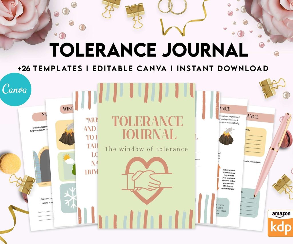 Tolerance Journal, window of tolerance, therapy journal , self discovery, self esteem, Canva Editable Templates 8,5x11 inch, KDP interior
1 × $14.99
Tolerance Journal, window of tolerance, therapy journal , self discovery, self esteem, Canva Editable Templates 8,5x11 inch, KDP interior
1 × $14.99 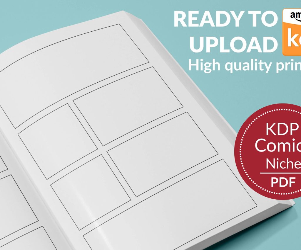 Printable Blank Comic Book Pages PDF : Create Your Own Comics - 3 Available Sizes
1 × $0.00
Printable Blank Comic Book Pages PDF : Create Your Own Comics - 3 Available Sizes
1 × $0.00 
DISCOVER OUR FREE BEST SELLING PRODUCTS
Editable Canva Lined Journal: Express Your Thoughts – KDP Template
Lined Pages Journal 120 pages Ready to Upload PDF Commercial Use KDP Template 6×9 8.5×11 5×8 for Notebooks, Diaries, Low Content
Lined Pages Journal 120 pages Ready to Upload PDF Commercial Use KDP Template 6×9 8.5×11 5×8 for Notebooks, Diaries, Low Content
Cute Dogs Coloring Book for Kids | Activity Book | KDP Ready-To-Upload
Daily Planner Diary : Diary Planners for Everyday Productivity, 120 pages, 6×9 Size | Amazon KDP Interior
Wolf Coloring KDP interior For Adults, Used as Low Content Book, PDF Template Ready To Upload COMMERCIAL Use 8.5×11"
Coloring Animals Head Book for Kids, Perfect for ages 2-4, 4-8 | 8.5×11 PDF
Printable Blank Comic Book Pages PDF : Create Your Own Comics – 3 Available Sizes
Notes KDP interior Ready To Upload, Sizes 8.5×11 6×9 5×8 inch PDF FILE Used as Amazon KDP Paperback Low Content Book, journal, Notebook, Planner, COMMERCIAL Use
Black Lined Journal: 120 Pages of Black Lined Paper Perfect for Journaling, KDP Notebook Template – 6×9
Student Planner Journal 120 pages Ready to Upload PDF Commercial Use KDP Template 6×9" 8.5×11" for Low Content book
Recipe Journal Template – Editable Recipe Book Template, 120 Pages – Amazon KDP Interior