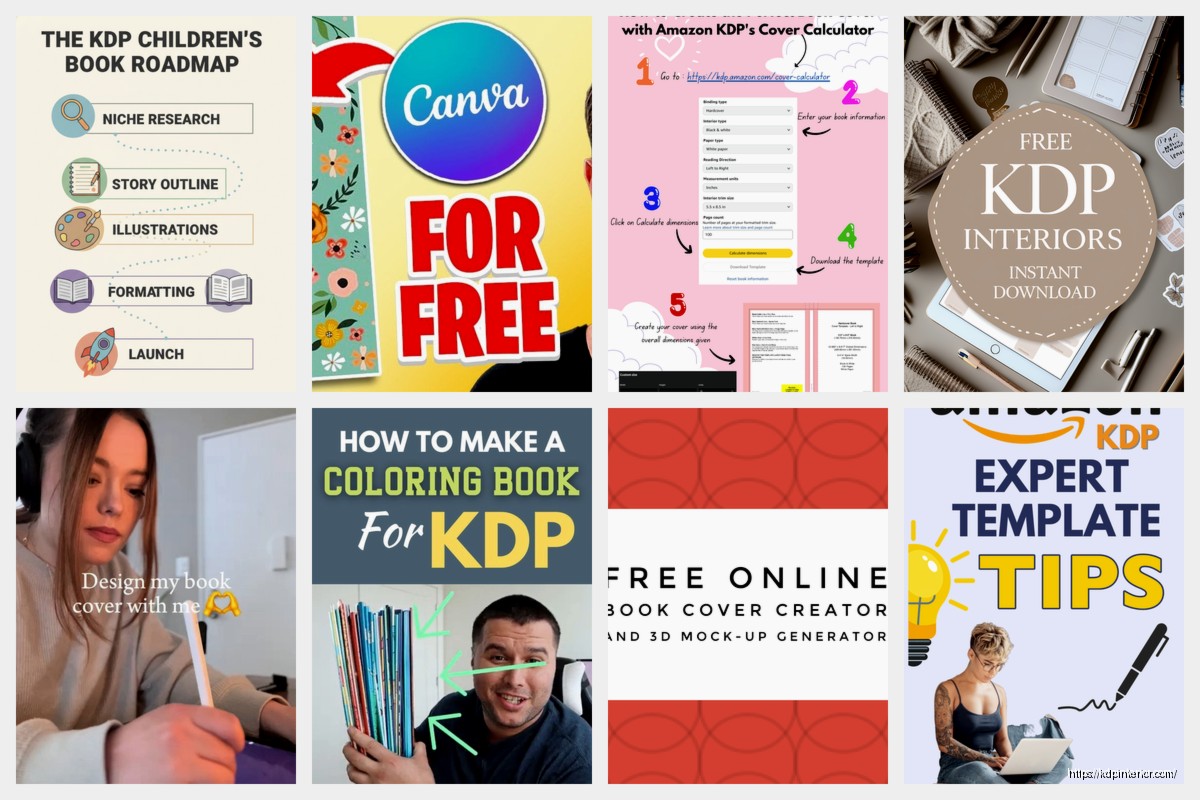
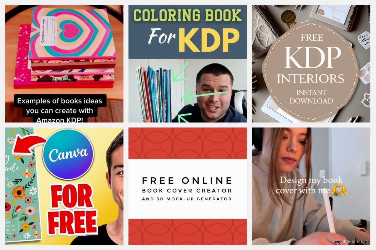
Amazon KDP guide, KDP book publishing
KDP Book Cover Creator: DIY Design Solutions
Mar
Okay so I just spent like three hours messing with KDP’s cover creator last week because I had this journal idea that I needed to test fast, and honestly? It’s actually way more capable than people give it credit for if you know the workarounds.
First thing – you gotta understand what KDP’s cover creator actually IS. It’s basically a template system with limited customization, but limited doesn’t mean useless. I’ve published probably 40 books using just this tool when I was starting out and didn’t wanna spend money on Canva Pro or whatever.
Getting Started Without Losing Your Mind
So you log into KDP, go to your bookshelf, and when you’re setting up a new book you’ll see the cover option. Click “Launch Cover Creator” and boom, you’re in. The interface looks kinda dated honestly – like something from 2015 – but whatever, it works.
Here’s what nobody tells you: the templates are organized by category but they’re basically all the same structure with different colors. You’ve got like 6-7 actual layout types that just repeat. I usually ignore their category suggestions completely and just scroll through everything because a “thriller” template might work perfectly for your cookbook if you swap the imagery.
Choosing Your Base Template
Pick something simple. I mean it. The fancier templates with multiple image zones and weird text placements are gonna fight you the entire time. Look for templates that have:
- One main image area (not split sections)
- Clear title placement at top or center
- Subtitle space if you need it
- Author name at the bottom that’s actually readable
My go-to is usually the ones that are just solid background color with a single image frame. Boring? Maybe. But you can actually make it look professional without wanting to throw your laptop.
The Image Problem and How to Work Around It
Okay so here’s where it gets tricky. KDP’s image library is… look, it’s not great. Lots of generic stock photos that scream “I used the free tool.” But wait – you can upload your own images, and THIS is where the magic happens.
I use a combination of:
- Pixabay or Unsplash for base images (free, commercial use)
- Simple graphics I make in Canva FREE version
- PNG overlays with transparent backgrounds
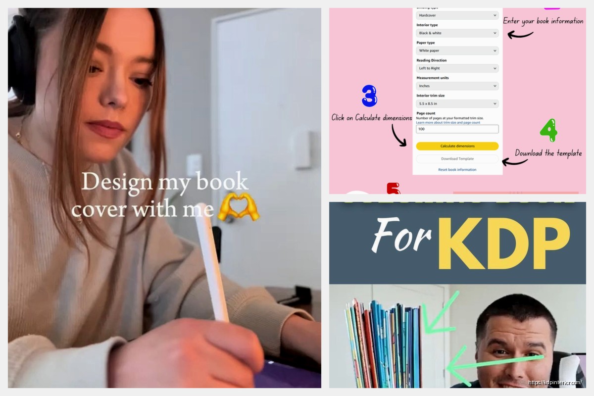
Here’s the workflow I actually use: I’ll go to Canva, create a 2560×1600 px canvas (the dimensions KDP wants for a 6×9 book cover), and I’ll design just the graphic elements there. Like if I want a decorative border or some icons or whatever. Export that as a PNG with transparent background, then upload it to KDP’s creator.
Oh and another thing – you can layer multiple uploaded images in KDP’s tool. Most people don’t realize this. You add one image, adjust it, then click to add another image on top. I’ve stacked up to 4 different elements this way to create something that looks way more custom.
Image Sizing That Actually Works
The tool is gonna resize your images automatically and it usually looks terrible. Here’s what I do: before uploading anything to KDP, I pre-size it in a free tool like Photopea or even just Preview on Mac.
For a 6×9 book (most common size):
- Full background images: 2560 x 1600 px minimum
- Central graphics/icons: 1200 x 1200 px works well
- Decorative elements: 800 x 800 px
The system will still compress them a bit, but starting with these sizes means less distortion.
Typography is Where Everyone Messes Up
The font selection in KDP’s creator is limited to like 20 fonts, and half of them are completely unusable for book covers. Here’s my actual font strategy:
For titles, I stick with: Impact, Bebas Neue, or Oswald. These are bold enough to show up in thumbnails, which is literally all that matters on Amazon.
For subtitles: Open Sans, Lato, or Merriweather. Readable, clean, not trying too hard.
Author name: Same as subtitle font but smaller.
Wait I forgot to mention – the biggest mistake people make is using too many fonts. Pick TWO maximum. One for title, one for everything else. I see people using four different fonts and it looks like a ransom note.
The Thumbnail Test
This is gonna sound weird but I always design with my phone across the room. Like I’ll make adjustments on my laptop, then walk 10 feet away and look at my phone to see if the title is readable in thumbnail size. Your cover needs to work at like 120 pixels wide because that’s how people first see it on Amazon.
If you can’t read the title from across the room on a phone screen, your fonts are too small or too decorative. Period.
Color Theory for People Who Don’t Care About Color Theory
I’m not gonna lecture you about complementary colors and all that. Here’s what actually works on Amazon:
High contrast = better. Dark background with light text, or light background with dark text. The covers that perform best in my catalog are the ones with the most dramatic contrast.
My cat just jumped on my keyboard but anyway – stick to 2-3 colors total. I use Adobe Color (free) to grab color palettes that already work together, then I just input those hex codes into KDP’s color picker.
Popular combinations that I’ve tested and actually convert:
- Navy blue background + gold/yellow text
- Black background + white text + one accent color
- Cream/beige background + dark brown text
- Deep red + white (for anything self-help or business)
Text Effects That Don’t Look Cheap
KDP’s creator has some text effect options – shadows, outlines, that kind of thing. Most of them look terrible at default settings. Here’s what I actually use:
Drop shadow: Set it to like 30-40% opacity, not the default 100%. Move the offset to just 2-3 pixels. This gives depth without looking like a PowerPoint from 2003.
Outline/stroke: Only use this if your text absolutely needs to pop against a busy background. Keep it thin – 1-2 pixels max. Thicker than that and it looks like clipart.
Background box: Sometimes I’ll put a semi-transparent rectangle behind text. In KDP’s tool, you do this by adding a shape element, changing its color, adjusting opacity to like 60-70%, then layering your text on top. Works great for subtitles that need to stand out.
The Spine and Back Cover Situation
Oh right, so KDP’s creator technically does the spine and back cover too, but honestly? For books under 100 pages, you barely have a spine, so I don’t stress about it. The tool auto-generates it based on your title and author name.
Back cover though – this matters more than people think. I keep it super simple:
- Book description (short version, like 3-4 sentences)
- Maybe 2-3 bullet points of what’s inside
- Author bio if there’s room
- Barcode area (KDP adds this automatically)
Use the same fonts and colors from your front cover. Consistency makes it look professional even if your design skills are mid.
The Preview Function Lies
Okay so funny story – the 3D preview in KDP’s creator looks amazing, right? The cover wraps around a book mockup and you’re like “wow I’m a designer.” But that preview uses different rendering than what actually appears on Amazon.
What I do: download the cover files (there’s a download option), then I upload them to a mockup generator like Placeit or even just check them at actual size on my screen. The KDP preview is optimistic. Reality is harsher.
Workarounds for Common Limitations
Can’t add custom fonts? Design your title text in Canva as an image, save it as PNG with transparent background, upload it to KDP as an image element. Boom, you’ve got custom typography.
Need more complex layouts? Create the entire background design in Canva or Photopea, export it, upload it as the background image in KDP, then just add your text on top. This is basically using KDP’s tool as just a text overlay system.
Want gradients? KDP’s creator doesn’t have gradient fills, but you can create a gradient in literally any free design tool, save it as a JPEG, and use it as your background.
The key is treating KDP’s cover creator as a assembly tool, not a design tool. Do your actual design work elsewhere with better tools, then use KDP to put it all together.
Testing What Actually Sells
I’ve published books with covers made entirely in KDP’s creator that have sold thousands of copies. I’ve also published books with $200 custom covers that flopped. The tool isn’t the limitation – knowing your market is.
Before you spend hours perfecting a cover, look at the top 20 books in your category. What do their covers have in common? Colors? Typography style? Image types? Just… copy the patterns that work. Not the actual covers obviously, but the visual language of successful books in your niche.
For low-content books especially – journals, planners, notebooks – simplicity wins. A solid color, nice typography, maybe one decorative element. That’s it. I’ve got a gratitude journal with a burgundy background and gold script text that was made in 45 minutes using KDP’s creator and it’s been consistently selling for three years.
When to NOT Use KDP’s Creator
Real talk: if you’re publishing fiction, especially in competitive genres like romance or thriller, you probably need a better cover. The KDP creator can technically do it, but you’re fighting an uphill battle against professional designs.
Also if your book is gonna be priced above $9.99, invest in a real cover. At higher price points, buyers expect polish.
But for low-content books, journals, workbooks, simple non-fiction? KDP’s creator is totally viable. I still use it for quick tests and lower-tier products in my catalog.
The thing nobody tells you is that you can always change your cover later. I’ve gone back and updated covers on books that were selling okay to see if a redesign would boost sales. Sometimes it works, sometimes it doesn’t, but the point is you’re not locked in forever.
Anyway that’s basically my entire process. It’s not fancy, but it works, and I’ve made enough money using this free tool that I can’t really complain about its limitations anymore.
DISCOVER OUR FREE BEST SELLING PRODUCTS
Editable Canva Lined Journal: Express Your Thoughts – KDP Template
Lined Pages Journal 120 pages Ready to Upload PDF Commercial Use KDP Template 6×9 8.5×11 5×8 for Notebooks, Diaries, Low Content
Lined Pages Journal 120 pages Ready to Upload PDF Commercial Use KDP Template 6×9 8.5×11 5×8 for Notebooks, Diaries, Low Content
Cute Dogs Coloring Book for Kids | Activity Book | KDP Ready-To-Upload
Daily Planner Diary : Diary Planners for Everyday Productivity, 120 pages, 6×9 Size | Amazon KDP Interior
Wolf Coloring KDP interior For Adults, Used as Low Content Book, PDF Template Ready To Upload COMMERCIAL Use 8.5×11"
Coloring Animals Head Book for Kids, Perfect for ages 2-4, 4-8 | 8.5×11 PDF
Printable Blank Comic Book Pages PDF : Create Your Own Comics – 3 Available Sizes
Notes KDP interior Ready To Upload, Sizes 8.5×11 6×9 5×8 inch PDF FILE Used as Amazon KDP Paperback Low Content Book, journal, Notebook, Planner, COMMERCIAL Use
Black Lined Journal: 120 Pages of Black Lined Paper Perfect for Journaling, KDP Notebook Template – 6×9
Student Planner Journal 120 pages Ready to Upload PDF Commercial Use KDP Template 6×9" 8.5×11" for Low Content book
Recipe Journal Template – Editable Recipe Book Template, 120 Pages – Amazon KDP Interior