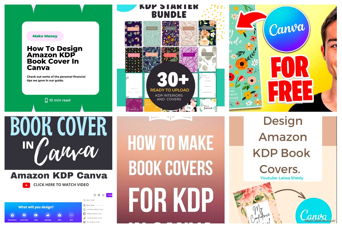
Okay so here’s how I actually make KDP covers in Canva without losing my mind
Alright so you need a cover template for KDP and you’re using Canva – smart move honestly because I’ve been doing this for years and Canva is just… it works. Let me walk you through this the way I’d actually do it, not some polished tutorial BS.
First thing – get your dimensions right or Amazon will reject it
So KDP has this whole trim size thing that confuses everyone at first. Your book cover isn’t just the front – it’s front + spine + back all in one file. This tripped me up for like my first 15 books I’m not even kidding.
For a standard 6×9 book (which is what like 80% of my books are), you gotta calculate the full wrap. Amazon has a cover calculator on their site but lemme save you the time – here’s what I do:
- Go to your KDP bookshelf, click “Cover Calculator”
- Enter your trim size (6×9 is most common)
- Enter your page count – be accurate because this affects spine width
- Pick paper type (white or cream)
- Download the template PNG they give you
The calculator spits out exact pixel dimensions. For a 120-page book at 6×9, you’re looking at roughly 12.375 x 9.25 inches total. The spine is gonna be like 0.25 inches or whatever based on page count.
Setting up Canva with custom dimensions
Okay so funny story – I tried using Canva’s built-in book cover templates for MONTHS and kept getting bleed issues. Don’t use their presets. Just don’t.
Here’s what actually works:
- Open Canva, click “Custom Size”
- Enter the EXACT dimensions from KDP’s calculator (in inches)
- Set it to 300 DPI if you have Canva Pro – this is non-negotiable for print quality
- Create design
Now you’ve got a blank canvas that’s the right size. This is gonna sound weird but I actually keep a Google Sheet with all my common dimensions saved because I got tired of calculating every single time.
Understanding the safety zones (this part is super important)
So Amazon has these invisible zones on your cover and if you put important stuff in the wrong place, it’ll get cut off or wrapped around the spine and look terrible. There’s three zones you need to know:
Bleed area: This is 0.125 inches (or 0.3175 cm) around ALL edges. Extend your background colors and images into this area because it gets trimmed.
Safety zone: Keep all text and logos at LEAST 0.125 inches away from trim lines. I usually go 0.25 inches to be safe because I’ve had Amazon reject covers for being too close.
Spine safety: Don’t put critical text within 0.0625 inches of where the spine meets front/back. Just trust me on this one.
In Canva, I create guide boxes using thin rectangle shapes to mark these zones. Make them a bright color like hot pink, then delete them before exporting. My cat knocked over my coffee while I was setting these up yesterday and I had to redo the whole thing but whatever.
Actually designing the thing
Alright so now you can actually design. Here’s my workflow that’s made me consistent money:
Background first: Use a solid color or gradient that extends to the full canvas including bleed. If you’re using an image background, make sure it’s high res – at least 300 DPI. Canva Pro has way better stock images for this.
I usually search for textures or abstract backgrounds. Marble, watercolor, geometric patterns – depends on the genre obviously. For low-content books like journals, simpler is better. For fiction ebooks that need print versions, you can get more elaborate.
Divide your sections: Use vertical lines to mark where front, spine, and back are. The KDP template PNG you downloaded earlier? Upload that into Canva as a layer, make it semi-transparent, and use it as a guide. Then hide it before exporting.
Wait I forgot to mention – for the spine, only add text if your book is over 100 pages. Under that and the spine is too narrow, Amazon might reject it or it’ll look squished and unprofessional.
Front cover elements
Your front cover needs to be readable as a tiny thumbnail because that’s how 90% of people will see it first. I learned this the hard way when my first 20 books had elaborate designs that looked like blurry messes at thumbnail size.
- Title: Big, bold, high contrast. I use fonts like Bebas Neue, Montserrat Bold, Playfair Display. Stay away from script fonts unless it’s like a wedding planner or something feminine
- Subtitle if needed: Smaller but still readable
- Author name: Bottom of the cover usually, doesn’t need to be huge
- Graphics/images: One focal point. Don’t clutter it
For low-content books I keep it super simple. A journal might just be a title, subtitle, and a small decorative element. That’s it. My best-selling gratitude journal has literally just text and a gold foil effect – made me like $8k last year alone.
Spine design (if applicable)
The spine is that narrow strip in the middle. Most people overthink this. Just put:
- Book title (rotated 90 degrees, reading bottom to top)
- Author name (also rotated)
- Maybe a small graphic element if there’s room
In Canva, select your text box, click the rotate icon, and manually set it to 270 degrees for proper spine orientation. Make sure the text is CENTERED on the spine area.
Back cover stuff
The back cover needs:
- Book description or blurb (for fiction/non-fiction) or feature list (for low-content)
- Author bio if you want
- Barcode space – leave a white rectangle 2×3 inches in the BOTTOM RIGHT corner. Amazon puts their barcode there
I usually keep back covers pretty minimal for journals and planners. Maybe just “Features include:” with a bullet list and some decorative elements that match the front.
Oh and another thing – make sure your back cover background extends to the bleed edge. I see so many newbie covers with white gaps on the edges because they didn’t extend the background far enough.

Export settings that actually work
This is where people mess up constantly. You gotta export correctly or KDP will reject it.
Click “Share” then “Download”:
- File type: PDF Print (NOT PDF Standard)
- Flatten PDF: YES – this is crucial, keeps all layers merged
- Crop marks and bleed: Turn OFF crop marks, turn ON bleed if the option exists
If you don’t have Canva Pro, you might need to export as PNG at highest quality then convert to PDF. But honestly Canva Pro is worth it just for the PDF Print option alone. I think it’s like $13/month or something.
Before you upload to KDP
Open your PDF and zoom in to like 200-300%. Check:
- All text is sharp and readable
- No weird white lines or gaps between elements
- Barcode area is clear white space
- Nothing important is too close to trim lines
I usually order a physical proof for any book I think will sell well. It’s like $5 or whatever and you can catch issues that don’t show up on screen. Color might be slightly different in print – Amazon’s printers tend to make things a bit darker and more saturated.
Common mistakes I see (and made myself)
Using RGB instead of CMYK – Canva handles this automatically if you export as PDF Print, but if you’re importing images make sure they’re print-quality
Text too close to edges – Amazon will reject it or it’ll get cut off
Spine text not centered – looks sloppy af when the book is on a shelf
Low resolution images – anything under 300 DPI looks pixelated in print. My client canceled last week so I spent like three hours going through Canva’s library finding high-res alternatives to common images and saved them to a folder
Forgetting the barcode space – Amazon will just slap their barcode over your design if you don’t leave room. I’ve had it cover up author names before, super annoying
Not checking thumbnail readability – shrink your design down to like 100×160 pixels and see if you can still read the title. If not, make it bigger and bolder
Template shortcuts I actually use
After doing 200+ covers, I’ve built my own template system in Canva. I have master templates for different trim sizes with all the guides and safety zones already marked. When I start a new book, I just duplicate the template and swap out text/colors.
This is gonna sound weird but I also keep a swipe file of successful covers in my niche. Not to copy, but to understand what design patterns work. If all the top gratitude journals use gold accents and serif fonts, there’s probably a reason.
For low-content specifically, simpler really is better. My most profitable covers are usually just:
- Solid or gradient background
- Bold title
- Subtitle explaining what it is
- Small decorative element (line, icon, shape)
That’s it. No need for complicated graphics or photos most of the time. Function over form for these types of books because people are buying them to use, not display.
Genre-specific stuff real quick
Journals/Planners: Clean, minimal, aspirational vibes. Pastels or earth tones sell well. Gold foil effects (Canva has gold gradient overlays) add perceived value
Coloring Books: The cover should be partially colored to show the style inside. Use actual pages from your interior
Notebooks: Super simple. Literally just a pattern or texture with “Notebook” on it works fine
Fiction: Genre conventions matter. Romance needs certain fonts and imagery, thriller needs dark moody colors, etc. Study bestsellers in your category
Testing covers (yeah this matters)
I usually create 2-3 cover variations for any book I think has potential. Upload them to KDP and run some small Amazon ads to each version for like $5-10. The one with better CTR and conversion becomes the permanent cover.
Covers make a HUGE difference in sales. I’ve had books go from 1-2 sales per day to 10-15 just by changing the cover to something that resonated better with the target audience. It’s probably the highest-leverage thing you can optimize.
Anyway that’s basically my whole process. Once you do it a few times it becomes pretty quick – I can knock out a solid cover in 30-45 minutes now. The key is just understanding those bleed and safety zones and keeping things simple and readable. Amazon’s preview tool will catch most major issues before you publish, but physical proofs are worth it for books you’re serious about.
 Wolf Coloring KDP interior For Adults, Used as Low Content Book, PDF Template Ready To Upload COMMERCIAL Use 8.5x11"
1 × $0.00
Wolf Coloring KDP interior For Adults, Used as Low Content Book, PDF Template Ready To Upload COMMERCIAL Use 8.5x11"
1 × $0.00  Notes KDP interior Ready To Upload, Sizes 8.5x11 6x9 5x8 inch PDF FILE Used as Amazon KDP Paperback Low Content Book, journal, Notebook, Planner, COMMERCIAL Use
1 × $0.00
Notes KDP interior Ready To Upload, Sizes 8.5x11 6x9 5x8 inch PDF FILE Used as Amazon KDP Paperback Low Content Book, journal, Notebook, Planner, COMMERCIAL Use
1 × $0.00 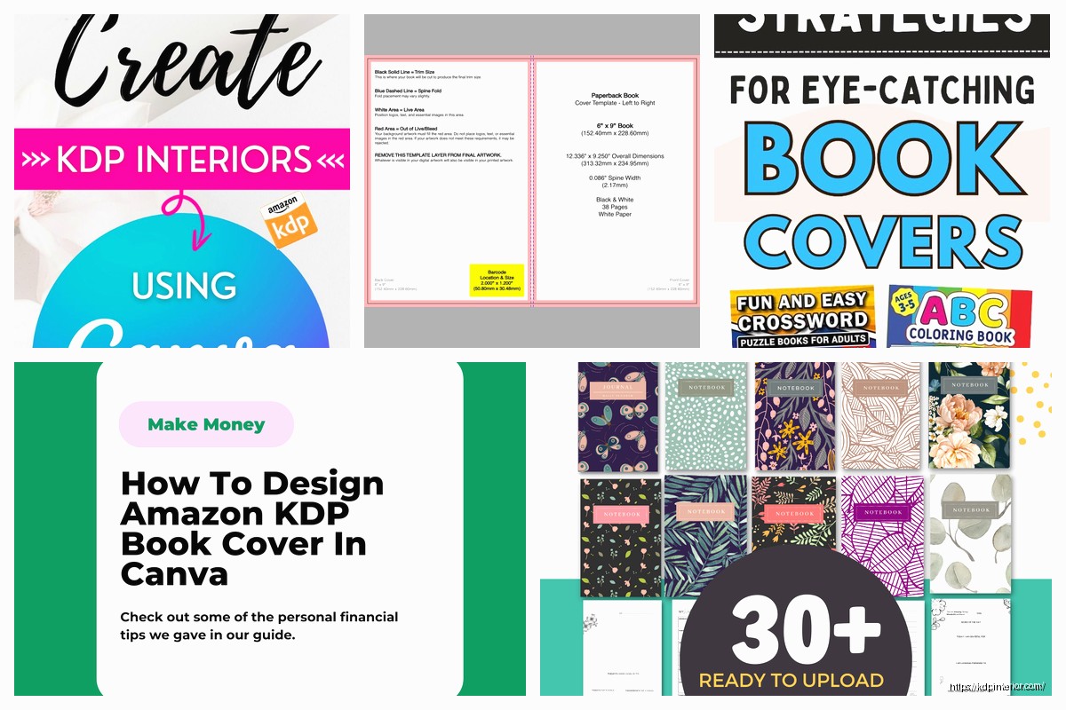
DISCOVER OUR FREE BEST SELLING PRODUCTS
Editable Canva Lined Journal: Express Your Thoughts – KDP Template
Lined Pages Journal 120 pages Ready to Upload PDF Commercial Use KDP Template 6×9 8.5×11 5×8 for Notebooks, Diaries, Low Content
Lined Pages Journal 120 pages Ready to Upload PDF Commercial Use KDP Template 6×9 8.5×11 5×8 for Notebooks, Diaries, Low Content
Cute Dogs Coloring Book for Kids | Activity Book | KDP Ready-To-Upload
Daily Planner Diary : Diary Planners for Everyday Productivity, 120 pages, 6×9 Size | Amazon KDP Interior
Wolf Coloring KDP interior For Adults, Used as Low Content Book, PDF Template Ready To Upload COMMERCIAL Use 8.5×11"
Coloring Animals Head Book for Kids, Perfect for ages 2-4, 4-8 | 8.5×11 PDF
Printable Blank Comic Book Pages PDF : Create Your Own Comics – 3 Available Sizes
Notes KDP interior Ready To Upload, Sizes 8.5×11 6×9 5×8 inch PDF FILE Used as Amazon KDP Paperback Low Content Book, journal, Notebook, Planner, COMMERCIAL Use
Black Lined Journal: 120 Pages of Black Lined Paper Perfect for Journaling, KDP Notebook Template – 6×9
Student Planner Journal 120 pages Ready to Upload PDF Commercial Use KDP Template 6×9" 8.5×11" for Low Content book
Recipe Journal Template – Editable Recipe Book Template, 120 Pages – Amazon KDP Interior