Amazon KDP guide, KDP book publishing
KDP Book Cover Template: Professional Designs & Specs
Mar
Okay so the whole KDP cover template thing is honestly way simpler than people make it but there’s like a few gotchas that’ll mess you up if you don’t know them upfront.
First thing – Amazon has this Cover Creator tool built right into KDP and yeah it’s basic but for low-content books it’s actually fine? Like I’ve made probably 60+ covers with it and they sell. Not gonna win design awards but when you’re pumping out journals and notebooks you don’t really need fancy. The templates are there, you pick one, swap the colors, done.
But if you want custom designs – which honestly you should for anything competitive – you need the actual dimensions and that’s where it gets specific.
The Actual Specs You Need
Amazon uses different trim sizes and the cover template changes based on your page count because of spine width. This trips people up constantly. Your cover isn’t just front and back – it’s a single wraparound image that includes the spine.
The formula is: trim width + spine width + trim width = total cover width. Height is just your trim height plus bleed.
For bleed, Amazon requires 0.125 inches on all sides. So if you’ve got a 6×9 book, your actual cover dimensions aren’t 12×9 (which would be front and back). You gotta add that spine calculation plus bleeds.
Wait I forgot to mention – Amazon actually has a calculator for this. In your KDP dashboard when you’re uploading a book, there’s a link that says “Calculate your book’s spine width” or something like that. You enter your page count and paper type (white or cream) and it tells you the spine width. Write that number down because you’ll need it.
Common Trim Sizes I Use
- 6×9 inches – most common for books, comfortable reading size
- 8.5×11 inches – workbooks, planners, activity books
- 5×8 inches – smaller books, gift books, compact reads
- 8×10 inches – coloring books, some journals
- 5.5×8.5 inches – standard notebooks and journals
The 6×9 is like the default for a reason. It looks professional, fits on shelves nicely, and readers expect it for most non-fiction.
Using Canva for KDP Covers
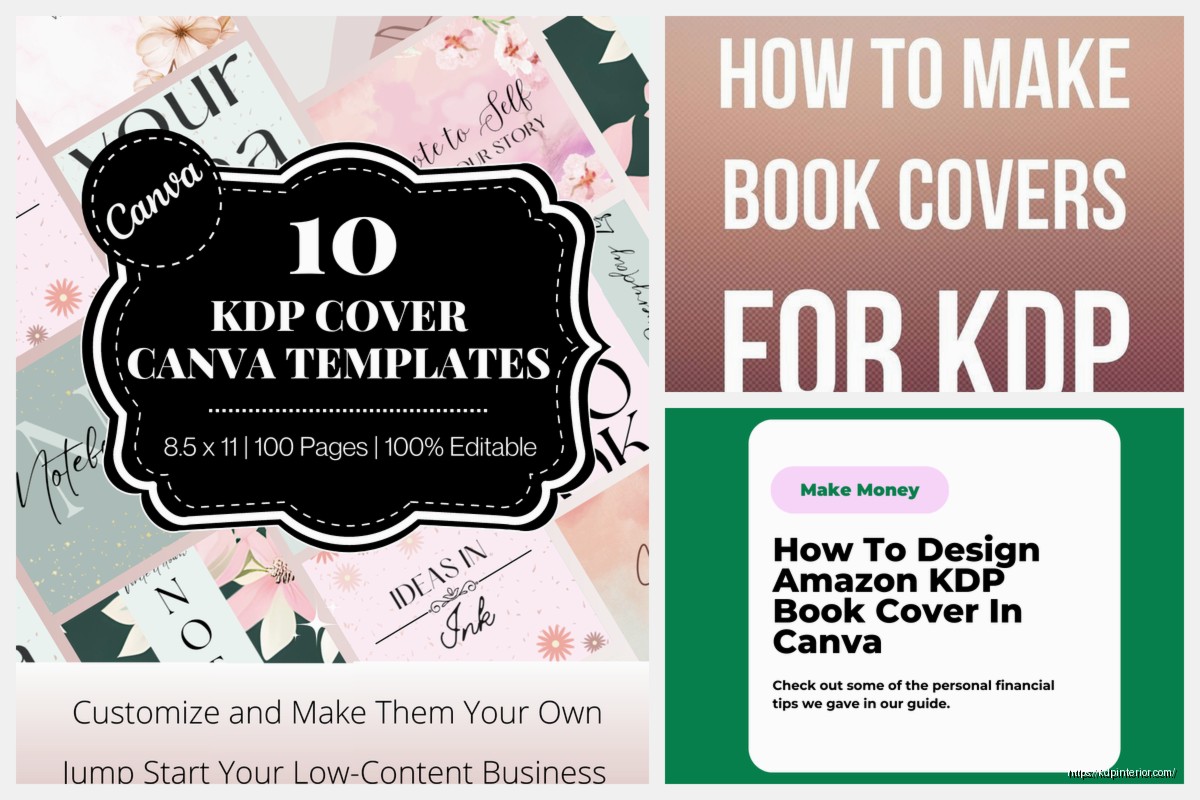
Okay so Canva is where I do probably 80% of my covers now. They actually have KDP book cover templates built in if you search for them, but honestly I just create custom dimensions.
Here’s what I do – let’s say I’m making a 6×9 book with 120 pages. I go to Amazon’s spine calculator, enter 120 pages and white paper (cream is slightly thicker). It tells me the spine is like 0.267 inches or whatever.
Then my math is:
– Total width: 6 + 0.267 + 6 + 0.25 (for bleeds on both sides) = 12.517 inches
– Total height: 9 + 0.25 (top and bottom bleed) = 9.25 inches
In Canva I create a custom size of 12.517 x 9.25 inches. Set it to 300 DPI in the download settings because Amazon requires high resolution.
Setting Up Safe Zones
This is gonna sound tedious but you need guides for your safe zones. The spine area shouldn’t have important text because it might get cut during trimming. Amazon recommends keeping text and important design elements at least 0.125 inches away from trim lines and 0.0625 inches from the spine edges.
I use ruler guides in Canva – you can drag them from the rulers if you turn them on. Place guides at:
– 0.125 inches from each edge (your bleed line)
– Then another 0.125 inches inside that (your safe zone)
– Mark where your spine starts and ends based on your calculation
The back cover starts at 0.125 inches, the spine starts at 6.125 inches (back cover width plus bleed), and the front cover starts at 6.125 + spine width.
Design Elements That Actually Work
Real talk – simple sells better than complex for most KDP niches. I tested this with like 15 journal designs last year, some with elaborate patterns and some with clean minimalist looks. The minimalist ones consistently got better conversion rates.
Colors matter more than you’d think. I had this phase where I was doing all these muted earth tones because they looked sophisticated, right? Sales were meh. Switched to bolder, more saturated colors – sales went up. People browsing Amazon on their phones need covers that pop in tiny thumbnails.
What Should Be On Your Cover
- Title that’s readable at thumbnail size – test it by zooming out
- Subtitle if needed but don’t cram too much text
- Your author name or brand
- Relevant imagery or patterns that signal what the book is
- Back cover text – description, benefits, maybe author bio
- Barcode space on the back bottom right (Amazon adds this automatically)
For the barcode space, leave a white rectangle about 2×1.25 inches in the bottom right corner of your back cover. Amazon will put the ISBN barcode there.
Oh and another thing – don’t put text on the spine if your book is under 100 pages. The spine’s too narrow and it’ll look bad. Amazon actually won’t let you upload spine text for really thin books.
Free Resources and Templates
Besides Canva, there’s a bunch of free tools. BookBolt has a cover creator that’s pretty solid – it’s mainly for low-content but it works. KD Pro Cover Creator is another one I’ve messed with.
For fonts, Google Fonts is your friend. All free for commercial use. I probably use Montserrat, Playfair Display, and Raleway on like 60% of my covers because they’re clean and readable.
Unsplash and Pixabay for free images if you need photos. For patterns and textures, Creative Fabrica has a subscription that’s worth it if you’re doing volume – unlimited downloads for like $7/month or something. I think I’ve downloaded 500+ elements from there.
Templates I Keep Reusing
I’ve got probably 20 Canva templates saved that I just duplicate and modify. Once you nail down a design that works, you can reskin it for different niches. Change the colors, swap the title, adjust the background pattern – boom, new cover in 15 minutes.
My dog just knocked over my water bottle but anyway –
For journals and notebooks, I’ve got this template with a simple pattern background, clean sans-serif title, and minimal design elements. I’ve used variations of it for gratitude journals, password logbooks, fitness trackers, recipe books. Same basic layout, different colors and titles.
Technical Upload Stuff
When you export from Canva, download as PDF Print with crop marks and bleed. Amazon accepts PDF or JPG/TIFF but PDF is usually better quality. Make sure you’re downloading at 300 DPI – there’s a setting for this.
File size limit is 40MB which you’ll basically never hit unless you’re doing something weird with images.
Amazon’s preview tool after upload will show you if anything’s wrong. It’ll flag if your resolution is too low or if important elements are outside the safe zone. Pay attention to those warnings.
Common Upload Errors
The most common rejection I get is the cover being slightly off dimensions. Even a few pixels can cause issues. Double-check your math and make sure you’re entering the exact spine width Amazon calculated.
Another one – RGB vs CMYK color mode. Amazon wants RGB for digital files even though CMYK is print standard. Canva defaults to RGB so you’re usually fine, but if you’re using Photoshop or something, make sure it’s RGB.
And gotta mention – don’t put Amazon badges or “bestseller” claims on your cover. Against TOS and they’ll reject it.
Testing Cover Designs
Here’s something I learned the hard way – your opinion doesn’t matter as much as data. I’ve designed covers I thought were gorgeous that bombed, and covers I thought were whatever that sold great.
PickFu is a testing service where you can poll target audiences on cover designs. Costs like $50 per poll but if you’re investing time in a book, it’s worth knowing which cover will perform better before you publish.
I also just look at bestsellers in my niche. What covers are ranking in the top 20? What patterns do you see? If all the top gratitude journals have floral designs and script fonts, there’s probably a reason. Don’t copy exactly but use those insights.
Spine and Back Cover Design
The spine is basically just your title and author name running vertically. Text should read top to bottom on the spine (so it’s readable when the book is lying face-up). Keep it simple – one or two font styles max.
Back covers are where you actually have some room to sell. I usually include:
– A headline or hook
– 3-5 bullet points of benefits or features
– Maybe a small graphic element
– Leave that barcode space
For low-content books like journals, the back cover might just describe what’s inside – “100 pages of guided prompts” or whatever. For books with more content, you can do a proper book description.
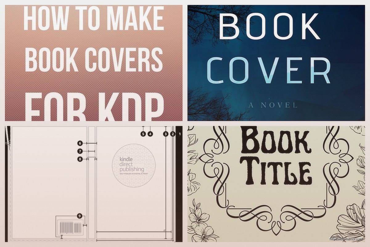
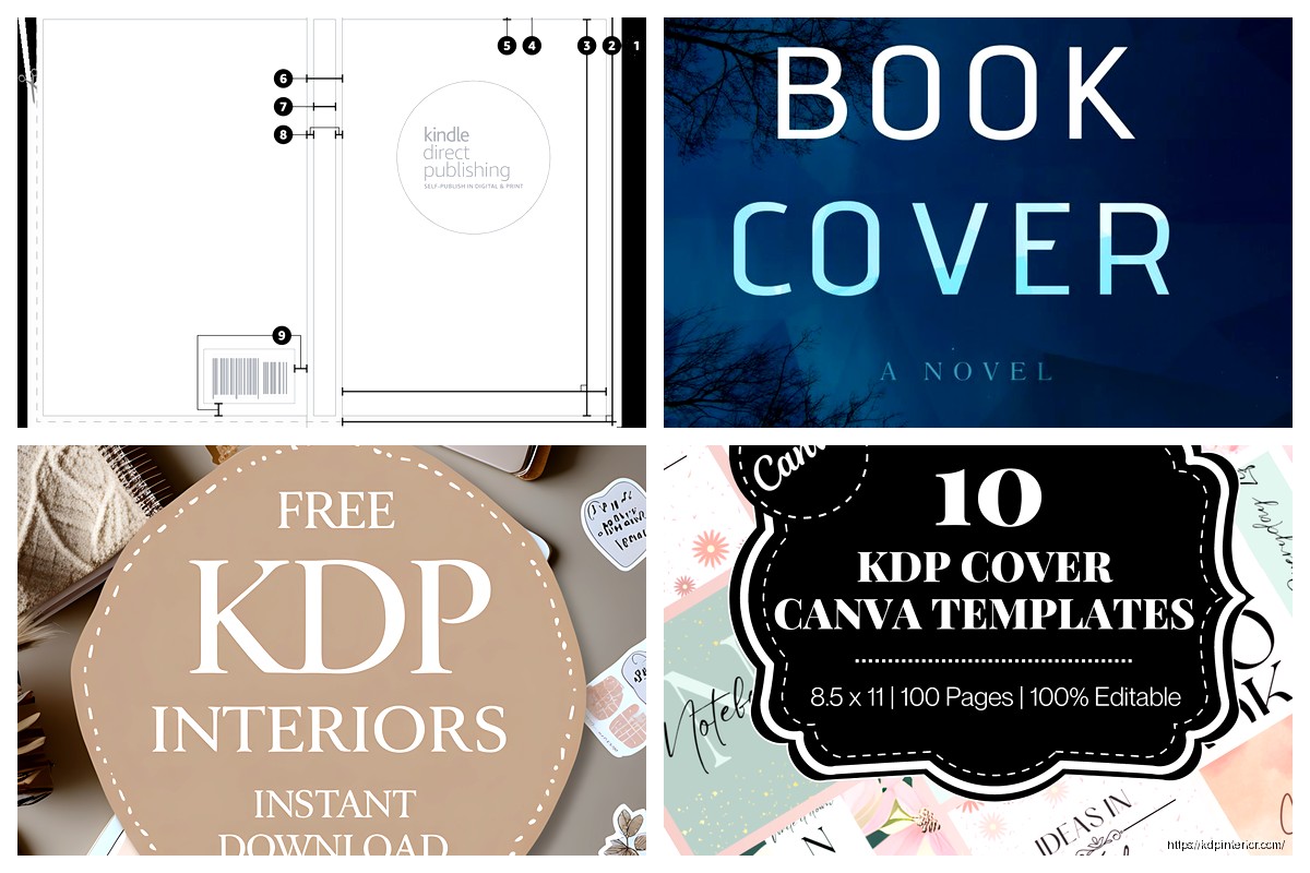
Wait I forgot to mention earlier – the KDP Cover Template specifically. Amazon actually provides downloadable templates if you search “KDP Cover Template” in their help section. They’re PNG files with guides showing where everything goes. You can drop these into Photoshop or whatever as a base layer.
Typography Tips That Actually Matter
Don’t use more than two fonts on your cover. Title font and body font, that’s it. More than that looks amateurish.
Make your title HUGE. Like bigger than you think. Remember people are seeing this as a thumbnail first. If they can’t read your title at tiny size, they’re scrolling past.
Contrast is key – light text on dark backgrounds or vice versa. That middle-ground stuff where you have medium gray on medium blue? Nobody can read that.
My Actual Workflow These Days
Just to give you the real process – I research the niche first, look at competing covers, note what’s working. Then I open Canva, create my custom dimensions with the spine width I calculated. Set up my guides for safe zones.
I pick a color scheme – usually three colors max. Find or create my background. Add title with a bold readable font. Add subtitle or additional text with a complementary font. Add any graphics or design elements but keep it clean.
Export as PDF, upload to KDP, check the preview. Usually gotta adjust something – text too close to edge, colors look different than expected, whatever. Re-export, re-upload.
Whole process takes maybe 30-45 minutes for a new design, 10-15 minutes if I’m using an existing template.
The thing nobody tells you is that covers are iterative. Your first version probably won’t be your best. I’ve gone back and redesigned covers on books that weren’t selling and seen sales pick up. Sometimes just changing the color scheme or making the title bigger makes a difference.
Anyway that’s basically the full rundown on KDP cover templates and specs. It seems complicated at first but once you do a few you’ll have the process down and it becomes pretty automatic.
DISCOVER OUR FREE BEST SELLING PRODUCTS
Editable Canva Lined Journal: Express Your Thoughts – KDP Template
Lined Pages Journal 120 pages Ready to Upload PDF Commercial Use KDP Template 6×9 8.5×11 5×8 for Notebooks, Diaries, Low Content
Lined Pages Journal 120 pages Ready to Upload PDF Commercial Use KDP Template 6×9 8.5×11 5×8 for Notebooks, Diaries, Low Content
Cute Dogs Coloring Book for Kids | Activity Book | KDP Ready-To-Upload
Daily Planner Diary : Diary Planners for Everyday Productivity, 120 pages, 6×9 Size | Amazon KDP Interior
Wolf Coloring KDP interior For Adults, Used as Low Content Book, PDF Template Ready To Upload COMMERCIAL Use 8.5×11"
Coloring Animals Head Book for Kids, Perfect for ages 2-4, 4-8 | 8.5×11 PDF
Printable Blank Comic Book Pages PDF : Create Your Own Comics – 3 Available Sizes
Notes KDP interior Ready To Upload, Sizes 8.5×11 6×9 5×8 inch PDF FILE Used as Amazon KDP Paperback Low Content Book, journal, Notebook, Planner, COMMERCIAL Use
Black Lined Journal: 120 Pages of Black Lined Paper Perfect for Journaling, KDP Notebook Template – 6×9
Student Planner Journal 120 pages Ready to Upload PDF Commercial Use KDP Template 6×9" 8.5×11" for Low Content book
Recipe Journal Template – Editable Recipe Book Template, 120 Pages – Amazon KDP Interior