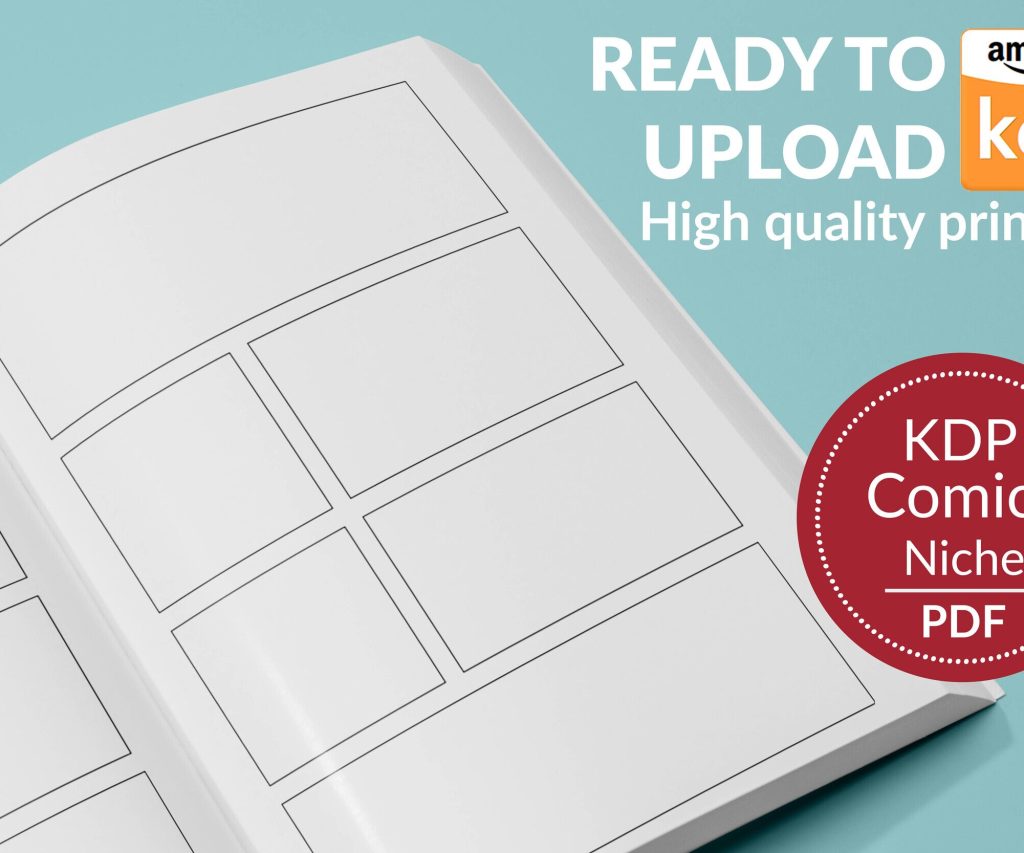
 Printable Blank Comic Book Pages PDF : Create Your Own Comics - 3 Available Sizes
 Subtotal: $0.00
Amazon KDP guide, KDP book publishing
KDP Book Publishing: Quality Standards & Best Practices
22
Feb
Feb
okay so here’s what actually matters with KDP quality standards
So I was up till like 2am last week fixing a client’s book that got rejected three times and honestly most of the quality issues people run into are super avoidable if you just know what Amazon’s bots are actually checking for.
First thing – and I cannot stress this enough – your PDF has to be clean. Like really clean. I’ve had books with 200+ pages sail through review and then a 30-page journal get rejected because there was some weird metadata embedded in the file. What I do now is always run my PDFs through a scrubber before upload. You can use Adobe Acrobat‘s sanitize function or even just re-export the PDF with a “print to PDF” function. Sounds excessive but it’s saved me probably 15+ rejections over the years.
The Cover Thing Everyone Messes Up
Your cover needs to be exactly the right dimensions and honestly the calculator on KDP is your best friend here. But here’s what they don’t tell you clearly enough – your spine width changes based on page count AND paper type. I had this whole batch of planners ready to go and realized I’d calculated spine width for white paper when I was using cream. Had to redo like 40 covers.
Resolution needs to be 300 DPI minimum. Not 299, not 250 with “good enough” quality. 300. The bots will catch it and auto-reject.
Oh and another thing about covers – if you’re doing a series or multiple books, don’t use the exact same cover with just different colors. Amazon’s been cracking down on that lately. I had a client get flagged for “duplicate content” even though the interiors were completely different. We had to redesign the whole series to make them visually distinct enough.
Interior Formatting That Won’t Get You Rejected
Margins are non-negotiable. For most trim sizes you need:
- Inside margin: 0.5 inches minimum (but I usually do 0.625 for books over 150 pages)
- Outside margin: 0.5 inches
- Top and bottom: 0.5 inches
But here’s where it gets tricky – if your book is over 400 pages, you need to increase that inside margin because of the spine curve. Nobody tells you this and then you get reviews saying text disappears into the gutter. Not technically a quality violation but it’ll kill your ratings.
Bleed is another thing. If you have any images or background colors that go to the edge of the page, you NEED to set up bleed. That’s an extra 0.125 inches on all sides that’ll get trimmed. My cat literally walked across my keyboard once and messed up a bleed setting and I didn’t notice until I got the proof copy. Pages had white strips on the edges. Looked terrible.
Content Quality Standards (The Subjective Stuff)
This is gonna sound weird but Amazon’s quality reviewers are looking for “value” and it’s super subjective. I’ve had identical notebook interiors – one gets approved, one gets rejected for “lack of content.” The difference? The approved one had a better cover and title that made it seem more professional.
For low-content books specifically:
- Needs to be at least 100 pages (I aim for 120 to be safe)
- Every page should have SOMETHING on it – even if it’s just a page number or header
- Don’t just copy-paste the same page 100 times with different numbers. They can detect that now
I tested this last month actually – created two versions of a gratitude journal. One had slight variations in the prompts every 10 pages, the other was identical throughout. The varied one got approved in 24 hours. The repetitive one got rejected for “poor customer experience.”
wait I forgot to mention the preview file thing
When you upload your interior PDF, Amazon generates a preview. ALWAYS download and check this preview before you approve your book. I’ve caught so many issues this way – pages that didn’t convert right, fonts that substituted to something ugly, images that shifted.
The preview shows you exactly what readers will see in the Look Inside feature too. If your first 10 pages are just blank or copyright info, that’s a problem. Front-load your best content.
Typography Standards Nobody Talks About
Font size matters more than you’d think. For regular books, 10-12pt is standard. Go smaller and you’ll get complaints, go bigger and it looks like a large-print edition (which is fine if that’s what you’re going for, but price it accordingly).
Embedded fonts – gotta make sure they’re actually embedded in your PDF. I use Google Fonts mostly because they’re free for commercial use and embed cleanly. Had a situation where a client used some fancy font from their computer, didn’t embed it, and Amazon’s system substituted it with Times New Roman. Looked completely different from what they intended.
Line spacing should be 1.15 to 1.5 for body text. Single spacing looks cramped in print, double spacing wastes pages and makes the book unnecessarily expensive.
The Proof Copy Is Not Optional
Okay so I know the digital proof is tempting because it’s free and fast, but order the physical proof. Every. Single. Time. Colors look different in print, text weight changes, binding affects readability near the spine – you cannot catch all this on a screen.
I was watching that show Severance while waiting for a proof copy once and almost approved a book without checking it because I was so into the episode. Thank god I paused and actually looked because the blacks weren’t printing true black – they were this muddy gray. Had to go back and adjust my PDF export settings to fix the color profile.
Common Rejection Reasons & Fixes
Here’s my running list from actual rejections I’ve dealt with:
- Poor image quality – usually means images under 300 DPI or overly compressed JPEGs. Switch to PNG or higher quality JPG export
- Incorrect margins – use their templates, seriously
- Duplicate content – if you’re publishing multiple similar books, change up at least 40% of the interior
- Public domain concerns – even if something IS public domain, you need to add unique value. Don’t just slap a new cover on Pride and Prejudice
- Unclear or missing page numbers – books over 24 pages should have them
The Metadata Quality Piece
Your book description and keywords affect quality perception too. If your description is full of typos or keyword stuffing, it signals low quality even if the book itself is fine. Write like a human. Describe what’s actually in the book. Use keywords naturally.
Categories matter – don’t put your adult coloring book in the children’s section hoping for more visibility. You’ll get flagged and possibly suspended. Been there, had to fight that one with a client who swore it was fine.
oh and the pricing psychology thing
This isn’t technically a “quality standard” but Amazon’s algorithm treats super cheap books differently. If you price a 200-page book at $2.99, the system assumes it’s low quality. I’ve noticed better conversion and less scrutiny when pricing is in line with comparable books. Usually $6.99-$12.99 for low-content, $9.99-$19.99 for regular books depending on page count.
Last thing – customer complaints can trigger quality reviews even after your book is published. If you get multiple returns or negative reviews mentioning quality issues, Amazon might pull your book and review it again. So don’t slack on quality thinking you can just squeak through initial review.
I’ve got like 200+ books published and honestly the quality standards have gotten stricter every year. What worked in 2018 won’t fly now. My rule is always aim higher than minimum requirements because Amazon’s bots are unpredictable and human reviewers are having bad days sometimes.
DISCOVER OUR FREE BEST SELLING PRODUCTS
Editable Canva Lined Journal: Express Your Thoughts – KDP Template
Lined Pages Journal 120 pages Ready to Upload PDF Commercial Use KDP Template 6×9 8.5×11 5×8 for Notebooks, Diaries, Low Content
Lined Pages Journal 120 pages Ready to Upload PDF Commercial Use KDP Template 6×9 8.5×11 5×8 for Notebooks, Diaries, Low Content
Cute Dogs Coloring Book for Kids | Activity Book | KDP Ready-To-Upload
Daily Planner Diary : Diary Planners for Everyday Productivity, 120 pages, 6×9 Size | Amazon KDP Interior
Wolf Coloring KDP interior For Adults, Used as Low Content Book, PDF Template Ready To Upload COMMERCIAL Use 8.5×11"
Coloring Animals Head Book for Kids, Perfect for ages 2-4, 4-8 | 8.5×11 PDF
Printable Blank Comic Book Pages PDF : Create Your Own Comics – 3 Available Sizes
Notes KDP interior Ready To Upload, Sizes 8.5×11 6×9 5×8 inch PDF FILE Used as Amazon KDP Paperback Low Content Book, journal, Notebook, Planner, COMMERCIAL Use
Black Lined Journal: 120 Pages of Black Lined Paper Perfect for Journaling, KDP Notebook Template – 6×9
Student Planner Journal 120 pages Ready to Upload PDF Commercial Use KDP Template 6×9" 8.5×11" for Low Content book
Recipe Journal Template – Editable Recipe Book Template, 120 Pages – Amazon KDP Interior