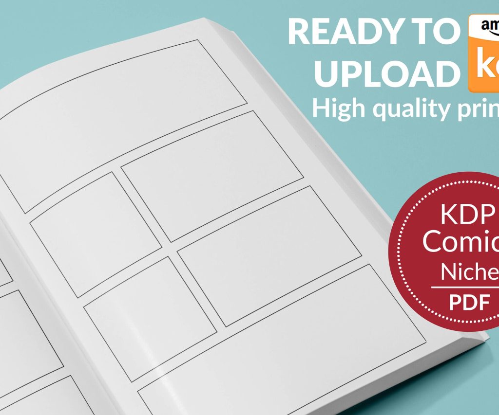
 Printable Blank Comic Book Pages PDF : Create Your Own Comics - 3 Available Sizes
 Subtotal: $0.00
Amazon KDP guide, KDP book publishing
KDP Cover Design Guide: Create Professional Book Covers
19
Feb
Feb
okay so cover design is literally make-or-break for KDP
Look, I’ve uploaded like 200+ books at this point and I can tell you right now that a bad cover will kill even the best content. People judge books by covers on Amazon – that’s just how it works. Your thumbnail needs to pop at like 120 pixels wide because that’s what most people see first when they’re scrolling.
the dimensions thing everyone screws up
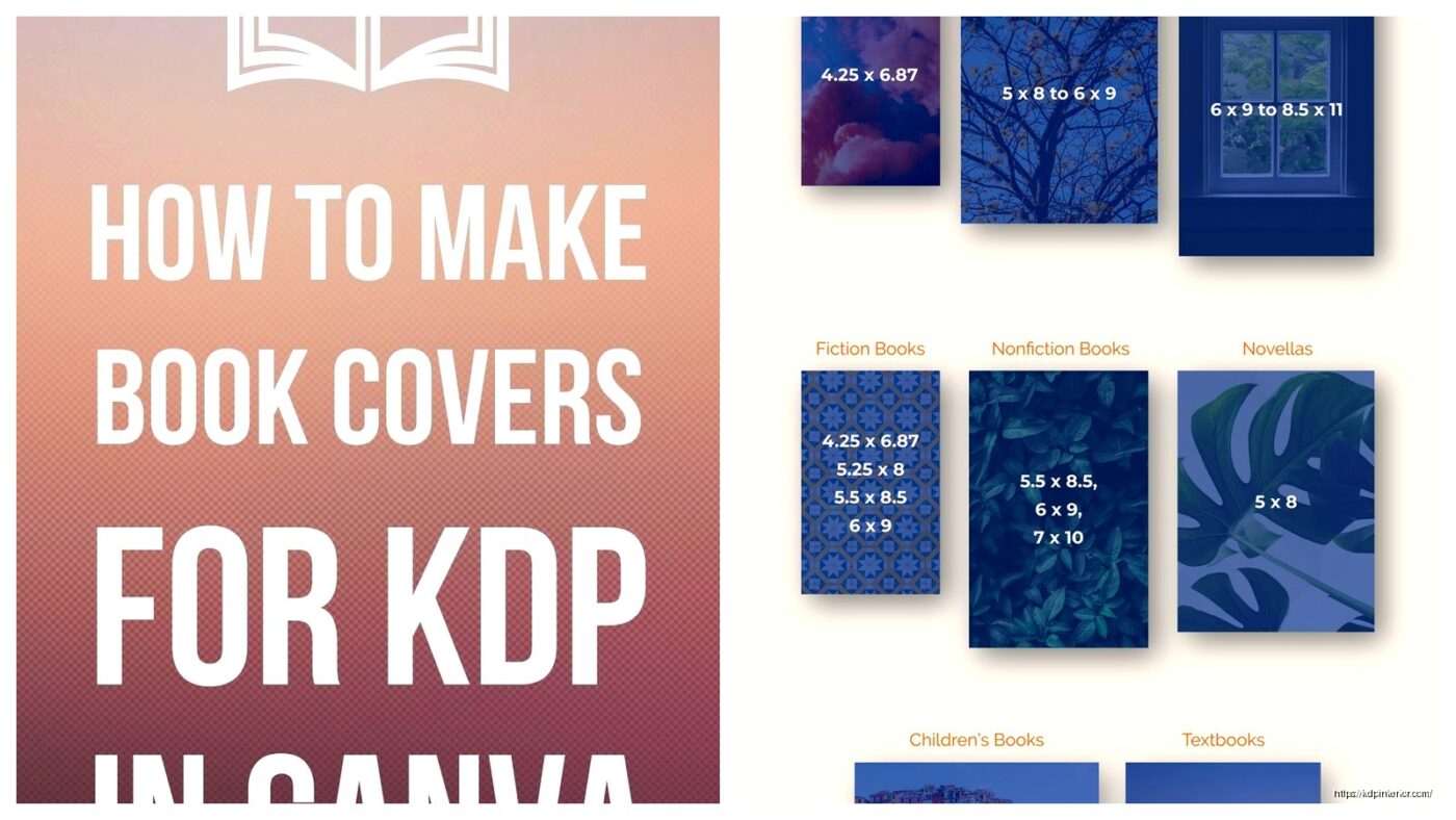
So KDP requires specific dimensions based on your page count and paper type. For ebooks it’s actually pretty simple – you just need a front cover. The minimum is 1000 x 1600 pixels but honestly I always go with 2560 x 1600 or bigger because Amazon’s system compresses everything anyway.
For paperbacks though… this is where people lose their minds. You need a full wraparound cover that includes front, spine, and back. Amazon has this cover calculator on the KDP dashboard and you gotta use it. Like, you punch in your page count, paper type (white or cream), and whether you want bleed or not.
Wait I forgot to mention – bleed just means your background colors or images extend past the trim line so you don’t get weird white edges if the cutting is slightly off. Always use bleed unless you have a plain white background.
the actual spine width calculation
Here’s what trips people up: spine width changes based on page count. A 100-page book with white paper has a thinner spine than a 100-page book with cream paper. The calculator tells you this but I’ve seen so many authors just guess and then their covers get rejected.
My 150-page coloring book on cream paper? Spine was 0.38 inches. But my 150-page journal on white paper was 0.34 inches. Small difference but it matters when you’re laying out text on that spine.
software options from free to expensive
So you don’t need Photoshop, real talk. I started with Canva free version and made my first like 50 covers there. The pro version is $13/month or whatever and gives you background remover, more fonts, and way more stock photos.
Canva’s got KDP templates now which is pretty clutch. You can search for “book cover” and find templates already sized correctly. Just make sure you’re adjusting for YOUR specific dimensions from the calculator.
Other tools I’ve used:
- GIMP – free Photoshop alternative, kinda clunky interface but powerful
- Affinity Publisher – one-time payment like $70, really solid if you’re gonna do this long-term
- BookBrush – specifically for book covers, has 3D mockup generators too
- Adobe Express – simpler than Photoshop, better than Canva for some things
design principles that actually move units
Okay so funny story, I had this client last year who insisted on putting like 7 different fonts on her cookbook cover. I told her it looked chaotic but she didn’t listen… book went live and crickets. We redesigned with 2 fonts max and suddenly sales picked up.
the thumbnail test
Before you finalize ANYTHING, shrink your cover down to thumbnail size. Like actually make it tiny on your screen. Can you read the title? Does the image still make sense? Is there enough contrast?
I usually squint at my monitor from across the room – my cat thinks I’m crazy but it works. If I can’t tell what the book is about from 10 feet away, the design needs work.
fonts and readability
Sans-serif fonts (like Arial, Helvetica, Montserrat) work better for thumbnails because they’re cleaner. Serif fonts (like Times New Roman, Garamond) can work for certain genres like literary fiction or historical stuff, but they gotta be THICK and BOLD.
Never use thin delicate fonts unless your book is like 8.5 x 11 inches and the title will be huge. I learned this the hard way with a poetry collection that nobody could read the title on.
genre-specific conventions you can’t ignore
Every genre on Amazon has visual expectations. Romance readers expect certain color palettes and imagery. Thriller readers want dark, moody, mysterious vibes. If you ignore these conventions you’re basically telling browsers “this isn’t for you.”
What I do is search my main keyword on Amazon, look at the top 20 bestsellers in that category, and screenshot them. Then I analyze:
- What colors dominate?
- Where’s the title positioned usually?
- Do they use photos or illustrations?
- How much text is on the cover?
- What’s the overall mood/feel?
You don’t wanna copy obviously but you need to fit in enough that browsers recognize your genre instantly.
low-content books are different
For journals, notebooks, planners – the cover needs to show what’s INSIDE. Like if it’s a gratitude journal, maybe show a sample page or make it obvious through graphics. I use mockups of spiral bindings or page edges to create that physical product feel even though it’s just a flat image.
where to get images legally
Do NOT just Google image search and download stuff. That’s copyright infringement and Amazon will remove your book or worse.
Stock photo sites I actually use:
- Unsplash – free, high quality, no attribution required
- Pexels – same deal as Unsplash
- Pixabay – free but quality varies
- Creative Fabrica – subscription service, tons of graphics and fonts (I pay for this one)
- Depositphotos – pay per image or subscription, huge library
Oh and another thing – if you’re using Canva Pro, their library is licensed for commercial use including book covers. Just read the terms because some elements can’t be used as-is for trademarked products.
the back cover nobody talks about
For paperbacks, your back cover needs the book description, maybe an author bio, and definitely a barcode area. KDP adds the barcode automatically during processing, so you need to leave a white rectangle in the bottom right corner (for books read left-to-right). The recommended size is 2 x 1.2 inches but check KDP’s current specs cause they change stuff sometimes.
I usually put my description in a clean readable font, maybe add some review quotes if I have them, and keep the design simpler than the front. People flip books over to read the back, so prioritize text readability over fancy graphics.
common rejection reasons
KDP will reject your cover if:
- Wrong dimensions or spine width
- Text too close to trim lines (stay at least 0.125″ away)
- Barcode area isn’t blank white
- Image quality too low (below 300 DPI)
- Copyright issues with images
- Cover doesn’t match interior content obviously
This is gonna sound weird but I’ve had covers rejected because the spine text was upside down. The text should read correctly when the book is laying face-up – so it goes bottom to top on the spine.
my actual workflow start to finish
So when I’m making a new cover, here’s what I do:
- Run KDP calculator for exact dimensions
- Research top 20 books in my category
- Sketch rough ideas on paper (yeah actually paper, helps me think)
- Open Canva or Affinity Publisher with correct dimensions
- Drop in background color or image
- Add title in 2-3 font sizes to test readability
- Add subtitle if needed
- Add author name
- Design spine and back cover for paperbacks
- Export as PNG or PDF with highest quality settings
- Test thumbnail view
- Make adjustments
- Upload to KDP and use their previewer tool
the previewer tool is your friend
KDP has this 3D previewer that shows your paperback cover wrapped around a book shape. Use it. I’ve caught spine alignment issues and bleed problems just by rotating that preview around.
honestly just test and iterate
Look my first 20 covers were pretty rough. You get better by doing it repeatedly. I spent like three hours last week comparing two cover variations for a client’s recipe book – my dog kept barking at the delivery guy which didn’t help – but testing different designs is how you figure out what works.
You can even A/B test covers by uploading one version, running it for a month, then updating with a new design and comparing sales data. Amazon lets you change covers anytime without creating a new listing which is pretty convenient.
The typography matters more than you think. The color psychology is real. And that thumbnail view will make or break your click-through rate every single time. Just keep tweaking until it looks professional at tiny size and you’ll be ahead of like 60% of KDP publishers who slap something together in five minutes.
DISCOVER OUR FREE BEST SELLING PRODUCTS
Editable Canva Lined Journal: Express Your Thoughts – KDP Template
Lined Pages Journal 120 pages Ready to Upload PDF Commercial Use KDP Template 6×9 8.5×11 5×8 for Notebooks, Diaries, Low Content
Lined Pages Journal 120 pages Ready to Upload PDF Commercial Use KDP Template 6×9 8.5×11 5×8 for Notebooks, Diaries, Low Content
Cute Dogs Coloring Book for Kids | Activity Book | KDP Ready-To-Upload
Daily Planner Diary : Diary Planners for Everyday Productivity, 120 pages, 6×9 Size | Amazon KDP Interior
Wolf Coloring KDP interior For Adults, Used as Low Content Book, PDF Template Ready To Upload COMMERCIAL Use 8.5×11"
Coloring Animals Head Book for Kids, Perfect for ages 2-4, 4-8 | 8.5×11 PDF
Printable Blank Comic Book Pages PDF : Create Your Own Comics – 3 Available Sizes
Notes KDP interior Ready To Upload, Sizes 8.5×11 6×9 5×8 inch PDF FILE Used as Amazon KDP Paperback Low Content Book, journal, Notebook, Planner, COMMERCIAL Use
Black Lined Journal: 120 Pages of Black Lined Paper Perfect for Journaling, KDP Notebook Template – 6×9
Student Planner Journal 120 pages Ready to Upload PDF Commercial Use KDP Template 6×9" 8.5×11" for Low Content book
Recipe Journal Template – Editable Recipe Book Template, 120 Pages – Amazon KDP Interior