 Editable Canva Lined Journal: Express Your Thoughts - KDP Template
 Subtotal: $0.00
Amazon KDP guide, KDP book publishing
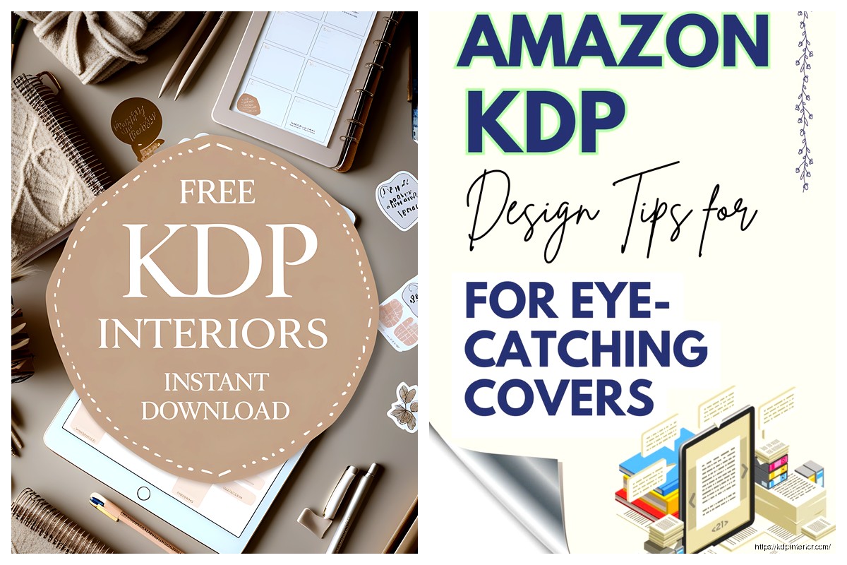
KDP Cover Template Download: Free Design Files
24
Mar
Mar
Okay so here’s the deal with KDP cover templates – I literally spent like three hours last Tuesday reorganizing all my design files and figured I should share what actually works because most people are downloading the wrong stuff or using outdated dimensions.
First thing, Amazon’s official template creator is at kdp.amazon.com/cover-templates or you can just search “KDP cover template” when you’re logged into your account. The thing is, you gotta know your trim size and page count before you even start downloading anything. Like I see so many people just grabbing random templates and then wondering why their covers get rejected.
The Official KDP Template Download Process
So when you’re in your KDP dashboard, there’s this cover calculator tool that literally nobody talks about enough. You put in your paperback trim size – let’s say 6×9 which is what I use for like 80% of my books – and then your page count. The page count matters way more than you’d think because it determines spine width, and if you’re off by even a few pages your whole cover is gonna be misaligned.
The calculator spits out a PDF or PNG template with guides showing you exactly where your front cover, spine, and back cover should be. Those red/pink zones around the edges? That’s bleed area. Anything important needs to stay inside the white safety zone or it might get cut off during printing.
I learned this the hard way with a journal I published in 2019 – had this beautiful mandala design that got chopped on all four sides because I didn’t understand bleed vs trim vs safety margins. Lost like $200 in author copies that I couldn’t even sell.
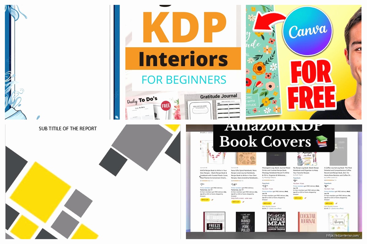
Free Design Software That Actually Works
Canva is gonna be everyone’s first answer and yeah, it works, but their free version has limitations. What I actually use now is a combo of tools depending on the project.
For simple covers – like low content books, journals, planners – Canva’s free tier is totally fine. They have KDP dimensions as preset templates if you search “KDP cover” in their template library. The 6×9 paperback template is already there with the right pixel dimensions.
But here’s what nobody tells you – Canva’s free templates don’t always account for spine width properly. So I download the actual KDP template first, note the exact dimensions including spine, then create a custom Canva document with those specs. It’s an extra step but saves you from rejection emails.
GIMP is the free Photoshop alternative and honestly it’s powerful enough for 90% of cover design work. The interface looks like it’s from 2005 which is kinda charming in a weird way, but once you learn where everything is, you can do gradients, text effects, layer manipulation – all the stuff you need. I use GIMP when I need to do heavy photo editing or complex layering that Canva can’t handle.
Oh and another thing – Photopea is this browser-based editor that’s basically Photoshop but free and you don’t download anything. I was watching The Bear last week and during commercial breaks I literally designed a cover for a recipe journal using just Photopea on my laptop. It handles PSD files, has all the professional tools, and the interface is almost identical to Photoshop so if you’ve ever used Adobe products you’ll figure it out immediately.
Where to Actually Get Free Design Assets
This is gonna sound obvious but Pixabay and Unsplash are your best friends for free stock photos. The license is commercial use with no attribution required, which means you can slap those images on a book cover and sell it without legal issues.
Pexels is another one I use constantly. I probably download 20-30 images a week from there when I’m in production mode cranking out multiple covers. The search function is better than Pixabay in my opinion.
For fonts – and this is super important – you can’t just use any font you find on Google. Most fonts have licenses that don’t allow commercial use. I exclusively use Google Fonts now because everything there is licensed for commercial projects. My go-to fonts are Playfair Display for elegant serif titles, Montserrat for clean modern sans-serif, and Crimson Text for book-y looking covers.
Wait I forgot to mention – Font Squirrel also has a filter where you can search only commercial-use fonts. That’s where I found some really unique display fonts that made my covers stand out more.
Free Graphics and Design Elements
Vecteezy has free vector graphics but you gotta watch the licensing. Some require attribution, some don’t. I always check the license details before downloading because the last thing you want is a DMCA notice because you used a graphic incorrectly.
Freepik has a free tier but honestly their best stuff is premium. I had a subscription for like six months and it was worth it when I was doing high-volume publishing, but if you’re just starting out, stick with the free resources.
Canva’s own element library is actually pretty extensive even on the free plan. Shapes, lines, frames, basic graphics – it’s all there. I use their elements probably more than external sites now because everything’s already integrated.
Setting Up Your Cover Template Correctly
Okay so once you’ve downloaded the KDP template, you need to understand the anatomy of it. Let me break this down because I see people mess this up constantly.
The template shows you total cover width which includes front cover + spine + back cover + bleed areas. For a 6×9 book with 120 pages, your total width might be something like 12.6 inches. That’s not three equal sections – the spine is way narrower, usually under half an inch for books under 200 pages.
Front cover dimensions for 6×9 with bleed are 6.125 x 9.25 inches. That extra .125 on each side is your bleed. Your actual trim size is 6×9 but you design to 6.125 x 9.25 so when they cut it, there’s no white edges showing.
The spine width formula is: (page count × paper thickness) but honestly just use Amazon’s calculator because they factor in paper type automatically. Cream paper is thicker than white paper, so same page count = different spine width depending on paper choice.
Back cover has the same dimensions as front cover – 6.125 x 9.25 with bleed. This is where your book description goes, author bio, barcode placement (though Amazon adds the barcode automatically so you don’t need to worry about that).
My Actual Workflow for Cover Design
I start with research. Like I’ll spend 30 minutes just browsing bestsellers in my category on Amazon, screenshotting covers that catch my eye. I’m looking at color schemes, typography choices, layout styles. This isn’t about copying – it’s about understanding what works in your market.
Then I download the KDP template for my specific trim size and page count. I usually design in Canva because it’s fastest for my workflow. I create a custom dimension document matching the template specs exactly.
I’ll grab a background image from Unsplash or create a solid color/gradient background. For low content books, simpler is often better. I published a gratitude journal last year with just a gradient background and clean typography and it outsold my more complex designs.
Typography is where most amateur covers fail. You’re looking at these covers as thumbnails on Amazon, so your title needs to be readable at tiny sizes. I test this by shrinking my design down to like 100 pixels wide and seeing if I can still read the title. If not, the font’s too thin or too decorative.
My cat literally just knocked over my coffee while I’m writing this, but anyway –
Color contrast matters more than you think. Dark text on light backgrounds or vice versa. Avoid red text on blue backgrounds, yellow on white, any combo that makes people’s eyes hurt. There are free contrast checker tools online if you’re unsure.
File Format and Upload Specs
KDP wants your cover as a single PDF or TIFF for paperbacks. The PDF should be flattened – meaning all layers merged, no editable text. Resolution needs to be 300 DPI minimum. I always design at 300 DPI from the start so I don’t have to worry about upscaling later.
File size can’t exceed 40 MB which is honestly generous. Most of my covers are 2-5 MB even with high-res images. If you’re hitting file size limits, you’re probably doing something wrong or have multiple huge images layered on top of each other unnecessarily.
For ebooks, it’s just the front cover. Dimensions are flexible but Amazon recommends 2560 x 1600 pixels for optimal display across devices. I usually do 1600 x 2400 which is a 2:3 ratio and looks good on Kindle screens.
Common Rejection Reasons and How to Avoid Them
Okay so I’ve had covers rejected probably 15-20 times over the years and it’s always frustrating but usually fixable.
Text or important design elements too close to trim edge – this is the number one reason. Keep everything at least .125 inches inside the trim line, preferably .25 inches for safety. Amazon’s guidelines say .125 but I go further because printing can shift slightly.
Spine text orientation wrong – spine text should read top to bottom when the book is lying face-up. I got this wrong on my first three books because I assumed it was bottom to top like some publishers do. Nope, KDP wants top to bottom.
Color mode issues – design in CMYK if you’re using professional software, or at least be aware that RGB colors look different when printed. That bright blue on your screen might print as dull purple. I order proof copies for any book I’m serious about to check color accuracy.
Bleed areas not properly filled – if you have a background that extends to the edge, it needs to fully cover the bleed area. I see people create designs that stop at the trim line and wonder why there’s white edges on their printed books.
Oh and another thing – don’t put the barcode on your cover. Amazon adds it automatically on the back cover bottom right. If you design your own barcode in that space, you’ll end up with two barcodes or they’ll reject it.
Free Resources I Actually Use Weekly
Coolors.co for color palette generation. I’ll upload a photo I want to use and it pulls out the color scheme, then I use those exact colors for text and design elements. Makes everything look cohesive without being a color theory expert.
Remove.bg for removing backgrounds from images. The free tier lets you do low-res downloads which is fine for testing cover concepts. If I need high-res I’ll pay for one credit but usually the free version works.
TinyPNG to compress file sizes without losing visible quality. I run all my final cover files through this before uploading to KDP. Smaller files = faster uploads = less time waiting around.
Amazon’s own previewer tool in KDP – after you upload your cover, they show you how it looks as a thumbnail, on product pages, in search results. I always check this before publishing because sometimes what looks good full-size looks terrible as a thumbnail.
This is gonna sound weird but I also keep a swipe file in Google Drive of covers I like. Just a folder with screenshots organized by genre. When I’m stuck creatively, I browse through there for inspiration. Not copying, just seeing what layout styles or color combos might work for my current project.
I spent like two months last year just testing different cover styles for the same planner to see what converted better. Same interior, different covers, tracked which one got more sales. The simple geometric pattern cover outsold the photo-based cover by almost 2:1. Market research is everything.
One last thing – don’t overthink your first cover. My first published book had a cover I designed in maybe 90 minutes using Canva’s free tools and a Pixabay image. It wasn’t amazing but it was professional enough to not hurt sales. You can always update covers later, and I’ve redesigned probably 40% of my back catalog over the years as I got better at design.
The templates are all free, the tools are mostly free, you just gotta put in the time to learn the specs and understand what works in your market. Start simple, test different approaches, and scale up as you learn what converts.
DISCOVER OUR FREE BEST SELLING PRODUCTS
Editable Canva Lined Journal: Express Your Thoughts – KDP Template
Lined Pages Journal 120 pages Ready to Upload PDF Commercial Use KDP Template 6×9 8.5×11 5×8 for Notebooks, Diaries, Low Content
Lined Pages Journal 120 pages Ready to Upload PDF Commercial Use KDP Template 6×9 8.5×11 5×8 for Notebooks, Diaries, Low Content
Cute Dogs Coloring Book for Kids | Activity Book | KDP Ready-To-Upload
Daily Planner Diary : Diary Planners for Everyday Productivity, 120 pages, 6×9 Size | Amazon KDP Interior
Wolf Coloring KDP interior For Adults, Used as Low Content Book, PDF Template Ready To Upload COMMERCIAL Use 8.5×11"
Coloring Animals Head Book for Kids, Perfect for ages 2-4, 4-8 | 8.5×11 PDF
Printable Blank Comic Book Pages PDF : Create Your Own Comics – 3 Available Sizes
Notes KDP interior Ready To Upload, Sizes 8.5×11 6×9 5×8 inch PDF FILE Used as Amazon KDP Paperback Low Content Book, journal, Notebook, Planner, COMMERCIAL Use
Black Lined Journal: 120 Pages of Black Lined Paper Perfect for Journaling, KDP Notebook Template – 6×9
Student Planner Journal 120 pages Ready to Upload PDF Commercial Use KDP Template 6×9" 8.5×11" for Low Content book
Recipe Journal Template – Editable Recipe Book Template, 120 Pages – Amazon KDP Interior