Okay so the biggest mistake I see with KDP ebook formatting is people designing for their laptop screen and then wondering why it looks terrible on a Kindle Paperwhite or someone’s phone. I literally spent like three hours last Tuesday fixing a client’s romance novel because she formatted everything in Calibre without testing on actual devices and it was a mess.
Start With Your Word Doc the Right Way
Here’s the thing – you wanna start in Microsoft Word or Google Docs, not some fancy design software. KDP converts from .doc or .docx files pretty cleanly if you set it up right from the beginning.
Use styles for everything. Like, EVERYTHING. Your chapter titles should be Heading 1, subheadings are Heading 2. Don’t just make text bigger and bold it – that’s gonna break on different screen sizes. I learned this the hard way back in 2018 when my first cookbook looked perfect on my MacBook but the headings were all wonky on Kindle Fire tablets.
Font choice matters less than you think because Kindle readers can override your font anyway. Most people just go with Georgia or Times New Roman. I use Georgia because it’s easier on the eyes for long reads. Set your body text to 12pt and don’t mess with it.
Margins should be 1 inch all around. Line spacing at 1.5 or 2.0 – single spacing looks cramped on e-readers and you’ll get complaints in reviews about readability.
The Paragraph Formatting Thing That Everyone Gets Wrong
Do NOT use tabs or spaces to indent paragraphs. Use the First Line Indent option in your paragraph settings – set it to 0.3 inches. This scales properly across devices. When you hit space bar five times to indent, different devices render that differently and it looks sloppy.
Oh and another thing – justify your text alignment. Left-aligned looks fine on computers but justified is the standard for ebooks and it just… looks more professional? People expect it.
For scene breaks, use three asterisks centered on their own line with blank lines above and below. Don’t use images or special characters that might not render properly. I’ve seen people use fancy divider graphics that just show up as broken image icons on older Kindles.
Chapter Headings and Page Breaks
Every chapter needs to start on a new page. In Word, insert a Page Break (Ctrl+Enter on Windows) – don’t just hit Enter a bunch of times. Those manual line breaks will cause chaos when the text reflows on different screen sizes.
Your chapter titles should be formatted as Heading 1 style, centered. Keep them simple. “Chapter One” or “1” or whatever fits your book’s vibe. I’ve got a thriller series where I just use numbers and it works fine.
After the chapter title, drop down two lines before starting your body text. Gives it breathing room.
Images Are Where Things Get Tricky
If you’re doing a text-only novel, skip images entirely except maybe your title page. But if you need images – cookbooks, travel guides, children’s books – you gotta be careful.
Save images as JPG files, 72 DPI, and resize them before inserting. A good rule is no wider than 600 pixels. Larger images bloat your file size and KDP charges delivery fees based on file size. I’ve seen people upload 50MB files when they could’ve been 5MB just because they didn’t compress images.
Insert images inline with text, not with text wrapping. Center them. Add a caption if needed using regular text, not Word’s caption feature which can break during conversion.
Wait I forgot to mention – convert images to grayscale if your book will be read on e-ink Kindles. Color images still work but they’re just black and white anyway on those devices and grayscale files are smaller.
Front Matter and Back Matter
Your ebook needs proper front matter. At minimum:
- Title page with book title and author name
- Copyright page with publication year and “All rights reserved” or whatever legal text
- Table of Contents (hyperlinked – we’ll get to that)
The title page should just be your book title in a large font (like 24pt or 28pt), centered, with your name below it. Simple. Don’t try to recreate your cover design here – it’s redundant since readers just saw your cover.
Copyright page is straightforward. Mine looks like:
Copyright © 2024 Daniel Harper
All rights reserved. No part of this book may be reproduced…
You get the idea. Google “copyright page template” if you need exact wording.
Table of Contents That Actually Works
This is gonna sound weird but you need TWO tables of contents. One for navigation (NCX TOC) that KDP generates automatically from your headings, and one visible TOC in your front matter that readers actually see.
For the visible TOC, list your chapters and hyperlink each one. In Word, select your chapter title text in the TOC, right-click, Insert Hyperlink, and link to the actual chapter heading using “Place in This Document” option. This lets readers tap a chapter name and jump right to it.
Make sure your Heading 1 styles are applied consistently because KDP’s conversion process uses those to build the NCX navigation. If you forget to style something as Heading 1, it won’t show up in the device’s menu navigation.
Testing on Kindle Previewer Before Upload
Download Kindle Previewer from Amazon – it’s free. This tool shows you how your book will look on different devices. You can preview it as a Kindle Paperwhite, Fire tablet, iPhone Kindle app, whatever.
Upload your Word file to Previewer and check every single page. I usually watch Netflix while clicking through because it’s tedious but necessary. My cat knocked over my coffee during the last one I was checking which was… annoying.
Look for:
- Weird spacing issues
- Chapter breaks in wrong places
- Images that are too large or don’t center properly
- TOC links that don’t work
- Text that runs off the screen
Switch between device types in the previewer. What looks good on a Fire tablet might be cramped on a phone screen. You want it readable everywhere.
Special Formatting Stuff
Drop caps: Don’t use them in ebooks. They break on too many devices. Just start your chapter with regular text.
Headers and footers: Remove them. Page numbers don’t make sense in ebooks since “pages” change based on font size and device. Running headers just take up screen real estate.
Footnotes: If you absolutely need them, use Word’s footnote feature and they’ll convert to pop-up notes on most devices. But honestly, consider moving them to endnotes at the back of the book instead – works more reliably.
Block quotes: Indent them an additional 0.5 inches from both left and right margins. Use italic if it’s a quote from another source.
Font and Text Formatting
Bold and italic work fine. Underline is outdated and looks weird – use italic for emphasis instead.
Don’t use colored text unless you have a specific reason. Remember that e-ink devices only show grayscale.
Never use ALL CAPS for long passages. It’s harder to read and comes across as shouting. If you want emphasis, use bold or italic.
File Size and Delivery Costs
KDP charges a delivery fee based on your file size – it’s like $0.15 per MB or something. For a text-only novel, you should be under 1MB easily. Even with some images, stay under 10MB if possible.
Large files also take longer for customers to download, especially on slower connections. I had a travel guide that was 45MB because I didn’t compress the photos and I got complaints about download times. Compressed everything and got it down to 8MB – problem solved.
The Actual Upload Process
When you’re uploading to KDP, you can upload your Word doc directly or convert it to EPUB first. I usually just upload the Word file because KDP’s converter has gotten pretty good.
After upload, KDP shows you a preview of the converted book. Click through it just like you did in Kindle Previewer. Make sure everything looks right. If something’s broken, fix it in your source file and re-upload.
You can download the converted file from KDP and open it in Kindle Previewer for another check if you want to be extra careful.
Common Problems and Quick Fixes
Chapters not starting on new pages: You probably hit Enter multiple times instead of inserting page breaks. Delete those manual breaks and insert proper page breaks.
TOC links don’t work: Your chapter headings probably aren’t formatted with Heading 1 style. Apply the style and recreate your hyperlinks.
Weird spacing between paragraphs: Check your paragraph settings. You might have “space before” or “space after” set to something wonky. Set both to 0 and use line spacing instead.
Text looks too cramped: Increase line spacing to 1.5 or 2.0.
Images are huge: Resize them before inserting. 600 pixels wide maximum.
Device-Specific Considerations
Kindle Paperwhite and e-ink devices are your baseline. If it looks good there, it’ll probably look good everywhere. These devices have limited formatting support – they’re basically just text and simple layout.
Fire tablets support more formatting but don’t rely on fancy features. Stick to basics.
The Kindle app on phones is where things get cramped. Test on the smallest screen size in Previewer. If chapter titles are too long, they might wrap weird on phones.
Oh and another thing – some older Kindles don’t support certain features. The Kindle Keyboard from like 2010 is still out there and it’s super limited. If you stick to basic formatting, you’ll be compatible with everything.
Final File Checklist
Before you upload, run through this:
- All chapter headings use Heading 1 style
- Page breaks before each chapter
- First line indents set to 0.3 inches, no tabs or spaces
- Images resized and compressed
- TOC hyperlinks all work
- No headers or footers
- Copyright page present
- Tested in Kindle Previewer on multiple device types
The truth is, ebook formatting isn’t that complicated once you understand the basics. Most issues come from people trying to make their ebook look exactly like a print book, which just doesn’t work. Ebooks are fluid – text reflows, font sizes change, screen dimensions vary. Your job is to provide clean, properly structured content that adapts well.
I’ve formatted over 200 books at this point and honestly, the simple ones perform just as well as the ones where authors spent weeks fussing over tiny details. Readers care about your content, not whether your scene breaks are three asterisks or five.
Just keep it clean, test on multiple devices, and you’ll be fine. The most important thing is that your book is readable and professional-looking across all devices – and if you follow this stuff, it will be.
 Cute Dogs Coloring Book for Kids | Activity Book | KDP Ready-To-Upload
1 × $0.00
Cute Dogs Coloring Book for Kids | Activity Book | KDP Ready-To-Upload
1 × $0.00  Printable Blank Comic Book Pages PDF : Create Your Own Comics - 3 Available Sizes
1 × $0.00
Printable Blank Comic Book Pages PDF : Create Your Own Comics - 3 Available Sizes
1 × $0.00 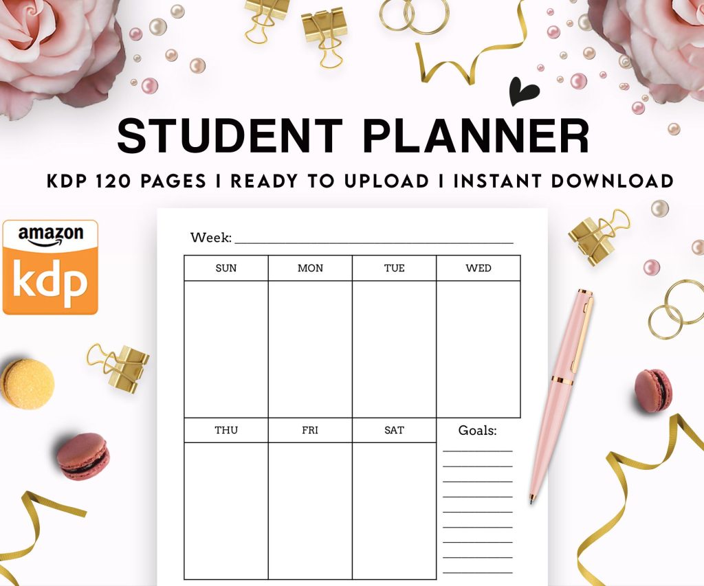 Student Planner Journal 120 pages Ready to Upload PDF Commercial Use KDP Template 6x9" 8.5x11" for Low Content book
1 × $0.00
Student Planner Journal 120 pages Ready to Upload PDF Commercial Use KDP Template 6x9" 8.5x11" for Low Content book
1 × $0.00 
DISCOVER OUR FREE BEST SELLING PRODUCTS
Editable Canva Lined Journal: Express Your Thoughts – KDP Template
Lined Pages Journal 120 pages Ready to Upload PDF Commercial Use KDP Template 6×9 8.5×11 5×8 for Notebooks, Diaries, Low Content
Lined Pages Journal 120 pages Ready to Upload PDF Commercial Use KDP Template 6×9 8.5×11 5×8 for Notebooks, Diaries, Low Content
Cute Dogs Coloring Book for Kids | Activity Book | KDP Ready-To-Upload
Daily Planner Diary : Diary Planners for Everyday Productivity, 120 pages, 6×9 Size | Amazon KDP Interior
Wolf Coloring KDP interior For Adults, Used as Low Content Book, PDF Template Ready To Upload COMMERCIAL Use 8.5×11"
Coloring Animals Head Book for Kids, Perfect for ages 2-4, 4-8 | 8.5×11 PDF
Printable Blank Comic Book Pages PDF : Create Your Own Comics – 3 Available Sizes
Notes KDP interior Ready To Upload, Sizes 8.5×11 6×9 5×8 inch PDF FILE Used as Amazon KDP Paperback Low Content Book, journal, Notebook, Planner, COMMERCIAL Use
Black Lined Journal: 120 Pages of Black Lined Paper Perfect for Journaling, KDP Notebook Template – 6×9
Student Planner Journal 120 pages Ready to Upload PDF Commercial Use KDP Template 6×9" 8.5×11" for Low Content book
Recipe Journal Template – Editable Recipe Book Template, 120 Pages – Amazon KDP Interior