-
×
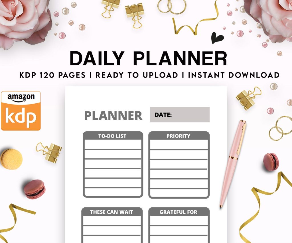 Daily Planner Diary : Diary Planners for Everyday Productivity, 120 pages, 6×9 Size | Amazon KDP Interior
1 × $0.00
Daily Planner Diary : Diary Planners for Everyday Productivity, 120 pages, 6×9 Size | Amazon KDP Interior
1 × $0.00
Subtotal: $0.00
Daily Planner Diary : Diary Planners for Everyday Productivity, 120 pages, 6×9 Size | Amazon KDP Interior
1 × $0.00 Subtotal: $0.00
Okay so I just spent like three hours yesterday setting up a hardcover template and honestly the whole thing is way less complicated than KDP makes it sound but there’s definitely some tricks you gotta know upfront.
So hardcovers on KDP are basically just paperbacks with a hard cover wrapped around them. Sounds obvious but like… the interior specs are identical to paperback which threw me off when I first started. You’re still using the same trim sizes – 6×9, 7×10, 8.5×11, whatever. The difference is all in the cover file and how you calculate spine width.
The bleed requirements are the same too. If you’re doing full bleed images you need that extra 0.125 inches on all sides. For text-only books you can skip bleed entirely which makes life easier. I usually just do no-bleed templates for journals and planners because why make more work for yourself.
You can’t do every size in hardcover. KDP limits you to specific options and honestly some of them don’t make sense for hardcover anyway. The 6×9 is your bread and butter – works for novels, journals, notebooks, pretty much everything. I probably use 6×9 for like 80% of my hardcover books.
The 8.5×11 is great for workbooks and activity books but the production cost gets wild. I had this coloring book last year and the hardcover version cost like $12 to produce which meant I had to price it at $29.99 just to make decent royalties. It sold okay but paperback crushed it in sales volume.
Oh and 7×10 is kinda the sweet spot for cookbooks or photography books if you’re doing that sort of content. Gives you more space than 6×9 but doesn’t kill your margins like 8.5×11 does.
So here’s where it gets annoying. You can’t just use KDP’s cover calculator like you do for paperback – well you can but you need to know the exact page count first and that means your interior is completely done. No estimating.
The spine width calculation is different because the case wrap is thicker. For a 200-page book in white paper the spine is gonna be like 0.9 inches roughly but don’t quote me on that because it changes based on paper type and page count obviously.
I always download the actual template from KDP after I upload my interior. They generate it based on your specific book which is way more reliable than trying to calculate it yourself. Had this situation two months ago where I calculated wrong and my spine text was off-center by like a quarter inch. Had to redo the whole cover.
The wraparound on hardcovers includes these flaps that fold inside the cover. They’re called case laminate and they add like 3 inches on each side. You don’t HAVE to put anything on these flaps but it looks more professional if you do. I usually put author bio on the back flap and maybe a book description or testimonial on the front flap.
Your back cover needs a barcode just like paperback. KDP puts it in the same spot – bottom right corner. Don’t put important design elements there or text you actually want people to read.
The spine is more visible on hardcovers because they sit differently on shelves. Makes spine design actually matter which is kinda fun honestly. I spend way more time on hardcover spines than paperback ones.
This is gonna sound weird but I literally use the exact same interior files for hardcover and paperback. Same margins, same formatting, same everything. The only time I change anything is if I’m adding like a “hardcover edition” note on the copyright page which is totally optional.
Your margins should still be 0.5 inches minimum on all sides for safety. I usually go with 0.75 inches on the gutter (inside margin) because it gives more breathing room when the book is open. Nobody wants text disappearing into the spine.
KDP offers white paper and cream paper for hardcovers. White is brighter and works better for books with images or color elements. Cream is easier on the eyes for text-heavy books like novels. The cream also feels more premium somehow? Might be psychological but my customers definitely mention it in reviews.
The paper choice affects your spine width calculation so you gotta decide before you do your cover. White paper is slightly thinner so a 200-page book in white will have a narrower spine than the same book in cream. It’s like a 0.1 inch difference but enough to screw up your cover if you’re not careful.
I use InDesign for interiors but honestly Word works fine if you know what you’re doing. The key is exporting to PDF correctly – you want PDF/X-1a:2001 format with fonts embedded. No bookmarks or hyperlinks in the interior PDF because KDP gets weird about that sometimes.
For covers I’m in Photoshop usually. Resolution needs to be 300 DPI minimum. I typically work at 600 DPI for covers because it gives more wiggle room and the file size isn’t that bad. We’re talking like 20MB versus 8MB which uploads fine.
Oh wait I forgot to mention – you need to set up your color profile right. Use CMYK for anything you want to look consistent. RGB can shift colors during printing and suddenly your nice navy blue is purple or whatever. Been there, had to reorder proof copies because I got lazy with color profiles.
Getting text to sit perfectly centered on the spine is lowkey the most frustrating part of hardcover design. What I do now is create a guide in Photoshop that marks the exact center of the spine width, then I place my text and check it like five times before finalizing.
Text should read from top to bottom on the spine when the book is standing upright. This is standard in the US but some countries do it differently so if you’re targeting international markets maybe worth checking. I don’t really sell internationally enough to worry about it though.
Font size matters too – if your spine is under 0.5 inches wide don’t even bother with spine text. It’ll be too small to read and look bad. Just leave it blank or do a simple design element.
Do not skip ordering a proof copy with hardcovers. I don’t care how good your files look on screen. The physical book will surprise you. Colors look different, spine alignment might be off, the paper texture affects readability more than you expect.
I order like two proof copies usually. One I mark up with notes and one I keep as reference for future books. The cost is annoying – proof copies are basically full production cost plus shipping – but it’s way cheaper than publishing a book with errors and getting bad reviews.
My dog ate the corner of a proof copy last month which was super helpful. Not really related but I’m still annoyed about it because it was for a client project and I had to order another one.
Bleed extending too far or not far enough. If you set up bleed make sure it goes all the way to the edge of the trim area. Halfway bleed looks terrible when trimmed.
Barcode placement wrong. I’ve seen people put it on the spine somehow? Or covering up important cover text. Just stick to bottom right corner, standard size, white background.
Interior margins too tight especially on the gutter. When someone opens a hardcover the pages curve more than paperback so you need extra space or text gets lost in the binding.
Spine width calculated for wrong page count. This happens when you change your interior after generating the cover template. Always finalize interior first, then do cover. Otherwise you’re redoing work.
Production costs are significantly higher. A 200-page 6×9 hardcover costs me about $7-8 to produce versus like $3 for paperback. That means your list price needs to be higher to make any money.
I typically price hardcovers 2.5x to 3x the paperback price. So if my paperback is $9.99 the hardcover is probably $24.99 or $27.99. Some people think that’s too high but honestly hardcovers are premium products. Customers expect to pay more.
The royalty rate is the same 60% for expanded distribution or regular distribution. I always opt out of expanded distribution for hardcovers because the extra discount cut isn’t worth the minimal additional exposure. Your margins are tight enough already.
This is gonna sound basic but name your files properly. I use a system like “BookTitle_6x9_Interior_HC_FINAL.pdf” and “BookTitle_6x9_Cover_HC_FINAL.pdf” – the HC tells me it’s hardcover specific and FINAL means it’s actually final not the seventeen other versions I saved while working.
Keep your source files organized too. I have a folder structure that’s like Project Name > Hardcover > Interior and Cover subfolders. Saves so much time when you need to update something six months later and can’t remember where anything is.
I built my own InDesign templates years ago with proper margins and page layouts for common trim sizes. Took like a day to set up but now I just duplicate the template file and drop in new content. Way faster than starting from scratch every time.
For covers I have Photoshop templates with all the guides and layers set up. Background layer, spine guides, text layers, barcode placeholder, everything. I just swap out the design elements and adjust spine width for each new book.
You can buy premade templates too if you don’t wanna build your own. There’s sellers on Creative Market and Etsy who make KDP-specific templates. Just make sure they’re updated for current KDP specs because things change sometimes.
When you’re actually uploading to KDP you’ll select hardcover as the format option. It walks you through basically the same steps as paperback – enter book details, upload interior PDF, upload cover PDF, preview, then submit.
The preview tool is okay but not perfect. I always check it but don’t rely on it completely. It’s caught obvious errors for me before like missing pages or weird formatting but subtle stuff gets through.
Processing time for hardcover seems longer than paperback in my experience. Usually takes like 24-48 hours for review versus 12-24 for paperback. Not a huge deal but worth knowing if you’re on a deadline.
One more thing – you can publish the same book in paperback and hardcover simultaneously. They show up as different format options on the same Amazon listing which is great for giving customers choices. I do this for pretty much all my books now because why leave money on the table. The hardcover sales are maybe 10-15% of total volume but it’s straight additional revenue with minimal extra work once you have the process down.
DISCOVER OUR FREE BEST SELLING PRODUCTS
Editable Canva Lined Journal: Express Your Thoughts – KDP Template
Lined Pages Journal 120 pages Ready to Upload PDF Commercial Use KDP Template 6×9 8.5×11 5×8 for Notebooks, Diaries, Low Content
Lined Pages Journal 120 pages Ready to Upload PDF Commercial Use KDP Template 6×9 8.5×11 5×8 for Notebooks, Diaries, Low Content
Cute Dogs Coloring Book for Kids | Activity Book | KDP Ready-To-Upload
Daily Planner Diary : Diary Planners for Everyday Productivity, 120 pages, 6×9 Size | Amazon KDP Interior
Wolf Coloring KDP interior For Adults, Used as Low Content Book, PDF Template Ready To Upload COMMERCIAL Use 8.5×11"
Coloring Animals Head Book for Kids, Perfect for ages 2-4, 4-8 | 8.5×11 PDF
Printable Blank Comic Book Pages PDF : Create Your Own Comics – 3 Available Sizes
Notes KDP interior Ready To Upload, Sizes 8.5×11 6×9 5×8 inch PDF FILE Used as Amazon KDP Paperback Low Content Book, journal, Notebook, Planner, COMMERCIAL Use
Black Lined Journal: 120 Pages of Black Lined Paper Perfect for Journaling, KDP Notebook Template – 6×9
Student Planner Journal 120 pages Ready to Upload PDF Commercial Use KDP Template 6×9" 8.5×11" for Low Content book
Recipe Journal Template – Editable Recipe Book Template, 120 Pages – Amazon KDP Interior