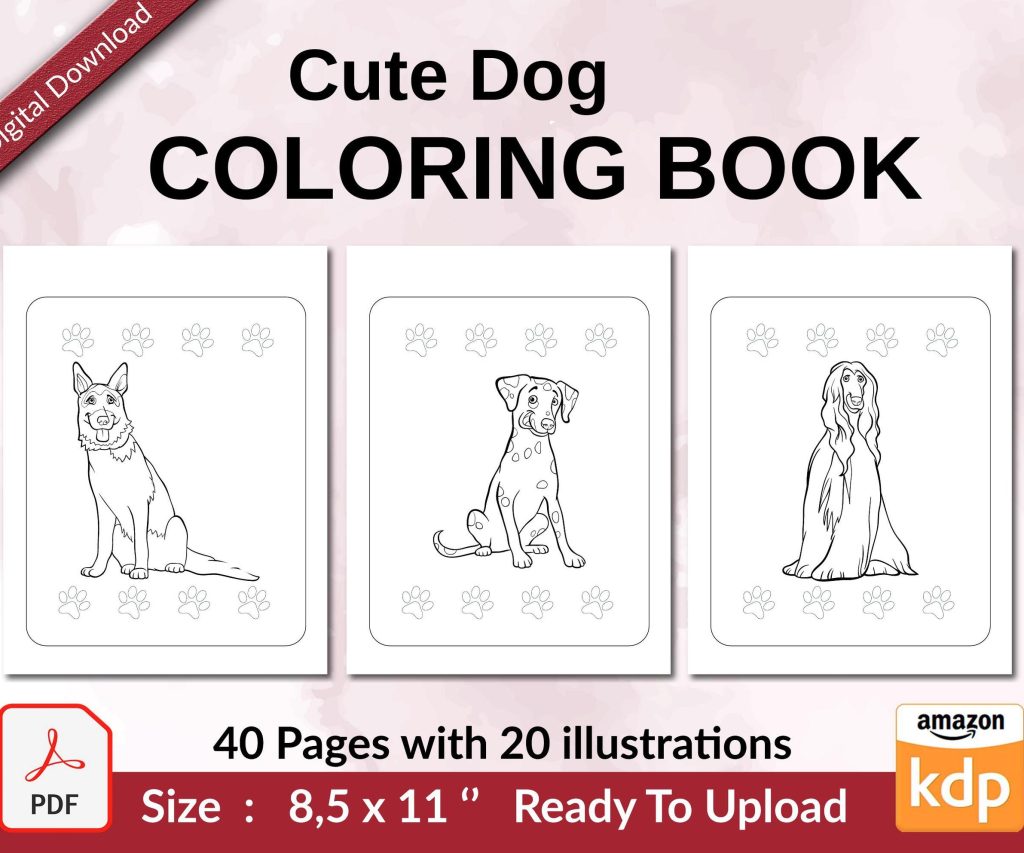
 Cute Dogs Coloring Book for Kids | Activity Book | KDP Ready-To-Upload
 Subtotal: $0.00
Amazon KDP guide, KDP book publishing
KDP Interior Templates: Complete Design Guide 2026
18
Feb
Feb
okay so I just spent like three hours fixing a client’s interior template mess last week and here’s what you actually need to know
So KDP interior templates… look, most people overthink this to death. You don’t need fancy software right away. I started with Word docs back in 2018 and made like $8k my first year just using basic templates. But yeah, there are better ways now.
The main thing is understanding trim sizes first because that dictates everything else. Amazon’s got standard sizes – 6×9 is the sweet spot for most books, 8.5×11 for workbooks and planners, 5×8 for little journals. I use 6×9 for probably 60% of my books because readers expect it and it just… works.
Setting Up Your Margins (this is where everyone screws up)
Your margins gotta be different on the inside vs outside because of the binding. Amazon calls it “gutter” but whatever. For a 6×9 book under 150 pages, I do:
- Inside margin (gutter): 0.5 inches minimum, I usually go 0.6 to be safe
- Outside margin: 0.4 inches
- Top: 0.5 inches
- Bottom: 0.5 inches
If your book is thicker than 150 pages, add more to that inside margin. Like 0.7 or 0.8 inches. Amazon has this calculator tool but honestly I just go by feel now after doing 200+ books.
Oh and another thing – people forget about bleed. If you’re doing a book with images or background colors that go to the edge, you need 0.125 inch bleed on all sides. So your document size becomes 6.125 x 9.125 instead of 6×9. I learned this the hard way when my first coloring book came back with white strips on the edges.
Software Options That Actually Work
Gonna be real with you – Microsoft Word works fine for text-heavy books. I still use it sometimes when I’m lazy. But the formatting can get wonky when you convert to PDF.
Canva Pro is what I switched to around 2021 and it changed everything. They have custom dimensions, you can set up templates, and the PDF export is clean. I literally created a master template for each trim size I use regularly, then just duplicate it for new projects. Saves so much time.
For low-content books (journals, planners, notebooks), Canva is perfect. For novels or text-heavy stuff, I actually prefer Atticus now. It’s like $150 one-time payment but the formatting is chef’s kiss. My cat walked across my keyboard while I was setting up an Atticus template last month and somehow it still looked better than my Word docs.
this is gonna sound weird but I also use Google Docs sometimes for collaborative projects with ghostwriters, then import into Canva for final formatting. Not ideal but it works.
Font Choices That Don’t Make Readers Hate You
Okay so funny story – I used to use all these fancy fonts thinking it looked “professional.” Sales were meh. Switched to basic fonts and conversions went up. Readers want readability, not art.
For body text:
- Garamond (classic, easy on eyes)
- Baskerville (I use this for 90% of my books now)
- Caslon (little old-fashioned but good)
- Georgia (if you want something modern)
Size matters too. 11pt minimum for body text in a 6×9 book. I usually go 11.5pt because I’m over 40 and my eyes are trash. For 8.5×11 workbooks, bump it to 12pt.
Line spacing should be 1.2 to 1.5. Single spacing looks cramped, double spacing wastes pages and makes your book cost more to print. I stick with 1.3 for most projects.
wait I forgot to mention – Page Numbers and Headers
Don’t put page numbers on your title page or copyright page. Start numbering on your first actual content page. In Word this means section breaks which are annoying. In Canva you just… don’t add page numbers to those pages.
Headers are optional but they look professional. I do book title on left pages (even numbers), chapter title on right pages (odd numbers). Or sometimes author name on left, book title on right. Depends on the vibe.
Font size for headers and page numbers should be like 9pt or 10pt. Small enough to not distract but readable.
Creating Your Actual Template File
Here’s my process and I’ve done this probably 300 times by now so it’s pretty dialed in:
- Open Canva or whatever software you’re using
- Set custom dimensions (remember the trim size plus bleed if needed)
- Set up margins using guides or ruler tool
- Create your master pages – one for chapter starts, one for regular pages
- Add page numbers and headers to the master
- Set your body text font and size
- Save this as your template
For low-content books it’s even easier because you’re just creating repeating pages. Like for a lined journal, I make one lined page design, duplicate it 100 times, add page numbers if needed, done. Takes maybe 20 minutes.
My client canceled a strategy call last Tuesday so I spent a few hours comparing different template styles and honestly the simpler ones always perform better. Readers don’t care about your gradient backgrounds or fancy borders.
Formatting Different Book Types
Novels and non-fiction books need chapter headings. I usually do these in a slightly larger font (16pt-20pt) with some space above and below. Don’t go crazy with decorative fonts here either. Maybe bold or small caps at most.
For workbooks and activity books, you want more white space. Don’t cram everything together. I leave at least half an inch between different sections or activities. Makes it feel less overwhelming.
Planners need consistency. If your Monday page looks one way, don’t randomly change the format on Thursday. I create one week spread, make sure it works, then replicate it for all 52 weeks. Sounds tedious but it’s just copying and pasting.
The PDF Export Settings Nobody Talks About
This trips people up all the time. When you export your interior to PDF:
- Use PDF/X-1a:2001 if your software has it (best for printing)
- Embed all fonts (usually automatic but check)
- Don’t compress images too much or they’ll look pixelated
- For black and white interiors, convert everything to grayscale before export
- For color, use CMYK not RGB
Amazon’s gonna reject your file if the PDF isn’t right. I’ve had files rejected for the dumbest things like margins being 0.49 inches instead of 0.5. Their system is picky.
oh and another thing – always download the proof copy and check it before approving. I caught a weird page number issue once that didn’t show up in the PDF preview but was obvious in print. Would’ve been embarrassing.
Time-Saving Template Hacks I Wish Someone Told Me Earlier
Create master templates for your most-used sizes and save them in a dedicated folder. Label them clearly like “6×9-novel-template-MASTER” so you don’t accidentally edit the original.
If you’re doing a series of books, keep the interior formatting identical. Readers notice consistency and it builds trust. Plus you just swap out the content and you’re done in like an hour.
For low-content books, I have a spreadsheet where I track which interior designs sold well. Then I just reuse those layouts with minor tweaks for new niches. No need to reinvent the wheel every time.
Batch your template creation. I’ll spend one afternoon making like 5 different templates, then I’ve got them ready whenever inspiration hits or a profitable niche pops up.
Common Mistakes That’ll Cost You Sales
Too much dead space – like huge margins or excessive spacing between lines. It makes your book look amateur and costs more to print which hurts your royalties.
Inconsistent formatting – switching fonts randomly or having different margin sizes on different pages. Looks sloppy.
Ignoring Amazon’s technical requirements – they’re pretty specific about file formats, color profiles, margins, bleed. Read their guidelines at least once. I know it’s boring but it’ll save you rejections.
Using low-res images in workbooks or coloring books. Needs to be at least 300 DPI. I aim for 600 DPI on coloring books to make sure the lines are crisp.
Not testing your template with actual content before creating 10 books with it. Make one book, order a proof, see how it actually looks and feels. Then roll it out.
I was watching this documentary about fonts last week (yeah I’m that nerdy now) and they talked about how serif fonts are easier to read in long blocks of text. That’s why almost every novel uses them. Sans-serif fonts are fine for headers or short text but they’re tiring for a whole book.
The interior template is honestly more important than people think. A mediocre cover with a solid interior will outperform a great cover with a messy interior every time. Readers look inside before buying, especially with the “Look Inside” feature on Amazon.
Just start with one good template, test it, tweak it based on results, then expand from there. You don’t need 50 different templates right away. I probably use the same 5-6 templates for most of my books and just adjust as needed.
DISCOVER OUR FREE BEST SELLING PRODUCTS
Editable Canva Lined Journal: Express Your Thoughts – KDP Template
Lined Pages Journal 120 pages Ready to Upload PDF Commercial Use KDP Template 6×9 8.5×11 5×8 for Notebooks, Diaries, Low Content
Lined Pages Journal 120 pages Ready to Upload PDF Commercial Use KDP Template 6×9 8.5×11 5×8 for Notebooks, Diaries, Low Content
Cute Dogs Coloring Book for Kids | Activity Book | KDP Ready-To-Upload
Daily Planner Diary : Diary Planners for Everyday Productivity, 120 pages, 6×9 Size | Amazon KDP Interior
Wolf Coloring KDP interior For Adults, Used as Low Content Book, PDF Template Ready To Upload COMMERCIAL Use 8.5×11"
Coloring Animals Head Book for Kids, Perfect for ages 2-4, 4-8 | 8.5×11 PDF
Printable Blank Comic Book Pages PDF : Create Your Own Comics – 3 Available Sizes
Notes KDP interior Ready To Upload, Sizes 8.5×11 6×9 5×8 inch PDF FILE Used as Amazon KDP Paperback Low Content Book, journal, Notebook, Planner, COMMERCIAL Use
Black Lined Journal: 120 Pages of Black Lined Paper Perfect for Journaling, KDP Notebook Template – 6×9
Student Planner Journal 120 pages Ready to Upload PDF Commercial Use KDP Template 6×9" 8.5×11" for Low Content book
Recipe Journal Template – Editable Recipe Book Template, 120 Pages – Amazon KDP Interior