 Editable Canva Lined Journal: Express Your Thoughts - KDP Template
 Subtotal: $0.00
Amazon KDP guide, KDP book publishing
KDP Journal Template Design: Profitable Interior Layouts
22
Mar
Mar
Okay so the biggest thing I learned about journal interiors is that simple actually sells better than complex, which sounds backwards but let me explain…
Last month I was testing like 15 different layouts and the ones that did best were honestly the most basic. Wide ruled lines, dot grid, nothing fancy. But here’s where people mess up – they make them TOO simple and forget about margins and bleed, which gets your book rejected or looks terrible when printed.
The Margin Thing Everyone Gets Wrong
So KDP has this gutter margin requirement that changes based on page count. For journals under 150 pages you need 0.375 inches, but most people just slap 0.5 inches on all sides and call it done. That works but you’re losing usable space that customers actually want. I do 0.375 inner margin, then 0.5 on top and bottom, and 0.375 on the outer edge. This gives you maximum writing space without getting flagged during review.
The bleed is another thing – you gotta add 0.125 inches to ALL sides if you’re doing full bleed designs. But honestly? Skip full bleed for journals unless you’re doing something decorative. It’s not worth the hassle and most lined journals don’t need it.
Line Spacing That Actually Works
Here’s what I’ve tested that sells:
- Wide ruled: 0.35 to 0.4 inches between lines (this is the sweet spot for most people)
- College ruled: 0.28 to 0.32 inches (honestly doesn’t sell as well for journals, better for notebooks)
- Dot grid: 0.2 inch spacing between dots works perfectly
- Graph/grid: 0.25 inch squares are standard
I was watching this documentary about fonts last week while setting up templates and realized… most people can’t tell the difference between line weights as long as they’re between 0.5pt and 1pt. I use 0.75pt gray lines (not black) at about 60-70% opacity. Black lines look harsh and cheap honestly.
The Software Situation
You can use whatever but here’s my actual workflow. I design in Affinity Publisher because it’s a one-time payment and handles master pages better than anything else. But loads of people use Canva now which is fine for simple stuff – just make sure you’re setting up custom dimensions correctly.
For a 6×9 journal (most common size), your document needs to be:
- 6.125 x 9.125 inches if you’re doing bleed
- Exactly 6 x 9 if no bleed
Wait I forgot to mention – always design in CMYK color mode, not RGB. I know it looks duller on screen but that’s how it’ll print. I learned this the hard way when my first batch of journals came back with lines that were supposed to be light gray but printed almost black because of RGB conversion issues.
Interior Layouts That Actually Make Money
The journals that consistently make me $500+ per month have these things in common:
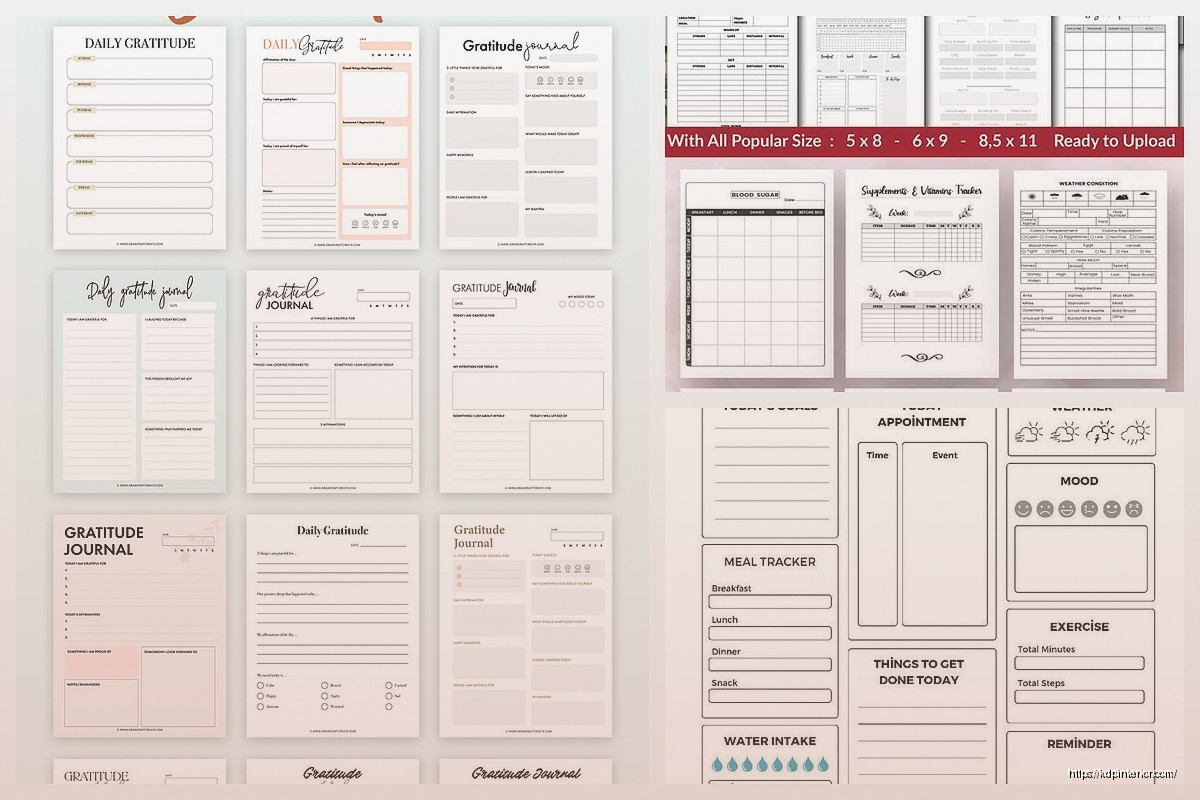
Lined pages with prompts at the top – like a small text area that says “Today I’m grateful for…” or “Date: ___” or whatever fits your niche. This adds perceived value without much extra work. I just create one master page with the prompt area, one without, and alternate them or use the prompted version every 5 pages or something.
Consistent header/footer space – even if you leave it blank, having that defined space makes the pages look more professional. I usually do a 0.4 inch header and 0.3 inch footer.
Oh and another thing – page numbers. Some people say don’t bother for journals but I’ve found that adding small page numbers in the bottom corner actually increases reviews mentioning “quality” and “professional.” Takes like 5 extra minutes to set up with master pages.
Niche-Specific Stuff That Works
So gratitude journals sell year-round but especially Q4. For these I do:
- Date field at top of each page
- Three sections with prompts like “3 things I’m grateful for today”
- Wide lined spaces for writing
- Maybe a small quote every 10 pages
Fitness journals need tables and that’s where it gets tricky. You can’t just wing it – the table lines need to be exactly aligned. I create mine in Excel first to get the measurements right, then recreate in my design software. Tables should have:
- Bold outer borders (1.5pt)
- Lighter inner lines (0.5pt)
- Enough space for people to actually write – at least 0.3 inches row height
This is gonna sound weird but my cat knocked over my coffee while I was working on a meal planning journal template last week and I had to redo like 20 pages. Anyway, meal planners need a weekly spread usually. I do Sunday through Saturday across the top, then rows for Breakfast/Lunch/Dinner/Snacks. Add a grocery list section on the opposite page.
The Dot Grid Secret
Dot grid journals are having a moment and they’re SO easy to make profitable. Here’s my exact setup:
Create dots that are 1pt circles, light gray (I use #CCCCCC), spaced 0.2 inches apart both horizontally and vertically. That’s it. The trick is making sure your first dot starts exactly at your margin line so everything aligns properly.
You can charge more for dot grid because people perceive them as premium. I sell the same page count for $2-3 more than lined journals.
Master Pages Save Your Life
If you’re not using master pages you’re wasting so much time. Set up like 3-5 master page templates:
- Standard lined page
- Lined page with header prompt
- Blank page (for section dividers)
- Special layout pages if your niche needs them
- Title page/introduction page
Then you just apply these masters to the pages you need. I can create a 200-page journal in under 2 hours now because of this system.
What Actually Matters for Sales
Look, I’ve designed journals with fancy borders, decorative elements, multiple colors… they don’t necessarily sell better than clean simple layouts. What DOES matter:
Consistency – every page should feel like it belongs in the same book. Same margins, same line weight, same spacing throughout.
Enough contrast – lines need to be visible but not overwhelming. Test print before you upload, seriously. What looks good on screen might be too light or too dark printed.
Actual usability – leave enough space for people to write. I see so many journals with prompts that take up half the page. Give them room.
The Page Count Sweet Spot
For KDP, 120 pages is the minimum I recommend for journals. It’s thick enough to feel substantial but not so thick that printing costs eat your profit. My best sellers are usually 120-150 pages.
Here’s the math that matters – at 6×9 size with white paper:
- 120 pages costs about $2.50 to print
- 150 pages costs about $2.90 to print
- 200 pages costs about $3.60 to print
You can sell a 120-page journal for $6.99-8.99 pretty easily, which gives you decent royalty. Going to 200 pages means you need to charge $9.99+ to make similar profit, and that’s a harder sell unless your niche supports it.
Technical Stuff You Gotta Get Right
File format: PDF only, and make sure it’s PDF/X-1a:2001 if your software offers it. Regular PDF works but X-1a is specifically for printing.
Resolution: 300 DPI minimum. I work at 300 DPI from the start so I don’t have to upscale anything.
Color: CMYK like I mentioned, but also make sure your blacks are true black (C:0 M:0 Y:0 K:100) not rich black. Rich black can cause registration issues with line work.
Fonts: embed them all. Even if you’re just using them for prompts or headers. KDP will reject your file if fonts aren’t embedded properly.
The Review Process Thing
Sometimes KDP flags journals for being “too simple” or “low content.” I’ve had this happen twice. The workaround is adding more variety – throw in some different page layouts, add section dividers, include a “how to use this journal” page at the beginning. Basically make it look like there was intentional design work, not just copy-paste.
Oh wait, another thing about colors – if you’re doing any colored elements (headers, borders, whatever), keep them light. Dark colors increase printing costs because they use more ink. A light blue or gray barely affects cost compared to full saturation colors.
Testing What Actually Sells
I publish multiple versions of similar journals with different interior layouts to see what converts better. Like I’ll have one with prompts, one without, same cover design. The data is pretty clear – prompted journals sell better for self-help niches (gratitude, mindfulness, etc.) but blank lined journals sell better for general purpose use.
Dot grid sells best to the bullet journal crowd and you can charge premium prices. Graph paper is niche but has loyal customers – usually students and technical people.
The biggest mistake I see is people spending weeks designing complex layouts that nobody wants. Start simple, validate it sells, THEN add complexity if you want. My first profitable journal was literally just lined pages with page numbers. Made $400 the first month with zero advertising.
Rapid Template Creation
Once you have one template that works, you can modify it for different niches in like 30 minutes. Change the prompt text, maybe adjust colors slightly, done. I have a base template for lined journals that I’ve probably used 50+ times with minor modifications.
Same with covers – design the interior first, then create covers that match different niches. The interior can stay basically identical for gratitude journals, prayer journals, daily journals, whatever. Just change the front matter and prompts.
Also gonna mention – always include a title page, copyright page, and maybe a “this journal belongs to” page at the front. It’s like 3 extra pages but makes the whole thing feel more legit. I use a simple design for these, nothing fancy needed.
The copyright page should have your pen name, year, and a note that no part can be reproduced without permission. Basic stuff but it matters for looking professional.
DISCOVER OUR FREE BEST SELLING PRODUCTS
Editable Canva Lined Journal: Express Your Thoughts – KDP Template
Lined Pages Journal 120 pages Ready to Upload PDF Commercial Use KDP Template 6×9 8.5×11 5×8 for Notebooks, Diaries, Low Content
Lined Pages Journal 120 pages Ready to Upload PDF Commercial Use KDP Template 6×9 8.5×11 5×8 for Notebooks, Diaries, Low Content
Cute Dogs Coloring Book for Kids | Activity Book | KDP Ready-To-Upload
Daily Planner Diary : Diary Planners for Everyday Productivity, 120 pages, 6×9 Size | Amazon KDP Interior
Wolf Coloring KDP interior For Adults, Used as Low Content Book, PDF Template Ready To Upload COMMERCIAL Use 8.5×11"
Coloring Animals Head Book for Kids, Perfect for ages 2-4, 4-8 | 8.5×11 PDF
Printable Blank Comic Book Pages PDF : Create Your Own Comics – 3 Available Sizes
Notes KDP interior Ready To Upload, Sizes 8.5×11 6×9 5×8 inch PDF FILE Used as Amazon KDP Paperback Low Content Book, journal, Notebook, Planner, COMMERCIAL Use
Black Lined Journal: 120 Pages of Black Lined Paper Perfect for Journaling, KDP Notebook Template – 6×9
Student Planner Journal 120 pages Ready to Upload PDF Commercial Use KDP Template 6×9" 8.5×11" for Low Content book
Recipe Journal Template – Editable Recipe Book Template, 120 Pages – Amazon KDP Interior