-
×
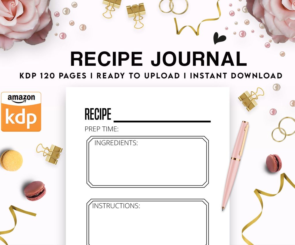 Recipe Journal Template - Editable Recipe Book Template, 120 Pages - Amazon KDP Interior
1 × $0.00
Recipe Journal Template - Editable Recipe Book Template, 120 Pages - Amazon KDP Interior
1 × $0.00
Subtotal: $0.00
Recipe Journal Template - Editable Recipe Book Template, 120 Pages - Amazon KDP Interior
1 × $0.00 Subtotal: $0.00
Okay so the manuscript templates thing is way less complicated than people make it out to be, but there’s like three different directions you can go depending on what type of book you’re doing.
First thing – Word vs Pages. I use both honestly, depends on which computer I’m on. Word is gonna be more reliable for KDP because that’s what most people use and test with, but Pages works fine if you know the export settings. I’ll get to that in a sec.
So KDP has like 40 trim sizes or whatever but realistically you’re using maybe five of them. For paperbacks I stick with 6×9 for most books, 5×8 if it’s a smaller novel or journal thing, and 8.5×11 for workbooks or planners. The 6×9 is your bread and butter though.
In Word, you gotta set this up right from the start or you’ll be reformatting everything later which is annoying as hell. Go to Layout > Size > More Paper Sizes. Then punch in your actual trim size. For 6×9 that’s obviously 6 inches width and 9 inches height. Make sure you’re in inches not centimeters because I’ve done that before and wondered why everything looked weird.
The margins thing trips up like 90% of new publishers. KDP needs bleed if you’re doing anything that goes to the edge of the page, but for regular books with just text you don’t need bleed. Your margins should be:
The gutter is the inside margin where the binding is. If your book is under 150 pages, 0.375 inches works. 151-300 pages, go with 0.5 inches. Over 300 pages you need like 0.625 or even 0.75 inches because thick books need more room in the spine area or text gets lost in the binding.
In Word: Layout > Margins > Custom Margins. Set your top, bottom, outside. Then for the inside, there’s a field called “Gutter” – that’s your inside margin. Also make sure “Multiple pages” is set to “Mirror margins” because left and right pages are mirrors of each other.
Wait I forgot to mention – download the KDP templates first. They have them right on the KDP site under like resources or tools or something. But honestly their templates are super basic and kinda ugly, so I made my own years ago and just modify it for each project.
Here’s my actual setup for a 6×9 book in Word:
Page size: 6×9 inches
Gutter: 0.5 inches
Top/Bottom: 0.75 inches
Outside: 0.75 inches
Mirror margins: ON
Font: Garamond 11pt for body text (sometimes I use Palatino or Caslon, depends on the vibe). Chapter headings are usually 18-22pt, same font or maybe something like Cinzel if I’m feeling fancy.
Line spacing: 1.15 or 1.3. Never single space, looks cramped. Never double space, wastes pages and looks amateurish.
Paragraph spacing: 0pt before, 6pt after each paragraph. OR first line indent of 0.3 inches with no spacing. Pick one style, don’t mix them.
This is where you put page numbers and maybe book title or chapter title. In Word, double-click the top or bottom of any page to open header/footer editing.
Check the box for “Different odd and even pages” because you want page numbers on the outside edges. Odd pages (right side) get numbers on the right. Even pages (left side) get numbers on the left.
Also check “Different first page” so your title page doesn’t have a page number on it.
My cat just knocked over my coffee but it’s fine, the cup was almost empty anyway.
For the actual content in headers – I usually put the book title on even pages (left aligned) and chapter title on odd pages (right aligned). Page numbers go in the footer, outside aligned. Some people do numbers in the header, that’s fine too.
Your front matter is everything before chapter one. The order I use:
Use section breaks to control this. In Word: Layout > Breaks > Next Page. This lets you have different headers/footers and start new sections on odd or even pages.
Oh and another thing – your title page should have the title obviously, subtitle if there is one, and author name. Center it vertically and horizontally. Don’t put a million graphics and weird fonts, keep it clean.
Copyright page is just the basic info: Copyright © 2025 Your Name, All rights reserved, ISBN if you have one, publisher name if you have one. Left aligned, small font like 9 or 10pt.
Okay so if you’re using Pages it’s pretty similar but the menus are in different spots.
Document setup is in the right sidebar. Click Document at the top of the sidebar. Set your page size – you might have to create a custom size because Pages doesn’t have all the KDP sizes built in. For 6×9 just put in 6in x 9in in the width and height fields.
Margins are in the same Document section. Pages calls them just margins not gutter, so your left margin is your gutter/inside margin. Set different left and right margins to account for the binding.
The thing that’s annoying about Pages is the headers and footers work differently. You still double-click to edit them, but the “different odd/even” option is under the Format sidebar > Section > Headers & Footers. Check the boxes for different first page and facing pages.
This is gonna sound weird but don’t export as PDF directly from Pages if you can avoid it. Export as Word (.docx) first, then open in Word or use an online converter to make the PDF. Pages PDFs sometimes have issues with KDP’s upload system – fonts get weird, spacing shifts, just random problems.
If you HAVE to export as PDF from Pages: File > Export To > PDF. Make sure “Best” quality is selected. Don’t check the box for “Require password” obviously.
Novels are the easiest. Just body text, chapter breaks, maybe a scene break symbol (I use *** or a decorative element). Start each chapter on a new page with a section break.
For low-content books like journals or planners, you’re usually doing 8.5×11 or maybe 8×10. Way more design work, less about the template and more about what’s on each page. I use Canva for most low-content interiors now and just export as PDF, don’t even mess with Word templates for those.
Workbooks and activity books – same as low-content mostly. If there’s significant text sections, then yeah use a Word template for those pages and combine PDFs later.
Wait I forgot to mention bleed earlier. If you have images or backgrounds that go to the edge of the page, you need a 0.125 inch bleed. That means your page size in Word needs to be bigger. For a 6×9 book with bleed, set your document to 6.25 x 9.25 inches. Your content still lives in the 6×9 area but images can extend into that extra 0.125 inch border.
KDP has a preview tool when you upload that shows you if stuff is too close to the edges. Use it, it catches a lot of mistakes.
Use Styles in Word, seriously. Don’t just manually format every heading. Set up your styles once (Heading 1, Heading 2, Body Text) and apply them throughout. Makes editing so much faster.
Right-click any style in the Styles pane and choose Modify. Set your font, size, spacing, all of it. Then when you apply that style to text, it auto-formats correctly.
I learned this like three years in and it changed everything. Before that I was manually formatting and then wondering why page 47 looked different from page 12.
That last one is important. Stick with standard fonts that are widely supported. Garamond, Georgia, Palatino, Times New Roman (boring but reliable), Baskerville, Caslon. Don’t use some weird downloaded font unless you’re absolutely sure it embeds correctly.
When you’re done formatting in Word, export as PDF. File > Save As > PDF. In the options, make sure fonts are embedded. There’s usually a checkbox or setting for this.
Adobe PDF settings: press the Options button and make sure “ISO 19005-1 compliant (PDF/A)” is NOT checked. KDP doesn’t like PDF/A format even though it’s supposed to be an archival standard.
For Pages, like I said, export to Word first then PDF. Or use Pages’ PDF export with Best quality selected.
Before you publish anything, order a proof copy. It costs like five bucks plus shipping. I cannot tell you how many times something looked perfect on screen but weird in print. The margins feel different, the font size might seem too small, a page break is in a weird spot.
I was watching that show Severance last week while waiting for a proof to arrive and I swear the wait is longer than the actual show episodes.
Also test your PDF in different viewers. Open it in Adobe Reader, Preview on Mac, Chrome’s built-in PDF viewer. Sometimes formatting breaks in specific viewers and you wanna catch that.
Once you’ve got a template you like, save it as an actual template file. In Word: File > Save As > Word Template (.dotx). Name it something obvious like “KDP 6×9 Novel Template” or whatever.
Then for your next book, start from that template. File > New > Personal or Custom, and your template should be there. Don’t have to set up margins and styles every single time.
I have like six templates now. 6×9 novel, 8.5×11 workbook, 5×8 small book, etc. Saves so much time.
One more thing – KDP’s dimensions are slightly different for hardcover if you ever do those. The case wrap adds like an eighth inch on each side, so a 6×9 hardcover is actually a bit bigger. Check their specs for hardcover before you format.
Okay I think that covers most of it. The main thing is just get your margins right, use mirror margins, and test with a proof copy before you publish for real.


DISCOVER OUR FREE BEST SELLING PRODUCTS
Editable Canva Lined Journal: Express Your Thoughts – KDP Template
Lined Pages Journal 120 pages Ready to Upload PDF Commercial Use KDP Template 6×9 8.5×11 5×8 for Notebooks, Diaries, Low Content
Lined Pages Journal 120 pages Ready to Upload PDF Commercial Use KDP Template 6×9 8.5×11 5×8 for Notebooks, Diaries, Low Content
Cute Dogs Coloring Book for Kids | Activity Book | KDP Ready-To-Upload
Daily Planner Diary : Diary Planners for Everyday Productivity, 120 pages, 6×9 Size | Amazon KDP Interior
Wolf Coloring KDP interior For Adults, Used as Low Content Book, PDF Template Ready To Upload COMMERCIAL Use 8.5×11"
Coloring Animals Head Book for Kids, Perfect for ages 2-4, 4-8 | 8.5×11 PDF
Printable Blank Comic Book Pages PDF : Create Your Own Comics – 3 Available Sizes
Notes KDP interior Ready To Upload, Sizes 8.5×11 6×9 5×8 inch PDF FILE Used as Amazon KDP Paperback Low Content Book, journal, Notebook, Planner, COMMERCIAL Use
Black Lined Journal: 120 Pages of Black Lined Paper Perfect for Journaling, KDP Notebook Template – 6×9
Student Planner Journal 120 pages Ready to Upload PDF Commercial Use KDP Template 6×9" 8.5×11" for Low Content book
Recipe Journal Template – Editable Recipe Book Template, 120 Pages – Amazon KDP Interior