-
×
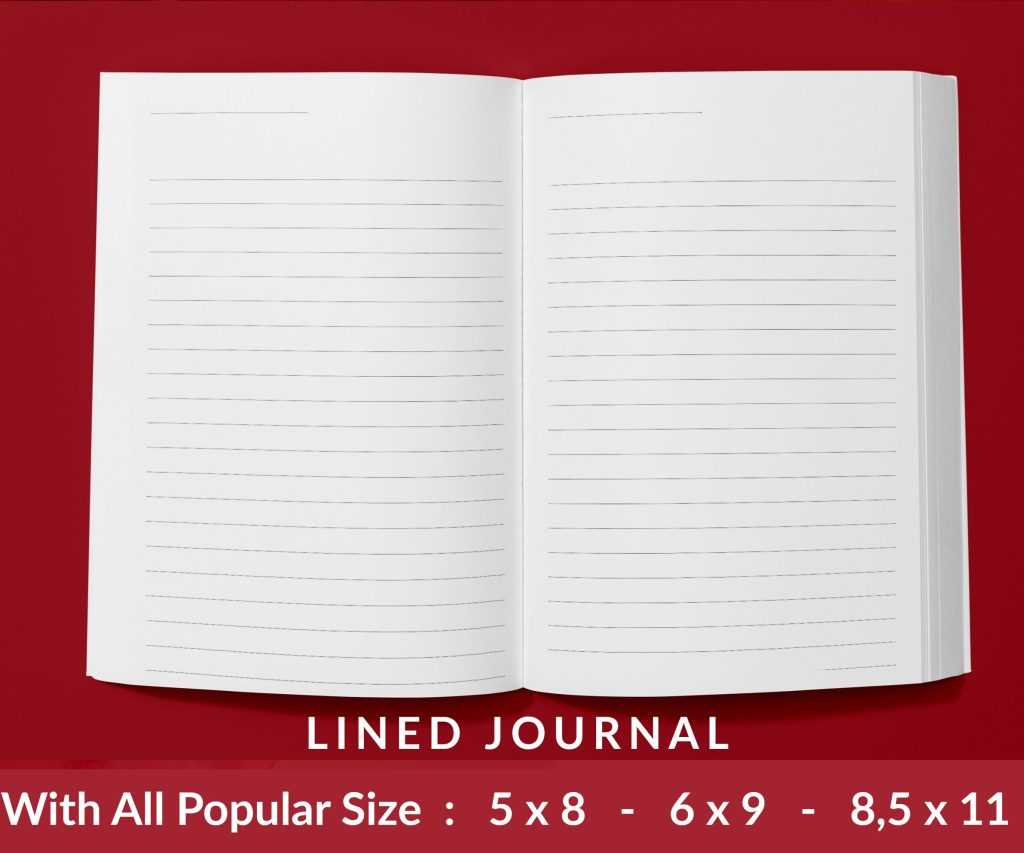 Lined Pages Journal 120 pages Ready to Upload PDF Commercial Use KDP Template 6x9 8.5x11 5x8 for Notebooks, Diaries, Low Content
1 × $0.00
Lined Pages Journal 120 pages Ready to Upload PDF Commercial Use KDP Template 6x9 8.5x11 5x8 for Notebooks, Diaries, Low Content
1 × $0.00
Subtotal: $0.00
Okay so the KDP paperback cover template thing trips up literally everyone at first and I spent like three hours one night fixing a client’s rejected cover because they didn’t understand the bleed requirements. Let me just break this down the way I wish someone had explained it to me back in 2017.
First thing you gotta know is that KDP needs your cover as one single PDF file. Not a front and back separately – one continuous wrap-around image that includes the spine. The dimensions depend on your page count and paper type and this is where people mess up immediately.
So KDP has this cover calculator buried in their help section and honestly just Google “KDP cover calculator” because their site navigation is terrible. You plug in your trim size (that’s the actual book size like 6×9 inches), your page count, and whether you’re using white or cream paper. The paper type matters because cream is slightly thicker so it changes your spine width.
The calculator spits out three numbers – total width, height, and spine width. Write these down or screenshot them because you’ll need them constantly. For a 200-page book at 6×9 trim with white paper you’re looking at roughly 12.6 inches wide by 9.25 inches tall but don’t just use my numbers, always calculate your specific book.
Here’s where it gets annoying. KDP requires 0.125 inches of bleed on all sides except the spine edges. Bleed is basically extra image area that extends past where the final cut happens. When they trim the book at the printer there’s slight variations so the bleed ensures your background colors or images go all the way to the edge without white gaps.
The spine though – you can’t have bleed crossing over the spine fold lines. If your design bleeds onto the spine area from the front or back cover Amazon will reject it immediately. I learned this the hard way when I had this gradient background and didn’t understand why they kept bouncing it back.
I use Photoshop for most covers but you can do this in Canva or GIMP or whatever. The key is getting your canvas size right from the start. Take that total width and height from the calculator and create your document at 300 DPI minimum. Anything less than 300 and it’ll look blurry when printed.
So let’s say your dimensions are 12.6 x 9.25 inches. In Photoshop you’d create a new document at exactly those dimensions, 300 DPI, RGB color mode (you can use CMYK but RGB is fine and easier to work with). Make sure your units are set to inches not pixels because that confuses people sometimes.
Oh and another thing – KDP provides these template files you can download that have guides showing the safe zones and spine placement. I always grab those even though I know the specs now because having visual guides prevents stupid mistakes at 2am when you’re rushing to upload.
Your cover has three critical zones marked on the KDP template:
The trim line is where they actually cut the book. Everything outside this gets trimmed off.
The bleed line is 0.125 inches beyond the trim line on the top, bottom, and outer edges. Your background needs to extend to this line.
The safe zone is 0.125 inches INSIDE the trim line. All your important text and images need to stay within this area or they risk getting cut off. I’ve seen people put their title too close to the edge and lose half a letter when it got trimmed.
The spine is its own beast. You’ve got spine edge lines that show exactly where the front cover ends and spine begins, and where spine ends and back cover begins. Nothing crosses these lines. The spine width varies with page count so a 100-page book has a narrower spine than a 300-page book obviously.
Okay so once you’ve got your canvas set up you need to think about placement. I usually start by placing guides at all the important lines. In Photoshop I drag guides from the rulers to mark the trim lines, safe zones, and spine edges. This way I can see exactly where everything needs to stay while I’m designing.
For the front cover your title and author name need to be in that safe zone. I generally keep them at least 0.25 inches from the edge to be extra safe because print variations happen. Same with any important imagery – if you’ve got a person’s face or a key visual element keep it well within the safe zone.
The spine is tricky because on thin books you barely have room for text. Like if your book is under 100 pages the spine might only be 0.2 inches wide and you’re trying to fit a title in there. I usually go vertical text on the spine, oriented so when the book is sitting on a shelf with the spine facing out people can read it. The text needs to be at least 0.0625 inches away from the spine edges.
Wait I forgot to mention – if your spine is less than 0.25 inches wide Amazon recommends not putting any text on it at all. The printing process isn’t precise enough and text might end up on the front or back cover instead of the spine. For really thin books just leave the spine blank or use a solid color.
The back cover needs your book description or blurb, usually a barcode area, and maybe author bio or testimonials. Amazon automatically adds their barcode so you need to leave space for it. The barcode goes in the lower right corner of the back cover and you should leave a white or light-colored rectangle about 2 x 1.2 inches for it.
Keep your back cover text in the safe zone too. I see people put text right up to the edge thinking it looks sleek but then it gets cut off. Also make sure there’s good contrast – light text on dark background or dark text on light background. Seems obvious but I’ve gotten files from authors with like gray text on slightly darker gray and it’s unreadable.
KDP wants a PDF file specifically. Not a JPG, not a PNG, not a layered PSD. A flattened PDF. When you export from Photoshop or whatever program you’re using make sure you’re not compressing the file too much. Use high quality settings.
For colors this is gonna sound weird but even though we’re printing physical books you should use RGB color mode not CMYK. KDP’s system converts it to CMYK during processing and if you submit CMYK files sometimes the colors shift in unexpected ways. I spent two months figuring this out because a cover I designed in CMYK came out with this weird greenish tint.
Black text should be solid black – RGB 0,0,0. Not dark gray, not rich black with other colors mixed in. Just straight black. This ensures it prints crisp and dark. For colored elements use bold saturated colors when possible because print colors are always slightly less vibrant than what you see on screen.
Amazon will reject your cover for a bunch of reasons and their feedback emails are usually vague. The most common issues I see:
Bleed doesn’t extend to the bleed line. Your background color or image stops at the trim line instead of going all the way out. This leaves white edges after trimming.
Content too close to trim line. Text or images in the danger zone outside the safe area. Even if it’s technically inside the trim line Amazon sometimes rejects it if it’s too close.
Design crosses spine fold lines. This is an automatic rejection. Your front cover design can’t extend onto the spine and vice versa.
Resolution too low. If any part of your cover is under 300 DPI it’ll get rejected for quality issues. This happens a lot when people resize images incorrectly or use low-res photos.
Wrong dimensions. Using dimensions from an old project or miscalculating the spine width. Always recalculate for each specific book.
Here’s what I do before uploading any cover – I order a proof copy. Yeah it costs like five bucks plus shipping but it’s saved me from so many problems. What looks perfect on screen sometimes has issues in print. Colors might be off, text might be too small to read comfortably, the spine alignment might be slightly off.
When you get the proof check the spine first. Does the text sit centered on the spine or is it shifted toward the front or back? Check all the edges – is anything cut off that shouldn’t be? Look at the color accuracy especially if you’ve got branded colors that need to match specific shades.
I was watching this documentary about printing presses the other night and it reminded me how much variation exists in physical printing. Every printer has slight differences and even the same printer on different days can produce slightly different results. This is why that safe zone buffer is so important.
KDP provides basic templates which are helpful for understanding the layout but honestly they’re pretty ugly if you just use them as-is. I download them for the guides then design my own cover on top. There are also paid templates from places like Creative Fabrica or Book Bolt where you can plug in your dimensions and they adjust automatically.
If you’re not a designer those template options are probably your best bet. Just make sure whatever template you use you’re adjusting it to your exact specifications from the KDP calculator. Don’t assume the template dimensions match your book.
The spine text orientation matters more than you’d think. Standard practice in most countries is vertical text reading from top to bottom when the book is standing upright. Some genres have different conventions though. Check books in your genre to see what’s normal.
Font size on the spine depends on spine width but I generally don’t go smaller than 16pt even on narrow spines. Smaller than that and it becomes hard to read from a distance. Use a clean font without thin serifs or decorative elements that might not print clearly at small sizes.
This doesn’t affect your template specs but it affects how your cover looks. Matte finish is popular right now especially for literary fiction and non-fiction. Glossy makes colors pop more and is common for thrillers or romance. You choose this in KDP during the upload process not in your file design.
Just know that dark covers with lots of black show fingerprints really badly on glossy finish. Matte hides that better. Also glossy can have glare that makes text harder to read at certain angles. I usually go matte unless the genre really calls for glossy.
Before you upload run through this checklist:
– File is a PDF at 300 DPI minimum
– Dimensions exactly match what KDP calculator gave you
– Bleed extends to bleed line on all outer edges
– All important content inside safe zone
– Nothing crosses spine fold lines
– Barcode area clear on back cover
– Text is readable and properly sized
– Colors are RGB mode
– File size under 40MB
That file size thing rarely comes up but if you’ve got a lot of complex images it can happen. Just reduce the quality slightly when exporting the PDF until you get under the limit.
Honestly once you do this a few times it becomes second nature but that first cover always takes forever because you’re triple-checking everything. I still use the templates and guides every time though because it’s so easy to make a small mistake that results in rejection and delays your launch by days.
DISCOVER OUR FREE BEST SELLING PRODUCTS
Editable Canva Lined Journal: Express Your Thoughts – KDP Template
Lined Pages Journal 120 pages Ready to Upload PDF Commercial Use KDP Template 6×9 8.5×11 5×8 for Notebooks, Diaries, Low Content
Lined Pages Journal 120 pages Ready to Upload PDF Commercial Use KDP Template 6×9 8.5×11 5×8 for Notebooks, Diaries, Low Content
Cute Dogs Coloring Book for Kids | Activity Book | KDP Ready-To-Upload
Daily Planner Diary : Diary Planners for Everyday Productivity, 120 pages, 6×9 Size | Amazon KDP Interior
Wolf Coloring KDP interior For Adults, Used as Low Content Book, PDF Template Ready To Upload COMMERCIAL Use 8.5×11"
Coloring Animals Head Book for Kids, Perfect for ages 2-4, 4-8 | 8.5×11 PDF
Printable Blank Comic Book Pages PDF : Create Your Own Comics – 3 Available Sizes
Notes KDP interior Ready To Upload, Sizes 8.5×11 6×9 5×8 inch PDF FILE Used as Amazon KDP Paperback Low Content Book, journal, Notebook, Planner, COMMERCIAL Use
Black Lined Journal: 120 Pages of Black Lined Paper Perfect for Journaling, KDP Notebook Template – 6×9
Student Planner Journal 120 pages Ready to Upload PDF Commercial Use KDP Template 6×9" 8.5×11" for Low Content book
Recipe Journal Template – Editable Recipe Book Template, 120 Pages – Amazon KDP Interior