-
×
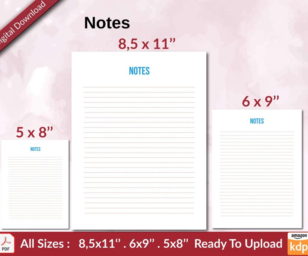 Notes KDP interior Ready To Upload, Sizes 8.5x11 6x9 5x8 inch PDF FILE Used as Amazon KDP Paperback Low Content Book, journal, Notebook, Planner, COMMERCIAL Use
1 × $0.00
Notes KDP interior Ready To Upload, Sizes 8.5x11 6x9 5x8 inch PDF FILE Used as Amazon KDP Paperback Low Content Book, journal, Notebook, Planner, COMMERCIAL Use
1 × $0.00
Subtotal: $0.00
Okay so the KDP paperback template thing is way less complicated than people make it seem but there are like three spots where everyone screws up and I’m gonna walk you through the actual process I use.
First thing you gotta know is that Amazon has these pre-made templates on their site and honestly just use those. Don’t overthink it. Go to the KDP help pages and search for “formatting paperback” and they have downloadable Word templates for pretty much every trim size. I always start there because the margins are already set correctly and that’s where most people mess up their first upload.
The trim size decision comes first though. Most people do 6×9 because it looks like a “real book” and it’s the standard for nonfiction and novels. I’ve published maybe 60% of my books in 6×9. But if you’re doing something with lots of images or it’s more of a workbook style thing, 8.5×11 gives you way more room. The cost per page goes up though so keep that in mind when you’re pricing.
If you’re not using their templates (sometimes I don’t if I’m reformatting something I already have), here’s what you need. Open Word or whatever you’re using. Page size needs to match your trim size exactly. So if you picked 6×9, that’s what your document size is. Not letter size, not A4.
Margins are where it gets specific. You need a bigger inside margin (that’s the side that gets bound) because part of it disappears into the binding. For a 6×9 book under 150 pages, I usually do:
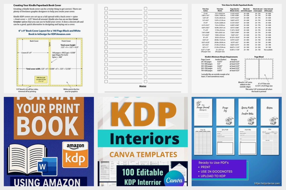
But here’s the thing… if your book is thicker like over 300 pages, you need a bigger inside margin. Amazon actually has a calculator for this. I think it’s like 0.875 inches for 151-400 pages and it goes up from there. I always reference their chart because I don’t have it memorized and I’ve been doing this for years.
Oh and another thing, if you have any images or colored backgrounds that go to the edge of the page, you need bleed. Bleed means your content extends 0.125 inches past where the page will actually be cut. Without it, you get these weird white lines on the edges after printing.
Most low-content books need bleed if you’re doing full-page designs. My planners always have bleed. But a straight text novel? No bleed needed. Amazon will ask you when you upload whether your file has bleed or not, and that changes which template you should download.
I messed this up on a journal once… designed the whole thing without bleed, uploaded it, ordered a proof copy and there were white slivers on every page edge. Had to redo the entire file. My cat knocked over my coffee during that reformatting session and I’m still annoyed about it.
So you’ve got your document set up with the right size and margins. Now the actual content formatting.
For text-based books, keep it simple. I use a readable font like Garamond, Georgia, or Palatino. Size 11 or 12. Amazon recommends staying away from super decorative fonts because they don’t always print well. Line spacing should be 1.15 or 1.5. Single spacing looks cramped in print, trust me.
Chapter headings can be bigger, maybe 16pt or 18pt. I usually bold them and add like 24pt spacing before and 12pt spacing after so there’s visual separation. You can center them or keep them left-aligned, doesn’t really matter but stay consistent.
Page numbers are important and people forget them. Insert page numbers in the header or footer. I usually put them in the footer, centered or on the outside edge (right side for odd pages, left side for even pages). Start numbering after your front matter. Your title page and copyright page shouldn’t have visible page numbers even though they count as pages i and ii.
This trips people up. The order should be:
I usually skip the half-title page honestly. It’s kinda old-fashioned and adds an extra page which adds cost.
If you’re putting images in your book, they need to be at least 300 DPI for print. This is non-negotiable. Screen resolution is 72 DPI and that looks terrible when printed. I learned this the hard way on like my third book.
Insert images as inline with text or wrapped tight to the margins. Don’t let them float weirdly or they’ll shift during PDF conversion. PNG files work better than JPG in my experience, especially if there’s any transparency or text in the image.
For coloring books or planners or anything that’s mostly graphics, I actually design those in Affinity Publisher or even Canva Pro now. Canva’s gotten really good for this stuff and you can set custom dimensions and download as print-ready PDF. Just make sure you turn on the bleed setting if you need it.
Okay so funny story, I used to just do “Save As PDF” from Word and call it done. That works maybe 80% of the time but sometimes the formatting shifts slightly. Fonts can embed weird, margins can move like 1/16 of an inch.
Now I use a PDF printer driver. On Windows, there’s a free one called PDFCreator. On Mac, the built-in print to PDF works fine. The trick is to print your Word doc to PDF instead of saving it. This tends to preserve formatting better.
Before you upload anything, open that PDF and scroll through every single page. Look for:
I caught a massive error once where my headers were literally printed on the trim line because I had them positioned wrong. Would’ve been a disaster if I hadn’t checked.
When you upload your PDF to KDP, their online previewer shows you how it’ll look. This thing is actually pretty accurate. It shows you the bleed area, the trim line, and flags any content that’s too close to the edges.
Pay attention to those yellow or red warnings. Yellow usually means you’re close to the margin but okay. Red means you’re gonna have text cut off. Fix red warnings always.
The 3D preview is kinda gimmicky but it does help you see if your cover spine width matches your page count. Wait I forgot to mention, spine width is calculated automatically based on page count and paper type. Cream paper is thicker than white, so same page count = wider spine with cream. KDP’s cover calculator handles this but it’s good to know.
People use way too many fonts. Stick to like two max. One for body text, maybe a different one for headings. That’s it.
Headers and footers too close to the page edge. Keep everything at least 0.5 inches from any edge, preferably more.
Forgetting about recto/verso pages. In traditional publishing, chapters start on recto (right-hand) pages. You don’t have to follow this but it looks more professional if you do. Just insert a blank page before each chapter if needed.
Not testing with a proof copy. Always order a physical proof before you make your book live. The screen never shows you what print actually looks like. I’ve had colors come out darker, text look smaller than expected, all kinds of stuff. Five bucks for a proof copy saves you from bad reviews about print quality.
KDP gives you white or cream paper for most sizes. White is brighter, better for books with images or graphics. Cream is easier on the eyes for text-heavy books like novels. There’s a slight cost difference but it’s minimal.
Black and white vs color is the big cost thing. Color printing is way more expensive per page. Only use color if you absolutely need it. A lot of my workbooks are black and white with maybe a colored cover, and that keeps the production cost down so I can price competitively.
Premium color is even more expensive but higher quality. I’ve used it for like two books total, both were photography-related where the image quality really mattered.
Your PDF needs to be under 650 MB. I’ve never hit that limit with a text book but some heavy image books can get close. If you do, compress the PDF. There are free online tools for this, or Adobe Acrobat Pro has a reduce file size option.
Sometimes uploads just fail for no reason. KDP’s system can be glitchy. If it happens, try a different browser or wait an hour and try again. I was watching this show about weird medical cases the other night and had to pause it three times because a book upload kept timing out. Eventually it worked.
Before I upload any paperback file:
Then after upload, I check the KDP previewer carefully and order a proof copy. That proof copy is the final check. I flip through it like a regular reader would, looking for anything that seems off.
The whole process from formatted Word doc to uploaded PDF takes me maybe 30 minutes now for a straightforward book. When I started it was like three hours and I still made mistakes. You get faster with practice and you learn which details actually matter versus which ones are just you being perfectionist about stuff no reader will ever notice.
DISCOVER OUR FREE BEST SELLING PRODUCTS
Editable Canva Lined Journal: Express Your Thoughts – KDP Template
Lined Pages Journal 120 pages Ready to Upload PDF Commercial Use KDP Template 6×9 8.5×11 5×8 for Notebooks, Diaries, Low Content
Lined Pages Journal 120 pages Ready to Upload PDF Commercial Use KDP Template 6×9 8.5×11 5×8 for Notebooks, Diaries, Low Content
Cute Dogs Coloring Book for Kids | Activity Book | KDP Ready-To-Upload
Daily Planner Diary : Diary Planners for Everyday Productivity, 120 pages, 6×9 Size | Amazon KDP Interior
Wolf Coloring KDP interior For Adults, Used as Low Content Book, PDF Template Ready To Upload COMMERCIAL Use 8.5×11"
Coloring Animals Head Book for Kids, Perfect for ages 2-4, 4-8 | 8.5×11 PDF
Printable Blank Comic Book Pages PDF : Create Your Own Comics – 3 Available Sizes
Notes KDP interior Ready To Upload, Sizes 8.5×11 6×9 5×8 inch PDF FILE Used as Amazon KDP Paperback Low Content Book, journal, Notebook, Planner, COMMERCIAL Use
Black Lined Journal: 120 Pages of Black Lined Paper Perfect for Journaling, KDP Notebook Template – 6×9
Student Planner Journal 120 pages Ready to Upload PDF Commercial Use KDP Template 6×9" 8.5×11" for Low Content book
Recipe Journal Template – Editable Recipe Book Template, 120 Pages – Amazon KDP Interior