-
×
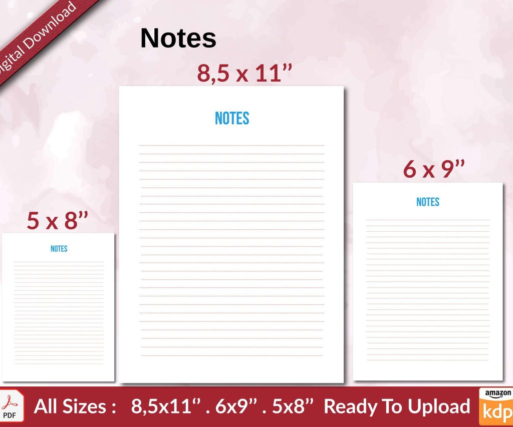 Notes KDP interior Ready To Upload, Sizes 8.5x11 6x9 5x8 inch PDF FILE Used as Amazon KDP Paperback Low Content Book, journal, Notebook, Planner, COMMERCIAL Use
1 × $0.00
Notes KDP interior Ready To Upload, Sizes 8.5x11 6x9 5x8 inch PDF FILE Used as Amazon KDP Paperback Low Content Book, journal, Notebook, Planner, COMMERCIAL Use
1 × $0.00
Subtotal: $0.00
Okay so I just finished uploading three photo books last month and here’s what actually matters when you’re dealing with image-heavy stuff on KDP.
First off, the 650MB limit is real but it’s also… not the problem you think it is. What kills most people is they’re uploading full-res images straight from their camera or phone and wondering why the file won’t process or takes forever. I learned this the hard way with a travel photo book where I had like 80 images at 4000px wide and KDP just choked on it.
Here’s what you gotta do – resize everything to 300 DPI at the exact dimensions they’ll appear in your book. Not bigger. If your photo is gonna be 6×4 inches in the layout, make it 1800×1200 pixels at 300 DPI. That’s it. Going bigger doesn’t improve print quality because KDP’s printing process maxes out around there anyway.
Convert everything to CMYK before you even think about building your PDF. I use Adobe RGB or sRGB when I’m editing but the final export has to be CMYK. The colors will look duller on your screen – that’s normal and it freaked me out the first time. What looks vibrant on your monitor comes out oversaturated and weird in print if you don’t convert.
Oh and another thing, embed your color profiles in the PDF. In InDesign or whatever you’re using, there’s usually an export option for this. It makes the file slightly bigger but it’s worth it because otherwise KDP’s system makes its own guesses about your colors and those guesses are usually wrong.
I’ve used InDesign, Affinity Publisher, and even Canva for photo books. InDesign is obviously the most powerful but it’s expensive and has a learning curve. Affinity Publisher is like $70 one-time and does 90% of what InDesign does. Totally worth it if you’re gonna make more than one book.
Canva… okay so Canva can work for simple photo books but their PDF export sometimes does weird compression things. I made a recipe book with photos last year using Canva and had to remake it because the images came out pixelated even though they looked fine in the editor. If you use Canva, download as PDF Print not PDF Standard.
Bleed is 0.125 inches on all sides. You already know this probably but what people don’t realize is you need to extend your images INTO the bleed area, not just make white space there. If you have a full-page photo, it should be 8.75×11.25 inches for an 8.5×11 book, not 8.5×11.
The safe zone is 0.25 inches from trim on all sides. Don’t put text or important parts of images there because the cutting isn’t always perfectly precise. I had a photobook where someone’s face got partially cut off because I put it too close to the edge and the trimming was slightly off on that batch.
300 DPI is the standard everyone says. In reality, you can get away with 250 DPI for most photos and nobody will notice. Below that, yeah it starts looking fuzzy. I tested this with a proof copy – printed the same image at 300, 250, and 200 DPI on different pages. The 250 was basically identical to 300. The 200 looked noticeably worse.
But here’s the thing… if you’re doing like a photography portfolio book where people are gonna look closely, stick with 300. If it’s a travel memory book or something more casual, 250 saves you file size.
When you export your PDF, use PDF/X-1a:2001 format. This is the print-ready standard and it flattens everything, embeds fonts, handles colors properly. In InDesign it’s under the export presets. In Affinity it’s in the export options.
Don’t use compression settings that are too aggressive. I usually set JPEG quality to “Maximum” for images. Yeah the file gets bigger but we’re still under that 650MB limit usually and the quality difference is noticeable. I made the mistake of using “Medium” quality once to save space and the gradients in sky photos came out with visible banding.
The most popular sizes for photo books are 8.5×11 and 8×10. The 8.5×11 is cheaper to print per page which matters if you’re making a thick book. I did a 150-page photobook and the difference between 8×10 and 8.5×11 was like $2 per copy at volume. Adds up.
Square formats like 8×8 are trendy but they cost more to print and your royalty takes a hit. Only worth it if the square format is really important to your concept.
You get two options: white paper or cream paper. For photo books, white paper is basically always better. The cream has this vintage look that can work for certain styles but it mutes colors and makes everything look yellower.
The paper quality is… okay it’s not amazing. KDP’s paper is decent but it’s not professional photo lab quality. Setting expectations here – it’s more like a nice magazine than a premium photography book. Which is fine for most purposes but don’t expect gallery-quality prints.
For image-heavy books, glossy cover is usually the move. The matte cover can work if you’re going for a more artistic vibe but glossy makes colors pop more. I do matte for journals and planners, glossy for anything with photos.
Your cover image needs to be high-res too. The full cover (front, spine, back) at 300 DPI. Use KDP’s cover calculator to get exact dimensions. The spine width changes based on page count and I always forget this and have to redo it.
Wait I forgot to mention – if your book is under 80 pages or so, the spine might be too narrow to put text on. KDP will accept it but it looks cramped. Better to just do a design element or leave it blank.
Keep your images organized in folders by chapter or section. I name them with numbers like 001_imagename, 002_imagename so they stay in order. Sounds basic but when you’re working with 50+ images it saves headaches.
Also keep your original high-res versions separate from your processed-for-print versions. I made a book once, then wanted to update it months later and had to re-process all the images because I’d overwritten the originals like an idiot.
If you’re adding text over images, make sure there’s enough contrast. Either use a semi-transparent box behind the text or pick image areas that are light/dark enough. I see so many photo books where the captions are barely readable because they’re white text on a light background.
Font size for captions should be at least 10pt, preferably 11-12pt. Smaller than that and it’s hard to read in print even if it looks fine on screen.
Order a proof copy. Always. Every single time. What looks good on your screen will have surprises in print. Colors shift, some images might look darker or lighter, binding eats into the gutter area more than you expected.
I ordered a proof of a landscape photography book and several images that looked fine on screen were way too dark in print. Had to go back and lighten them like 10-15% and reupload.
The gutter is that inside margin where pages meet. You need like 0.375 inches there minimum or text and images disappear into the binding. For photo books this matters less unless you’re doing full-spread images across two pages. Those are tricky because the gutter breaks them up and they never line up perfectly.
Photo books are expensive to print because they’re heavy. A 100-page color book costs like $4-5 just in printing costs. If you price it at $9.99, you’re barely making anything. Most photo books need to be priced $15-30 to make decent royalty.
The expanded distribution option costs even more to print so your royalty gets destroyed there. I usually skip expanded for photo books and just do Amazon. The print quality complaints go up with expanded anyway.
Using low-res images from Instagram or Facebook. They look terrible in print. If you don’t have high-res versions, the book won’t work. Period.
Not checking the final PDF before upload. Open that thing in Acrobat and zoom in to 200%. Check the images, check the text, look at the edges. KDP’s previewer misses stuff sometimes.
Forgetting about page order. Every book needs a title page, copyright page, maybe a table of contents. Don’t just start with photos on page 1. It looks amateur.
Oh and another thing – margins that are too small. I’ve seen people try to maximize space by using tiny margins and then important stuff gets cut off. Use at least 0.5 inch margins, better to use 0.75 inches.
When you upload your interior PDF, KDP runs it through a review process. For image-heavy files this can take 10-15 minutes. Don’t refresh the page or close it. Just let it sit there. My cat knocked my laptop closed once during this and I had to start over.
If you get errors about image resolution or file problems, it’s usually because images aren’t embedded properly or your PDF settings were wrong. Go back to your design software and re-export with different settings.
The preview tool on KDP is helpful but not perfect. It sometimes shows weird artifacts that don’t appear in the actual print. Still useful for checking layout and text though.
You can update your book anytime but there’s this thing where Amazon doesn’t always notify previous buyers about updates. If you’re fixing errors that’s fine, but if you’re adding significant content you might wanna make it a new edition instead.
I updated a photo book once to fix some typos and adjust a few images. Took like 3 days for the new version to fully replace the old one in Amazon’s system. During that time some people were still getting the old version.
This is gonna sound weird but check your book listing every few weeks. Sometimes the preview images Amazon generates look wrong or they use a random interior page instead of your actual cover for the thumbnail. You can contact support to fix it but it’s annoying.
The whole process gets easier after you do it a few times. First photo book took me like a week of messing around. Now I can put one together in a day or two once I have all the images ready. Just gotta remember the technical stuff about resolution and color and you’re basically good to go.
DISCOVER OUR FREE BEST SELLING PRODUCTS
Editable Canva Lined Journal: Express Your Thoughts – KDP Template
Lined Pages Journal 120 pages Ready to Upload PDF Commercial Use KDP Template 6×9 8.5×11 5×8 for Notebooks, Diaries, Low Content
Lined Pages Journal 120 pages Ready to Upload PDF Commercial Use KDP Template 6×9 8.5×11 5×8 for Notebooks, Diaries, Low Content
Cute Dogs Coloring Book for Kids | Activity Book | KDP Ready-To-Upload
Daily Planner Diary : Diary Planners for Everyday Productivity, 120 pages, 6×9 Size | Amazon KDP Interior
Wolf Coloring KDP interior For Adults, Used as Low Content Book, PDF Template Ready To Upload COMMERCIAL Use 8.5×11"
Coloring Animals Head Book for Kids, Perfect for ages 2-4, 4-8 | 8.5×11 PDF
Printable Blank Comic Book Pages PDF : Create Your Own Comics – 3 Available Sizes
Notes KDP interior Ready To Upload, Sizes 8.5×11 6×9 5×8 inch PDF FILE Used as Amazon KDP Paperback Low Content Book, journal, Notebook, Planner, COMMERCIAL Use
Black Lined Journal: 120 Pages of Black Lined Paper Perfect for Journaling, KDP Notebook Template – 6×9
Student Planner Journal 120 pages Ready to Upload PDF Commercial Use KDP Template 6×9" 8.5×11" for Low Content book
Recipe Journal Template – Editable Recipe Book Template, 120 Pages – Amazon KDP Interior